🔥 Today Only: Save 30% on Premium — Offer Ends Soon! - Upgrade Now!
Table

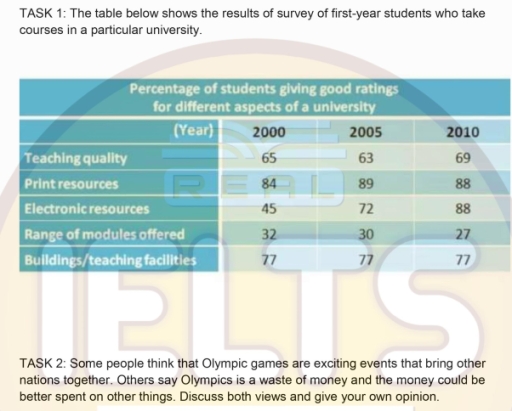
Band 4+: the table below shows the results of survey of first-year students who take courses in a particular university

Image for topic: the table below shows the results of survey of first-year students who take courses in a particular university
Our system will evaluate the answer based on this AI-generated description.
The image contains two separate tasks; TASK 1 displays a table listing percentages of first-year students giving good ratings to various university aspects for three different years: 2000, 2005, and 2010. Teaching quality received 65% in 2000, 75% in 2005, and 69% in 2010. Print resources had 84% in 2000, 89% in 2005, and 88% in 2010. Electronic resources began at 45% in 2000, jumped to 72% in 2005, and reached 88% in 2010. The range of modules offered was rated 32% in 2000, rose to 60% in 2005, and held at 77% in 2010. Lastly, buildings/teaching facilities were consistently at 77% in both 2000 and 2005, but experienced a 6% drop to 71% in 2010. TASK 2 presents a text prompt discussing varying opinions on the Olympic games, suggesting it can either be an exciting event that unites nations or a waste of money that could be allocated elsewhere; the task requires discussing both views and providing a personal opinion.
Given the complexity of the image, the above description may not be entirely accurate.
Note: Both the topic and the answer were created by one of our users.

The table illustrates the information about how many students are gave good rating for different aspects of the university in 2000, 2005 and 2010.

Overall, most coutgeries showing changing over the period, Electronic resources are almost all years diffrenent rating in three years.

On the one hand, In 2000, teaching quality recevied 60% not assume rate, which slightly dropped to 63% in 2005 before slightly up 69% in 2010. Print resources Stayed very high in all the three years, starting in 87% in 2000, to going on 89% in 2005 however, little fall in 2010, which is 88%. Electronic resources all the years are different aspectation rating 45% in 2000, then number was up 72% in 2005 and last year doubled level of rating 88% in 2010.

In contrast, the range of modules fell in from 32% to 27%. Buildings and teaching facilities Stayed the all the three years at 77%.

Word Count: 151

Answers On The Same Topic:

the table below shows the results of survey of first-year students who take courses in a particular university

The table illustrates the percentage of students gave good ratings for different aspects of a university in three different years. Overall, it is clear that the highest proportions of rating witnessed by the print and electronic resources, while range of models offered had the significant lowest throughout the period. In detail, print resources accounted for […]

the table below shows the results of survey of first-year students who take courses in a particular university

The given table illustrates the outcome of three surveys in 3 particular years in 2000,2005 and 2010. Overall, it is clear that print resources got the best rating in all the given years while range of modules offered were at least in all years and teaching facilities were stable throught the time. Firstly, in 2000 […]

the table below shows the results of survey of first-year students who take courses in a particular university

The data present inpormation about students giving good rating for different aspects of a university. Overall, five parts were being rating. It is: teaching quality, print resouces, electronic resources, range of modules offered and buildings or teaching facillties in 2000, 2005 and 2010. Two first aspects had the wave growth. Electronic resources rosed significaly, while, […]

the table below shows the results of survey of first-year students who take courses in a particular university

The table illustrates the percentage of results they achieved of first year students and then whoever taking courses in their frequency of university. overall, it is clear that the percentage of print resources students increased , while the average number of ratings also increased the period shown. conversely, range of modules offered was the lowest […]

See All

Other Topics:

Task 1: The table below gives the information about the amount of tax collected (as % of GDP) in five countries for 4 years between 1975 and 2005. Summarize the information by selecting and reporting the main features, and make comparisons where relevant.

The table provides information about the percentage of GDP collected as tax in five countries in 1975, 1985, 1995 and 2005. Overall, Sweden had the highest tax revenue as a percentage of GDP throughout the period, while the USA showed the most stable figures. All countries experienced an overall increase, although Turkey recorded a slight […]

The table below gives information about the average monthly salaries (in US dollars) for workers in five different industries in Australia in 2010 and 2020.

The table illustrates the information about the mean monthly salaries for employees in five different sectors in Australia between 2010 and 2020. Overall, information tech had the highest average monthly salary in both years, while retail had the lowest figures. It is also noticable that salaries in all five industries between 2010 and 2020. In […]

The table below shows the percentage of first year students who get "very good" rating to the resources provided by the college for three courses

The table provides information on the percentage of first-year students who rated various college resources as ‘very good’ across three distinct fields of study:Economics, Law, Commerce. The categories include pre course information, teaching, tutor, resources (print) and other resources. Overall, Commerce students were the most satisfied, givingthe highest results, conversely, law students lowest satistaction, particularly […]

The chart below shows the amount of energy consumed in three countries in the year 2000 and the rate of increase in energy consumption as compared with the year 1999. Summarise the information by selecting and reporting the main features, and make comparisons where relevant

The table illustrates different economic sectors in three countries in 2000 and the growth rate of energy consumption compared with the year 1999 Overall, the US took the lead in the energy consumption. But the fastest growth rate of energy use belonged to Japan Looking first at the industry field, the US kept the lion’share […]

The table below shows the results of a survey that asked 6800 scottish adults whether they had taken part in different cultural activties

The table chart given illustrates the outcome of an investigation about the rate of the participation of scottish adults (aged 16 years and over) to various cultural activities in that year. Overall; the biggest participation is by far in the performance based activities(dancing,singing,acting…) with a downright trend based on the ages.In the other hand the […]

The table compares the data of the work's large-scale and small-scale sea fishing industries.

The provided table compares various metrics between global company-owned large scale and artisanal small scale sea fishing industries. Overall, there are clear differences between large and small scale industries regarding financial funding, number of fishermen employed, fish caught for industrial reduction and other. In huge scale fishing industries that are company owned, they employ around […]

See All
We have detected unusual activity on your device.
Please verify your identity to continue.
Note: This verification step won't sign you in. If you have a premium account, please log in to access the service as usual.
Google/Gmail Verification
Or verify using Email/Code
We've sent a verification code to:
youremail@gmail.com (Not your email?)
Enter it below to complete the verification process.
Ensure your email address is correct, your inbox is not full, and you check your spam folder. If no email arrives, consider using an alternative email.
You will need a Premium plan to perform your action!
Note: If you already have a premium account, please log in to access our services as usual.

Plans & Pricing

Our mission is to make quality education accessible for everyone.
However, to keep our hardworking team running and this service alive, we genuinely need your support!
By opting for a premium plan, not only do you sustain us in achieving the mission, but you also unlock advanced features to enrich your learning experience.

Free

For learners who aren't pressed for time

What's included on Free
100+ Cambridge IELTS Tests
Instant IELTS Writing Task 1 & 2 Evaluation (2 times/month)
Instant IELTS Speaking Part 1, 2, & 3 Evaluation (2 times/month)
Instant IELTS Writing Task 1 & 2 Essay Generator (2 times/month)
500+ Dictation & Shadowing Exercises
100+ Pronunciation Exercises
Flashcards
Other Advanced Tools

Premium

For those serious about advancing their English proficiency, and for IELTS candidates aspiring to boost their band score by 1-2 points (especially in writing & speaking) in just 30 days or less

What's included on Premium
Save Your IELTS Test Progress & Analyze Mistakes By Question Type
Save Your Own Flashcard Sets & Use Them On Any Device
Unlock All Courses, IELTS Tests, Section & Part Practice
Unlimited AI Conversations
Unlimited AI Writing Enhancement Exercises
Unlimited IELTS Writing Task 1 & 2 Evaluation
Unlimited IELTS Speaking Part 1, 2, & 3 Evaluation
Checked Answers Will Not Be Published
Unlimited IELTS Writing Task 1 & 2 Essay Generator
Unlimited IELTS Speaking Part 1, 2, & 3 Sample Generator
Unlimited Usage Of Advanced Tools & AI Features
Priority Support within 24h (12-month plan only)

Due to the nature of our service and the provided free trials, payments are non-refundable.