🔥 Today Only: Save 30% on Premium — Offer Ends Soon! - Upgrade Now!
Table

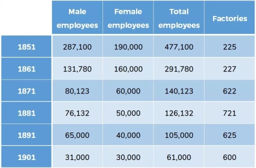
Band 8+: The table describes the number of employees and factories in England and Wales from 1851 to 1901.

Image for topic: The table describes the number of employees and factories in England and Wales from 1851 to 1901.
Our system will evaluate the answer based on this AI-generated description.
The image is a table with five rows and five columns. The first column headers are "Male employees," "Female employees," "Total employees," and "Factories." The rows are labeled with years 1851 to 1901 in increments of 10 years. In 1851, male employees were 287,100, female employees were 190,000, total employees were 477,100, and there were 225 factories. In 1861, male employees dropped to 131,780, female employees to 160,000, total employees to 291,780, and factories increased to 227. By 1871, male employees decreased to 80,123, female employees to 60,000, total to 140,123, and a significant jump in factories to 622. In 1881, male employees were 76,132, female employees at 50,000, total employees at 126,132, and factories rose to 721. By 1891, male employees fell to 65,000, female to 40,000, total to 105,000, and factories dropped to 625. Finally, in 1901, male employees were 31,000, female employees at 30,000, total employees at 61,000, and factories reduced to 600.
Given the complexity of the image, the above description may not be entirely accurate.
Note: Both the topic and the answer were created by one of our users.

The table illustrates how the number of factories and workers changed in England and Wales in the period of 50 years, commencing from 1851.

At a first glance, it can be seen that while the factories experienced an uptrend, the opposite pattern was true for both male and female employees. Notably, the number of male labour was considerably higher than that of females for most of the research period.

Looking at the employee statistics, in 1851, the number of workers was 287,100 and 190,000 as respective figures for male and female, which was 477,100 employees altogether. The workforce then decreased dramatically to just north of 290,000 employees in 1861, which is the only year that there were more women employed than men, before falling gradually and hitting the floor at 61,000 in 1901.

Regarding factories, there were 225 factories at the beginning of the period, before increasing sharply and peaking at 721 factories in 1881. The figures then experienced a downtrend before stopping at 600 in 1901.

Word Count: 167

Answers On The Same Topic:

The table describes the number of employees and factories in England and Wales from 1851 to 1901.

The table illustrates the workforce dynamics and factory numbers within the silk production industry in England and Wales over a 50-year span from 1851 to 1901. It is apparent that the total employee count experienced a marked decline throughout the period, while the distribution of male and female workers shifted sharply. Concurrently, the number of […]

The table describes the number of employees and factories in England and Wales from 1851 to 1901.

The table illustrates how the number of factories and workers changed in England and Wales during a 50-year period, commencing from 1851. At first glance, it can be seen that while the factories experienced an uptrend, the opposite pattern was true for both male and female employees. Notably, the number of male laborers was considerably […]

The table describes the number of employees and factories in England and Wales from 1851 to 1901.

The given table represents the amount of employees and factories in England and Wales every ten years from 1851 to 1901. Overall, the numbers of staff, both male and female, reduced during that period, while the total number of industries increased. We can see that the sum of workers reached its peak in 1851 with […]

The table describes the number of employees and factories in England and Wales from 1851 to 1901.

The table provides a detailed breakdown of the number of factories and employees in Wales and England over a 50-year period, from 1851 to 1901. In summary, while the employment figures exhibited a significant decline, the number of factories rose significantly, even though their numbers declined considerably in the last two decades. In detail, the […]

See All

Other Topics:

The graph below shows the oil production ( in barrels) in several African countries from 2000 to 2004.

The table demonstrates the amount of oil produced in four African countries. Overall, it is clear that Congo was the largest oil producer at the beginning of the period, although its production declined slightly. In contrast, Somalia and Chad experienced significant increases, while Nigeria’s production slightly fluctuated. Nigeria and Congo started the period by producing […]

the following table gives statistics showing the aspects of quality of life in five countries. Summarize the information by selecting and reporting the main features and make comparisons where relevant.

The following table provides statistics showing the aspects of quality of life in countries named Bangladesh, Bolivia, Egypt, Indonesia and the USA. Looking from an overall perspective. Overall, it can be seen that The United States had a higher GNP per head than the other countries , whereas Bangladesh had the lowest calorie supply per […]

The graph below shows the daily water consumption for Americans in their homes. Summarise the information by selecting and reporting the main features, and make comparisons where relevant.

The table compares the average amount of water used daily by households in the USA across various categories in 2011 and 2012, following the application of water efficiency measures. Overall, total daily usage of water decreased significantly after the water-saving measures were introduced. While the majority of categores experienced a reduction, some showed minimal change […]

The table below shows population figures for four countries for 2003 and projected figures for 2025 and 2050. Summarize the information by selecting and reporting the main features, and make a comparison where relevant.

The table chart compares four countries population during 2003 and projected figures for 2025 and 2050. Looking in the more detail,it is quite evident that Idonesia holds highest population during this time period which given in figure.It holds 238 million in 2003 and slightly increased in 2025 274 million,312 million population wiil be in 2050.Where […]

The table below gives information about languages with the most native speakers. Summarize the information by selecting and reporting the main features, and make comparisons where relevant.

The given table illustrates different languages spoken by native speakers as well as non-native ones. Overall, with regards to number of native speakers, Mandarin Chinese occupies the highest position across six surveyed languages while English is most commonly by non-native ones as opposed to the lowest figure recorded for Portuguese. As can be seen from […]

Write a report for the given table. The table shows the number of exchange students from universities in Europe to Australia and vice versa.

Both tables delineate the enumeration of exchange students initially from Europe to Australia and vice versa. Overall, more scholars were transferred to Australia in 2009 than in 2007; by contrast, scholars’ destination in Europe remain unchanged. The first table delineating exchange students to Australia reveals that, in 2007, France has the most scholars transferred at […]

See All
We have detected unusual activity on your device.
Please verify your identity to continue.
Note: This verification step won't sign you in. If you have a premium account, please log in to access the service as usual.
Google/Gmail Verification
Or verify using Email/Code
We've sent a verification code to:
youremail@gmail.com (Not your email?)
Enter it below to complete the verification process.
Ensure your email address is correct, your inbox is not full, and you check your spam folder. If no email arrives, consider using an alternative email.
You will need a Premium plan to perform your action!
Note: If you already have a premium account, please log in to access our services as usual.

Plans & Pricing

Our mission is to make quality education accessible for everyone.
However, to keep our hardworking team running and this service alive, we genuinely need your support!
By opting for a premium plan, not only do you sustain us in achieving the mission, but you also unlock advanced features to enrich your learning experience.

Free

For learners who aren't pressed for time

What's included on Free
100+ Cambridge IELTS Tests
Instant IELTS Writing Task 1 & 2 Evaluation (2 times/month)
Instant IELTS Speaking Part 1, 2, & 3 Evaluation (2 times/month)
Instant IELTS Writing Task 1 & 2 Essay Generator (2 times/month)
500+ Dictation & Shadowing Exercises
100+ Pronunciation Exercises
Flashcards
Other Advanced Tools

Premium

For those serious about advancing their English proficiency, and for IELTS candidates aspiring to boost their band score by 1-2 points (especially in writing & speaking) in just 30 days or less

What's included on Premium
Save Your IELTS Test Progress & Analyze Mistakes By Question Type
Save Your Own Flashcard Sets & Use Them On Any Device
Unlock All Courses, IELTS Tests, Section & Part Practice
Unlimited AI Conversations
Unlimited AI Writing Enhancement Exercises
Unlimited IELTS Writing Task 1 & 2 Evaluation
Unlimited IELTS Speaking Part 1, 2, & 3 Evaluation
Checked Answers Will Not Be Published
Unlimited IELTS Writing Task 1 & 2 Essay Generator
Unlimited IELTS Speaking Part 1, 2, & 3 Sample Generator
Unlimited Usage Of Advanced Tools & AI Features
Priority Support within 24h (12-month plan only)

Due to the nature of our service and the provided free trials, payments are non-refundable.