🔥 Today Only: Save 30% on Premium — Offer Ends Soon! - Upgrade Now!
Table

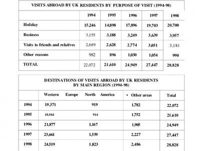
Band 7+: The tables shows the number of residents who traveled abroad between 1994 to 1998.

Image for topic: The tables shows the number of residents who traveled abroad between 1994 to 1998.
Our system will evaluate the answer based on this AI-generated description.
The image presents two tables regarding visits abroad by UK residents from 1994 to 1998. The first table, "VISITS ABROAD BY UK RESIDENTS BY PURPOSE OF VISIT (1994-98)", details visits for 1994, 1995, 1996, 1997, and 1998 respectively: Holiday (15,246, 14,898, 17,896, 19,703, 20,700), Business (3,155, 3,188, 3,249, 3,639, 3,957), Visits to friends and relatives (2,689, 2,628, 2,774, 3,051, 3,181), and Other reasons (982, 896, 1,030, 1,054, 990), with total visits per year being 22,072, 21,610, 24,949, 27,447, and 28,828. The second table, "DESTINATIONS OF VISITS ABROAD BY UK RESIDENTS BY MAIN REGION (1994-98)", provides a regional breakdown for the same years: Western Europe (19,371, 18,944, 21,877, 23,661, 24,519), North America (919, 914, 1,167, 1,559, 1,823), and Other areas (1,782, 1,752, 1,905, 2,227, 2,486), with the same corresponding total visits per year.
Given the complexity of the image, the above description may not be entirely accurate.
Note: Both the topic and the answer were created by one of our users.

The provided bar chart illustrates the percentage of global population and distribution of wealth by region. These are divided into two categories: population and global wealth. The unit is measured in percentage.

In detail, North America has the highest wealth and the lowest population around the globe, with accounting for 34% and 6%. Followed by Europe, slightly lower at 30%. Moreover, Rich-Acia-Pacific representsaround 24%. Meanwhile, China, India, Latin America & the Caribbean, and other Asia-Pacific countries have the lowest at under 1%.

On the other hand, China amounts to the majority of the population. Following from this, India, Europe, and other Asia Pacific countries show the same accounting of people, with approximately 15%. In contrast, Africa remains stable at 10%. Thereafter, other nations such as North America, Latin America & the Caribbean, and other rich Asia-Pacific countries have fewer people than others.

Overall, China accounts for a quarter of the total population. While North America holds high wealth and low population, indicating a developed nation.

Word Count: 165

Answers On The Same Topic:

The tables shows the number of residents who traveled abroad between 1994 to 1998.

The given tables present information about United Kingdom residents’ travels abroad: their destinations and the purposes of visits, over five years from 1994 to 1998. Overall, it’s clear that the main purpose of travel outside the UK was Holiday, and Western Europe was the favorite destination for the residents. In contrast, North America recorded the […]

The tables shows the number of residents who traveled abroad between 1994 to 1998.

The first table illustrates the number of British people who travelled outside their country as well as the reasons for their travel while the second one shows the preferred destinations for the immigrants. The data is a comparison for five years between 1994- 1998. Overall it is clear that majority of the the poeple from […]

The tables shows the number of residents who traveled abroad between 1994 to 1998.

The provided bar graph illustrates the average Australian annual residential water consumption in six different cities. While the pie chart shows the water distribution in 2014. These are divided into seven categories. The unit is measured in percentage. In terms of cities, Perth had the highest water utilization, reaching 300 kiloliters per property. Followed by […]

The tables shows the number of residents who traveled abroad between 1994 to 1998.

The provided table illustrates the number and percentage of people at a Canadian university who have taken online courses. These are divided into two different categories: under 25 and over 25. The unit is measured in number. In detail, those under age 25, around 10% (79) of students who have never taken an online course, […]

See All

Other Topics:

The table below shows the number of international students from five regions studying in the United Kingdom in 2019 and 2023. Summarise the information by selecting and reporting the main features, and make comparisons where relevant.

The provided table chart displays data on the number of international students in the Uk by region between 2019 and 2023. Overall, it can be seen that the highest figure was for Asia at 325,000, while +5,000 in North America accounted for the lowest rate. According to the table chart, in 2019, the number of […]

The table below gives information about the average distance in miles travelled by adults in a European capital city, by mode of travel, in 1977 and 2007. Summarise the information by selecting and reporting the main features, and make comparisons where relevant.

The table provides information about moderate distance in miles travelled by teenagers in a European capital city, by mode of travel, between 1977 and 2007. Units are measured in miles. Overall, walking, bicycle, motocycle, and bus showed decrease. Meanwhile, train and taxi experienced increase. Of particular note in car, where the highest number recorded. The […]

The table shows the average annual expenditure of university students in three different countries in 2017. Summarize the information by selecting and reporting the main features, and make comparisons where relevant.

The table illustrates the percentage of expenditure of university students in five different categories – accommodation, food, books, leisure and others – by three nations in 2017. Overall, it is clear that spending on accommodaton was relatively higher in all three nations than other expeditures. Australian students showed the highest interested on food and book, […]

SUmmarise the information by selecting and reporting some main features, and make comparisons where relevaant

The tables illustrate the results of surveys which gathered information on different aspects of living in a city were good or bad in the years 1980 and 2010. Overall, the surveys show that most people regarded on education, healthcare and environment as aspects of both years education had the lowest percentage of bad vote in […]

The table below shows the amount of waste production in six different countries from 1980 to 2000.

The given table illustrate the calculation of waste produced by Ireland, Japan, Korea, Poland, Portugal and US in the year 1980, 1990 and 2000. The amount is calculated in millions of tonnes . Overall, half of the countries like Ierland, Poland and Portugal were againt the remaning countries who produced modrate and high amount of […]

The table below gives information about UK independent films. Summarise the information by selecting and reporting the main features, and make comparison where relevant

The table illustrates the information about independent movies lunched in different genre in the UK and republic of Ireland in 2012. Overall, it is clear that comedy recorded the highest percentage of income from ticket sales, whereas biopic had the lowest share of all releases. It is also noticeable that the remaining types of films […]

See All
We have detected unusual activity on your device.
Please verify your identity to continue.
Note: This verification step won't sign you in. If you have a premium account, please log in to access the service as usual.
Google/Gmail Verification
Or verify using Email/Code
We've sent a verification code to:
youremail@gmail.com (Not your email?)
Enter it below to complete the verification process.
Ensure your email address is correct, your inbox is not full, and you check your spam folder. If no email arrives, consider using an alternative email.
You will need a Premium plan to perform your action!
Note: If you already have a premium account, please log in to access our services as usual.

Plans & Pricing

Our mission is to make quality education accessible for everyone.
However, to keep our hardworking team running and this service alive, we genuinely need your support!
By opting for a premium plan, not only do you sustain us in achieving the mission, but you also unlock advanced features to enrich your learning experience.

Free

For learners who aren't pressed for time

What's included on Free
100+ Cambridge IELTS Tests
Instant IELTS Writing Task 1 & 2 Evaluation (2 times/month)
Instant IELTS Speaking Part 1, 2, & 3 Evaluation (2 times/month)
Instant IELTS Writing Task 1 & 2 Essay Generator (2 times/month)
500+ Dictation & Shadowing Exercises
100+ Pronunciation Exercises
Flashcards
Other Advanced Tools

Premium

For those serious about advancing their English proficiency, and for IELTS candidates aspiring to boost their band score by 1-2 points (especially in writing & speaking) in just 30 days or less

What's included on Premium
Save Your IELTS Test Progress & Analyze Mistakes By Question Type
Save Your Own Flashcard Sets & Use Them On Any Device
Unlock All Courses, IELTS Tests, Section & Part Practice
Unlimited AI Conversations
Unlimited AI Writing Enhancement Exercises
Unlimited IELTS Writing Task 1 & 2 Evaluation
Unlimited IELTS Speaking Part 1, 2, & 3 Evaluation
Checked Answers Will Not Be Published
Unlimited IELTS Writing Task 1 & 2 Essay Generator
Unlimited IELTS Speaking Part 1, 2, & 3 Sample Generator
Unlimited Usage Of Advanced Tools & AI Features
Priority Support within 24h (12-month plan only)

Due to the nature of our service and the provided free trials, payments are non-refundable.