🔥 Today Only: Save 30% on Premium — Offer Ends Soon! - Upgrade Now!
Table

Band 7+: The tables shows the number of residents who traveled abroad between 1994 to 1998.

Image for topic: The tables shows the number of residents who traveled abroad between 1994 to 1998.
Our system will evaluate the answer based on this AI-generated description.
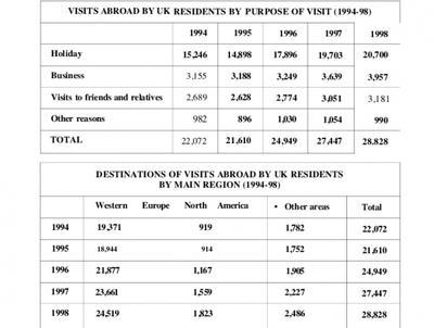
The image presents two tables regarding visits abroad by UK residents from 1994 to 1998. The first table, "VISITS ABROAD BY UK RESIDENTS BY PURPOSE OF VISIT (1994-98)", details visits for 1994, 1995, 1996, 1997, and 1998 respectively: Holiday (15,246, 14,898, 17,896, 19,703, 20,700), Business (3,155, 3,188, 3,249, 3,639, 3,957), Visits to friends and relatives (2,689, 2,628, 2,774, 3,051, 3,181), and Other reasons (982, 896, 1,030, 1,054, 990), with total visits per year being 22,072, 21,610, 24,949, 27,447, and 28,828. The second table, "DESTINATIONS OF VISITS ABROAD BY UK RESIDENTS BY MAIN REGION (1994-98)", provides a regional breakdown for the same years: Western Europe (19,371, 18,944, 21,877, 23,661, 24,519), North America (919, 914, 1,167, 1,559, 1,823), and Other areas (1,782, 1,752, 1,905, 2,227, 2,486), with the same corresponding total visits per year.
Given the complexity of the image, the above description may not be entirely accurate.
Note: Both the topic and the answer were created by one of our users.

The provided bar graph illustrates the average Australian annual residential water consumption in six different cities. While the pie chart shows the water distribution in 2014. These are divided into seven categories. The unit is measured in percentage.

In terms of cities, Perth had the highest water utilization, reaching 300 kiloliters per property. Followed by Adelaide and Brisbane, which had the second highest with slightly the same at 250 kiloliters. Sydney recorded around 200 kiloliters. Melbourne and Canberra had the least consumption, approximately 150 kiloliters.

Among water distribution, around 67% of water was used in agriculture. Households made up 9%. Moreover, water supply and drainage accounted for 7%, the same as electricity and gas supply. Manufacturing and other industries were at 4% each, and mining had a minimal share of just 2%.

Overall, residential consumption in various cities were relatively low in terms of national portion, whereas the farming sector was dominant in water consumption.

Word Count: 155

Answers On The Same Topic:

The tables shows the number of residents who traveled abroad between 1994 to 1998.

The given tables present information about United Kingdom residents’ travels abroad: their destinations and the purposes of visits, over five years from 1994 to 1998. Overall, it’s clear that the main purpose of travel outside the UK was Holiday, and Western Europe was the favorite destination for the residents. In contrast, North America recorded the […]

The tables shows the number of residents who traveled abroad between 1994 to 1998.

The first table illustrates the number of British people who travelled outside their country as well as the reasons for their travel while the second one shows the preferred destinations for the immigrants. The data is a comparison for five years between 1994- 1998. Overall it is clear that majority of the the poeple from […]

The tables shows the number of residents who traveled abroad between 1994 to 1998.

The provided table illustrates the number and percentage of people at a Canadian university who have taken online courses. These are divided into two different categories: under 25 and over 25. The unit is measured in number. In detail, those under age 25, around 10% (79) of students who have never taken an online course, […]

The tables shows the number of residents who traveled abroad between 1994 to 1998.

The provided bar chart illustrates the percentage of global population and distribution of wealth by region. These are divided into two categories: population and global wealth. The unit is measured in percentage. In detail, North America has the highest wealth and the lowest population around the globe, with accounting for 34% and 6%. Followed by […]

See All

Other Topics:

The table below gives information about the average annual distance travelled by adults and the types of travel in 1997 and 2007

The table provides information about the average annual travelling distance that were done by adults and the variety of travel types between 1977 and 2007. Overall, in 1997, adult people mostly use cars to travel, while in 2007, the trend of driving cars increased fourfold. In 1997, a considerable amount of miles were travelled by […]

The table below given the information about the underground railway systems in 6 countries.

The table compares six underground railway networks based on their opening dates, total route lengths, and annual passenger figures. Overall, London has the oldest and most extensive underground system, while Tokyo serves the highest number of passengers per year. In contrast, the more recently established networks in Kyoto and Los Angeles are significantly smaller in […]

The table below shows information about the population of New Zealand from 2011 to 2012 by age group. Summarize the formation by selecting and reporting the main features and make comparisons where relevant.

The table illustrates data regarding the population of New Zealand across five distinct age brackets between 2011 and 2012. Overall, it is clear that New Zealand’s total population experienced a marginal increase during the one-year period. It is also noticeable that while the older demographics saw an upward trend, with the elderly group growing the […]

The graph below shows the percentage of people using the Internet in three countries from 2000 to 2020.

The table illustrates overall trend in the proportion of internet users in three countries over a twenty-year period from 2000 to 2020. Overall, it is immediately apparent that it experienced gradual increase in three parts of the world such as the USE, Canada, and Mexico throughout the entire period. In 2000, the number of people […]

The table below describes percentage of home schooled students in some country in199-2004. Write a report for a university lecturer describing the information shown.

The table illustrates changes in the proportion of home schooled pupils across five different categories in a particular nation between 1999 and 2004. In general, it is noticeable that different trends were observed in all the given years. While kindergarten was the most common grade group for the whole period, the opposite was true for […]

The table below describes percentage of home schooled students in some country in199-2004. Write a report for a university lecturer describing the information shown.

The table illustrates changes in the proportion of home schooled pupils across five different categories in particularly nation between 1999 and 2004. In general, it is noticeable that different trends were observed in all the given years. While kindergarten was the most common grades group for the whole period, the opposite was true for ‘grades […]

See All
We have detected unusual activity on your device.
Please verify your identity to continue.
Note: This verification step won't sign you in. If you have a premium account, please log in to access the service as usual.
Google/Gmail Verification
Or verify using Email/Code
We've sent a verification code to:
youremail@gmail.com (Not your email?)
Enter it below to complete the verification process.
Ensure your email address is correct, your inbox is not full, and you check your spam folder. If no email arrives, consider using an alternative email.
You will need a Premium plan to perform your action!
Note: If you already have a premium account, please log in to access our services as usual.

Plans & Pricing

Our mission is to make quality education accessible for everyone.
However, to keep our hardworking team running and this service alive, we genuinely need your support!
By opting for a premium plan, not only do you sustain us in achieving the mission, but you also unlock advanced features to enrich your learning experience.

Free

For learners who aren't pressed for time

What's included on Free
100+ Cambridge IELTS Tests
Instant IELTS Writing Task 1 & 2 Evaluation (2 times/month)
Instant IELTS Speaking Part 1, 2, & 3 Evaluation (5 times/month)
Instant IELTS Writing Task 1 & 2 Essay Generator (2 times/month)
500+ Dictation & Shadowing Exercises
100+ Pronunciation Exercises
Flashcards
Other Advanced Tools

Premium

For those serious about advancing their English proficiency, and for IELTS candidates aspiring to boost their band score by 1-2 points (especially in writing & speaking) in just 30 days or less

What's included on Premium
Save Your IELTS Test Progress
Unlock All Courses & IELTS Tests
Unlimited AI Conversations
Unlimited AI Writing Enhancement Exercises
Unlimited IELTS Writing Task 1 & 2 Evaluation
Unlimited IELTS Speaking Part 1, 2, & 3 Evaluation
Checked Answers Will Not Be Published
Unlimited IELTS Writing Task 1 & 2 Essay Generator
Unlimited IELTS Speaking Part 1, 2, & 3 Sample Generator
Unlimited Usage Of Advanced Tools
Priority Support within 24h (12-month plan only)

Due to the nature of our service and the provided free trials, payments are non-refundable.
Nếu bạn là người Việt Nam và không có hoặc không muốn trả bằng credit/debit cards, bạn có thể thanh toán bằng phương thức chuyển khoản:


Chọn gói:
419,000₫ 277,000 ₫ cho gói 1 tháng (chỉ 9,233₫/ngày)
1,239,000₫ 597,000 ₫ cho gói 3 tháng (chỉ 6,633₫/ngày)
2,469,000₫ 1,027,000 ₫ cho gói 6 tháng (chỉ 5,706₫/ngày)
4,929,000₫ 1,417,000 ₫ cho gói 12 tháng (chỉ 3,936₫/ngày)


Sau khi chuyển khoản, vui lòng đợi trình duyệt tự động điều hướng bạn trở lại Engnovate và bạn sẽ ngay lập tức nhận được mã kích hoạt tài khoản premium.
Nếu có lỗi xảy ra, bạn có thể liên hệ với team thông qua một trong các phương thức: email đến helloengnovate@gmail.com hoặc nhắn tin qua facebook.com/engnovate.
Vì toàn bộ công cụ trên website đều có thể sử dụng thử miễn phí, Engnovate không hỗ trợ hoàn tiền.