🔥 Today Only: Save 30% on Premium — Offer Ends Soon! - Upgrade Now!
Bar Chart

Band 4+: two bar graphs showing how often people exercised europe 2016

Image for topic: two bar graphs showing how often people exercised europe 2016
Our system will evaluate the answer based on this AI-generated description.
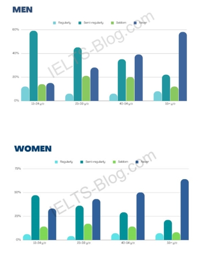
The image shows two bar charts depicting percentages of regular, semi-regular, and seldom activity among men and women in four age groups: 15-24, 25-39, 40-54, and 55+. In the Men's chart, Regular activity is highest in the 55+ group at approx 70%, followed by 25-39 at over 50%, then 40-54 at approx 50%, and lowest in 15-24 at less than 20%. Semi-regular activity is relatively uniform across age groups, ranging from approx 20% to 30%. Seldom activity is highest in the 15-24 group at over 60%, decreases with age, with the 55+ group at less than 10%. In the Women's chart, Regular activity is highest in the 55+ group at over 50%, then 40-54 at over 40%, 25-39 at approx 40%, and lowest in 15-24 at less than 20%. Semi-regular activity trends similarly to men, with a range from 20% to slightly over 30%. Seldom activity is highest in the 15-24 group at over 50%, decreases with age, with 55+ at approx 10%.
Given the complexity of the image, the above description may not be entirely accurate.
Note: Both the topic and the answer were created by one of our users.

The bar chart shows how often men and women of different age groups exercised in Europe in 2016. In the two diagrams, there are 4 age groups, namely 15–24, 25–39, 40–54, and 55+. In the male diagram, the highest semi-regular activity is at the age of 15–24 with a percentage of less than 60%, followed by the age of 25–39 with 45%, then at the age of 40–54 with about 35%, and finally at the age of 55+ with more than 20%. For almost the same percentage in each age group of less than 20%, the seldom group has a percentage of about 10% to 20%, and the never exercise group is highest at the age of 55+ with less than 60%.

Then, in the female diagram in the semi-regular group, the highest percentage is at the age of 15–24 with less than 50%, then in regular activities, the percentage of each age group is the same, which is less than 10%, then in seldom activities, all age groups are less than 25%, and the highest never activity is in the 55+ group with a percentage of around 60–65%.

So it can be concluded that the 55+ age group is the age group that rarely exercises because they are old, and the percentage of people who are used to exercising is in the 15-24 age group.

Word Count: 226

Answers On The Same Topic:

two bar graphs showing how often people exercised europe 2016

The bar charts illustrate the frequency of European men and women engaged in sports activities, which were divided into four age groups (15 to 24 years old, 25 to 39 years old, 40 to 54 years old, and 55 years old). The graphs revealed that both genders have a similar trend in terms of engaging […]

two bar graphs showing how often people exercised europe 2016

The graphs represent the data about the frequency of training between different age groups of people (15-20, 25-39, 40-54 and 55+ years old) and gender. Overall, young males exercised semi-regularly as the frequency dropped between elderly men. As for the women, they exercise less compared to males in their early years and never train as […]

two bar graphs showing how often people exercised europe 2016

Overall, two bar charts show the average amount of exercise among men and women divided by their ages. Initially, among men, the majority between the ages of 15 and 24 exercise almost regularly. Likewise, older people between 25 and 39. However, as men get older, the rate of exercising is followed by a huge fall. […]

two bar graphs showing how often people exercised europe 2016

The bar charts illustrate how often men and women belonging to different age groups exercise in Europe in the year 2016. Considering the overall age groups in the survey, on average men tend to exercise slightly more than women. In contrast, the former also have a larger percentage who rarely exercise than the latter. People […]

See All

Other Topics:

The bar chart below shows the percentage of food bought by people in a town in different ways during the week in 2009, 2011 and 2013.

The bar chart illustrates the percentage of food purchased by people in a particular town on different days of the week in 2009, 2011 and 2013 Overall, it is clear that the percentages tended to be considerably higher towards the end of the week, particularly from Friday to Sunday, whereas Wednesday and Thursday generally recorded […]

The bar chart below shows the percentage of food bought by people in a town in different ways during the week in 2009, 2011 and 2013.

The bar chart illustrates the percentage of food purchased by people in a particular town on different days of the week in 2009, 2011 and 2013 Overall, it is clear that the percentages tended to be considerably higher towards the end of the week, particularly from Friday to Sunday, whereas Wednesday and Thursday generally recorded […]

WRITING TASK 1 You should spend about 20 minutes on this task. The bar chart below shows the percentage of Australian men and women in different age groups who did regular physical activity in 2010. Summarise the information by selecting and reporting the main features, and make comparisons where relevant. Write at least 150 words.

“The bar chart compares the proportions of men and women in six different age groups who participated in regular physical activity in Australia in 2010. Overall, women were generally more active than men in most age groups. The only exceptions were the youngest group, where men were slightly more active, and the oldest group, where […]

The bar chart illustrates the expenditure on Health and Education in UAE from 1985 to 1993. The line graph gives information about child mortality as well as life expectancy from 1970 to 1992 in the same country. Summarise the information by selecting and reporting the main features, and make comparisons where relevant.

The given chart compares the expenses on health and Education, in terms of GDP in Dubai, over a span of 8 years, between 1985 and 1993. Overall, the largest proportion of the cost has recorded on education, followed by upward trend. whereas, health consisted the low expenditure with a steadly fluctuated proportion, throughout the year. […]

The graphs below show four categories of citrus fruits and the top three countries to which these were exported (in thousand kg) in 2012.

The table delineates four categories of citrus fruits along with the top three countries to which these were exported in 2012. Units are measured in thousand kg. A quick look at the table reveals that the oranges were the most exported fruit compared to other three citrus fruits, while other categories of citrus fruits were […]

The bar chart below compares the performance of two artificial intelligence models, GPT-4o-mini and GPT-o1, across three evaluation metrics (ROUGE-1, ROUGE-L and METEOR) in four long-text generation tasks. Summarise the information by selecting and reporting the main features, and make comparisons where relevant.

The illustration gives information about comparison between GPT-40 and GPT-01 across different metrics. Overall, GPT-40 outperforms and achieve highest scores from GPT-01. The task 1 meteor was dominant candidate among all other dataset, where both GPT-40 and 01 are on the top in scores. In contrast, ROUGE-L gains scores hovering around 0.19 for both artificial […]

See All
We have detected unusual activity on your device.
Please verify your identity to continue.
Note: This verification step won't sign you in. If you have a premium account, please log in to access the service as usual.
Google/Gmail Verification
Or verify using Email/Code
We've sent a verification code to:
youremail@gmail.com (Not your email?)
Enter it below to complete the verification process.
Ensure your email address is correct, your inbox is not full, and you check your spam folder. If no email arrives, consider using an alternative email.
You will need a Premium plan to perform your action!
Note: If you already have a premium account, please log in to access our services as usual.

Plans & Pricing

Our mission is to make quality education accessible for everyone.
However, to keep our hardworking team running and this service alive, we genuinely need your support!
By opting for a premium plan, not only do you sustain us in achieving the mission, but you also unlock advanced features to enrich your learning experience.

Free

For learners who aren't pressed for time

What's included on Free
100+ Cambridge IELTS Tests
Instant IELTS Writing Task 1 & 2 Evaluation (2 times/month)
Instant IELTS Speaking Part 1, 2, & 3 Evaluation (2 times/month)
Instant IELTS Writing Task 1 & 2 Essay Generator (2 times/month)
500+ Dictation & Shadowing Exercises
100+ Pronunciation Exercises
Flashcards
Other Advanced Tools

Premium

For those serious about advancing their English proficiency, and for IELTS candidates aspiring to boost their band score by 1-2 points (especially in writing & speaking) in just 30 days or less

What's included on Premium
Save Your IELTS Test Progress & Analyze Mistakes By Question Type
Save Your Own Flashcard Sets & Use Them On Any Device
Unlock All Courses, IELTS Tests, Section & Part Practice
Unlimited AI Conversations
Unlimited AI Writing Enhancement Exercises
Unlimited IELTS Writing Task 1 & 2 Evaluation
Unlimited IELTS Speaking Part 1, 2, & 3 Evaluation
Checked Answers Will Not Be Published
Unlimited IELTS Writing Task 1 & 2 Essay Generator
Unlimited IELTS Speaking Part 1, 2, & 3 Sample Generator
Unlimited Usage Of Advanced Tools & AI Features
Priority Support within 24h (12-month plan only)

Due to the nature of our service and the provided free trials, payments are non-refundable.