🔥 Today Only: Save 30% on Premium — Offer Ends Soon! - Upgrade Now!
Line Graph

Band 5+: Write an essay based on the graph above. You should write not less than 150 words

Image for topic: Write an essay based on the graph above. You should write not less than 150 words
Our system will evaluate the answer based on this AI-generated description.
The image presents a line graph depicting consumption across three types of jam (Strawberry, Lemon, Cherry) in an Asian country from 1991-2014, marking consumption volume on the y-axis in increments (0, 40, 80, 120, 160 tons) and years on the x-axis (1991, 1996, 2001, 2006, 2011, 2014). Strawberry jam consumption starts at 30 tons in 1991, peaks at 120 tons in 1996, falls to ≈65 tons in 2001, rises slightly to ≈70 tons in 2006, before dropping to nearly 40 tons by 2014. Lemon jam begins at ≈10 tons in 1991, rising significantly to ≈55 tons in 1996, then jumps to its peak at 100 tons in 2001, drops back to ≈90 tons in 2006, and further descends to about 55 tons by 2014. Cherry jam starts just above 0 tons in 1991, grows to ≈30 tons in 1996, spikes to ≈50 tons in 2001, experiences a peak of ≈115 tons in 2006, and decreases sharply to around 30 tons by 2014.
Given the complexity of the image, the above description may not be entirely accurate.
Note: Both the topic and the answer were created by one of our users.

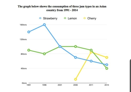
The line chart below illustrates the evolution in consumption of 3 kind of fruits in an Asian country between 1991 and 2014.

Overall, there is an downward trend for Strawberry and lemon which lost half of the amount consumed whereas the cherry knew a significant rise at the end.

At the begining of the period, the number of jam eaten was about 140 for strawberry and 85 tons for lemon. Despite reaching his apex at 160 tons strawberry sharply decreased at 100 tons in 2001. Inverssly Lemon strated by going down and reached the same point as strawberry consumption in 2001.

For the next following years, strawberry followed its downward trend by hitting arround 50 tons its lowest point at the end of the period. The lemon consumptions made a curve evolution by slightly decreasing until 2011 at 95 tons and finshed with a dip positionning at 40 tons, under strawberry consumption.

Finally, the cherry consumption appeard in 2006 at 10 tons eaten. Despite an important soar in 2011 over 80 tons his peak, it finally decreased under 80 tons. It ultimately exceeded the number of Strawberry and Lemon.

Word Count: 189

Answers On The Same Topic:

Write an essay based on the graph above. You should write not less than 150 words

The given line graph illustrates the use of three jam types such as strawberry, lemon and cherry in an Asian country between 1991 and 2014. Overall, it is evident that the most consumed jam type was strawberry at the beginning of the period. In addition, the least consumed was cherry which started after strawberry and […]

Write an essay based on the graph above. You should write not less than 150 words

The given line graph illustrates three sorts of jams consumed in the Asian market from 1991 to 2014. In general terms, Strawberry jam was the most popular jam in an Asian country, whereas cherry jam accounted for the lowest place among three different kinds of jams. Looking at the graph in more detail, by 2001, […]

Write an essay based on the graph above. You should write not less than 150 words

The graph demonstrate the , popularity of three types of james in Asian country over 13 years. Overall, what stand out from the graph, In 1991 strawberry jam consumption was widespread whereas there are no details about cherry jam and it was introduced after 2006 after that it consumption amount surpassed other two jams. Looking […]

See All

Other Topics:

The line graph illustrates the number of visitors to three different museums (the British Museum, the Science Museum and the Natural History Museum) over a four-month period in the summer of 2013, measured in thousands

The line graph provides information about the total number of guests who visited the British museum,the Science Museum and the Natural History Museum between the month of June and September 2013,the summer period. Overall,it can be seen clearly that, British Museum was mostly preferred by the people while Science Museum was the least chosen, and […]

The line graph below shows the number of people who used the internet in the UK, USA, and Italy between 2000 and 2015.

The given line graph delineates the quantity of people who accessed to the internet In three different nations including UK, USA and Italy over a 15-year period from 2000 to 2015. It is obvious that USA was the only country recorded the upward trend despite fluctuations, while two remanins contries comprising UK and Italy showed […]

The graph below gives information about the number of jobs in four sectors economy in the US between 1960 and 2020.

The line graph illustrates data on the number of jobs in America in the 1960 and 2020. There were four sections of the economy; manufacturing, agriculture, retail, and healthcare. Overall, manufacturing and agriculture were experienced slight fluctuation in the whole period. At the beginning they increased but in the end they showed decline. Another two […]

The graph below gives information about one company's unit sales of 5 different types of jam from 2009 to 2014. Summarise the information by selecting and reporting the main features, and make comparisons where relevant.

The line graph illustrates how many one company sold five different types of jam from 2009 to 2014, namely strawberry, raspberry, plum, cherry, and grape. Overall, there was an increase in four different kinds of jam, with grape enjoying the most dramatic growth in sales, while the number of plum’s sales saw a gradual decline. […]

The graph illustrates the percentage of materials recycled from 1982 to 2010 in a particular country.

The graph line reveals the percentage of different types of materials used to be recycled between 1982 and 2010 in a country. Overall, all four types of materials showed upward trends in the given time. Paper & cardboard had the highest percentage throughout the given period. Paper & cardboard started as the highest amongst the […]

The graph below gives information about income of four restaurants between January to December. Provide an overview of the information by identifying and describing the key details, and include comparisons where appropriate.

The line graph provides information about the income of four restaurants during the period from January to December. Overall, a detailed examination reveals a volatile pattern in all restaurants, with early dominance of Spicy Fortune, which was later overtaken by Evening Paradise. Looking closer at the graph, in January, Spicy Fortune earned 160 thousand dollars, […]

See All
We have detected unusual activity on your device.
Please verify your identity to continue.
Note: This verification step won't sign you in. If you have a premium account, please log in to access the service as usual.
Google/Gmail Verification
Or verify using Email/Code
We've sent a verification code to:
youremail@gmail.com (Not your email?)
Enter it below to complete the verification process.
Ensure your email address is correct, your inbox is not full, and you check your spam folder. If no email arrives, consider using an alternative email.
You will need a Premium plan to perform your action!
Note: If you already have a premium account, please log in to access our services as usual.

Plans & Pricing

Our mission is to make quality education accessible for everyone.
However, to keep our hardworking team running and this service alive, we genuinely need your support!
By opting for a premium plan, not only do you sustain us in achieving the mission, but you also unlock advanced features to enrich your learning experience.

Free

For learners who aren't pressed for time

What's included on Free
100+ Cambridge IELTS Tests
Instant IELTS Writing Task 1 & 2 Evaluation (2 times/month)
Instant IELTS Speaking Part 1, 2, & 3 Evaluation (5 times/month)
Instant IELTS Writing Task 1 & 2 Essay Generator (2 times/month)
500+ Dictation & Shadowing Exercises
100+ Pronunciation Exercises
Flashcards
Other Advanced Tools

Premium

For those serious about advancing their English proficiency, and for IELTS candidates aspiring to boost their band score by 1-2 points (especially in writing & speaking) in just 30 days or less

What's included on Premium
Save Your IELTS Test Progress
Unlock All Courses & IELTS Tests
Unlimited AI Conversations
Unlimited AI Writing Enhancement Exercises
Unlimited IELTS Writing Task 1 & 2 Evaluation
Unlimited IELTS Speaking Part 1, 2, & 3 Evaluation
Checked Answers Will Not Be Published
Unlimited IELTS Writing Task 1 & 2 Essay Generator
Unlimited IELTS Speaking Part 1, 2, & 3 Sample Generator
Unlimited Usage Of Advanced Tools
Priority Support within 24h (12-month plan only)

Due to the nature of our service and the provided free trials, payments are non-refundable.
Nếu bạn là người Việt Nam và không có hoặc không muốn trả bằng credit/debit cards, bạn có thể thanh toán bằng phương thức chuyển khoản:


Chọn gói:
419,000₫ 277,000 ₫ cho gói 1 tháng (chỉ 9,233₫/ngày)
1,239,000₫ 597,000 ₫ cho gói 3 tháng (chỉ 6,633₫/ngày)
2,469,000₫ 1,027,000 ₫ cho gói 6 tháng (chỉ 5,706₫/ngày)
4,929,000₫ 1,417,000 ₫ cho gói 12 tháng (chỉ 3,936₫/ngày)


Sau khi chuyển khoản, vui lòng đợi trình duyệt tự động điều hướng bạn trở lại Engnovate và bạn sẽ ngay lập tức nhận được mã kích hoạt tài khoản premium.
Nếu có lỗi xảy ra, bạn có thể liên hệ với team thông qua một trong các phương thức: email đến helloengnovate@gmail.com hoặc nhắn tin qua facebook.com/engnovate.
Vì toàn bộ công cụ trên website đều có thể sử dụng thử miễn phí, Engnovate không hỗ trợ hoàn tiền.