🔥 Today Only: Save 30% on Premium — Offer Ends Soon! - Upgrade Now!
Line Graph

Band 5+: Write an essay based on the graph above. You should write not less than 150 words

Image for topic: Write an essay based on the graph above. You should write not less than 150 words
Our system will evaluate the answer based on this AI-generated description.
The image presents a line graph depicting consumption across three types of jam (Strawberry, Lemon, Cherry) in an Asian country from 1991-2014, marking consumption volume on the y-axis in increments (0, 40, 80, 120, 160 tons) and years on the x-axis (1991, 1996, 2001, 2006, 2011, 2014). Strawberry jam consumption starts at 30 tons in 1991, peaks at 120 tons in 1996, falls to ≈65 tons in 2001, rises slightly to ≈70 tons in 2006, before dropping to nearly 40 tons by 2014. Lemon jam begins at ≈10 tons in 1991, rising significantly to ≈55 tons in 1996, then jumps to its peak at 100 tons in 2001, drops back to ≈90 tons in 2006, and further descends to about 55 tons by 2014. Cherry jam starts just above 0 tons in 1991, grows to ≈30 tons in 1996, spikes to ≈50 tons in 2001, experiences a peak of ≈115 tons in 2006, and decreases sharply to around 30 tons by 2014.
Given the complexity of the image, the above description may not be entirely accurate.
Note: Both the topic and the answer were created by one of our users.

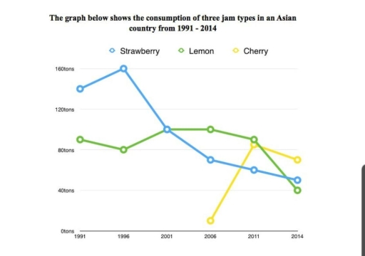
The given line graph illustrates the use of three jam types such as strawberry, lemon and cherry in an Asian country between 1991 and 2014.

Overall, it is evident that the most consumed jam type was strawberry at the beginning of the period. In addition, the least consumed was cherry which started after strawberry and lemon. However at the end of the period it expected to overcome all of them.

In 1991, the consumption of strawberry was approximately at 140 tons, while the intake of lemon was nearly at 90 tons. By contrast, in 2006, Cherry started to consume and was roughly at 10 tons at the beginning of the period.

In 2014, the intake of strawberry experienced a sharp decline, reaching approximately at 50 tons. Moreover, during the period the consumption of lemon saw a steady increase. However, showed a quick decrease, becoming the least consumed jam at the end of the period. Additionally, the most consumed jam became the cherry which started after strawberry and lemon, reaching nearly at 70 tons at the end of the period.

Word Count: 179

Answers On The Same Topic:

Write an essay based on the graph above. You should write not less than 150 words

The given line graph illustrates three sorts of jams consumed in the Asian market from 1991 to 2014. In general terms, Strawberry jam was the most popular jam in an Asian country, whereas cherry jam accounted for the lowest place among three different kinds of jams. Looking at the graph in more detail, by 2001, […]

Write an essay based on the graph above. You should write not less than 150 words

The line chart below illustrates the evolution in consumption of 3 kind of fruits in an Asian country between 1991 and 2014. Overall, there is an downward trend for Strawberry and lemon which lost half of the amount consumed whereas the cherry knew a significant rise at the end. At the begining of the period, […]

Write an essay based on the graph above. You should write not less than 150 words

The graph demonstrate the , popularity of three types of james in Asian country over 13 years. Overall, what stand out from the graph, In 1991 strawberry jam consumption was widespread whereas there are no details about cherry jam and it was introduced after 2006 after that it consumption amount surpassed other two jams. Looking […]

See All

Other Topics:

The graph below shows the usage of oil in four different countries between 1966 and 2006 as a percentage of total energy use within each nations.

The chart illustrates the oil usage in four countries from 1966 to 2006. Overall, oil usage declined significantly in Sweden and Italy over the period, while Turkey experienced a steady increase, from the bottom to the top. Italy consistently recorded the highest oil consumption percentage, although its figures fluctuated throughout the period. According to the […]

The line graoh shows the percentage of tourists to Scotland who visited four different attractions in Wdinburgh. Summarize the information by selecting and reporting the main features, and make comparisons where relevant.

The line graph illustrates the proportion of tourists who visited four different attractions in Scotland between 1980 and 2010. Overall, it is clear that while the castle experienced a significant rise in popularity to become the most visited attraction, the aquarium and the festival saw long-term declines. Meanwhile, the zoo showed a notable recovery in […]

The graph below shows radio and television audiences throughout the day in 1992. Summarise the information by selecting and reporting the main features, and make comparisons where relevant. Write at least 150 words.

The line graph illustrates the amount of people consuming radio and television all over the day in the period between October and December in UK in 1992. Overall, it could be seen that radio have been using bigger population among audiences in early morning hours, while the number of people who wached TV was considerably […]

Here is your line graph showing trends in two categories (A and B) from 2010 to 2020. You can now describe it for your IELTS Writing Task 1.

The line chart illustrates the value of trends in two categories (A and B) over a period of 10 years, starting from 2010. It can be seen from the graph, both categories witnessed an upward trend. The highest value experienced by group A, while the lowest reported by category B. With the respect of group […]

This line graph illustrates the participation levels for five different activities at a social centre in Melbourne from 2000 to 2020.

The line graph shows the number of participants for five different activities at one cosial centre in Melbourne,Australia between 2000 and 2020. Overall, we can see from the chart that ratio of people who participate for film club and martial arts showed almost steadily growth, while the number of amateur dramatics decreased over the given […]

The charts below show the number of visitors arriving in a particular country for a short trip, and the number of residents leaving that country for a short trip, from 2009 to 2011. Summarise the information by selecting and reporting the main features, and make comparisons where relevant. Write at least 150 words.

The charts illustrate the number of visitors on a short trip to a specific country and the number of indigenes moving out of the country for a short trip starting from 2009 to 2011. Overall, the number of departing residents from the country increased significantly over the years while the number of visitors to the […]

See All
We have detected unusual activity on your device.
Please verify your identity to continue.
Note: This verification step won't sign you in. If you have a premium account, please log in to access the service as usual.
Google/Gmail Verification
Or verify using Email/Code
We've sent a verification code to:
youremail@gmail.com (Not your email?)
Enter it below to complete the verification process.
Ensure your email address is correct, your inbox is not full, and you check your spam folder. If no email arrives, consider using an alternative email.
You will need a Premium plan to perform your action!
Note: If you already have a premium account, please log in to access our services as usual.

Plans & Pricing

Our mission is to make quality education accessible for everyone.
However, to keep our hardworking team running and this service alive, we genuinely need your support!
By opting for a premium plan, not only do you sustain us in achieving the mission, but you also unlock advanced features to enrich your learning experience.

Free

For learners who aren't pressed for time

What's included on Free
100+ Cambridge IELTS Tests
Instant IELTS Writing Task 1 & 2 Evaluation (2 times/month)
Instant IELTS Speaking Part 1, 2, & 3 Evaluation (5 times/month)
Instant IELTS Writing Task 1 & 2 Essay Generator (2 times/month)
500+ Dictation & Shadowing Exercises
100+ Pronunciation Exercises
Flashcards
Other Advanced Tools

Premium

For those serious about advancing their English proficiency, and for IELTS candidates aspiring to boost their band score by 1-2 points (especially in writing & speaking) in just 30 days or less

What's included on Premium
Save Your IELTS Test Progress
Unlock All Courses & IELTS Tests
Unlimited AI Conversations
Unlimited AI Writing Enhancement Exercises
Unlimited IELTS Writing Task 1 & 2 Evaluation
Unlimited IELTS Speaking Part 1, 2, & 3 Evaluation
Checked Answers Will Not Be Published
Unlimited IELTS Writing Task 1 & 2 Essay Generator
Unlimited IELTS Speaking Part 1, 2, & 3 Sample Generator
Unlimited Usage Of Advanced Tools
Priority Support within 24h (12-month plan only)

Due to the nature of our service and the provided free trials, payments are non-refundable.
Nếu bạn là người Việt Nam và không có hoặc không muốn trả bằng credit/debit cards, bạn có thể thanh toán bằng phương thức chuyển khoản:


Chọn gói:
419,000₫ 277,000 ₫ cho gói 1 tháng (chỉ 9,233₫/ngày)
1,239,000₫ 597,000 ₫ cho gói 3 tháng (chỉ 6,633₫/ngày)
2,469,000₫ 1,027,000 ₫ cho gói 6 tháng (chỉ 5,706₫/ngày)
4,929,000₫ 1,417,000 ₫ cho gói 12 tháng (chỉ 3,936₫/ngày)


Sau khi chuyển khoản, vui lòng đợi trình duyệt tự động điều hướng bạn trở lại Engnovate và bạn sẽ ngay lập tức nhận được mã kích hoạt tài khoản premium.
Nếu có lỗi xảy ra, bạn có thể liên hệ với team thông qua một trong các phương thức: email đến helloengnovate@gmail.com hoặc nhắn tin qua facebook.com/engnovate.
Vì toàn bộ công cụ trên website đều có thể sử dụng thử miễn phí, Engnovate không hỗ trợ hoàn tiền.