🔥 Today Only: Save 30% on Premium — Offer Ends Soon! - Upgrade Now!
Table

Band 5+: You should spend about 20 minutes on this Task. The charts show (Chart a) the average speed of urban zone traffic (in kilometres per hour or kph) in a number of countries over a fifty year period, including a future estimate; and also (Chart b) the total number of urban zones per country (in thousands.) Write a report summarising the information. Select and describe the main features, and make comparisons where relevant.

Image for topic: You should spend about 20 minutes on this Task. The charts show (Chart a) the average speed of urban zone traffic (in kilometres per hour or kph) in a number of countries over a fifty year period, including a future estimate; and also (Chart b) the total number of urban zones per country (in thousands.) Write a report summarising the information. Select and describe the main features, and make comparisons where relevant.
Our system will evaluate the answer based on this AI-generated description.
The image contains two charts: Chart (a) displays urban traffic speed (in kph) for France: 48 (1970), 55 (1990), 52 (2010), 72 (2020est); USA: 32 (1970), 48 (1990), 43 (2010 and 2020est); Italy: 52 (1970), 52 (1990), 54 (2010), 65 (2020est); Brazil: 54 (1970), 54 (1990), 56 (2010), 67 (2020est); UK: 53 (1970), 53 (1990), 62 (2010), 79 (2020est); Russia: 61 (1970), 63 (1990), 61 (2010), 64 (2020est); Spain: 69 (1970), 51 (1990), 65 (2010), 70 (2020est); Canada: 51 (1970), 59 (1990), 63 (2010), 71 (2020est); Chile: 51 (1970), 52 (1990), 53 (2010), 52 (2020est); Chart (b) shows urban zones (in thousands) for France: 2.8 (1970), 9.3 (2020est); USA: 38 (1970), 128.2 (2020est); Italy: 1.1 (1970), 15.1 (2020est); Brazil: 3.4 (1970), 12.4 (2020est); UK: 6.4 (1970), 11.8 (2020est); Russia: 6.7 (1970), 3.2 (2020est); Spain: 2.6 (1970), 8.5 (2020est); Canada: 9.9 (1970), 9.9 (2020est); Chile: 1.1 (1970), 5.4 (2020est).
Given the complexity of the image, the above description may not be entirely accurate.
Note: Both the topic and the answer were created by one of our users.

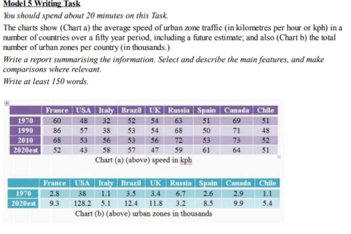
The charts give changes in the mean city traffic zone speed and the total number of city areas between 1970 and 2010, also including a forecast for 2020.

Overall, there is no any correlation between the speed of urban zones and its total number.

Countries, such as France, USA, UK, Russia, Canada exhibited initial increase, followed by an immediate decrease: France and USA started at 60 kph and 48kph, respectively, in 1970, increasing to peak 86kph and 57 kph, respectively, in1990, ultimately declining to estimate 52 and 43, respectively, in 2020. Likewise, UK, Russia and Canada also followed identical pattern. UK started at 54, increasing by 2 kph to reach the peak in 2010, decreasing to estimate 47 in 2020. Russia started at 63 kph, rising to 72 in 2010,followed by a drop at estimate 59 in 2020. Canada started at 63, reached its peak in 2010 at 73, before falling to estimate 64 in 2020.

On the other hand, an upward trend was observed in countries such as Italy,Brazil, Spain, with respective numbers at 32 kph, 52kph,51 kph, initially. Ulwimately they reached 58kph,57kph,61kph, respectively. By contrast, Chile remained relatively stable over the given period.

Regarding urban zones, a rising trend was observed for all of countries.

Word Count: 207

Answers On The Same Topic:

You should spend about 20 minutes on this Task. The charts show (Chart a) the average speed of urban zone traffic (in kilometres per hour or kph) in a number of countries over a fifty year period, including a future estimate; and also (Chart b) the total number of urban zones per country (in thousands.) Write a report summarising the information. Select and describe the main features, and make comparisons where relevant.

The two charts give infromation about the the average speed of city traffic zones with projections of the future, and how many urban zones there were in total in nine different countries for the period from 1970 to 2020 . Overall, it can be clearly seen that all nations experienced considerable fluctuations of the rate […]

You should spend about 20 minutes on this Task. The charts show (Chart a) the average speed of urban zone traffic (in kilometres per hour or kph) in a number of countries over a fifty year period, including a future estimate; and also (Chart b) the total number of urban zones per country (in thousands.) Write a report summarising the information. Select and describe the main features, and make comparisons where relevant.

The tables illustrate the average speed of vehicles in an urban city and a total amount of urban areas per country across 9 different countries between 1970 and future prediction. Overall, chart A demonstrates that all 9 countries experienced fluctuations in the value of average speed. While it illustrates that some countries witnessed a decrease […]

You should spend about 20 minutes on this Task. The charts show (Chart a) the average speed of urban zone traffic (in kilometres per hour or kph) in a number of countries over a fifty year period, including a future estimate; and also (Chart b) the total number of urban zones per country (in thousands.) Write a report summarising the information. Select and describe the main features, and make comparisons where relevant.

The table demonstrates information about the average speed in urban areas and also a prediction for the coming year in a variety of countries over 50 years; the amount of urbanized districts each country has. Overall, in chart a, some countries rose and others illustrated a decline in kph. In the second table, there was […]

You should spend about 20 minutes on this Task. The charts show (Chart a) the average speed of urban zone traffic (in kilometres per hour or kph) in a number of countries over a fifty year period, including a future estimate; and also (Chart b) the total number of urban zones per country (in thousands.) Write a report summarising the information. Select and describe the main features, and make comparisons where relevant.

The first table illustrates the average speed in urban zones in 9 countries from 1970 to 2020 in kilometres per hour. The second table demostrates the size of urban zones in thousands in the same countries. Overall, in almost all countries the average speed is decreasing slightly for 50 years. Also the count of urban […]

See All

Other Topics:

The table below gives information about the value of exports of kiwi fruit from New Zealand to five countries between 2010 and 2012. Summarize the information by selecting and re-porting the main features, and making comparisons where relevant.

The table illustrates the value of kiwi fruit exports from New Zealand to five countries between 2010 and 2012. Overall, export values to Japan, China and Russia increased during the period, while the figures for Mexico and Saudi Arabia declined overall. In addition, Japan was by far the largest market for kiwi fruit exports, whereas […]

The table below given the information about the underground railway systems in 6 countries.

The following graph exhibits details of the underground railway systems among London , Paris , Tokyo , Washington DC , Kyoto and Los Angeles. As can be seen , every countries have different opening date. Paris has the longest route when Tokyo has the highest number of passengers annually ; however , Kyoto has the […]

The table below ahows the number of hours' delay experienced by commuters in different-sized cities between 1995 and 2015 (with predicted for 2025)

The table represents how many hours of delay were witnessed by commuters in different-sized cities from 1985 to 2015 (with projections until 2025). Overall, it can be seen that the most hours of delay were experienced by commuters of metropolis cities, whereas the least hours of delay were recorded in small cities. In addition, metropolis […]

Consumer Spending on Different Items in Five Different Contries in 2002

The table shows data about spending on three items categories in five different countries in 2002. Overall, the category of food, drinks, and tobacco had the higher percentage than others. In contrast, people in the five countries spent a smaller number on leisure/education, compared to clothing/footwear category. The largest proportions of food/drinks/tobacco were seen in […]

the table gives information about uk population between 1991 and 2011.

The table illustrates information about the UK population, including the percentage and amount of 15 age bracket, and 75 age group, which changed in every five eras from 1911 to 2011. It is clear that the total amount of citizens significantly increased. While the percentage of 15-years-old teens slightly decreased but with the high quantity, […]

the table gives information about uk population between 1991 and 2011.

The table illustrates information about the UK population, including the percentage and number of 15 years old and 75 years old age groups, which changed in each five decades from 1911 to 2011. It is clear that the total population significantly increased. While, the percentage of 15 years old teens slightly decreased but with high […]

See All
We have detected unusual activity on your device.
Please verify your identity to continue.
Note: This verification step won't sign you in. If you have a premium account, please log in to access the service as usual.
Google/Gmail Verification
Or verify using Email/Code
We've sent a verification code to:
youremail@gmail.com (Not your email?)
Enter it below to complete the verification process.
Ensure your email address is correct, your inbox is not full, and you check your spam folder. If no email arrives, consider using an alternative email.
You will need a Premium plan to perform your action!
Note: If you already have a premium account, please log in to access our services as usual.

Plans & Pricing

Our mission is to make quality education accessible for everyone.
However, to keep our hardworking team running and this service alive, we genuinely need your support!
By opting for a premium plan, not only do you sustain us in achieving the mission, but you also unlock advanced features to enrich your learning experience.

Free

For learners who aren't pressed for time

What's included on Free
100+ Cambridge IELTS Tests
Instant IELTS Writing Task 1 & 2 Evaluation (2 times/month)
Instant IELTS Speaking Part 1, 2, & 3 Evaluation (5 times/month)
Instant IELTS Writing Task 1 & 2 Essay Generator (2 times/month)
500+ Dictation & Shadowing Exercises
100+ Pronunciation Exercises
Flashcards
Other Advanced Tools

Premium

For those serious about advancing their English proficiency, and for IELTS candidates aspiring to boost their band score by 1-2 points (especially in writing & speaking) in just 30 days or less

What's included on Premium
Save Your IELTS Test Progress
Unlock All Courses & IELTS Tests
Unlimited AI Conversations
Unlimited AI Writing Enhancement Exercises
Unlimited IELTS Writing Task 1 & 2 Evaluation
Unlimited IELTS Speaking Part 1, 2, & 3 Evaluation
Checked Answers Will Not Be Published
Unlimited IELTS Writing Task 1 & 2 Essay Generator
Unlimited IELTS Speaking Part 1, 2, & 3 Sample Generator
Unlimited Usage Of Advanced Tools
Priority Support within 24h (12-month plan only)

Due to the nature of our service and the provided free trials, payments are non-refundable.
Nếu bạn là người Việt Nam và không có hoặc không muốn trả bằng credit/debit cards, bạn có thể thanh toán bằng phương thức chuyển khoản:


Chọn gói:
419,000₫ 277,000 ₫ cho gói 1 tháng (chỉ 9,233₫/ngày)
1,239,000₫ 597,000 ₫ cho gói 3 tháng (chỉ 6,633₫/ngày)
2,469,000₫ 1,027,000 ₫ cho gói 6 tháng (chỉ 5,706₫/ngày)
4,929,000₫ 1,417,000 ₫ cho gói 12 tháng (chỉ 3,936₫/ngày)


Sau khi chuyển khoản, vui lòng đợi trình duyệt tự động điều hướng bạn trở lại Engnovate và bạn sẽ ngay lập tức nhận được mã kích hoạt tài khoản premium.
Nếu có lỗi xảy ra, bạn có thể liên hệ với team thông qua một trong các phương thức: email đến helloengnovate@gmail.com hoặc nhắn tin qua facebook.com/engnovate.
Vì toàn bộ công cụ trên website đều có thể sử dụng thử miễn phí, Engnovate không hỗ trợ hoàn tiền.