Our system will evaluate the answer based on this AI-generated description.
The image is a bar graph showing GDP from Automotive and Finance industry in Australia as a percentage of GDP over the years 2012, 2014, 2016, 2018, and 2020; two bars for each year representing Finance and Automotive industry respectively. The y-axis is marked from 0 to 16 increasing by 2 units. The x-axis lists the years in an increasing order. The Finance industry starts with a value slightly above 8 in 2012, decreases to just below 8 in 2014, remains constant in 2016, then increases to almost 14 in 2018 and just below 16 in 2020. The Automotive industry maintains a consistent value just above 4 across all years. The graph has dotted lines running across horizontally corresponding to the y-axis values and solid lines running vertically separating each year. There are two legends in a square box with dotted outlines, one for each industry, placed at the bottom center of the image.
Given the complexity of the image, the above description may not be entirely accurate.
Skyrocket your IELTS band score by 1-2 points in under a month with our premium plan!
Note: Both the topic and the answer were created by one of our users.
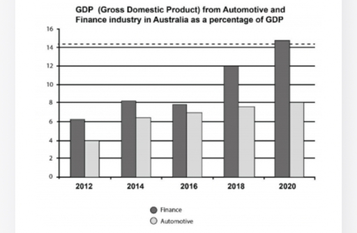
The provided bar chart depicts the proportion of the Australian domestic earnings coming from two categories of industry, which were finance and automotive companies, spanning the period from 2012 to 2020.
Overall, the finance industry consistently exhibited the highest earnings proportion over the course of the period, while the automotive industry registered considerably lower figures. Notably, the income rate for both demonstrated upwards trajectories throughout the observed period.
Initially, the rate of domestic income earned by the finance sector escalated markedly from 6% in 2012 to 8% in 2014, before decreasing marginally just below the latest percentage. Subsequently, the proportion experienced a consistent and dramatic rise to just beyond 14%, contributing the highest number of income throughout the years.
Similarly, starting at only 4% in 2012, the rate of gross national earnings showed a significant surge to 6% in 2014, followed by a consistent incline throughout the rest of the period, peaking at 8% by the end of the given timeframe.
Word Count: 161