24 Hours Only: Get 20% OFF on Our Premium Plan - Upgrade Now!
Bar Chart

Band 5+: You should spend about 20 minutes on this task The chart shows components of GDP in Australia from 2012 to 2020. Summarise the information by selecting and reporting the main features and make comparisons where relevant. Write at least 150 words.

Image for topic: You should spend about 20 minutes on this task The chart shows components of GDP in Australia from 2012 to 2020. Summarise the information by selecting and reporting the main features and make comparisons where relevant. Write at least 150 words.
Our system will evaluate the answer based on this AI-generated description.
The image is a bar graph showing GDP from Automotive and Finance industry in Australia as a percentage of GDP over the years 2012, 2014, 2016, 2018, and 2020; two bars for each year representing Finance and Automotive industry respectively. The y-axis is marked from 0 to 16 increasing by 2 units. The x-axis lists the years in an increasing order. The Finance industry starts with a value slightly above 8 in 2012, decreases to just below 8 in 2014, remains constant in 2016, then increases to almost 14 in 2018 and just below 16 in 2020. The Automotive industry maintains a consistent value just above 4 across all years. The graph has dotted lines running across horizontally corresponding to the y-axis values and solid lines running vertically separating each year. There are two legends in a square box with dotted outlines, one for each industry, placed at the bottom center of the image.
Given the complexity of the image, the above description may not be entirely accurate.
Note: Both the topic and the answer were created by one of our users.

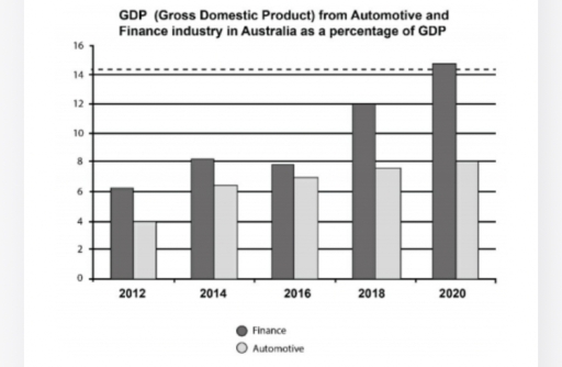
The chart illustrates the percentage of GDP from the Finance and Automotive industries in Australia between 2012 and 2020.

Overall, There was an upward trend on both industries in entire period, with the components of GDP in the finance industry higher than automotive.

In 2012, the proportion of GDP in the Finance industry was more than 6%, which was greater than automotive(4%). Both figures increased slightly in next two years. But witnessed a slight drop in 2016, nearly 8% in Finance and about 7% in automotive.

In 2018, the percentage of GDP in the finance industry rose significantly reaching exactly 12%.While the figure for automotive industry was approximately 8%. The most substantial differences in GDP happened in 2020 approximately 15% in Finance industry, whereas just 8% in Automotive sector.

Word Count: 129

Answers On The Same Topic:

You should spend about 20 minutes on this task The chart shows components of GDP in Australia from 2012 to 2020. Summarise the information by selecting and reporting the main features and make comparisons where relevant. Write at least 150 words.

The chart shows how the automotive and finance industries contributed to Australia’s GDP from 2012 to 2020. Overall, both industries went up over time, but the finance sector grew much faster. It was always higher than the automotive sector, and the gap between them became bigger in the later years. In 2012, finance made up […]

You should spend about 20 minutes on this task The chart shows components of GDP in Australia from 2012 to 2020. Summarise the information by selecting and reporting the main features and make comparisons where relevant. Write at least 150 words.

The bar chart displays components of Australia’s GDP from 2012 to 2020. Overall, both components of GDP continued to increase steadily until the end of the period where they reached their peak. The automotive industry witnessed no drop throughout the entire period, while the finance industry experienced a slight dip in between the years. In […]

You should spend about 20 minutes on this task The chart shows components of GDP in Australia from 2012 to 2020. Summarise the information by selecting and reporting the main features and make comparisons where relevant. Write at least 150 words.

The chart compares the contribution of the financial and automotive sectors to Australia’s GDP between 2012 and 2020. Overall, it can be seen that the finance industry gradually increased throughout the entire period and eventially became higher than the automative sector, which was the smallest component and grew only marginally. According to the data, in […]

You should spend about 20 minutes on this task The chart shows components of GDP in Australia from 2012 to 2020. Summarise the information by selecting and reporting the main features and make comparisons where relevant. Write at least 150 words.

The provided bar chart delineates the proportion of Australia’s Gross Domestic Product (GDP) derived from the finance and automotive industries over a nine-year period, from 2012 to 2020. Overall, the finance sector’s contribution to GDP was consistently and significantly higher than that of the automotive sector. Both industries demonstrated a clear upward trend in their […]

See All

Other Topics:

The world health organization recommends that people should eat five or more portion of fruit and vegetables per day. The bar chart shows the percentage of males and females in the UK by age group in 2006. You should write at least 150 words. Percentage of males and females consuming five or more portions of fruit and vegetables per day by age group (UK in 2006)

The bar chart illustrates the percentage of males and females who consume more than five portions of fruit and vegetables per day by age group in the UK in 2006. Overall, the world health organization proposes people to eat this amount of fruits and vegetables according to the proposion of people in UK doing this. […]

The graph below shows the percentage of men and women employed in executive positions in AMCE oil company from July 1993 to June 1994

The bar chart illustrates the percenatge of men and women employed in executive positions in AMCE oil company from 1993 to 1994. Overall, it is clear that the men and women had a highest and lowest proportion over the year. Women shows gradually decrease, while men demonstrated grew steadily. Regarding to entry-level roles, women held […]

The chart below shows percentage of households with different income level in the UK

The bar chart illustrates information about the percentage of earning levels of households in the United Kingdom. Overall, what stands out from the graph is that there are four income levels. Notably, the upper middle class made up the biggest proportion, as opposed to the high class, which generally had the smallest. In terms of […]

The bar graph below shows the percentage growth in average property prices in three different countries between 2007 and 2010. Summarise the information by selecting and reporting the main features, and make comparisons where relevant.

The presented bar illustrates by what percentage the prices of properties increased in Algeria, China and Argentina from 2007 to 2010. Overall , Algeria and China witnessed the largest increases in property prices; however, Algeria experienced a steady decrease , while China followed the opposite trend. The trend for Argentina fluctuated over the period shown. […]

The percentage of males and females in Australia who did not consume enough calcium in their diet in 2012, categorized by age group.

The bar chart illurstrate the number of males and females in Australia who did not comsume enough clacium in their diet in 2012 in term of percentage. Overall,it can be seen that both females and males in the age group of 71+ were the highest percentage of people that not consumed calaium enough in 2012, […]

The graph below shows the top priorities by business companies in the USA in 2016. Summarise the information by selecting and reporting the main features and make comparisons where relevant.

The given bar chart compares information about the most significant categories for firms in the US in the year 2016. Overall, it can be seen that increasing contacts and converting those into cusomers have the largest share of priority ,followed by the financial aspects. The lowest attention gets the cost reductionn of new customer acquisition […]

See All
We have detected unusual activity on your device.
Please verify your identity to continue.
Note: This verification step won't sign you in. If you have a premium account, please log in to access the service as usual.
Google/Gmail Verification
Or verify using Email/Code
We've sent a verification code to:
youremail@gmail.com (Not your email?)
Enter it below to complete the verification process.
Ensure your email address is correct, your inbox is not full, and you check your spam folder. If no email arrives, consider using an alternative email.
You will need a Premium plan to perform your action!
Note: If you already have a premium account, please log in to access our services as usual.

Plans & Pricing

Our mission is to make quality education accessible for everyone.
However, to keep our hardworking team running and this service alive, we genuinely need your support!
By opting for a premium plan, not only do you sustain us in achieving the mission, but you also unlock advanced features to enrich your learning experience.

Free

For learners who aren't pressed for time

What's included on Free
100+ Cambridge IELTS Tests
Instant IELTS Writing Task 1 & 2 Evaluation (2 times/month)
Instant IELTS Speaking Part 1, 2, & 3 Evaluation (5 times/month)
Instant IELTS Writing Task 1 & 2 Essay Generator (2 times/month)
500+ Dictation & Shadowing Exercises
100+ Pronunciation Exercises
Flashcards
Other Advanced Tools

Premium

For those serious about advancing their English proficiency, and for IELTS candidates aspiring to boost their band score by 1-2 points (especially in writing & speaking) in just 30 days or less

What's included on Premium
Save Your IELTS Test Progress
Unlock All Courses & IELTS Tests
Unlimited AI Conversations
Unlimited AI Writing Enhancement Exercises
Unlimited IELTS Writing Task 1 & 2 Evaluation
Unlimited IELTS Speaking Part 1, 2, & 3 Evaluation
Checked Answers Will Not Be Published
Unlimited IELTS Writing Task 1 & 2 Essay Generator
Unlimited IELTS Speaking Part 1, 2, & 3 Sample Generator
Unlimited Usage Of Advanced Tools
Priority Support within 24h (12-month plan only)

Due to the nature of our service and the provided free trials, payments are non-refundable.
Nếu bạn là người Việt Nam và không có hoặc không muốn trả bằng credit/debit cards, bạn có thể thanh toán bằng phương thức chuyển khoản:


Chọn gói:
459,000₫ 347,000 ₫ cho gói 1 tháng (chỉ 11,567₫/ngày)
1,359,000₫ 797,000 ₫ cho gói 3 tháng (chỉ 8,856₫/ngày)
2,699,000₫ 1,367,000 ₫ cho gói 6 tháng (chỉ 7,594₫/ngày)
5,399,000₫ 1,997,000 ₫ cho gói 12 tháng (chỉ 5,547₫/ngày)


Sau khi chuyển khoản, vui lòng đợi trình duyệt tự động điều hướng bạn trở lại Engnovate và bạn sẽ ngay lập tức nhận được mã kích hoạt tài khoản premium.
Nếu có lỗi xảy ra, bạn có thể liên hệ với team thông qua một trong các phương thức: email đến helloengnovate@gmail.com hoặc nhắn tin qua facebook.com/engnovate.
Vì toàn bộ công cụ trên website đều có thể sử dụng thử miễn phí, Engnovate không hỗ trợ hoàn tiền.