🔥 Today Only: Save 30% on Premium — Offer Ends Soon! - Upgrade Now!
Multiple Graphs

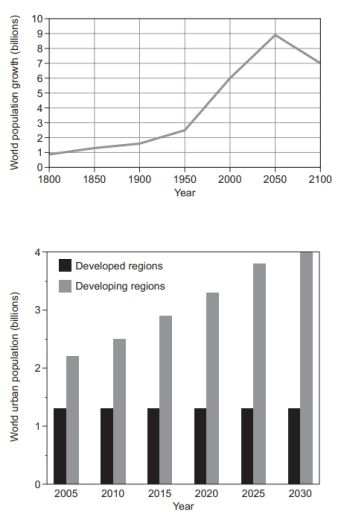
Band 7+: you should spend about 20 minutes on this task. The graphs below provide information on global population fi gures and fi gures for urban populations in different world regions. Summarise the information by selecting and reporting the main features, and make comparisons where relevant.

Image for topic: you should spend about 20 minutes on this task. The graphs below provide information on global population fi gures and fi gures for urban populations in different world regions. Summarise the information by selecting and reporting the main features, and make comparisons where relevant.
Our system will evaluate the answer based on this AI-generated description.
The image includes two graphs: one showing world population growth, reaching 1 billion in 1850, 2 billion by 1950, approximately 3.8 billion by 2000, peaking at around 8 billion by 2050, then declining to about 7 billion by 2100. The second graph portrays world urban population with developed regions at about 1 billion in 2005 and developing regions at about 1.4 billion, while in 2010 developed regions reach 1.1 billion and developing regions about 1.8 billion; in 2015, developed regions are approximately 1.2 billion and developing regions around 2.2 billion; in 2020, developed regions are about 1.2 billion and developing regions approximately 2.6 billion; by 2025, developed regions reach roughly 1.3 billion and developing regions about 3 billion; in 2030, developed regions are around 1.3 billion and developing regions close to 3.3 billion.
Given the complexity of the image, the above description may not be entirely accurate.
Note: Both the topic and the answer were created by one of our users.

The charts depict the figures for world and urban population in various parts of the world. Overall, the global population experiences steep dramatic growth with an expectation of decline. The urban population in developed places has no changes while the population increasing gradually in developing regions.

Based on the first graph, it can be seen that the global population grew consistently from 1 billion people in 1800 to roughly 2,5 billion in 1950. The number then rose drastically to 6 billion in 2000. The population figure is expected to keep growing, peaking at 9 billion people in 2050 which is followed by a considerable decline to 7 billion in 2100.

In the second graph, the urban people who lived in developed regions remained the same by slightly over 1 billion people for 15 years and is predicted to stay the same number from 2025 to 2030. Conversely, the figure for those residing in the developing areas grew consistently from slightly over 2 billion in 2005 to approximately over 3 billion in 2020. The number is anticipated to grow in the next decade, peaking at 4 billion people in 2030.

Word Count: 189

Answers On The Same Topic:

you should spend about 20 minutes on this task. The graphs below provide information on global population fi gures and fi gures for urban populations in different world regions. Summarise the information by selecting and reporting the main features, and make comparisons where relevant.

The line graph shows the data on global population growth for three centuries, from 1800 to 2100. Different regions are presented in the bar graph for the urban population. Overall, world population growth has an increasing value over time for both regions. Developing regions increased in billions while developed regions, on the other hand, remain […]

you should spend about 20 minutes on this task. The graphs below provide information on global population fi gures and fi gures for urban populations in different world regions. Summarise the information by selecting and reporting the main features, and make comparisons where relevant.

The diagram illustrates world population growth over three centuries and the urban populations in various global regions over a 25-year period. The figures are expressed in billions. Overall, there has been a significant increase in global population growth since the mid-20th century, with a predicted decline by the year 2100. While the urban population in […]

you should spend about 20 minutes on this task. The graphs below provide information on global population fi gures and fi gures for urban populations in different world regions. Summarise the information by selecting and reporting the main features, and make comparisons where relevant.

The diagram illustrates the world population growth in a span of three centuries and world urban populations in several global regions over a 25 year period. The figures are expressed in billions. Overall, there is a sharp rise in the global population growth beginning at the mid-20th century and is predicted to dip by the […]

you should spend about 20 minutes on this task. The graphs below provide information on global population fi gures and fi gures for urban populations in different world regions. Summarise the information by selecting and reporting the main features, and make comparisons where relevant.

The chart depicts the population growth of humans around the world and it also features the urban population growth in both developed as well as undeveloped regions. Overall, the world population had a rise and dip with a tiny fluctuation. Urban population in developed provinces had constant population unlike undeveloped provinces , which had a […]

See All

Other Topics:

Writing Task 1 You should spend about 20 minutes on this task. The table and charts below give information on the police budget for 2017 and 2018 in one area of Britain. The table shows where the money came from and the charts show how it was distributed. Summarise the information by selecting and reporting the main features, and make comparisons where relevant. Write at least 150 words.

The table illustrates data about the source of police budget in one region of Britain in 2017 and 2018, while pie charts indicate how the money was spent in these two years. Overall, the police budget increased in 2017 and 2018, with the nation government remaining the largest source of funding. Additionally, money was mainly […]

The charts below give information on the ages of populations in Yemen and Italy in 2000 and projections for 2050. Summarise the information by selecting and reporting the main features, and make comparisons where relevant.

The pie charts show the ages of populations in two different countries in 2000 and predictions for 2050. Overall, while in both countries the prominent age group is predicted to be the 15-59-year-olds, the main bracket varies for each in 2000. Notably, in Yemen the smallest proportion belongs to people aged 60 and above, while […]

The bar chart below gives information about the average number of years at school of adult males and females in Singapore, and the pie charts show the level of the highest educational achievement. Summarise the information by selecting and reporting the main features, and make comparisons where relevant.

The pie chart illustrates the average years that male and female adults at school in Singapore from 2000 to 2010, while the two pie charts compare the degree of educational achievement in 2000 and in 2010. Overall, it is clear that the figures for both male and female increased moderately. In spite of this, the […]

The chart below shows the electricity consumption in different sectors of Eastern Europe in 2007 and 2010. Summarize the information by selecting and reporting the main features and make comparisons where relevant.

The chart compares the electricity consumption across different sectors in Eastern Europe in 2007 and 2010. Overall, there were several notable changes. The electricity consumption in four sectors namely, transport, residential, commercial and agriculture, remained unchanged throughout the period. While the figures for mining and other metals increased, the manufacturing and aluminium categories witnessed noticeable […]

The bar chart below gives information about the average number of years at school of adult males and females in Singapore, and the pie charts show the level of the highest educational achievement. Summarise the information by selecting and reporting the main features, and make comparisons where relevant.

The bar chart shows the average number of years at school of adult males and females in Singapore, while the pie charts compare the level of highest educational achievement. Overall, the average years of schooling increased for adult males and females throughout the period, with males consistently recording higher figures than females. Meanwhile, the proportions […]

The chart below shows the electricity consumption in different sectors of Eastern Europe in 2007 and 2010. Summarize the information by selecting and reporting the main features and make comparisons where relevant.

The chart illustrates the consumption of electricity accounted for in different sectors of Eastern Europe in 2007 and 2010. Overall, there were several notable changes. While most of the shares of chart namely, transport, agriculture, residential and commercial fields remained unchanged throughout the period, the figures for mining and other metals rose relatively. In addition, […]

See All
We have detected unusual activity on your device.
Please verify your identity to continue.
Note: This verification step won't sign you in. If you have a premium account, please log in to access the service as usual.
Google/Gmail Verification
Or verify using Email/Code
We've sent a verification code to:
youremail@gmail.com (Not your email?)
Enter it below to complete the verification process.
Ensure your email address is correct, your inbox is not full, and you check your spam folder. If no email arrives, consider using an alternative email.
You will need a Premium plan to perform your action!
Note: If you already have a premium account, please log in to access our services as usual.

Plans & Pricing

Our mission is to make quality education accessible for everyone.
However, to keep our hardworking team running and this service alive, we genuinely need your support!
By opting for a premium plan, not only do you sustain us in achieving the mission, but you also unlock advanced features to enrich your learning experience.

Free

For learners who aren't pressed for time

What's included on Free
100+ Cambridge IELTS Tests
Instant IELTS Writing Task 1 & 2 Evaluation (2 times/month)
Instant IELTS Speaking Part 1, 2, & 3 Evaluation (2 times/month)
Instant IELTS Writing Task 1 & 2 Essay Generator (2 times/month)
500+ Dictation & Shadowing Exercises
100+ Pronunciation Exercises
Flashcards
Other Advanced Tools

Premium

For those serious about advancing their English proficiency, and for IELTS candidates aspiring to boost their band score by 1-2 points (especially in writing & speaking) in just 30 days or less

What's included on Premium
Save Your IELTS Test Progress & Analyze Mistakes By Question Type
Save Your Own Flashcard Sets & Use Them On Any Device
Unlock All Courses, IELTS Tests, Section & Part Practice
Unlimited AI Conversations
Unlimited AI Writing Enhancement Exercises
Unlimited IELTS Writing Task 1 & 2 Evaluation
Unlimited IELTS Speaking Part 1, 2, & 3 Evaluation
Checked Answers Will Not Be Published
Unlimited IELTS Writing Task 1 & 2 Essay Generator
Unlimited IELTS Speaking Part 1, 2, & 3 Sample Generator
Unlimited Usage Of Advanced Tools & AI Features
Priority Support within 24h (12-month plan only)

Due to the nature of our service and the provided free trials, payments are non-refundable.