🔥 Today Only: Save 30% on Premium — Offer Ends Soon! - Upgrade Now!
Multiple Graphs

Band 6+: you should spend about 20 minutes on this task. The graphs below provide information on global population fi gures and fi gures for urban populations in different world regions. Summarise the information by selecting and reporting the main features, and make comparisons where relevant.

Image for topic: you should spend about 20 minutes on this task. The graphs below provide information on global population fi gures and fi gures for urban populations in different world regions. Summarise the information by selecting and reporting the main features, and make comparisons where relevant.
Our system will evaluate the answer based on this AI-generated description.
The image includes two graphs: one showing world population growth, reaching 1 billion in 1850, 2 billion by 1950, approximately 3.8 billion by 2000, peaking at around 8 billion by 2050, then declining to about 7 billion by 2100. The second graph portrays world urban population with developed regions at about 1 billion in 2005 and developing regions at about 1.4 billion, while in 2010 developed regions reach 1.1 billion and developing regions about 1.8 billion; in 2015, developed regions are approximately 1.2 billion and developing regions around 2.2 billion; in 2020, developed regions are about 1.2 billion and developing regions approximately 2.6 billion; by 2025, developed regions reach roughly 1.3 billion and developing regions about 3 billion; in 2030, developed regions are around 1.3 billion and developing regions close to 3.3 billion.
Given the complexity of the image, the above description may not be entirely accurate.
Note: Both the topic and the answer were created by one of our users.

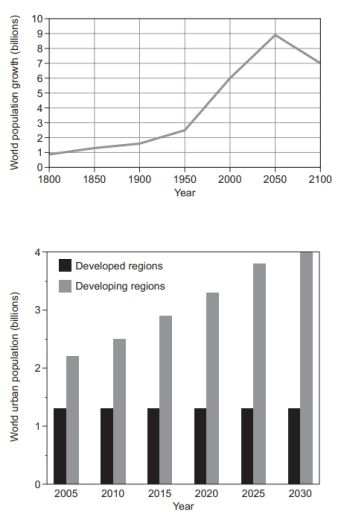
The chart depicts the population growth of humans around the world and it also features the urban population growth in both developed as well as undeveloped regions.

Overall, the world population had a rise and dip with a tiny fluctuation. Urban population in developed provinces had constant population unlike undeveloped provinces , which had a stable rise.

Global population, it started with just below a billion people in the year 1800 and had a steady growth every 50 year until it reached its highest point of well above 8 billion, in the year 2050. Then it had a sudden decrease in its growth with around 7 billion people during the year 2010.

As mentioned , urban population at developed region continued to remain the same throughout the period from 2005 to 2030 at just above 1 billion. Although, undeveloped countries maintained it growth in terms of people at a good and steady pace from above 2 billion in 2005 to 4 billion in 2030.

Word Count: 164

Answers On The Same Topic:

you should spend about 20 minutes on this task. The graphs below provide information on global population fi gures and fi gures for urban populations in different world regions. Summarise the information by selecting and reporting the main features, and make comparisons where relevant.

The line graph shows the data on global population growth for three centuries, from 1800 to 2100. Different regions are presented in the bar graph for the urban population. Overall, world population growth has an increasing value over time for both regions. Developing regions increased in billions while developed regions, on the other hand, remain […]

you should spend about 20 minutes on this task. The graphs below provide information on global population fi gures and fi gures for urban populations in different world regions. Summarise the information by selecting and reporting the main features, and make comparisons where relevant.

The diagram illustrates world population growth over three centuries and the urban populations in various global regions over a 25-year period. The figures are expressed in billions. Overall, there has been a significant increase in global population growth since the mid-20th century, with a predicted decline by the year 2100. While the urban population in […]

you should spend about 20 minutes on this task. The graphs below provide information on global population fi gures and fi gures for urban populations in different world regions. Summarise the information by selecting and reporting the main features, and make comparisons where relevant.

The diagram illustrates the world population growth in a span of three centuries and world urban populations in several global regions over a 25 year period. The figures are expressed in billions. Overall, there is a sharp rise in the global population growth beginning at the mid-20th century and is predicted to dip by the […]

you should spend about 20 minutes on this task. The graphs below provide information on global population fi gures and fi gures for urban populations in different world regions. Summarise the information by selecting and reporting the main features, and make comparisons where relevant.

The charts depict the figures for world and urban population in various parts of the world. Overall, the global population experiences steep dramatic growth with an expectation of decline. The urban population in developed places has no changes while the population increasing gradually in developing regions. Based on the first graph, it can be seen […]

See All

Other Topics:

The charts below give information about car ownership in four different regions of one country in 2015.

The pie chart provides the information about car ownership in four different regions namely region A,B,C, and D of one country in 2015. Overall, it is evident that the highest percentage of households are owner of one car in four regions in 2015. In 2015, one car was bought by people at 41%, which was […]

The first graph below shows the weight (in tonnes) of fruit produced by a farm during each month in 2013, and also the amount (in tonnes) of fertiliser used. The second graph shows the volume of rainfall in each month (in millimetres). Write a report summarising the information. Select and describe the main features, and make comparisons where relevant.

The line graphs depict the tonnage of fruit production and consumption of fertilisers by farm in 2013 per month, while the bar chart gives data on the monthly volume of rainfall in the same year. The weight of fruit produced doubled gradually from 2.1 to 4.2 tonnes in the first 8 months until the autumn […]

The ple charts compare ways of accessing the news in Canada and Australia. Summarise the information by selecting and reporting the main features, and make comparisons where relevant.

The pie charts illustrates how people in Canada and Australia obtain news through five different sources: TV, radio, print, online platforms, and unspecified sources. Overall, TV ad online news were the two most popular sources in both countries. However, Australians relied more on online news, while Canadians preffered TV. Radio and unspecified sources accounted for […]

The graphs below show the cinema attendance in Austria and the average cinema visits of different age groups from 1996 to 2000.

The graphs illustrate cinema attendance rates and the average cinema visit frequencies among different age groups in Austria between 1996 and 2000. Overall, the attendance rate increased despite minor fluctuations, whereas the average frequency of visits peaked in 1997 before falling and then remaining relatively stable. Moreover, distinct age groups followed a similar pattern, with […]

The bar charts below show the average number of trips made by bus, train, taxi, and Uber, and the average cost per trip in Sydney between 2004 and 2016.

The bar chart represents the average number of trips made by bus, train, taxi, and Uber. The another bar chart represents average cost per trip in Sydney between 2004 to 2016. In general, average number of trip made by train has a more yearly users than other three vehicles that 2016 is the highest average […]

The table and graph below show the number of international tourists and the income of tourism in four countries in East Asia from 2000 to 2014.

The table and graph compare international tourist numbers and tourism revenue in Thailand, South Korea, Singapore, and Japan over the period shown. It is clear that both tourist numbers and tourism revenue increased steadily between 2000 and 2014. Thailand was by far the most popular country, attracting the highest number of visitors and generating the […]

See All
We have detected unusual activity on your device.
Please verify your identity to continue.
Note: This verification step won't sign you in. If you have a premium account, please log in to access the service as usual.
Google/Gmail Verification
Or verify using Email/Code
We've sent a verification code to:
youremail@gmail.com (Not your email?)
Enter it below to complete the verification process.
Ensure your email address is correct, your inbox is not full, and you check your spam folder. If no email arrives, consider using an alternative email.
You will need a Premium plan to perform your action!
Note: If you already have a premium account, please log in to access our services as usual.

Plans & Pricing

Our mission is to make quality education accessible for everyone.
However, to keep our hardworking team running and this service alive, we genuinely need your support!
By opting for a premium plan, not only do you sustain us in achieving the mission, but you also unlock advanced features to enrich your learning experience.

Free

For learners who aren't pressed for time

What's included on Free
100+ Cambridge IELTS Tests
Instant IELTS Writing Task 1 & 2 Evaluation (2 times/month)
Instant IELTS Speaking Part 1, 2, & 3 Evaluation (5 times/month)
Instant IELTS Writing Task 1 & 2 Essay Generator (2 times/month)
500+ Dictation & Shadowing Exercises
100+ Pronunciation Exercises
Flashcards
Other Advanced Tools

Premium

For those serious about advancing their English proficiency, and for IELTS candidates aspiring to boost their band score by 1-2 points (especially in writing & speaking) in just 30 days or less

What's included on Premium
Save Your IELTS Test Progress
Unlock All Courses & IELTS Tests
Unlimited AI Conversations
Unlimited AI Writing Enhancement Exercises
Unlimited IELTS Writing Task 1 & 2 Evaluation
Unlimited IELTS Speaking Part 1, 2, & 3 Evaluation
Checked Answers Will Not Be Published
Unlimited IELTS Writing Task 1 & 2 Essay Generator
Unlimited IELTS Speaking Part 1, 2, & 3 Sample Generator
Unlimited Usage Of Advanced Tools
Priority Support within 24h (12-month plan only)

Due to the nature of our service and the provided free trials, payments are non-refundable.
Nếu bạn là người Việt Nam và không có hoặc không muốn trả bằng credit/debit cards, bạn có thể thanh toán bằng phương thức chuyển khoản:


Chọn gói:
419,000₫ 277,000 ₫ cho gói 1 tháng (chỉ 9,233₫/ngày)
1,239,000₫ 597,000 ₫ cho gói 3 tháng (chỉ 6,633₫/ngày)
2,469,000₫ 1,027,000 ₫ cho gói 6 tháng (chỉ 5,706₫/ngày)
4,929,000₫ 1,417,000 ₫ cho gói 12 tháng (chỉ 3,936₫/ngày)


Sau khi chuyển khoản, vui lòng đợi trình duyệt tự động điều hướng bạn trở lại Engnovate và bạn sẽ ngay lập tức nhận được mã kích hoạt tài khoản premium.
Nếu có lỗi xảy ra, bạn có thể liên hệ với team thông qua một trong các phương thức: email đến helloengnovate@gmail.com hoặc nhắn tin qua facebook.com/engnovate.
Vì toàn bộ công cụ trên website đều có thể sử dụng thử miễn phí, Engnovate không hỗ trợ hoàn tiền.