24 Hours Only: Get 39% OFF on Our Premium Plan - Check Out Now!
Line Graph

Band 4+: the graph below shows the population of India and china from the year 2000 to the present day with projects for growth to the year 2050

Image for topic: the graph below shows the population of India and china from the year 2000 to the present day with projects for growth to the year 2050
Our system will evaluate the answer based on this AI-generated description.
The image depicts a line graph titled "Changes in the population of India and China 2000-2050", contrasting the populations of India and China from 2000 with forecasts up to 2050. The x-axis indicates years at 10-year intervals from 2000 to 2050, whereas the y-axis measures population in millions from 1,000 to 1,700 in increments of 100. India’s population starts at approximately 1,050 million in 2000, climbing gradually to about 1,200 million by 2010, then to around 1,350 million by 2020, and is projected to reach about 1,500 million by 2030, close to 1,600 million by 2040, and roughly 1,700 million by 2050. China’s population begins at about 1,250 million in 2000, increases slightly to around 1,350 million by 2010, remains near this level by 2020, is forecasted to start a downward trend to approximately 1,320 million by 2030, about 1,280 million by 2040, and approximately about 1,250 million by 2050. The graph clearly projects India's ascending trajectory surpassing China around 2030, where China’s population peaks and then declines.
Given the complexity of the image, the above description may not be entirely accurate.
Note: Both the topic and the answer were created by one of our users.

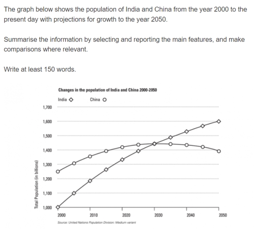
The line graph compares the total number of citizens in billions of two countries from the year 2000 to current day with a prediction for growth until year 2050.

Overall, India starts off with least change change in population. meanwhile, China ends with lowest change in population..

In more detail, Total Population of India starts off 1000 population. which gradually increases approximately 1400 to present day while, China begins at around 1250 then, slightly inclined roughly to 1430 population. in current day days.

Furthermore, There is an intersection between two lines in the year 2023 with approximately 1435 population.. subsequently, predictions after that year India roses till 1600 population. but China decreased to 1400 population. till the end of the year.

Word Count: 121

Answers On The Same Topic:

the graph below shows the population of India and china from the year 2000 to the present day with projects for growth to the year 2050

The chart illustrates the population of India and China between 2000 to present day with predictions for the trend in population in the year 2050. India experienced a linear growth in population throughout the review period. In the year 2000, 1 billion people called India home. The figures rose to 1.2 billion in 2010, a […]

the graph below shows the population of India and china from the year 2000 to the present day with projects for growth to the year 2050

The line graph below demonstrates the number of people living in China and India from 2000 up to 2025, including predictions until 2050. Overall, the population of the two given countries showed a steady increase over the period provided. At the start of the timeline, the population of China was noticeably higher than the number […]

the graph below shows the population of India and china from the year 2000 to the present day with projects for growth to the year 2050

The graph below shows the population of India and china from the year 2000 to the present day with projections for growth to the year 2050. The graph below displays the number of people in India and china from the year 2000 upto today with predictions for increase to the year 2050. Overall, the population […]

the graph below shows the population of India and china from the year 2000 to the present day with projects for growth to the year 2050

The information above depicts the population data of China and India from 2000 to the present, including projections of populations up to 2050. Overall, the population of China was more than the Indian population from 2000 to the present, and is projected to still be more than the Indian population until the year 2023. At […]

See All

Other Topics:

The graph shows sales of songs from three musical genres during a period of ten years.

The graph demonstrates sales of songs from three different types of music during a span of ten years. Overall, the Korean pop by far had the most sales among the three, while Jazz mostly has been stable before increasing gradually. Conversely, Pop music has declined gradually in the given period. Firstly, Korean pop beginning at […]

: The graph below gives information about one company's unit sales of 5 different types of jam from 2009 to 2014

The line chart compares the sales figures across 5 distinctive fruit jam categories in one particular corporation over a 5-year timespan. From an overall perspective, revenue generated from all jam types increased over the period recorded, with the exception of plum jams, which notably declined by the end of the report. The strawberry jams considerably […]

The graph below shows the percentage of households in a European country using renewable energy (solar, wind, and biomass) for heating and electricity between 2000 and 2020.

The chart above shows the percentage of houses using three different renewable sources of power between 2000 and 2020 for heating and electricity. In the year 2000 solar energy was the less used, by 5% of the population willing to invest in this type of green energy. A steady and firm rise of its use […]

The chart below shows information about European people of different age groups who went to the gym once a month or more between 1990 and 2010.

The line chart gives information about the percentage of individuals of different age groups who went to the gym once a month or more in Europe from 1990 to 2010. Overall, the proportion of European people of different age groups increased steadily. While, the figure for the 45 and over age group going to the […]

The line grap gives information about the percentage of incidence of involuntary part time workers.

The line graph provides a comparative analysis of involuntary part-time employment as a share of total employment across various OECD member states from 1990 to 2021. Overall, the data is characterized by significant divergence. While a majority of nations experienced a peak in underemployment following the 2008 financial crisis, the trajectories vary from relative stability […]

The graph below shows UK air pollutants in millions of tonnes, from three different sources, between 1990 and 2005.

The lime graph illustrates three types of sources in UK air pollutions in millions of tonnes between 1990 and 2005. Overall it is evident, that all the given groups decreased throughout the period except transport usage. The highest increase has seen in total number of air pollutions. To be begin with the total number of […]

See All
We have detected unusual activity on your device.
Please verify your identity to continue.
Note: This verification step won't sign you in. If you have a premium account, please log in to access the service as usual.
Google/Gmail Verification
Or verify using Email/Code
We've sent a verification code to:
youremail@gmail.com (Not your email?)
Enter it below to complete the verification process.
Ensure your email address is correct, your inbox is not full, and you check your spam folder. If no email arrives, consider using an alternative email.
You will need a Premium plan to perform your action!
Note: If you already have a premium account, please log in to access our services as usual.

Plans & Pricing

Our mission is to make quality education accessible for everyone.
However, to keep our hardworking team running and this service alive, we genuinely need your support!
By opting for a premium plan, not only do you sustain us in achieving the mission, but you also unlock advanced features to enrich your learning experience.

Free

For learners who aren't pressed for time

What's included on Free
100+ Cambridge IELTS Tests
Instant IELTS Writing Task 1 & 2 Evaluation (2 times/month)
Instant IELTS Speaking Part 1, 2, & 3 Evaluation (5 times/month)
Instant IELTS Writing Task 1 & 2 Essay Generator (2 times/month)
500+ Dictation & Shadowing Exercises
100+ Pronunciation Exercises
Flashcards
Other Advanced Tools

Premium

For those serious about advancing their English proficiency, and for IELTS candidates aspiring to boost their band score by 1-2 points (especially in writing & speaking) in just 30 days or less

What's included on Premium
Save Your IELTS Test Progress
Unlock All Courses & IELTS Tests
Unlimited AI Conversations
Unlimited AI Writing Enhancement Exercises
Unlimited IELTS Writing Task 1 & 2 Evaluation
Unlimited IELTS Speaking Part 1, 2, & 3 Evaluation
Checked Answers Will Not Be Published
Unlimited IELTS Writing Task 1 & 2 Essay Generator
Unlimited IELTS Speaking Part 1, 2, & 3 Sample Generator
Unlimited Usage Of Advanced Tools

Due to the nature of our service and the provided free trials, payments are non-refundable.
Nếu bạn là người Việt Nam và không có hoặc không muốn trả bằng credit/debit cards, bạn có thể thanh toán bằng phương thức chuyển khoản:


Chọn gói:
279,000₫ 157,000 ₫ cho gói 1 tháng (chỉ 5,233₫/ngày)
819,000₫ 397,000 ₫ cho gói 3 tháng (chỉ 4,411₫/ngày)
1,649,000₫ 667,000 ₫ cho gói 6 tháng (chỉ 3,706₫/ngày)
3,299,000₫ 857,000 ₫ cho gói 12 tháng (chỉ 2,381₫/ngày)


Sau khi chuyển khoản, vui lòng đợi trình duyệt tự động điều hướng bạn trở lại Engnovate và bạn sẽ ngay lập tức nhận được mã kích hoạt tài khoản premium.
Nếu có lỗi xảy ra, bạn có thể liên hệ với team thông qua một trong các phương thức: email đến helloengnovate@gmail.com hoặc nhắn tin qua facebook.com/engnovate.
Vì toàn bộ công cụ trên website đều có thể sử dụng thử miễn phí, Engnovate không hỗ trợ hoàn tiền.