Our system will evaluate the answer based on this AI-generated description.
The image contains a line graph showing Twitter use by age group over 8 time points: 10/11, 11/01, 11/05, 11/08, 12/02, 12/08, 12/12, 13/05. Age groups are represented as 18-29, 30-49, 50-64, 65+. At 10/11, 18-29 usage is around 30%, 30-49 around 15%, 50-64 around 5%, 65+ just under 5%. At 11/01, 18-29 increases to just under 35%, 30-49 to just above 15%, 50-64 and 65+ remain steady. At 11/05, 18-29 drops to just above 30%, 30-49 rises to 20%, 50-64 to almost 10%, 65+ to almost 5%. At 11/08, 18-29 rises to just under 35%, 30-49 to just over 20%, 50-64 to just over 10%, 65+ to just over 5%. At 12/02, 18-29 drops to 30%, 30-49 drops to 15%, 50-64 rises to 12.5%, 65+ drops to 5%. At 12/08, 18-29 rises to almost 35%, 30-49 rises to 20%, 50-64 to almost 15%, 65+ to just over 5%. At 12/12, 18-29 drops to just above 30%, 30-49 drops to just over 15%, 50-64 rises to 15%, 65+ to just under 5%. At 13/05, 18-29 rises to just below 35%, 30-49 to just over 20%, 50-64 to just under 15%, 65+ remains steady.
Given the complexity of the image, the above description may not be entirely accurate.
Skyrocket your IELTS band score by 1-2 points in under a month with our premium plan!
Note: Both the topic and the answer were created by one of our users.
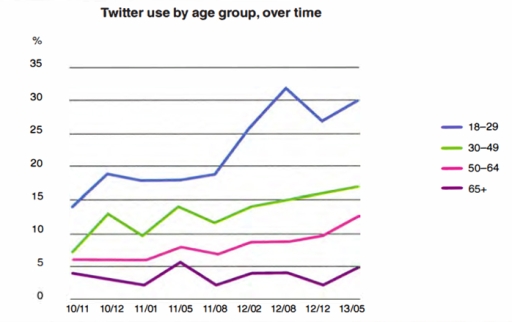
If you look at the graph, you can see the less the group ages, the more they use Twitter.
The twitter use is increased from al groups on May 2013 compared to November 2010, specially the group of teenage and twenties shows two times of increasing. Their Twitter use increased about 5% from November 2010 during a months and levelled off till August 2011 but it soared and hit a peak on August 2012 only during an year.
Compared to them, Twitter usage of the oldest group increased from November 2010 till January 2011. The flow is changed to increase and hit a peak on May 2011 but it fluctuated again and couldn’t be restored peak point till May 2013.
Word Count: 120