24 Hours Only: Get 39% OFF on Our Premium Plan - Check Out Now!
Multiple Graphs

Band 8+: The graph below provide infornation on global population figures and figures for urban population in different world regions

Image for topic: The graph below provide infornation on global population figures and figures for urban population in different world regions
Our system will evaluate the answer based on this AI-generated description.
The image presents two visual data representations. The first graph illustrates world population growth from 1800 to 2100 in billions: 1 billion at 1800, 1 billion at 1850, 2 billion at 1900, 3 billion at 1950, 5 billion at 2000, a peak at 10 billion by 2050, and projected decline to 9 billion by 2100. The second graph is a bar chart showing world urban population in billions from 2005 to 2030 across developed and developing regions. In 2005, developed regions have approximately 1 billion, developing regions about 2 billion; in 2010, developed regions around 1.2 billion, developing regions roughly 2.5 billion; in 2015, developed regions about 1.4 billion, developing regions about 3 billion; in 2020, developed regions approximately 1.6 billion, developing regions around 3.5 billion; in 2025, developed regions about 1.8 billion, developing regions near 4 billion; in 2030, both regions collectively surpass the 6 billion mark, with developing regions significantly leading.
Given the complexity of the image, the above description may not be entirely accurate.
Note: Both the topic and the answer were created by one of our users.

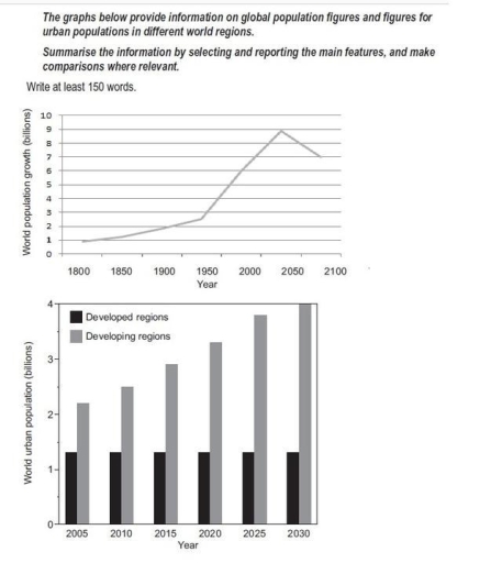
The given graph demonstrates the increase in population numbers worldwide over a 300-year period, while the chart depicts the changes in the number of people living in cities between 2005 and 2030.

Generally, an upward trend is noticed throughout the given period, with a slight decline during the last eighty years. The global population gradually increased from about 900 million to 2.7 billion by 1950, then rose sharply, reaching a peak of around 9 billion in 2025. However, after 2025, the number is projected to fall slightly towards 2100.

Regarding urban areas, the population in developing regions experienced continuous and significant growth throughout the 25-year period, while developed regions showed little or no change. In developing regions, the number of city dwellers grew steadily by roughly 500 million every five years, reaching 4 billion in 2030. In contrast, the population in developed regions remained stable at about 1.5 billion people.

Overall, while the global population and the number of urban residents in developing regions show strong upward trends, the figures for developed regions remain comparatively unchanged, highlighting a clear gap in urban growth between the two groups.

Word Count: 187

Answers On The Same Topic:

The graph below provide infornation on global population figures and figures for urban population in different world regions

The diagrams below provide information about world population trends in urbanization between developed and developing regions. Overall, developing countries have the highest figures and a rapid rise in urbanization; expected to peak around in 2035; however this trend may decline quickly. According to the line graph, the lowest figures recorded in 1800, when features of […]

The graph below provide infornation on global population figures and figures for urban population in different world regions

The given graph demonstrates the increase in population number worldwide in 300-year period, while the chart depicts the changes number of people living in cities between 2005 and 2030. Generally, the upward trend is noticed throughout the given period with sudden decline by last eighty years. The number of population gradually increased from 900 million […]

The graph below provide infornation on global population figures and figures for urban population in different world regions

The two graphs provide information about global population growth and the urban populations in both developed and developing regions from the past to the future. Overall, the world population showed a steady increase between 1800 and 2050 and it is expected to decline slightly by 2100. The second graph shows that urban populations in developing […]

See All

Other Topics:

The line charts show the amount of beer sold to pubs and supermarkets over six years, where a bar graph displays the amount of pubs closed over the same period.

The charts provide data about the volume of beer sold and the total number of Pubs in the UK from 2000 to 2016. Overall, in the first chart, it is evident that pubs and supermarkets experienced different trends. While transportation to pubs kept gradually decreasing, the figures of supermarkets showed an unstable trend. Notably, they […]

The charts below reveal the differences in reasons that motivated students to choose a college or university in 1985 and 2017.

The two pie charts illustrates the propotion of reasons that students enrolled to the university in UK in 1958 and 2017. Overall, the highest percentage of reason in both years was stable degree courses. The propotion of quarlity of reasources and good sports and social activities were decrease, but quarlity of teaching and proximitly to […]

The following diagrams show international student enrolments at a university from 1975 to 2009.

This diagrams illustrate information about international students enrolments from 1975 to 2009. Firstly, looking at the table, we can see that in 2009 Asia is almost three times as big as in 1975, whereas Europe has saved it’s point the same as it used to be. However, Africa and North America has decreased their value […]

The charts below show the physical activity levels of adult men and women in England from 2016 to 2017, and the activities they participated in. Summarise the information in both charts by selecting and reporting the main features, and make comparisons where relevant.

The bar charts compare the physical activity levels between adult men and women in England from 2016 to 2017, as well as the specific activities they took part in. In general, men were more physically active than women. In terms of kinds of activities, walking for leisure and sporting activities were the most common for […]

The charts below illustrate the percentage of time that male and female students spend on five different types of websites. Summarise the information by selecting and reporting the main features, and make comparisons where relevant.

This pie chart depicts different gender students spend how much time into which various websites during day.Overall , male students spend their most of time into websites which is about sport. Female students spend much time into website which is corresponding with educational purposes. To begin with first pie chart , male students use sport […]

The pie charts below show the percentage of time working adults spent on different activities in a particular country in 1959 and 2008. Summarize the information and by selecting and reporting the main features and make comparison where relevant.

The chart illustrates percentage of working time with different activities among children between two years 1959 and 2008. Overall, first year working was the highest,nevertheless, it was the highest after years, travel to work was the lowest one. Sleeping showed a big change and tr4avel also changed. In the 1959,working was the highest percentage and […]

See All
We have detected unusual activity on your device.
Please verify your identity to continue.
Note: This verification step won't sign you in. If you have a premium account, please log in to access the service as usual.
Google/Gmail Verification
Or verify using Email/Code
We've sent a verification code to:
youremail@gmail.com (Not your email?)
Enter it below to complete the verification process.
Ensure your email address is correct, your inbox is not full, and you check your spam folder. If no email arrives, consider using an alternative email.
You will need a Premium plan to perform your action!
Note: If you already have a premium account, please log in to access our services as usual.

Plans & Pricing

Our mission is to make quality education accessible and free for everyone.
However, to keep our hardworking team running and this service alive, we genuinely need your support!
By opting for a premium plan, not only do you sustain us in achieving the mission, but you also unlock advanced features to enrich your learning experience.

Free

For learners who aren't pressed for time

What's included on Free
1000+ IELTS Tests & Samples
Instant IELTS Writing Task 1 & 2 Evaluation (2 times/month)
Instant IELTS Speaking Part 1, 2, & 3 Evaluation (5 times/month)
Instant IELTS Writing Task 1 & 2 Essay Generator (2 times/month)
500+ Dictation & Shadowing Exercises
100+ Pronunciation Exercises
Flashcards
Other Advanced Tools

Premium

For those serious about advancing their English proficiency, and for IELTS candidates aspiring to boost their band score by 1-2 points (especially in writing & speaking) in just 30 days or less

What's included on Premium
Save Your IELTS Test Progress
Unlock All Courses & Content
Unlimited AI Conversations
Unlimited AI Writing Enhancement Exercises
Unlimited IELTS Writing Task 1 & 2 Evaluation
Unlimited IELTS Speaking Part 1, 2, & 3 Evaluation
Checked Answers Will Not Be Published
Unlimited IELTS Writing Task 1 & 2 Essay Generator
Unlimited IELTS Speaking Part 1, 2, & 3 Sample Generator
Unlimited Usage Of Advanced Tools

Due to the nature of our service and the provided free trials, payments are non-refundable.
Nếu bạn là người Việt Nam và không có hoặc không muốn trả bằng credit/debit cards, bạn có thể thanh toán bằng phương thức chuyển khoản:


Chọn gói:
279,000₫ 157,000 ₫ cho gói 1 tháng (chỉ 5,233₫/ngày)
819,000₫ 397,000 ₫ cho gói 3 tháng (chỉ 4,411₫/ngày)
1,649,000₫ 667,000 ₫ cho gói 6 tháng (chỉ 3,706₫/ngày)
3,299,000₫ 857,000 ₫ cho gói 12 tháng (chỉ 2,381₫/ngày)


Sau khi chuyển khoản, vui lòng đợi trình duyệt tự động điều hướng bạn trở lại Engnovate và bạn sẽ ngay lập tức nhận được mã kích hoạt tài khoản premium.
Nếu có lỗi xảy ra, bạn có thể liên hệ với team thông qua một trong các phương thức: email đến helloengnovate@gmail.com hoặc nhắn tin qua facebook.com/engnovate.
Vì toàn bộ công cụ trên website đều có thể sử dụng thử miễn phí, Engnovate không hỗ trợ hoàn tiền.