🔥 Today Only: Save 30% on Premium — Offer Ends Soon! - Upgrade Now!
Line Graph

Band 8+: The graph below gives information from a 2008 report about consumption of energy in the USA since 1980 with projections until 2030. Summarise the information by selecting and reporting the main features, and make comparisons where relevant.

Image for topic: The graph below gives information from a 2008 report about consumption of energy in the USA since 1980 with projections until 2030. Summarise the information by selecting and reporting the main features, and make comparisons where relevant.
Our system will evaluate the answer based on this AI-generated description.
The image shows a line graph titled "U.S. Energy Consumption by Fuel (1980-2030)" with data from 1980 to 2007 as history and projected data from 2010 to 2030. The graph displays energy consumption in quadrillion units on the y-axis and time in years on the x-axis. Petrol and Oil consumption starts at approximately 35 quadrillion units in 1980, reaching nearly 45 quadrillion units in 2007 and projected to reach over 50 quadrillion units by 2030. Coal consumption begins at just over 15 quadrillion units, increasing to almost 25 quadrillion units in 2007 and projected at 30 quadrillion units in 2030. Natural Gas consumption starts at around 15 quadrillion units, with a steady increase to 25 quadrillion units in 2007 and projected to continue to about 30 quadrillion units in 2030. Nuclear, Solar/Wind, and Hydropower have significantly lower consumption levels, all starting below 5 quadrillion units in 1980. Nuclear energy shows a gradual increase to approximately 8 quadrillion units by 2007, with a projection of nearly 10 quadrillion units by 2030. Solar/Wind energy sees the most significant projected increase, starting at nearly 0 quadrillion units in 1980, with a slight increase to almost 3 quadrillion units in 2007 and an anticipated surge to 10 quadrillion units by 2030. Hydropower consumption remains relatively stable, starting at just over 2 quadrillion units, with little change by 2007 and a small projected increase to about 4 quadrillion units by 2030.
Given the complexity of the image, the above description may not be entirely accurate.
Note: Both the topic and the answer were created by one of our users.

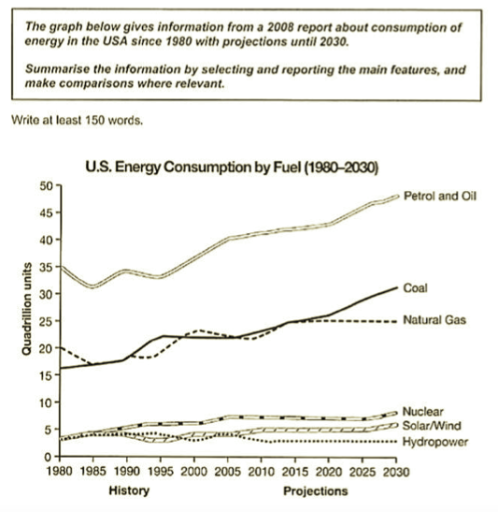
The line graph compares energy consumption in the USA from 1980 to 2005, with projections up to 2030, for six different fuel sources.

Overall, petrol and oil remain by far the most widely used fuels throughout the period, and their consumption is expected to continue rising. Coal and natural gas are also projected to increase, while the use of nuclear power, solar or wind, and hydropower is predicted to stay relatively low and stable.

In 1980, petrol and oil consumption stood at around 35 quadrillion units, before falling slightly to just under 32 units in 1985. It then rose steadily, reaching roughly 40 units by 2005, and is forecast to climb further to about 47 units by 2030. Coal use started at 16 units and grew gradually to approximately 23 units in 2005, with a sharper rise expected afterwards, reaching nearly 30 units by the end of the period.

Natural gas followed a similar but less pronounced upward trend. Its figure fluctuated around 20 units between 1980 and 2005 and is projected to level off at about 25 units by 2030. In contrast, nuclear, solar/wind and hydropower each remained below 10 units throughout. Nuclear energy increased slightly from about 4 to 7 units, while solar and wind rose slowly from near zero to around 5 units. Hydropower shows almost no change over time and is expected to stay at roughly 4 units in 2030.

Word Count: 234

Answers On The Same Topic:

The graph below gives information from a 2008 report about consumption of energy in the USA since 1980 with projections until 2030. Summarise the information by selecting and reporting the main features, and make comparisons where relevant.

The graph illustrates data of U.S energy consumption from 1980 to present time along projecting estimate till 2030. Graph measures data in quadrillion unit of six distinct fuel sources. Petrol and oil was leading energy source in 1980 at 35 quadrillion units.Despite some minor fluctuations in late 1980’s.It’s consumption climbed steadily to 50 quadrillion in […]

The graph below gives information from a 2008 report about consumption of energy in the USA since 1980 with projections until 2030. Summarise the information by selecting and reporting the main features, and make comparisons where relevant.

The graph shows the consumption of energy in USA years between 1980 to 2008, with the forecast until 2030. Overall, the consumption of petrol and oil were at the peak, the coal and natural gas were trying climb one another. The rest of the energies had a unstable growth. Firstly, the petrol and oil had […]

The graph below gives information from a 2008 report about consumption of energy in the USA since 1980 with projections until 2030. Summarise the information by selecting and reporting the main features, and make comparisons where relevant.

The line graph compares historical data and future projections for energy consumption by different fuel sources in the USA from 1980 to 2030, according to a report published in 2008. All figures are measured in quadrillion units. Overall, petrol and oil dominate energy consumption throughout the period and are forecast to continue rising. By contrast, […]

The graph below gives information from a 2008 report about consumption of energy in the USA since 1980 with projections until 2030. Summarise the information by selecting and reporting the main features, and make comparisons where relevant.

The line graph shows how energy consumption by fuel in the USA changed from 1980, with predictions for 2030. It is clear from the graph that despite a slight drop in the first five years, energy consumption from petrol and oil increased dramatically from 35 quadrillion units in 1980 to about 40 quadrillion in 2008, […]

See All

Other Topics:

THE GRAPH BELOW SHOWS THE UNEMPLOYMENT RATES IN THREE COUNTRIES FROM 1990 TO 2004

The graph illustrates the rates of unemployment in three different countries from year 1990 to 2004. Overall, it is immediately apparent that USA had the leading number of unemployment levels in 2000 and 2004, even though it started at a lower percent. Japan experienced a sharp increase during the period of 1996 with a dramatic […]

The chart below shows three different types of crime in England and Wales from 1970 to 2005. Summarise the information by selecting and reporting the main features, and make comparisons where relevant. Write at least 150 words.

The graph illustrates the rate of three types of crimes in England and Wales between 1970 and 2005 years. Overall, what stands out from graph is that the number of incidents had grown by the 2005. At the same time it is easy to see that while one type of crime had steady increase, other […]

The line graph shows the percentage of people who used three different types of transport (car, bus, and bicycle) to travel to work in a city between 2000 and 2020.

The chart illustrates the persentage of individuals travelling to work by three various types of transport in a city over the 20-year period between 2000 and 2020. overall, It is clear that car usage begin with the highest percentage and saw a significant decline by the end of the year, while the use of bus […]

The graph below shows the average closing prices of selected precious metals from 2013 to 2021. Summerise the information by selecting and reporting the main features and make comparisons where relevant.

The line graph presents the typical closing prices designated precious metals between 2013 and 2021. Overall, the value of palladium has experienced a very significant increase after being remainly steady at first. While gold showed an overall upward trend, platinum generally declined before recovering slightly in the final year. The value of palladium in 2013 […]

The graph below shows the percentage of 18-25 year olds in universities in four different countries. Summarise the information by selection and reporting the main features and make comparisons where relevant.

The line graph compares the proportion of 18-25 years old universities in four different different countries – Singapore Malaysia Philippines and Tailand. Overall , the percentage of university students aged 18-25 increased in all four countries, but the increase was particularly dramatic in Thailand by the end of the period. At the beginning of the […]

The graph shows average annual expenditures on cell phone and residential phone services between 2001 and 2010.

The graphs illustrate average annual spendings on cell phone and residential phone services over a nine-year period from 2001 and 2010. Overall, the mean cell phone annual expenditures showed increased each year from 2001 until 2010 and reached a peak spendings in 2010. However, compare to the residential phone service, it decreased over almost a […]

See All
We have detected unusual activity on your device.
Please verify your identity to continue.
Note: This verification step won't sign you in. If you have a premium account, please log in to access the service as usual.
Google/Gmail Verification
Or verify using Email/Code
We've sent a verification code to:
youremail@gmail.com (Not your email?)
Enter it below to complete the verification process.
Ensure your email address is correct, your inbox is not full, and you check your spam folder. If no email arrives, consider using an alternative email.
You will need a Premium plan to perform your action!
Note: If you already have a premium account, please log in to access our services as usual.

Plans & Pricing

Our mission is to make quality education accessible for everyone.
However, to keep our hardworking team running and this service alive, we genuinely need your support!
By opting for a premium plan, not only do you sustain us in achieving the mission, but you also unlock advanced features to enrich your learning experience.

Free

For learners who aren't pressed for time

What's included on Free
100+ Cambridge IELTS Tests
Instant IELTS Writing Task 1 & 2 Evaluation (2 times/month)
Instant IELTS Speaking Part 1, 2, & 3 Evaluation (5 times/month)
Instant IELTS Writing Task 1 & 2 Essay Generator (2 times/month)
500+ Dictation & Shadowing Exercises
100+ Pronunciation Exercises
Flashcards
Other Advanced Tools

Premium

For those serious about advancing their English proficiency, and for IELTS candidates aspiring to boost their band score by 1-2 points (especially in writing & speaking) in just 30 days or less

What's included on Premium
Save Your IELTS Test Progress & Analyze Mistakes By Question Type
Unlock All Courses & IELTS Tests
Unlimited AI Conversations
Unlimited AI Writing Enhancement Exercises
Unlimited IELTS Writing Task 1 & 2 Evaluation
Unlimited IELTS Speaking Part 1, 2, & 3 Evaluation
Checked Answers Will Not Be Published
Unlimited IELTS Writing Task 1 & 2 Essay Generator
Unlimited IELTS Speaking Part 1, 2, & 3 Sample Generator
Unlimited Usage Of Advanced Tools
Priority Support within 24h (12-month plan only)

Due to the nature of our service and the provided free trials, payments are non-refundable.
Nếu bạn là người Việt Nam và không có hoặc không muốn trả bằng credit/debit cards, bạn có thể thanh toán bằng phương thức chuyển khoản:


Chọn gói:
419,000₫ 277,000 ₫ cho gói 1 tháng (chỉ 9,233₫/ngày)
1,239,000₫ 597,000 ₫ cho gói 3 tháng (chỉ 6,633₫/ngày)
2,469,000₫ 1,027,000 ₫ cho gói 6 tháng (chỉ 5,706₫/ngày)
4,929,000₫ 1,417,000 ₫ cho gói 12 tháng (chỉ 3,936₫/ngày)


Sau khi chuyển khoản, vui lòng đợi trình duyệt tự động điều hướng bạn trở lại Engnovate và bạn sẽ ngay lập tức nhận được mã kích hoạt tài khoản premium.
Nếu có lỗi xảy ra, bạn có thể liên hệ với team thông qua một trong các phương thức: email đến helloengnovate@gmail.com hoặc nhắn tin qua facebook.com/engnovate.
Vì toàn bộ công cụ trên website đều có thể sử dụng thử miễn phí, Engnovate không hỗ trợ hoàn tiền.