24 Hours Only: Get 39% OFF on Our Premium Plan - Check Out Now!
Line Graph

Band 4+: The figure shows demographic trends in an industrialized country. Summarize the information by selecting and reporting the main features.

Image for topic: The figure shows demographic trends in an industrialized country. Summarize the information by selecting and reporting the main features.
Our system will evaluate the answer based on this AI-generated description.
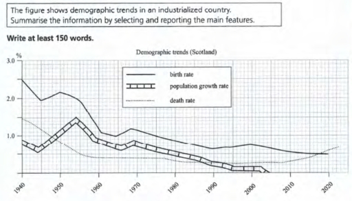
The image illustrates demographic trends in Scotland from 1940 to 2050, showing three key rates: birth, population growth, and death. In 1940, birth rate stands at 2.5%, population growth rate at 0.7%, and death rate at 1.5%. By 1950, birth rate remains around 2.6%, population growth reaches 1.0%, death rate is about 1.4%. From 1960 to 1970, birth rate peaks at 2.9% in 1960 and drops to 2.1% by 1970; population growth rate peaks at 1.1% in 1960, reduces to 1.0% by 1970; death rate remains steady around 1.3%. A continued decline in birth rate and population growth rate is observed from 1980, with birth rate at 1.7% in 1980, 1.2% in 1990, and further dropping to 1.0% by 2000; population growth rate remains at 0.7% in 1980, decreases to 0.4% in 1990, and to 0.0% in 2000. Death rate remains near 1.2% in 1980 and decreases to 1.1% by 2000. From 2010 to 2050, the birth rate declines from 1.2% in 2010 to 0.8% forecasted in 2050; the population growth rate reduces from 0.2% in 2010 to negative values around -0.1% by 2050; the death rate drops from 1.3% in 2010 to about 0.4% by 2050.
Given the complexity of the image, the above description may not be entirely accurate.
Note: Both the topic and the answer were created by one of our users.

The figure shows the amount of industrialized country. Summarize the displays by selecting and reporting the main features.

The figure shows displays in Schotland country that demographic trends between 1940 and 2020. There are birth rate, population growth rate, death rate. For intance birth rate to be every year change it percentage. At the beginning it that fall then go up. However become fluctuate. Population growth rate this types start up 1.5 percentage. The type in 1940 year decreased next year also decreased. Then the table be constant change. The last demographic trend it is death rate. This type very sad because your first year it is suddenly grow but next to next years to be arounded. but this statics finished in 2000 year.

Overall, the demographic trends in Scotland this analys gives information for 1940 to 2020 years. Maybe the table changed for the future in a good state.

Word Count: 150

Answers On The Same Topic:

The figure shows demographic trends in an industrialized country. Summarize the information by selecting and reporting the main features.

The graphic above illustrates trend of demographic in Scotland between 1940 to 2020 in percent. The trend has three factors which are birth rate, population growth rate and death rate. From overall percpective , the population growth rate and birth rate slowly dropped over the following years. On the other hand, the death rate of […]

The figure shows demographic trends in an industrialized country. Summarize the information by selecting and reporting the main features.

The line graph compares demographic data in Scotland which is industrial country, over the period of 80 years. It is clear that the birth and death rate have significant difference. Population growth rate trend shows the result of difference between death and birth rate in Scotland. In 1940 birth rate was about two percent of […]

The figure shows demographic trends in an industrialized country. Summarize the information by selecting and reporting the main features.

The present line graph depicts the changes of three core variables in demographic data of an industrialized country in a time span of 60 years. At first glance, it is evident that a general decreasing trend was dominated on all studied categories from 1940 to 2020. A closer examination of figures reveals that the fluctuations […]

See All

Other Topics:

The graph below shows the percentage of female members of parliament in five European countries, from 2000 to 2012. Summarise the information by selecting and reporting the main features, and make comparison where relevant.

The given line graph illustrates the proportion of women who worked in parliament in five European countries between 2000 and 2012. Overall, all counties experienced significant changes during the period. There was a dramatic rise in the share of female workers of Italian parliament, while this figure in other countries increase gradually. In Germany, the […]

The line graph shows TV news viewing figures over a one-year period.

The line graph illustrates TV news viewing figures over a one-year period. Overall, it is evident that from the start of the year the most frequent time of viewing news was at 6 p.m. However, none of the viewer never watched TV news at 11 p.m. until first May. In January, the most TV news […]

the graph below shows the millions which were spent by four states, Summarise the information by selecting and reporting the main features, and make comparisons where relevant.

The chart provides how millions, which were spent in The UK, France, Spain and Germany changed, over a 12-year period. starting from 1980. Overall, It can be seen that goverment spending on tourist infrustructure in The UK, France and Germany showed, which had increased. whereas they decreased in spain shown. furthermore, France showed highest increased […]

The graph below shows the number of books read by men and women at Public Library A from 2016 to 2019. Summarize the information by selecting and reporting the main features and make comparisons where relevant.

The line graph illustrates the figure for books read by men and women at public library between 20276 to 2019. these number experienced different of patterns change over the cource of 3 years. The figgure of the men rose gradually over in 2 years. however the figure for women dropped from 2018 to 2019. In […]

The graph below shows the amount of money spent on books in Germany, France, Italy and Austria between 1995 and 2005.

The line graph illustrates the amount of money allocated on books in Germany, France, Italy, and Austria between 1995 and 2005. Overall, it can be seen that the expenditure on books witnessed a noticeable increase in all four countries, with Austria showing a marked improvement throughout the period. It is also clear that Germany spent […]

The line graph shows the number of XYZ radio station listeners from 1940 to 2030, including future projectionsSummarise the information by selecting and reporting main features, and make comparisons where relevant.

The line graph shows the number of XYZ radio station listeners from 1940 to 2030, including future projections. Overall, the number of listeners had a lot of changes. There was a record high in the middle of the period, but after that the figures went down sharply and then showed some recovery again in recent […]

See All
We have detected unusual activity on your device.
Please verify your identity to continue.
Note: This verification step won't sign you in. If you have a premium account, please log in to access the service as usual.
Google/Gmail Verification
Or verify using Email/Code
We've sent a verification code to:
youremail@gmail.com (Not your email?)
Enter it below to complete the verification process.
Ensure your email address is correct, your inbox is not full, and you check your spam folder. If no email arrives, consider using an alternative email.
You will need a Premium plan to perform your action!
Note: If you already have a premium account, please log in to access our services as usual.

Plans & Pricing

Our mission is to make quality education accessible for everyone.
However, to keep our hardworking team running and this service alive, we genuinely need your support!
By opting for a premium plan, not only do you sustain us in achieving the mission, but you also unlock advanced features to enrich your learning experience.

Free

For learners who aren't pressed for time

What's included on Free
100+ Cambridge IELTS Tests
Instant IELTS Writing Task 1 & 2 Evaluation (2 times/month)
Instant IELTS Speaking Part 1, 2, & 3 Evaluation (5 times/month)
Instant IELTS Writing Task 1 & 2 Essay Generator (2 times/month)
500+ Dictation & Shadowing Exercises
100+ Pronunciation Exercises
Flashcards
Other Advanced Tools

Premium

For those serious about advancing their English proficiency, and for IELTS candidates aspiring to boost their band score by 1-2 points (especially in writing & speaking) in just 30 days or less

What's included on Premium
Save Your IELTS Test Progress
Unlock All Courses & IELTS Tests
Unlimited AI Conversations
Unlimited AI Writing Enhancement Exercises
Unlimited IELTS Writing Task 1 & 2 Evaluation
Unlimited IELTS Speaking Part 1, 2, & 3 Evaluation
Checked Answers Will Not Be Published
Unlimited IELTS Writing Task 1 & 2 Essay Generator
Unlimited IELTS Speaking Part 1, 2, & 3 Sample Generator
Unlimited Usage Of Advanced Tools

Due to the nature of our service and the provided free trials, payments are non-refundable.
Nếu bạn là người Việt Nam và không có hoặc không muốn trả bằng credit/debit cards, bạn có thể thanh toán bằng phương thức chuyển khoản:


Chọn gói:
279,000₫ 157,000 ₫ cho gói 1 tháng (chỉ 5,233₫/ngày)
819,000₫ 397,000 ₫ cho gói 3 tháng (chỉ 4,411₫/ngày)
1,649,000₫ 667,000 ₫ cho gói 6 tháng (chỉ 3,706₫/ngày)
3,299,000₫ 857,000 ₫ cho gói 12 tháng (chỉ 2,381₫/ngày)


Sau khi chuyển khoản, vui lòng đợi trình duyệt tự động điều hướng bạn trở lại Engnovate và bạn sẽ ngay lập tức nhận được mã kích hoạt tài khoản premium.
Nếu có lỗi xảy ra, bạn có thể liên hệ với team thông qua một trong các phương thức: email đến helloengnovate@gmail.com hoặc nhắn tin qua facebook.com/engnovate.
Vì toàn bộ công cụ trên website đều có thể sử dụng thử miễn phí, Engnovate không hỗ trợ hoàn tiền.