🔥 Today Only: Save 30% on Premium — Offer Ends Soon! - Upgrade Now!
Line Graph

Band 8+: The graph below shows the quantities of goods transported in the UK between 1974 and 2002 by 4 different modes of transport.

Image for topic: The graph below shows the quantities of goods transported in the UK between 1974 and 2002 by 4 different modes of transport.
Our system will evaluate the answer based on this AI-generated description.
The image presents a line graph displaying the quantities of goods transported in the UK between 1974 and 2002 by road, water, rail, and pipeline. In 1974, road transport started at approximately 70 million tonnes, saw a gradual increase peaking at around 100 million tonnes in 1998, and a slight decrease to just below 100 million tonnes by 2002. Water transport began just above 40 million tonnes, fluctuated with a peak at approximately 60 million tonnes in 1994, and ended around 58 million tonnes in 2002. Rail transport started at roughly 40 million tonnes, dipped to about 30 million tonnes by 1982, and then had a steady growth to peak at approximately 42 million tonnes in 2002. Pipeline transport had the least amount in 1974 at around 5 million tonnes, then showed a sharp increase reaching about 20 million tonnes by 1978, followed by a steady growth to nearly 25 million tonnes in 2002.
Given the complexity of the image, the above description may not be entirely accurate.
Note: Both the topic and the answer were created by one of our users.

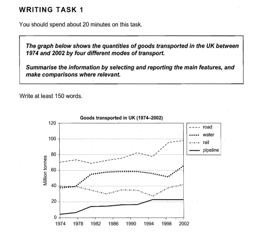
The line graph illustrates the quantity of goods transported in the UK via four modes of transport—road, water, rail, and pipeline—between 1974 and 2002. The measurement is in million tonnes.

Overall, road transport carried the highest amount of goods throughout the period, while pipeline transport handled the least. Water transport saw a steady increase, whereas rail transport fluctuated and declined before rising again in the final years.

In 1974, road transport accounted for approximately 70 million tonnes, rising gradually to nearly 100 million tonnes by 2002. Water transport started at around 40 million tonnes and experienced a steady increase, reaching around 65 million tonnes by the end of the period.

Rail transport began at about 40 million tonnes but declined to around 30 million tonnes in the 1990s before rebounding to 40 million tonnes in 2002. Pipeline transport, which was the least used method, grew from around 5 million tonnes in 1974 to 20 million tonnes in 1994, remaining stable afte

rward.

Word Count: 162

Answers On The Same Topic:

The graph below shows the quantities of goods transported in the UK between 1974 and 2002 by 4 different modes of transport.

the line graph illustrates the number of goods transported in the UK from 1974 to 2002 by four different modes ( road , water , rail and pipeline ) of transport. Overall , the transported goods by road had the highest and it picked up among the other modes of transport while the transported goods […]

The graph below shows the quantities of goods transported in the UK between 1974 and 2002 by 4 different modes of transport.

The line chart delineates the number of products being transported in the United Kingdom by four disparate types of transportation from 1974 to 2002, quantified in million tonnes. Overall, the quantity of goods carried on roads was consistently higher than the others, whereas transporting through pipelines was the least favoured. Additionally, while most cohorts witnessed […]

The graph below shows the quantities of goods transported in the UK between 1974 and 2002 by 4 different modes of transport.

Writing & test 4 teed 1 7. Un graph illustrates hay in about the quantites a good tranthesed the United kingdom tom 1974 to 2002 y four ways al transpert. The twite GN NE in million tonnes. Overall, it can be charly seen from thu chart that the highest hind modis Η κονιμος two road, […]

The graph below shows the quantities of goods transported in the UK between 1974 and 2002 by 4 different modes of transport.

The line graph illustrates changes in the amount of goods transported in the UK between 1974 and 2002 using four different modes of transport: road, water, rail and pipeline. Overall, goods carried by road, water and pipeline showed an upward trend throughout the period. In contrast, rail transport fluctuated and did not experience significant overall […]

The graph below shows the quantities of goods transported in the UK between 1974 and 2002 by 4 different modes of transport.

The graphic shows the amount of goods moved in the UK from 1974 to 2002, using four types of transport: road, water, rail, and pipeline, and he amount is measured in million tonnes. Overall, road transport was the most popular way to move goods during the whole period. The amount of goods moved by pipeline […]

See All

Other Topics:

WRITING TASK 1 You should spend about 20 minutes on this task. The graph below gives information on the numbers of participants for different activities at one social centre in Melbourne, Australia for the period 2000 to 2020. Summarise the information by selecting and reporting the main features, and make comparisons where relevant. Write at least 150 words.

The line graph displays data on the numbers of the people for numerous activities in Melbourne between 2000 and 2020. The graph shows that the most popular activity among participants in this decade was film club. However, the least popular activities among people were amateur dramatics and musical performance. The graph illustrates the infromation about […]

You should spend about 20 minutes on this task. The graph below provides a breakdown of the UK weekly market share of visits to three social networking websites between March 2007 and March 2008. Summarise the information by selecting and reporting the main features, and make comparisons where relevant. Write at least 150 words.

The line graph illustrates the distribution of weekly market share percentages of visits to three prominent social networking websites in the UK from March 2007 to March 2008. In a period marked by notable fluctuations, Facebook exhibited a significant upward trajectory, surpassing its competitors, while MySpace and Bebo reflected varied patterns of decline and fluctuating […]

You should spend about 20 minutes on this task. The graph below provides a breakdown of the UK weekly market share of visits to three social networking websites between March 2007 and March 2008. Summarise the information by selecting and reporting the main features, and make comparisons where relevant. Write at least 150 words.

The line graph displays the percentage of the UK weekly market share of visits to three social networking websites during one year between March 2007 and March 2008. Overall,all three social networking websites experiences large fluctuations.However,facebook jumped and outpaced other websites in the beginning of September. The percentage of visits to myspace fluctuated between roughly […]

The graph below shows the per capita consumption of whole milk and low-fat milk in the United States between 1970 and 2015. Summarize the information by selecting and reporting the main

The line graph presented to us the per capita consumption of both whole milk and low-fat milk in US between 1970 and 2015. Overall, the whole milk have a dwindling tendency. In the beginning, 1970 year, low fat milk was unpopular and it was almost 6 per capita consumption, while whole milk was on its […]

The graph below gives information about the number of jobs in four sectors of the economy in the US between 1960 and 2020.

The line graph illustrates the number of jobs in 4 economical parts in the US in 1960, 1980, 2000 and 2020. Overall, there are manufacturing, retail, agriculture and healthcare sectors. Figures in retail industry slightly grew thoughout the years. Healthcare line increased extremely, and by 2020, the manufacturing and healthcare values were absolutely similar. Retail […]

The graph shows the Japanese average monthly salary (Yen) from 1953 to 1983, and the prices of black and white television and color television during the same period

The line chart shows the Price of color TV, Price of black and white TV and Japanese average monthly salary (Yen) from 1953 to 1983, and the prices of black-and-white televisions and color television from 1953 to 1983 in Japan. Overall, while Price of color TV and Prince of black and white TV significantly decreased, […]

See All
We have detected unusual activity on your device.
Please verify your identity to continue.
Note: This verification step won't sign you in. If you have a premium account, please log in to access the service as usual.
Google/Gmail Verification
Or verify using Email/Code
We've sent a verification code to:
youremail@gmail.com (Not your email?)
Enter it below to complete the verification process.
Ensure your email address is correct, your inbox is not full, and you check your spam folder. If no email arrives, consider using an alternative email.
You will need a Premium plan to perform your action!
Note: If you already have a premium account, please log in to access our services as usual.

Plans & Pricing

Our mission is to make quality education accessible for everyone.
However, to keep our hardworking team running and this service alive, we genuinely need your support!
By opting for a premium plan, not only do you sustain us in achieving the mission, but you also unlock advanced features to enrich your learning experience.

Free

For learners who aren't pressed for time

What's included on Free
100+ Cambridge IELTS Tests
Instant IELTS Writing Task 1 & 2 Evaluation (2 times/month)
Instant IELTS Speaking Part 1, 2, & 3 Evaluation (5 times/month)
Instant IELTS Writing Task 1 & 2 Essay Generator (2 times/month)
500+ Dictation & Shadowing Exercises
100+ Pronunciation Exercises
Flashcards
Other Advanced Tools

Premium

For those serious about advancing their English proficiency, and for IELTS candidates aspiring to boost their band score by 1-2 points (especially in writing & speaking) in just 30 days or less

What's included on Premium
Save Your IELTS Test Progress
Unlock All Courses & IELTS Tests
Unlimited AI Conversations
Unlimited AI Writing Enhancement Exercises
Unlimited IELTS Writing Task 1 & 2 Evaluation
Unlimited IELTS Speaking Part 1, 2, & 3 Evaluation
Checked Answers Will Not Be Published
Unlimited IELTS Writing Task 1 & 2 Essay Generator
Unlimited IELTS Speaking Part 1, 2, & 3 Sample Generator
Unlimited Usage Of Advanced Tools
Priority Support within 24h (12-month plan only)

Due to the nature of our service and the provided free trials, payments are non-refundable.
Nếu bạn là người Việt Nam và không có hoặc không muốn trả bằng credit/debit cards, bạn có thể thanh toán bằng phương thức chuyển khoản:


Chọn gói:
419,000₫ 277,000 ₫ cho gói 1 tháng (chỉ 9,233₫/ngày)
1,239,000₫ 597,000 ₫ cho gói 3 tháng (chỉ 6,633₫/ngày)
2,469,000₫ 1,027,000 ₫ cho gói 6 tháng (chỉ 5,706₫/ngày)
4,929,000₫ 1,417,000 ₫ cho gói 12 tháng (chỉ 3,936₫/ngày)


Sau khi chuyển khoản, vui lòng đợi trình duyệt tự động điều hướng bạn trở lại Engnovate và bạn sẽ ngay lập tức nhận được mã kích hoạt tài khoản premium.
Nếu có lỗi xảy ra, bạn có thể liên hệ với team thông qua một trong các phương thức: email đến helloengnovate@gmail.com hoặc nhắn tin qua facebook.com/engnovate.
Vì toàn bộ công cụ trên website đều có thể sử dụng thử miễn phí, Engnovate không hỗ trợ hoàn tiền.