🔥 Today Only: Save 30% on Premium — Offer Ends Soon! - Upgrade Now!
Line Graph

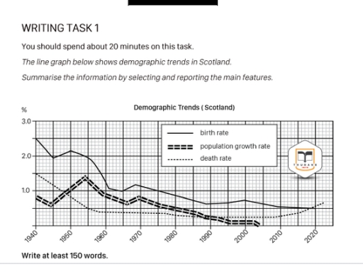
Band 6+: The line graph below shows demographic trends in Scotland. Summarise the information by selecting and reporting the main features.

Image for topic: The line graph below shows demographic trends in Scotland. Summarise the information by selecting and reporting the main features.
Our system will evaluate the answer based on this AI-generated description.
The image shows a line graph detailing demographic trends in Scotland from 1940 to 2020 with three indicators: birth rate, population growth rate, and death rate, measured in percentages. In 1940, birth rate is approximately 2.7%, population growth rate is around 0.5%, and death rate is near 1.5%. In 1950, birth rate peaks at 3%, population growth rate slightly over 1%, and death rate approximately 1%. By 1960, birth rate is around 2.4%, population growth rate about 0.8%, and death rate around 0.9%. In 1970, birth rate drops to about 1.9%, population growth rate to approximately 0.4%, and death rate at 0.8%. By 1980, birth rate decreases to around 1.6%, population growth rate slightly over 0%, and death rate under 0.7%. In 1990, birth rate is about 1.5%, population growth rate approaches 0%, and death rate about 0.6%. In 2000, birth rate is roughly 1.4%, population growth rate slightly negative, and death rate about 0.55%. By 2010, birth rate is near 1.3%, population growth rate slightly above 0%, and death rate under 0.5%. In 2020, birth rate is around 1.3%, population growth rate approximately 0.2%, and death rate just above 0.4%.
Given the complexity of the image, the above description may not be entirely accurate.
Note: Both the topic and the answer were created by one of our users.

The chart shows the demographic trend of Scottish population from 1940 to 2020. Analysing the birth rate, we notice that it drastically reduced after the second world war. This phenomenon denounces the changes of the current Scottish society in order words having children isn’t a priority anymore.

An another very important trend shows the reduction of the mortality rate from 1940 to 2010. This was the result of numerous medical discoveries that developed new and therapies. Moreover, after the war the economic boom led to wealth and a better lifestyle. The death rate reduced to one point and a half making the population more long-lived. Unfortunately, from 2020 the trend began to raise because of the worldwide emergency COVID-19 killing especially elder.

The Scottish population dropped during the second world war because of dead soldiers and few birth. Later from 1945 to 1955 the trend increased thanks to the acquired longevity. Since this period the population has constantly reduced.

If we compare these data with other European trend, they are very similar because current societies getting old and the young couples can’t afford to grow up a child. Maybe our societies are definitely changing.

Word Count: 194

Answers On The Same Topic:

The line graph below shows demographic trends in Scotland. Summarise the information by selecting and reporting the main features.

The line graph elucidates how the numbers for three different categories, namely birth rate, population growth rate and death rate altered in Scotland from 1940 to 2020. Overall, it is immediately apparent that while the figures for both birth rate and population growth rate experienced and downward trend and the death rate illustrated flunctuation. It […]

The line graph below shows demographic trends in Scotland. Summarise the information by selecting and reporting the main features.

The supplied line graph illustrates the birth rate, population growth rate, and death rate in Scotland between 1940 and 2020. All three figures are measured in percentages. From an overall perspective, it is evident that the birth rate was consistently higher than the other two indicators, although it declined gradually over time. Meanwhile, both the […]

The line graph below shows demographic trends in Scotland. Summarise the information by selecting and reporting the main features.

The graph illustrates demographic patterns of Scotland from 1940 to 2020. Overall, the birth pace was the highest for most of the time while the death figure and the population rate were changing ranks. However, the mortality rate was unique in that it experienced a gradual regrowth after declining. The pace of population expansion remained […]

The line graph below shows demographic trends in Scotland. Summarise the information by selecting and reporting the main features.

The line graph illustrates the changes in Demographic trends in Scotland over the period from 1940 to 2020. Overall, it is clear that birth rate, while death rate underwent a comparately significant change. Overall, the data shows a clear downward trend across the period. Notably, death rate experienced a steep decline, whereas birth rate followed […]

The line graph below shows demographic trends in Scotland. Summarise the information by selecting and reporting the main features.

The given chart illustrates demographic trends such as birth rate, population growth rate and death rate in Scotland over the eighty-year period between 1940 and 2020. Overall, the figures share the same downward trend with some fluctuation. It is depicted that the birth rate has the highest percentage of all three throughout the eighty-year period. […]

See All

Other Topics:

You should spend about 20 minutes on this task. The graph below gives information on the numbers of participants for different activities at one social centre in Melbourne, Australia for the period 2000 to 2020. Summarise the information by selecting and reporting the main features, and make comparisons where relevant. Write at least 150 words.

The line graph illustrates the number of participants in five different activities at a social centre in Melbourne, Australia, between 2000 and 2020. Overall, the film club remained the most popular activity throughout the period, while table tennis experienced the most significant growth. In contrast, participation in amateur dramatics declined considerably. Musical performances also became […]

The chart below shows seasonal changes in citrus fruit in the UK in 2022 Summerise in information by selecting and reporting th main features, and make comparation where revalant

The line graph demonstrates seasonal variations in the importation of citrus crops in the UK of both the EU and non-EU throughout the year 2022. Overall, imports from the EU exhibited a downward trend in first half of the year but then considerably increased in the last four months. In contrast, the number of non-EU […]

The line graph shows distance covered in a 100-kilometer race between a tortoise and a hare.

The line chart depicts the distance travelled over time during a 100-kilometer race between a tortoise and a hare. The units are measured in kilometers and hours. Overall, while the hare initially gained a substantial lead over the tortoise, it lost traction owing to a nap, and remained at a standstill for a lengthy period […]

The graph below shows the number of overseas visitors to three different areas of a European country between 1987 and 2007.

The line graph illustrates the number of overseas visitors to three different areas in a European country between 1987 and 2007. Overall, the number of visitors to the coast and lakes increased over the period given, while the number for mountains remained unchanged. At the start of the period, the coast was the most popular […]

The line graph below shows the percentage of Internet users by population in the USA, Canada and Mexico between 1999 and 2009. Summarise the information by selecting and reporting the main features and make comparisons where relevant.

The report is generay rfer to the internet users in USA, Canada and Mexico and in this report we analyze how internet user increase or decrease in those countries. As we get a graph which shows that how internet users grow or decrease in the USA, Canada and Mexico.Firs we talk about Mexico, in Mexico […]

The graph below shows the number of international tourists (in millions) visiting three different countries between 1995 and 2015. Summarize the information by selecting and reporting the main features, and make comparisons where relevant.

The line chart illustrates the number of foreign tourists visiting France, Brazil and Egypt between 1995 and 2015. Overall, the number of international tourists in France and Brazil had an upward trend. Meanwhile the number in Egypt tended to be the opposited. The number of foreign tourists visiting France was 30 million in 1995. It […]

See All
We have detected unusual activity on your device.
Please verify your identity to continue.
Note: This verification step won't sign you in. If you have a premium account, please log in to access the service as usual.
Google/Gmail Verification
Or verify using Email/Code
We've sent a verification code to:
youremail@gmail.com (Not your email?)
Enter it below to complete the verification process.
Ensure your email address is correct, your inbox is not full, and you check your spam folder. If no email arrives, consider using an alternative email.
You will need a Premium plan to perform your action!
Note: If you already have a premium account, please log in to access our services as usual.

Plans & Pricing

Our mission is to make quality education accessible for everyone.
However, to keep our hardworking team running and this service alive, we genuinely need your support!
By opting for a premium plan, not only do you sustain us in achieving the mission, but you also unlock advanced features to enrich your learning experience.

Free

For learners who aren't pressed for time

What's included on Free
100+ Cambridge IELTS Tests
Instant IELTS Writing Task 1 & 2 Evaluation (2 times/month)
Instant IELTS Speaking Part 1, 2, & 3 Evaluation (2 times/month)
Instant IELTS Writing Task 1 & 2 Essay Generator (2 times/month)
500+ Dictation & Shadowing Exercises
100+ Pronunciation Exercises
Flashcards
Other Advanced Tools

Premium

For those serious about advancing their English proficiency, and for IELTS candidates aspiring to boost their band score by 1-2 points (especially in writing & speaking) in just 30 days or less

What's included on Premium
Save Your IELTS Test Progress & Analyze Mistakes By Question Type
Save Your Own Flashcard Sets & Use Them On Any Device
Unlock All Courses, IELTS Tests, Section & Part Practice
Unlimited AI Conversations
Unlimited AI Writing Enhancement Exercises
Unlimited IELTS Writing Task 1 & 2 Evaluation
Unlimited IELTS Speaking Part 1, 2, & 3 Evaluation
Checked Answers Will Not Be Published
Unlimited IELTS Writing Task 1 & 2 Essay Generator
Unlimited IELTS Speaking Part 1, 2, & 3 Sample Generator
Unlimited Usage Of Advanced Tools & AI Features
Priority Support within 24h (12-month plan only)

Due to the nature of our service and the provided free trials, payments are non-refundable.