🔥 Today Only: Save 30% on Premium — Offer Ends Soon! - Upgrade Now!
Line Graph

Band 5+: The line graph below shows demographic trends in Scotland. Summarise the information by selecting and reporting the main features.

Image for topic: The line graph below shows demographic trends in Scotland. Summarise the information by selecting and reporting the main features.
Our system will evaluate the answer based on this AI-generated description.
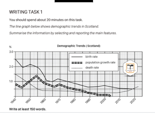
The image shows a line graph detailing demographic trends in Scotland from 1940 to 2020 with three indicators: birth rate, population growth rate, and death rate, measured in percentages. In 1940, birth rate is approximately 2.7%, population growth rate is around 0.5%, and death rate is near 1.5%. In 1950, birth rate peaks at 3%, population growth rate slightly over 1%, and death rate approximately 1%. By 1960, birth rate is around 2.4%, population growth rate about 0.8%, and death rate around 0.9%. In 1970, birth rate drops to about 1.9%, population growth rate to approximately 0.4%, and death rate at 0.8%. By 1980, birth rate decreases to around 1.6%, population growth rate slightly over 0%, and death rate under 0.7%. In 1990, birth rate is about 1.5%, population growth rate approaches 0%, and death rate about 0.6%. In 2000, birth rate is roughly 1.4%, population growth rate slightly negative, and death rate about 0.55%. By 2010, birth rate is near 1.3%, population growth rate slightly above 0%, and death rate under 0.5%. In 2020, birth rate is around 1.3%, population growth rate approximately 0.2%, and death rate just above 0.4%.
Given the complexity of the image, the above description may not be entirely accurate.
Note: Both the topic and the answer were created by one of our users.

The line graph elucidates how the numbers for three different categories, namely birth rate, population growth rate and death rate altered in Scotland from 1940 to 2020.

Overall, it is immediately apparent that while the figures for both birth rate and population growth rate experienced and downward trend and the death rate illustrated flunctuation. It is also noteworthy that birth rate remained the dominant category throughout the entire duration.

Looking at the details, the proportion of birth rate commenced at 2.5% in 1940, which was significantly higher than that of population growth rate, which stood at 1.8%. Following this, both categories witnessed a steady decreased. By 2020, the figure for birth rate dropped to 0.5%, closely followed by population growth rate, which reached 0%

In stark contrast, a complemetly different pattern was observed in the data for death rate. Unlike the other two categories, its numbers pick up 1.5% in the initiat year and flunctuated, at the end of the period, making it the significant indicator

Word Count: 166

Answers On The Same Topic:

The line graph below shows demographic trends in Scotland. Summarise the information by selecting and reporting the main features.

The supplied line graph illustrates the birth rate, population growth rate, and death rate in Scotland between 1940 and 2020. All three figures are measured in percentages. From an overall perspective, it is evident that the birth rate was consistently higher than the other two indicators, although it declined gradually over time. Meanwhile, both the […]

The line graph below shows demographic trends in Scotland. Summarise the information by selecting and reporting the main features.

The graph illustrates demographic patterns of Scotland from 1940 to 2020. Overall, the birth pace was the highest for most of the time while the death figure and the population rate were changing ranks. However, the mortality rate was unique in that it experienced a gradual regrowth after declining. The pace of population expansion remained […]

The line graph below shows demographic trends in Scotland. Summarise the information by selecting and reporting the main features.

The line graph illustrates the changes in Demographic trends in Scotland over the period from 1940 to 2020. Overall, it is clear that birth rate, while death rate underwent a comparately significant change. Overall, the data shows a clear downward trend across the period. Notably, death rate experienced a steep decline, whereas birth rate followed […]

The line graph below shows demographic trends in Scotland. Summarise the information by selecting and reporting the main features.

The given chart illustrates demographic trends such as birth rate, population growth rate and death rate in Scotland over the eighty-year period between 1940 and 2020. Overall, the figures share the same downward trend with some fluctuation. It is depicted that the birth rate has the highest percentage of all three throughout the eighty-year period. […]

See All

Other Topics:

The graph below gives information about the price of bananas in four countries between 1984 and 2004. Summarize the information by selecting and reporting the main features, and make comparisons where relevant.

The provided line chark depicts statistics about the costs of bananas in four distinct countries: Japan, France, Germany and USA, in the period of 20 years between 1994 and 2004. A glance at the graph reveals that the highest price of bananas illustreted by Japan with a significant peak. However, USA has the lowest. Getting […]

The line graph below shows the number of international tourists visiting three different countries (France, the USA, and Australia) from 1990 to 2020. Summarize the information by selecting and reporting the main features, and make comparisons where relevant.

The given paragraph differenriate the numbers of international tourists visiting three different countries France, the USA, and Australia over 30 years from 1990 to 2020. The data can be compared across different categories and time periods. Overall; France has noticeable change over other two countries because the number of tourists had 40 million at the […]

The following graph shows the population growth in developing countries and industrialised countries, with a prediction to 2050. Summarise the information by selecting and reporting the main features, and make comparisons where relevant. Write at least 150 words.

The graph illustrates/compares data about of population growth in developing and industrialised countries between 1750 and 2050. The population of developing countries rises, especially after 1950, while the population of industrialised countries grows much more slowly. Units are measured in billions of people. Between 1750 and 1900, the population of developing countries slowly but gradually […]

The graph below shows UK air pollutants in millions of tonnes, from three different sources, between 1990 and 2005.

The line graph illustrates the amount of air pollutants in the United Kingdom, measured in millions of tonnes, produced by three different sources Industry, Transport, and Households as well as the Total, over a fifteen-year period from 1990 to 2005. Overall, the total level of air pollutants declined significantly over the period. While emissions from […]

Percentage of working adults in Australia using text messaging to communicate in work related situations.

The line graph displays percentage of working adults in Australia using text messaging to interact in job related situations from 2002 to 2010 Overall, average percentages of adults using text messages in work-related scenarios showed steady surge among all age groups dating from 2002 to 2010. Younger generation generally recorded higher figures than older adults,although […]

Percentage of working adults in Australia using text messaging to communicate in work related situations.

The diagramm illustrates proportion of working citizens using text messaging to communicate in work related situations in Australia from 2002 to 2010. Overall, youger generations between 19 and 24 years old kept higest position through the period, while the oldest workers between 56 and 65 had the lowest percentage. Every generation experienced a steady growth. […]

See All
We have detected unusual activity on your device.
Please verify your identity to continue.
Note: This verification step won't sign you in. If you have a premium account, please log in to access the service as usual.
Google/Gmail Verification
Or verify using Email/Code
We've sent a verification code to:
youremail@gmail.com (Not your email?)
Enter it below to complete the verification process.
Ensure your email address is correct, your inbox is not full, and you check your spam folder. If no email arrives, consider using an alternative email.
You will need a Premium plan to perform your action!
Note: If you already have a premium account, please log in to access our services as usual.

Plans & Pricing

Our mission is to make quality education accessible for everyone.
However, to keep our hardworking team running and this service alive, we genuinely need your support!
By opting for a premium plan, not only do you sustain us in achieving the mission, but you also unlock advanced features to enrich your learning experience.

Free

For learners who aren't pressed for time

What's included on Free
100+ Cambridge IELTS Tests
Instant IELTS Writing Task 1 & 2 Evaluation (2 times/month)
Instant IELTS Speaking Part 1, 2, & 3 Evaluation (5 times/month)
Instant IELTS Writing Task 1 & 2 Essay Generator (2 times/month)
500+ Dictation & Shadowing Exercises
100+ Pronunciation Exercises
Flashcards
Other Advanced Tools

Premium

For those serious about advancing their English proficiency, and for IELTS candidates aspiring to boost their band score by 1-2 points (especially in writing & speaking) in just 30 days or less

What's included on Premium
Save Your IELTS Test Progress
Unlock All Courses & IELTS Tests
Unlimited AI Conversations
Unlimited AI Writing Enhancement Exercises
Unlimited IELTS Writing Task 1 & 2 Evaluation
Unlimited IELTS Speaking Part 1, 2, & 3 Evaluation
Checked Answers Will Not Be Published
Unlimited IELTS Writing Task 1 & 2 Essay Generator
Unlimited IELTS Speaking Part 1, 2, & 3 Sample Generator
Unlimited Usage Of Advanced Tools
Priority Support within 24h (12-month plan only)

Due to the nature of our service and the provided free trials, payments are non-refundable.
Nếu bạn là người Việt Nam và không có hoặc không muốn trả bằng credit/debit cards, bạn có thể thanh toán bằng phương thức chuyển khoản:


Chọn gói:
419,000₫ 277,000 ₫ cho gói 1 tháng (chỉ 9,233₫/ngày)
1,239,000₫ 597,000 ₫ cho gói 3 tháng (chỉ 6,633₫/ngày)
2,469,000₫ 1,027,000 ₫ cho gói 6 tháng (chỉ 5,706₫/ngày)
4,929,000₫ 1,417,000 ₫ cho gói 12 tháng (chỉ 3,936₫/ngày)


Sau khi chuyển khoản, vui lòng đợi trình duyệt tự động điều hướng bạn trở lại Engnovate và bạn sẽ ngay lập tức nhận được mã kích hoạt tài khoản premium.
Nếu có lỗi xảy ra, bạn có thể liên hệ với team thông qua một trong các phương thức: email đến helloengnovate@gmail.com hoặc nhắn tin qua facebook.com/engnovate.
Vì toàn bộ công cụ trên website đều có thể sử dụng thử miễn phí, Engnovate không hỗ trợ hoàn tiền.