🔥 Today Only: Save 30% on Premium — Offer Ends Soon! - Upgrade Now!
Multiple Graphs

Band 6+: Write a report for a university lecturer describing the information in the graphs below. You should write at least 150 words.

Image for topic: Write a report for a university lecturer describing the information in the graphs below. You should write at least 150 words.
Our system will evaluate the answer based on this AI-generated description.
The image displays two bar graphs. The first bar graph, titled "Deaths in Someland 1990 (millions)," details deaths from various diseases: AIDS (approximately 0.5 million), Leprosy (approximately 0.1 million), Tropical Diseases (approximatey 0.3 million), Diarrhoea (approximatey 1.7 million), Malaria (approximatey 1.5 million), and TB (approximately 0.8 million). The second bar graph, titled "Medical research funding in Someland (millions)," shows the funding allocations for the same diseases: AIDS (approximatey 180 million), Leprosy (approximatey 20 million), Tropical Diseases (approximatey 120 million), Diarrhoea (approximatey 140 million), Malaria (approximatey 160 million), and TB (approximatey 100 million). Both graphs have a vertical measurement scale, and the diseases are listed vertically on the y-axis with corresponding horizontal bars extending to the right indicating quantitative values.
Given the complexity of the image, the above description may not be entirely accurate.
Note: Both the topic and the answer were created by one of our users.

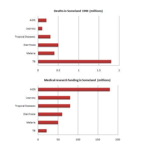
The graphs illustrate the number of deaths in Someland in 1990 due to six different diseases and the amount of funds allocated for research into each of those diseases.

Overall, the quantity of money provided for the study did not correspond with the disease’s severity as measured by the number of fatalities. While TB was the disease that caused the greatest number of deaths, the largest amount of funding was given to research into AIDS

In 1990, approximately 0.1 million individuals died from leprosy, 0.2 million from AIDS, and 0.3 million from tropical disease. This year, there were 0.5 million deaths because of diarrhea, 0.4 million deaths from malaria, and 1.8 million deaths from TB

The amount of funding provided for each disease is so different. TB has the highest quantity of deaths but it is only receives about 25 million dollars, the lowest of any disease. Research on leprosy and tropical diseases has yielded 75 million results this year. Diarrhoea was spent 60 million and 50 million dollars on malaria research. Approximately 175 million dollars was prioritized for AIDS, the highest among any disease

Word Count: 185

Answers On The Same Topic:

Write a report for a university lecturer describing the information in the graphs below. You should write at least 150 words.

The first bar chart given compares the medical research funding contributed to six disparate types of diseases during 1990 in Someland, while the second one shows the number of deaths resulting from each type. Overall, it can be seen that the funding allocation negatively correlated with their death tolls. While a relatively low mortality rate […]

Write a report for a university lecturer describing the information in the graphs below. You should write at least 150 words.

The two graphs above provide information about some of the possible causes of death in 1990 Someland and the amount of funding (in millions ) that was invested in medical research for these diseases. As we analyze the first graph ,which illustrates the different types of diseases and the number of deaths they cause, we […]

Write a report for a university lecturer describing the information in the graphs below. You should write at least 150 words.

The graphs illustrate the number of deaths in Someland in 1990 due to six different diseases and the amount of funding allocated for research into each of those of diseases. Overall, the quantity of money provided for the study did not correspond with the disease’s severity as measured by the number of fatalities. While TB […]

Write a report for a university lecturer describing the information in the graphs below. You should write at least 150 words.

The above bar graphs illustrate the number of deaths in Someland (per million) while correlating it to the medical research funding (in millions) in 1990. On an average, we observe that the amount of funds allocated for various diseases is inversely proportional to the number of deaths in the population taking place. For example, maximum […]

See All

Other Topics:

The charts below illustrate which of 3 fast-food restaurants were the most preferred amongst teenagers in Vietnam and Indonesia in 2017 and predictions for 2027.

The pie charts compare adolescents’ preferences for three fast-food restaurants in Vietnam and Indonesia in 2017, together with projected figures for 2027. Overall, Burger King was the most popular choice among Vietnamese adolescents in 2017, but McDonald’s is projected to overtake it by 2027. In Indonesia, McDonald’s was the leading choice in 2017 and is […]

The charts below illustrate which of 3 fast-food restaurants were the most preferred amongst teenagers in Vietnam and Indonesia in 2017 and predictions for 2027.

The pie charts depict adolescents’ preferences for 3 fast-food restaurants in Vietnam and Indonesia in 2017 and the projections for 2027. Overall, Burger King was the most popular restaurant in Vietnam in 2017, while McDonald’s is predicted to be the most popular in 2027. In Indonesia, McDonald’s was the favourite in 2017, and although its […]

The illustration shows the floor schema of a social library 20 years ago and how we can saw it now.How the library has changed in this period ?

The diagram illustrates changes is layout of a public library over a 20 years period. Overall, the building has been considerably modernised by several facilities replaced into areas for technology and community activities. The most noticeable changes are removing of a reading room and enquiry desk, as well as renewing them to a computer room […]

The charts below show the average percentages in typical meals of three nutrients.All of which may be unhealthy if eaten too much

The rendered pie charts shows the proportions of different meals in a day. Catagorized into three types of nutrients. It will be unhealthy if eaten in excess. Overall, breakfast figures is quite stable in each type of nutrients, while snack proportions fluctuates wildly. Added sugar in snacks and dinner is highest of all and least […]

The pie charts below show the percentage of students at one adult education centre taking various courses offered in 1985 and this year. Summarise the information by selecting and reporting the main features, and make comparisons where relevant.

The pie charts below illustrate the percentage of students at one adult education centre taking various courses offered in 1985 and this year.Overall, some couorses were cancelled and added during the given period. In addition, while modern language classes constituted the largest proportion of all courses in 1985, IT is the most preferred course in […]

The pie charts below illustrate the most popular sports in french secondary school in three different years.

The given pie chart gives the information about the most popular sports in French secondary schools in three different years. Overall, swimming was the dominant sport in all years, demonstrating a steady changes between years, in contrast while swimming and basketball maintained the most popular sport in French secondary school for two years tennis attracted […]

See All
We have detected unusual activity on your device.
Please verify your identity to continue.
Note: This verification step won't sign you in. If you have a premium account, please log in to access the service as usual.
Google/Gmail Verification
Or verify using Email/Code
We've sent a verification code to:
youremail@gmail.com (Not your email?)
Enter it below to complete the verification process.
Ensure your email address is correct, your inbox is not full, and you check your spam folder. If no email arrives, consider using an alternative email.
You will need a Premium plan to perform your action!
Note: If you already have a premium account, please log in to access our services as usual.

Plans & Pricing

Our mission is to make quality education accessible for everyone.
However, to keep our hardworking team running and this service alive, we genuinely need your support!
By opting for a premium plan, not only do you sustain us in achieving the mission, but you also unlock advanced features to enrich your learning experience.

Free

For learners who aren't pressed for time

What's included on Free
100+ Cambridge IELTS Tests
Instant IELTS Writing Task 1 & 2 Evaluation (2 times/month)
Instant IELTS Speaking Part 1, 2, & 3 Evaluation (2 times/month)
Instant IELTS Writing Task 1 & 2 Essay Generator (2 times/month)
500+ Dictation & Shadowing Exercises
100+ Pronunciation Exercises
Flashcards
Other Advanced Tools

Premium

For those serious about advancing their English proficiency, and for IELTS candidates aspiring to boost their band score by 1-2 points (especially in writing & speaking) in just 30 days or less

What's included on Premium
Save Your IELTS Test Progress & Analyze Mistakes By Question Type
Save Your Own Flashcard Sets & Use Them On Any Device
Unlock All Courses, IELTS Tests, Section & Part Practice
Unlimited AI Conversations
Unlimited AI Writing Enhancement Exercises
Unlimited IELTS Writing Task 1 & 2 Evaluation
Unlimited IELTS Speaking Part 1, 2, & 3 Evaluation
Checked Answers Will Not Be Published
Unlimited IELTS Writing Task 1 & 2 Essay Generator
Unlimited IELTS Speaking Part 1, 2, & 3 Sample Generator
Unlimited Usage Of Advanced Tools & AI Features
Priority Support within 24h (12-month plan only)

Due to the nature of our service and the provided free trials, payments are non-refundable.