🔥 Today Only: Save 30% on Premium — Offer Ends Soon! - Upgrade Now!
Table

Band 7+: Take a look at the graphic and complete the task. The table presents information about university-level academic staff in one country. Summarise the information by selecting and reporting the main features, and make comparisons where relevant. You should spend about 20 minutes on this task.

Image for topic: Take a look at the graphic and complete the task. The table presents information about university-level academic staff in one country. Summarise the information by selecting and reporting the main features, and make comparisons where relevant. You should spend about 20 minutes on this task.
Our system will evaluate the answer based on this AI-generated description.
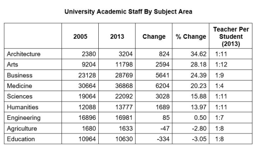
The image shows a table titled "University Academic Staff By Subject Area" with columns for 2005, 2013, Change, % Change, and Teacher Per Student (2013). Architecture had 2380 staff in 2005, 3204 in 2013, a change of 824, % change of 34.62, and teacher per student ratio of 1:11. Arts had 9204 staff in 2005, 11798 in 2013, a change of 2594, % change of 28.18, and a ratio of 1:12. Business had 23128 staff in 2005, 28769 in 2013, a change of 5641, % change of 24.39, and a ratio of 1:9. Medicine had 30664 staff in 2005, 36868 in 2013, a change of 6204, % change of 20.23, and a ratio of 1:4. Sciences had 19064 staff in 2005, 22092 in 2013, a change of 3028, % change of 15.88, and a ratio of 1:11. Humanities had 12088 staff in 2005, 13777 in 2013, a change of 1689, % change of 13.97, and a ratio of 1:11. Engineering had 16896 staff in 2005, 16981 in 2013, a change of 85, % change of 0.50, and a ratio of 1:7. Agriculture had 1680 staff in 2005, 1633 in 2013, a change of -47, % change of -2.80, and a ratio of 1:8. Education had 10964 staff in 2005, 10630 in 2013, a change of -334, % change of -3.05, and a ratio of 1:8.
Given the complexity of the image, the above description may not be entirely accurate.
Note: Both the topic and the answer were created by one of our users.

The table demostrates the data on teaching staff in various subjects in the UK universities.

Overall, it can be seen that a proportion of teachers increased in all departments, with the exception of Agriculture and Education, which experienced a decline. While Medicine and Business hired the largest number of teachers, the growth percentage was more significant in Art and Architecture faculties.

According to the table, Medicine department employed 36868 teachers in 2013, having the highest change. Business department also hired a high proporton of teachers in 2013 (28769 ), whereas Agriculture department saw an opposite trend , dismissing 47 teachers and becoming the least staffed faculty. Similarly, there was a dramtic figure of dismissals in the Education department (-337).

As for the percentage growth, Architecture department led in this category (34.62%). Arts faculty accounted for 28.18% , compared to Agriculture and Education with a notable fall with -2.80% for the former and -3.05% for the latter. Regarding other departments, their portion rose moderately in a range from 13.97% to 24.39% , while the Engineering faculty grew by a mere 0.50%.

Word Count: 180

Answers On The Same Topic:

Take a look at the graphic and complete the task. The table presents information about university-level academic staff in one country. Summarise the information by selecting and reporting the main features, and make comparisons where relevant. You should spend about 20 minutes on this task.

The table illustrates the number of university graduates across several academic disciplines over a given period. Overall, graduate figures rose consistently in most fields, with particularly strong growth in architecture and the arts. The data indicate a general expansion in the supply of qualified specialists across all sectors. In 2005, graduate numbers were at their […]

Take a look at the graphic and complete the task. The table presents information about university-level academic staff in one country. Summarise the information by selecting and reporting the main features, and make comparisons where relevant. You should spend about 20 minutes on this task.

The table displays data about people with university degree in this specific area. Overall,specialist numbers are moderatlg improving in this area,especially architects and art students ara rapidly increasing and depand on that specific type of specialists is on a rise. Its worth noticing,that in 2005 numbers of students enrolled in universities was on its highest […]

Take a look at the graphic and complete the task. The table presents information about university-level academic staff in one country. Summarise the information by selecting and reporting the main features, and make comparisons where relevant. You should spend about 20 minutes on this task.

This table illustrates the change of university-academic staff in a country in between 2005 and 2013 based on subjects. Overall, the medicine subject had the largest number of staff, there were more than 30,000 and almost 37,000 in 2005 and 2013 respectively. Meanwhile, the academic staff in the Agriculture area was the lowest and experienced […]

Take a look at the graphic and complete the task. The table presents information about university-level academic staff in one country. Summarise the information by selecting and reporting the main features, and make comparisons where relevant. You should spend about 20 minutes on this task.

The given table depicts the university academic staff by subject area throughout the years of 2005 and 2013 while also detailing the change in numbers and percentage and teachers per student in 2013. In 2005 the academic staff for most subjects were above 10000 but a few such as arts, architecture and agriculture stood at […]

Take a look at the graphic and complete the task. The table presents information about university-level academic staff in one country. Summarise the information by selecting and reporting the main features, and make comparisons where relevant. You should spend about 20 minutes on this task.

The table illustrates information about the number of academic staff working at the university-level in a particular country. In both years, the total number of medicine subject remained the same, but there was a significant difference between the years 2005 and 2013. In 2005, the share of medicine staff was 20,23%. The ratio of architectuire, […]

See All

Other Topics:

the given chart shows the information about the medical care in three countries of Europe. Choose the main feature to report

The table compares the number of physicians, hospital beds, and average stay in hospitals in Austria, France, and Sweden between 1980 and 2000. It is clear that there was a significant increase in the number of hospital beds and physicians in Austria, while France experienced a notable decline in the number of physicians and average […]

The two tables below show the percentage of households with three different types of internet connections and the average number of hours spent online per household in Country B in 2015 and 2025.

The two tables illustrate the number of households using three different types of internet connection, and the average hours spent online on each connection type per week from 2015 to 2025 in country B. Overall, both tables show that the majority of households use fiber optic as their internet provider. Followed closely by cable, with […]

The table below gives information about the percentage of land covered by forest in various countries in 1990 and 2005 with estimated figures for 2015. Summarize the information by selecting and reporting the main features, and make comparisons where relevant.

The given table compares the percentage of forest coverage across four different countries in 2010, 2025 and a projected figure for 2035. As can be observed, Eryndale took the lead in the proportion of land covered by forest among four nations, despite the marginal decrease over the period, whereas that of Caeloria showed an upward […]

The bar chart below shows the percentage of households in four countries that own three types of electronic devices.

The table shows the percentages of households in three different countries in Europe who owens three type of electronic devices. Overall, smartphones are the most common devices using families, which the UK recorded the highest proportion for smartphones and for the other devices as well, while Spain recorded the lowest percentages. Smartphones were the most […]

The table below shows the number of people who used five different facilities at a public library in 2000, 2005 and 2010. Summarise the information by selecting and reporting the main features, and make comparisons where relevant.

The table provides information about the number of people who used five different facilities at public library in a town, spanning a decade from 2000 to 2010. Overall, it’s clear that lending books was the most popular category at the start of the period. However, computer internet access recorded the highest figure at the end […]

The table shows the obesity rate in one country over a period of time.

The line graph illustrates the obesity rate in one country between 1971 and 2005. Overall, the figure of obesity was fluctuated in 4 different groups. It’s clear the percentage of overweight 45 – 65 years was elevated while people who younger 29 was lower. The number of overweight people who younger 29 didn’t change between […]

See All
We have detected unusual activity on your device.
Please verify your identity to continue.
Note: This verification step won't sign you in. If you have a premium account, please log in to access the service as usual.
Google/Gmail Verification
Or verify using Email/Code
We've sent a verification code to:
youremail@gmail.com (Not your email?)
Enter it below to complete the verification process.
Ensure your email address is correct, your inbox is not full, and you check your spam folder. If no email arrives, consider using an alternative email.
You will need a Premium plan to perform your action!
Note: If you already have a premium account, please log in to access our services as usual.

Plans & Pricing

Our mission is to make quality education accessible for everyone.
However, to keep our hardworking team running and this service alive, we genuinely need your support!
By opting for a premium plan, not only do you sustain us in achieving the mission, but you also unlock advanced features to enrich your learning experience.

Free

For learners who aren't pressed for time

What's included on Free
100+ Cambridge IELTS Tests
Instant IELTS Writing Task 1 & 2 Evaluation (2 times/month)
Instant IELTS Speaking Part 1, 2, & 3 Evaluation (2 times/month)
Instant IELTS Writing Task 1 & 2 Essay Generator (2 times/month)
500+ Dictation & Shadowing Exercises
100+ Pronunciation Exercises
Flashcards
Other Advanced Tools

Premium

For those serious about advancing their English proficiency, and for IELTS candidates aspiring to boost their band score by 1-2 points (especially in writing & speaking) in just 30 days or less

What's included on Premium
Save Your IELTS Test Progress & Analyze Mistakes By Question Type
Save Your Own Flashcard Sets & Use Them On Any Device
Unlock All Courses, IELTS Tests, Section & Part Practice
Unlimited AI Conversations
Unlimited AI Writing Enhancement Exercises
Unlimited IELTS Writing Task 1 & 2 Evaluation
Unlimited IELTS Speaking Part 1, 2, & 3 Evaluation
Checked Answers Will Not Be Published
Unlimited IELTS Writing Task 1 & 2 Essay Generator
Unlimited IELTS Speaking Part 1, 2, & 3 Sample Generator
Unlimited Usage Of Advanced Tools & AI Features
Priority Support within 24h (12-month plan only)

Due to the nature of our service and the provided free trials, payments are non-refundable.
Nếu bạn là người Việt Nam và không có hoặc không muốn trả bằng credit/debit cards, bạn có thể thanh toán bằng phương thức chuyển khoản:


Chọn gói:
419,000₫ 277,000 ₫ cho gói 1 tháng (chỉ 9,233₫/ngày)
1,239,000₫ 597,000 ₫ cho gói 3 tháng (chỉ 6,633₫/ngày)
2,469,000₫ 1,027,000 ₫ cho gói 6 tháng (chỉ 5,706₫/ngày)
4,929,000₫ 1,417,000 ₫ cho gói 12 tháng (chỉ 3,936₫/ngày)


Sau khi chuyển khoản, vui lòng đợi trình duyệt tự động điều hướng bạn trở lại Engnovate và bạn sẽ ngay lập tức nhận được mã kích hoạt tài khoản premium.
Nếu có lỗi xảy ra, bạn có thể liên hệ với team thông qua một trong các phương thức: email đến helloengnovate@gmail.com hoặc nhắn tin qua facebook.com/engnovate.
Vì toàn bộ công cụ trên website đều có thể sử dụng thử miễn phí, Engnovate không hỗ trợ hoàn tiền.