🔥 Today Only: Save 30% on Premium — Offer Ends Soon! - Upgrade Now!
Line Graph

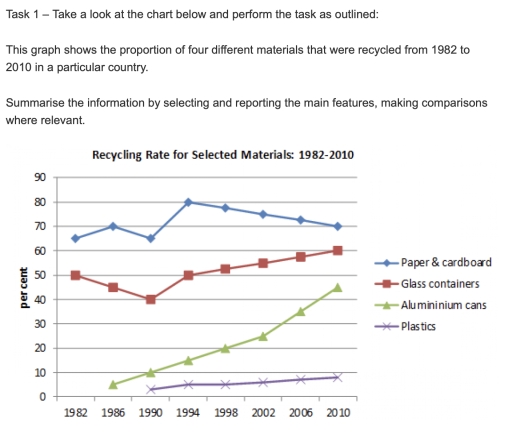
Band 5+: Task 1 – Take a look at the chart below and perform the task as outlined: This graph shows the proportion of four different materials that were recycled from 1982 to 2010 in a particular country. Summarise the information by selecting and reporting the main features, making comparisons where relevant.

Image for topic: Task 1 – Take a look at the chart below and perform the task as outlined: This graph shows the proportion of four different materials that were recycled from 1982 to 2010 in a particular country. Summarise the information by selecting and reporting the main features, making comparisons where relevant.
Our system will evaluate the answer based on this AI-generated description.
The image displays a line graph of recycling rates for selected materials from 1982-2010. Paper & cardboard recycling began at nearly 70% in 1982, dipping to 65% in 1986, rising to 75% in 1990, a peak near 80% in 1994-1998, slight dip to just below 80% in 2002, and slowly declining to nearly 70% by 2010. Glass containers started at approximately 50% in 1982, a slight rise to 55% in 1986, decreasing to near 50% in 1990, rising to 60% in 1994, maintaining until 2002, and increasing to just above 60% by 2010. Aluminum cans began near 5% in 1982, rising sharply to 45% in 1986, continual rise to 65% in 1990, fluctuation between 65-70% until 2002, and a steady increase to 75% by 2010. Plastics started just above 0% in 1982, slight increase to approximately 7% in 1986, gradual rise to just below 15% in 1990, steady increase to just above 20% in 1994, reaching nearly 40% in 2002, and a sharper rise to just below 70% by 2010.
Given the complexity of the image, the above description may not be entirely accurate.
Note: Both the topic and the answer were created by one of our users.

The provided graph displays the recycling amount of four diverse materials in the time period from 1982 to 2010 in unknown country. Overall, paper and cardboard were the most popular things to recycle, however, across all the other materials, only they experienced a downfall.

Paper and cardboard remained at the top through the illustrated 28 years, nevertheless, their recycling rate flactuated the most. Starting a 65% in 1982, the amount of the recycled paper went upwards untill 1986, reaching 70%, collapsing and touching its highest point in 1994 with 80%, only to take a nosedive and slip to 70% in 2010. Similar trend was seen with glass containers, where from a half of the recycling rate they fell to 40% in 1990, but climbed to 60% in 2010.

Conversely, the recycling rate of aluminium cans and plastics increased along the way. Recycling of the cans began in 1986 with 5% and imidiatly skyrocketed, leaping to 25% in 2002 and skyrocketing to its apex of 45% in 2010. The recycling of the plastics was the least common one, as it started in 1990 with approximately 2% and almost reached 5% in 2010, notwithstanding, in never decreased.

Word Count: 195

Answers On The Same Topic:

Task 1 – Take a look at the chart below and perform the task as outlined: This graph shows the proportion of four different materials that were recycled from 1982 to 2010 in a particular country. Summarise the information by selecting and reporting the main features, making comparisons where relevant.

The chart shows the recycling rate for that selected material from 1982 to 2010 in that a particular country. The chart explains the changes of that specific material as some started to decrease at the start and as it continues, it they start to increase gradually proportional to the increasing years. During the data collection, […]

Task 1 – Take a look at the chart below and perform the task as outlined: This graph shows the proportion of four different materials that were recycled from 1982 to 2010 in a particular country. Summarise the information by selecting and reporting the main features, making comparisons where relevant.

The graph shows the proportion of four dipperent materials that were recycled from 1982702010 per percent in a particular country Overall, trends of the four different materians not addicted from by ourselves. Each of them have different figures of growth or drop graphs of plastic and aluminium cans had the most stable figures between 1986-2010 […]

Task 1 – Take a look at the chart below and perform the task as outlined: This graph shows the proportion of four different materials that were recycled from 1982 to 2010 in a particular country. Summarise the information by selecting and reporting the main features, making comparisons where relevant.

The line graph illustrates the percentage of the recycling rate for four different materials between 1982 to 2010 in specific country. Overall, The percentage of the recycling rate was increased for most of materials, with noticeable fluctuations for Paper cardboard and Glass containers and rapidly increase for Aluminium cans. In detail, There was a rapid […]

Task 1 – Take a look at the chart below and perform the task as outlined: This graph shows the proportion of four different materials that were recycled from 1982 to 2010 in a particular country. Summarise the information by selecting and reporting the main features, making comparisons where relevant.

This graph displays the ratio of various reprocceced materials from one country between 1982 and 2010. Overall, chart shows growth in recycling rates in glass, aluminium and plastic materials. End of 1990s has mutual increase that followed up in 2000s. However paper and cardboard is only one that has visible peak in period of 1990 […]

Task 1 – Take a look at the chart below and perform the task as outlined: This graph shows the proportion of four different materials that were recycled from 1982 to 2010 in a particular country. Summarise the information by selecting and reporting the main features, making comparisons where relevant.

The line graph illustrates the percentage of recycled waste consisting of paper & cardboard, glass containers, aluminium cans, and plastics during the period 1982-2020. Overall, the paper-based materials consistently led the figures among other categories, followed by the glass materials. Aluminium cans climbed steadily, while the plastic materials showed an unnoticeable rise and remained the […]

See All

Other Topics:

The graph below shows the price of different kinds of bread, in dollars, from 2001 to 2005. Summarise the information by selecting and reporting the main features and make comparisons where relevant.

The line chart illustrates the prices of four different kinds of bread in dollars between 2001 and 2005. Overall, it can be observed that the prices of brown and white bread increased over the period, whereas wholegrain bread fluctuated considerably. In addition, rye was the cheapest variety. In 2001, wholegrain bread stood at $0.80 before […]

The graph below shows the price of different kinds of bread, in dollars, from 2001 to 2005. Summarise the information by selecting and reporting the main features and make comparisons where relevant.

The line chart illustrates the price of different kinds of bread, in dollars, between 2001 and 2005. Overall, it can be observed that the prices of brown and white bread increased over the period, while wholegrain bread fluctuated considerably. In addition, rye was the cheapest variety. In 2001, wholegrain bread stood at 0.8 dollar before […]

The graph below gives information about the main purposes of overseas residents' visit to China between 2000 and 2016. Summarise the information by selecting and reporting the main features, and make comparisons where relevant.

The given line graph indicates the main purposes of overseas residents’ explore to china between 2000 to 2016. Overall, it is observable from given line graph that, holiday visits showed highest number, where as inverse could be seen in miscellaneous. To begin with, In 2000, Holiday and visiting friends or relatives were at 9000 and […]

Number of people travelling to work by walking, cycling, and driving in the period of 2012 to 2019

this graph illustartes us number of people preferences to go to their workplace by walking,cycling or driving between 2012-2019 Overall,Over the years,transformation of all choices are noticed.Driving sharply declined from 2012 to 2019,In contrast,people choice for walking and cycling are positvely increased. In 2012,Driving is dominated in this graph which was 900,Hovewer gradually it was […]

The graph below shows the average number of UK commuters travelling each day by car, bus or train between 1970 and 2010. Summarise the information by selecting and reporting the main features, and make comparisons where relevant.

The line graph shows changes in the average number of UK commuters travelling by car, bus or train on a daily basis in ten-year intervals, from 1970 and 2010. Overall, the number of people who travelling by car showed highest figures over the period, while the reverse was true for people who commuting by bus […]

The line graph shows the number of visitors to three different museums in a particular city between 2000 and 2015. Summarise the information by selecting and reporting the main features, and make comparisons where relevant.

The line graph illustrates the number of people visiting three different museums in a particular city from 2000 to 2015 Overall, museum A was the most popular, dominating each year and rose consistently. The number of visitors to museums A and B increased, but museum C fluctuated before reaching 6,000. In 2000, museum A was […]

See All
We have detected unusual activity on your device.
Please verify your identity to continue.
Note: This verification step won't sign you in. If you have a premium account, please log in to access the service as usual.
Google/Gmail Verification
Or verify using Email/Code
We've sent a verification code to:
youremail@gmail.com (Not your email?)
Enter it below to complete the verification process.
Ensure your email address is correct, your inbox is not full, and you check your spam folder. If no email arrives, consider using an alternative email.
You will need a Premium plan to perform your action!
Note: If you already have a premium account, please log in to access our services as usual.

Plans & Pricing

Our mission is to make quality education accessible for everyone.
However, to keep our hardworking team running and this service alive, we genuinely need your support!
By opting for a premium plan, not only do you sustain us in achieving the mission, but you also unlock advanced features to enrich your learning experience.

Free

For learners who aren't pressed for time

What's included on Free
100+ Cambridge IELTS Tests
Instant IELTS Writing Task 1 & 2 Evaluation (2 times/month)
Instant IELTS Speaking Part 1, 2, & 3 Evaluation (2 times/month)
Instant IELTS Writing Task 1 & 2 Essay Generator (2 times/month)
500+ Dictation & Shadowing Exercises
100+ Pronunciation Exercises
Flashcards
Other Advanced Tools

Premium

For those serious about advancing their English proficiency, and for IELTS candidates aspiring to boost their band score by 1-2 points (especially in writing & speaking) in just 30 days or less

What's included on Premium
Save Your IELTS Test Progress & Analyze Mistakes By Question Type
Save Your Own Flashcard Sets & Use Them On Any Device
Unlock All Courses, IELTS Tests, Section & Part Practice
Unlimited AI Conversations
Unlimited AI Writing Enhancement Exercises
Unlimited IELTS Writing Task 1 & 2 Evaluation
Unlimited IELTS Speaking Part 1, 2, & 3 Evaluation
Checked Answers Will Not Be Published
Unlimited IELTS Writing Task 1 & 2 Essay Generator
Unlimited IELTS Speaking Part 1, 2, & 3 Sample Generator
Unlimited Usage Of Advanced Tools & AI Features
Priority Support within 24h (12-month plan only)

Due to the nature of our service and the provided free trials, payments are non-refundable.