🔥 Today Only: Save 30% on Premium — Offer Ends Soon! - Upgrade Now!
Bar Chart

Band 5+: The bar chart below shows current health expenditure totals as percentages of GDP* for various European countries for the years 2002, 2007 and 2012. Summarise the information by selecting and reporting the main features, and make comparisons where relevant. You should write at least 150 words. * GDP (Gross Domestic Product) is the total value of goods that are made and services that are provided in a country.

Image for topic: The bar chart below shows current health expenditure totals as percentages of GDP* for various European countries for the years 2002, 2007 and 2012. Summarise the information by selecting and reporting the main features, and make comparisons where relevant. You should write at least 150 words. * GDP (Gross Domestic Product) is the total value of goods that are made and services that are provided in a country.
Our system will evaluate the answer based on this AI-generated description.
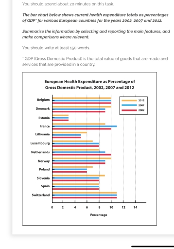
The image displays a bar chart with European Health Expenditure as a Percentage of GDP (Gross Domestic Product) for the years 2002, 2007, and 2012. Belgium's health expenditure percentages are 7.9 (2002), 10.3 (2007), and 10.7 (2012); Denmark's are 8.4 (2002), 9.5 (2007), and 10.4 (2012); Estonia's are 5.0 (2002), 5.7 (2007), and 6.2 (2012); France's are 10.1 (2002), 11.2 (2007), and 11.6 (2012); Lithuania's are 5.6 (2002), 6.2 (2007), and 6.8 (2012); Luxembourg's are 5.9 (2002), 7.1 (2007), and 7.2 (2012); Netherlands' are 8.7 (2002), 9.4 (2007), and 11.9 (2012); Norway's are 7.8 (2002), 8.2 (2007), and 9.3 (2012); Poland's are 4.3 (2002), 6.4 (2007), and 6.6 (2012); Slovenia's are 6.6 (2002), 7.7 (2007), and 8.4 (2012); Spain's are 6.7 (2002), 8.5 (2007), and 9.1 (2012); Switzerland's are 10.4 (2002), 10.7 (2007), and 11.4 (2012).
Given the complexity of the image, the above description may not be entirely accurate.
Note: Both the topic and the answer were created by one of our users.

The illustrated chart conveys health expenses as a percentage of European Gross Domestic Product during the years 2002, 2007, and 2012.

Most of the countries indicate that there is no overall increase, maintaining a relative percentile throughout the non-consecutive three-decade period,

with Switzerland, Belgium, Spain, and Estonia serving as models for this conclusion, as their expenses see no shift in trajectory for the three years recorded.

A large portion of the nations reported a pattern of increase within the three years, showing a one percent decrease from 2007 to 2012 of an estimated one percent, marking no change in the shift from 2002 to 2007.

A quarter of the countries, conversely, distinctly expressed an increase in their values throughout the years; for instance, Luxembourg, the Netherlands, and France see an overall upward shift in the expenditure percentile. All follow an increase throughout the three years, with France being the outlier, where it noted an upward increase in its health expenditure in 2007 by one percent.

Word Count: 165

Answers On The Same Topic:

The bar chart below shows current health expenditure totals as percentages of GDP* for various European countries for the years 2002, 2007 and 2012. Summarise the information by selecting and reporting the main features, and make comparisons where relevant. You should write at least 150 words. * GDP (Gross Domestic Product) is the total value of goods that are made and services that are provided in a country.

The bar chart compares the proportion of the European health consumption in GDP, starting from 2002 to 2012. Overall, most countries showed an upward in heath expenditure. Switzerland had the largest proportion whereas Estonia had the lowest. Belgium, Estonia, and Switzerland remained the same over year while other countries exhibited a change. In terms of […]

The bar chart below shows current health expenditure totals as percentages of GDP* for various European countries for the years 2002, 2007 and 2012. Summarise the information by selecting and reporting the main features, and make comparisons where relevant. You should write at least 150 words. * GDP (Gross Domestic Product) is the total value of goods that are made and services that are provided in a country.

The bar chart illustrates the proportion of GDP allocated to health expenditure in twelve European countries in 2002, 2007, and 2012. Overall, Switzerland consistently spent the largest percentage of GDP on health across all three years, while Estonia allocated the least. Although some countries maintained relatively stable expenditure levels over the years, others experienced notable […]

The bar chart below shows current health expenditure totals as percentages of GDP* for various European countries for the years 2002, 2007 and 2012. Summarise the information by selecting and reporting the main features, and make comparisons where relevant. You should write at least 150 words. * GDP (Gross Domestic Product) is the total value of goods that are made and services that are provided in a country.

The bar chart provides data on the health expenses in twelve european countries over 3 different years, five years apart, from 2002 to 2012. Overall, whathever the country, the percentage of health expenditure did’nt fluctuated much during the period. For instance, France seems to have the bigger increase over the decade, with 2% more spending. […]

The bar chart below shows current health expenditure totals as percentages of GDP* for various European countries for the years 2002, 2007 and 2012. Summarise the information by selecting and reporting the main features, and make comparisons where relevant. You should write at least 150 words. * GDP (Gross Domestic Product) is the total value of goods that are made and services that are provided in a country.

The provided bar chart delineates the total percentage of spending on healthcare by twelve European states in 2002,2007, and 2012 utilizing the Gross Domestic Product measure. Overall, Switzerland demonstrated the highest proportion over the period, while in contrast, the lowest belonged to Estonia. To begin with, as it was mentioned before, the Swiss dominated the […]

See All

Other Topics:

the chart below shows the age when hearing loss begins for males and females in the USA

The given bar chart illustrates the statistics of six different age groups when hearing loss begins for males and females in the USA. Measurments for genders are in percentages. Overall, for both genders hearing loss begins mostly between the age of 40 and 59, showcasing approximately 34% for former and 32% for latter. Additionally, in […]

The bar chart shows a percentage of young people in higher education in 2000, 2005 and 2010.

The provided chart illustrates the proportion of young people engaged in higher education during the years 2000, 2005, and 2010. Overall, the majority of young individuals were in Country D, while the least were in Country B. According to the chart, Country D had the highest percentage of individuals in higher education in 2010, at […]

The chart shows the minimum number of days spent per week on sport and exercise by young people in Canada. Write a report for a university lecturer describing the information shown below.

This bar chart illustrates the minimum time expenditure of Canadian youth on physical activities per week. Overall, boys were more active than girls throughout the week. Almost all boys were involved in a physical activity for at least 30 minutes once a week. However, very few boys and girls were involved in sports or any […]

IELTS Essay Task 1: Transport Preferences Among Young People The bar chart below shows transport preferences among young people in four countries in a single year. Summarise the information by selecting and reporting the main features, and make comparisons where relevant.

The given bar chart reveals data on transport preferences among young individuals annually in four countries. Overall, it is clear that using cars had substantially highest figures in all countries, whereas the information about number of people who consumed motorcycles and bicycles generally recorded the lowest proportions. Regarding the greatest percentage, cities such as The […]

line graph - amounts of shops opened and closed between 2011 and 2018

The given line graph illustrates the number of shops that opened and closed in a certain country between 2011 and 2018. Overall, the number of shop openings was generally higher than the number of shop closures. Both figures experienced a significant declining in the middle of the period, and they by the end of the […]

See All
We have detected unusual activity on your device.
Please verify your identity to continue.
Note: This verification step won't sign you in. If you have a premium account, please log in to access the service as usual.
Google/Gmail Verification
Or verify using Email/Code
We've sent a verification code to:
youremail@gmail.com (Not your email?)
Enter it below to complete the verification process.
Ensure your email address is correct, your inbox is not full, and you check your spam folder. If no email arrives, consider using an alternative email.
You will need a Premium plan to perform your action!
Note: If you already have a premium account, please log in to access our services as usual.

Plans & Pricing

Our mission is to make quality education accessible for everyone.
However, to keep our hardworking team running and this service alive, we genuinely need your support!
By opting for a premium plan, not only do you sustain us in achieving the mission, but you also unlock advanced features to enrich your learning experience.

Free

For learners who aren't pressed for time

What's included on Free
100+ Cambridge IELTS Tests
Instant IELTS Writing Task 1 & 2 Evaluation (2 times/month)
Instant IELTS Speaking Part 1, 2, & 3 Evaluation (5 times/month)
Instant IELTS Writing Task 1 & 2 Essay Generator (2 times/month)
500+ Dictation & Shadowing Exercises
100+ Pronunciation Exercises
Flashcards
Other Advanced Tools

Premium

For those serious about advancing their English proficiency, and for IELTS candidates aspiring to boost their band score by 1-2 points (especially in writing & speaking) in just 30 days or less

What's included on Premium
Save Your IELTS Test Progress
Unlock All Courses & IELTS Tests
Unlimited AI Conversations
Unlimited AI Writing Enhancement Exercises
Unlimited IELTS Writing Task 1 & 2 Evaluation
Unlimited IELTS Speaking Part 1, 2, & 3 Evaluation
Checked Answers Will Not Be Published
Unlimited IELTS Writing Task 1 & 2 Essay Generator
Unlimited IELTS Speaking Part 1, 2, & 3 Sample Generator
Unlimited Usage Of Advanced Tools
Priority Support within 24h (12-month plan only)

Due to the nature of our service and the provided free trials, payments are non-refundable.
Nếu bạn là người Việt Nam và không có hoặc không muốn trả bằng credit/debit cards, bạn có thể thanh toán bằng phương thức chuyển khoản:


Chọn gói:
419,000₫ 277,000 ₫ cho gói 1 tháng (chỉ 9,233₫/ngày)
1,239,000₫ 597,000 ₫ cho gói 3 tháng (chỉ 6,633₫/ngày)
2,469,000₫ 1,027,000 ₫ cho gói 6 tháng (chỉ 5,706₫/ngày)
4,929,000₫ 1,417,000 ₫ cho gói 12 tháng (chỉ 3,936₫/ngày)


Sau khi chuyển khoản, vui lòng đợi trình duyệt tự động điều hướng bạn trở lại Engnovate và bạn sẽ ngay lập tức nhận được mã kích hoạt tài khoản premium.
Nếu có lỗi xảy ra, bạn có thể liên hệ với team thông qua một trong các phương thức: email đến helloengnovate@gmail.com hoặc nhắn tin qua facebook.com/engnovate.
Vì toàn bộ công cụ trên website đều có thể sử dụng thử miễn phí, Engnovate không hỗ trợ hoàn tiền.