🔥 Today Only: Save 30% on Premium — Offer Ends Soon! - Upgrade Now!
Multiple Graphs

Band 6+: The bar chart below shows the estimated sales nationally of silver goods in '000s of units for two companies next year. The pie chart shows the projected market share of the two companies in silver goods at the end of next year. Silver goods refer to CD players, Walkmans etc. Write a report for a university lecturer describing the information shown below. You should write at least 150 words.

Image for topic: The bar chart below shows the estimated sales nationally of silver goods in '000s of units for two companies next year. The pie chart shows the projected market share of the two companies in silver goods at the end of next year. Silver goods refer to CD players, Walkmans etc. Write a report for a university lecturer describing the information shown below. You should write at least 150 words.
Our system will evaluate the answer based on this AI-generated description.
The image displays two segments: a bar graph estimating monthly silver goods sales next year in thousands of units, increasing from January to December, and a pie chart illustrating projected market share for three entities. Bar graph details: January - Meteor Products Ltd: 200, Mark Jones Ltd: 100; February - Meteor: 300, Mark Jones: 200; March - Meteor: 400, Mark Jones: 300; April - Meteor: 500, Mark Jones: 400; May - Meteor: 500, Mark Jones: 450; June - Meteor: 550, Mark Jones: 500; July - Meteor: 600, Mark Jones: 600; August - Meteor: 650, Mark Jones: 700; September - Meteor: 700, Mark Jones: 750; October - Meteor: 750, Mark Jones: 800; November - Meteor: 800, Mark Jones: 850; December - Meteor: 900, Mark Jones: 850. Pie chart details: Meteor Products Ltd holds 50% market share, Mark Jones Ltd holds 30%, Others hold the remaining 20%.
Given the complexity of the image, the above description may not be entirely accurate.
Note: Both the topic and the answer were created by one of our users.

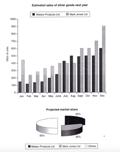
The chart above is divided into two types of charts as a prediction for next year. The bar chart shows the number of estimated sales between Meteor Products Ltd and Mark Jones Ltd. Meanwhile, the pie chart shows the number of projected market shares between those companies and the other. The first one is informed by the total of units and the second one is by percentages.

To begin with, December has the highest amount of estimated sales for both companies which is almost 100,000 for Mark Lones Ltd and 600,000 for Meteor Products Ltd. Otherwise, February has only reached below 300,000 for both of them. Mark Jones Ltd always gets the highest number from January to December, except for July and August. Not only do they get the highest number for sales, but also projected market shares. It is shown by the second bar chart that informed Mark Jones Ltd has reached 50%.

In conclusion, Mark Lones Ltd leads the number of prediction sales and market sales for next year from January to December rather than the others.

Word Count: 179

Answers On The Same Topic:

The bar chart below shows the estimated sales nationally of silver goods in ‘000s of units for two companies next year. The pie chart shows the projected market share of the two companies in silver goods at the end of next year. Silver goods refer to CD players, Walkmans etc. Write a report for a university lecturer describing the information shown below. You should write at least 150 words.

The graph illustrates predicted national sales of silver goods for two companies- Mark Jones Ltd and Meteor Products Ltd- by the end of the following year. The pie shart demonstrates each company’s projected market share till next year. Overall, the total sales for both companies are expected to rise dramatically by december. Mark Jones Ltd […]

The bar chart below shows the estimated sales nationally of silver goods in ‘000s of units for two companies next year. The pie chart shows the projected market share of the two companies in silver goods at the end of next year. Silver goods refer to CD players, Walkmans etc. Write a report for a university lecturer describing the information shown below. You should write at least 150 words.

The bar chart above shows the estimated sales nationally of silver goods in thousands of units from two companies and the pie chart shows the projected market share of the two companies in silver goods at the end of next year. Mark Jones has the highest average sales in a year and beats Meteor products […]

The bar chart below shows the estimated sales nationally of silver goods in ‘000s of units for two companies next year. The pie chart shows the projected market share of the two companies in silver goods at the end of next year. Silver goods refer to CD players, Walkmans etc. Write a report for a university lecturer describing the information shown below. You should write at least 150 words.

In the following year, meteor products Ltd and Mark Jones Ltd expect to sell silver goods. Another thing is that the pie chart tells the market sales over the period of the year. Overall, it can be anticipated that both businesses’ sales will rise, while the other companies hold 50% of the market. At the […]

See All

Other Topics:

The chart below shows energy consumption by fuel type and the resulting carbon dioxide emmisions in America. Summarise the information by selecting and reporting the main features, and make comparisons where relevant.

The chart illustrates the percentage of different types of fuel consumption and then as the consequences, the resulting carbon dioxide emissions in America in 2010. Overall, petroleum and natural gas became the most consumed types of fuel. However in terms of emissions only petroleum demonstrated a significant increase , while natural gas and coal fuel […]

Chart and table provide allocation of men and women for the household activities, apart from paid work, in 2008 in the UK. Summarize the information by describing the main features of the charts and making comparisons where appropriate.

The table chart illustrates the average amount of time to household activities, while the bar chart demonstrates the means of leisure activities by males and females in the UK in 2008. Looking from an overall perspective, it is readily apparent that the average annual time females spent was witnessed in upward trajectories from the household, […]

The first chart below shows the value of goods that australia imported from china and those exported to china from australia. The second chart shows the types of good imported from china. Summarise the information by selecting and reporting the main features, and make a comparisons where relevant.

The charts illustrate the value of goods in Autralia-China imported and exported in the period of 7 years( 1998-2004) ,and the value of 5 different kinds of goods between 2003 and 2004. Units are measured in billion dollars Overall, it is clear that the worth of both imports and exports were steadily increase through the […]

The charts show average levels of participation in education and the highesteducation level of adults from 2000 to 2010 in Singapore.

The line chart shows average levels of participation in education from 2000 to 2010 in Singapore, while the pie chart illustrates the data for the highest education level of adults during the same timeframe. Overall, it is clear that all categories experienced growth despite fluctuation, although the figure for adults males increased more substantially than […]

the bar chart gives information about the life expectancy in Japan, Korea, the USA, and Indonesia, and the table shows the change in life expectancy between 1953 and 2008.

The bar chart compares life expectancy in Japan, Korea, the United States and Indonesia in 2018, while the table presents the increase in life expectancy in these countries between 1953 and 2008. Overall, Japan had the highest life expectancy, whereas Indonesia recorded the lowest figure. Furthermore, Indonesia and Korea experienced much greater increases in life […]

The pie charts below show the comparison of exports in Great Britian over five years

The two pie charts illustrate the percentages of five different categories of goods exported from Great Britain in 2010 and 2015. Overall, machinery and vehicles were two largest export categories in both years. However the share of pharmaceuticals deacreased significantly, while the proportions of plastics and organic chemicals increased over the five year period. In […]

See All
We have detected unusual activity on your device.
Please verify your identity to continue.
Note: This verification step won't sign you in. If you have a premium account, please log in to access the service as usual.
Google/Gmail Verification
Or verify using Email/Code
We've sent a verification code to:
youremail@gmail.com (Not your email?)
Enter it below to complete the verification process.
Ensure your email address is correct, your inbox is not full, and you check your spam folder. If no email arrives, consider using an alternative email.
You will need a Premium plan to perform your action!
Note: If you already have a premium account, please log in to access our services as usual.

Plans & Pricing

Our mission is to make quality education accessible for everyone.
However, to keep our hardworking team running and this service alive, we genuinely need your support!
By opting for a premium plan, not only do you sustain us in achieving the mission, but you also unlock advanced features to enrich your learning experience.

Free

For learners who aren't pressed for time

What's included on Free
100+ Cambridge IELTS Tests
Instant IELTS Writing Task 1 & 2 Evaluation (2 times/month)
Instant IELTS Speaking Part 1, 2, & 3 Evaluation (5 times/month)
Instant IELTS Writing Task 1 & 2 Essay Generator (2 times/month)
500+ Dictation & Shadowing Exercises
100+ Pronunciation Exercises
Flashcards
Other Advanced Tools

Premium

For those serious about advancing their English proficiency, and for IELTS candidates aspiring to boost their band score by 1-2 points (especially in writing & speaking) in just 30 days or less

What's included on Premium
Save Your IELTS Test Progress
Unlock All Courses & IELTS Tests
Unlimited AI Conversations
Unlimited AI Writing Enhancement Exercises
Unlimited IELTS Writing Task 1 & 2 Evaluation
Unlimited IELTS Speaking Part 1, 2, & 3 Evaluation
Checked Answers Will Not Be Published
Unlimited IELTS Writing Task 1 & 2 Essay Generator
Unlimited IELTS Speaking Part 1, 2, & 3 Sample Generator
Unlimited Usage Of Advanced Tools
Priority Support within 24h (12-month plan only)

Due to the nature of our service and the provided free trials, payments are non-refundable.
Nếu bạn là người Việt Nam và không có hoặc không muốn trả bằng credit/debit cards, bạn có thể thanh toán bằng phương thức chuyển khoản:


Chọn gói:
419,000₫ 277,000 ₫ cho gói 1 tháng (chỉ 9,233₫/ngày)
1,239,000₫ 597,000 ₫ cho gói 3 tháng (chỉ 6,633₫/ngày)
2,469,000₫ 1,027,000 ₫ cho gói 6 tháng (chỉ 5,706₫/ngày)
4,929,000₫ 1,417,000 ₫ cho gói 12 tháng (chỉ 3,936₫/ngày)


Sau khi chuyển khoản, vui lòng đợi trình duyệt tự động điều hướng bạn trở lại Engnovate và bạn sẽ ngay lập tức nhận được mã kích hoạt tài khoản premium.
Nếu có lỗi xảy ra, bạn có thể liên hệ với team thông qua một trong các phương thức: email đến helloengnovate@gmail.com hoặc nhắn tin qua facebook.com/engnovate.
Vì toàn bộ công cụ trên website đều có thể sử dụng thử miễn phí, Engnovate không hỗ trợ hoàn tiền.