🔥 Today Only: Save 30% on Premium — Offer Ends Soon! - Upgrade Now!
Bar Chart

Band 4+: The bar chart below shows the production of the world’s oil in OPEC and non-OPEC countries. Write a short report for a university lecturer describing the information shown below.

Image for topic: The bar chart below shows the production of the world’s oil in OPEC and non-OPEC countries. Write a short report for a university lecturer describing the information shown below.
Our system will evaluate the answer based on this AI-generated description.
The image shows a bar graph titled 'Over a barrel' with forecasted increases in world oil production for three time periods: 1980-2000, 2000-10, and 2010-20. Three categories of oil-producing regions are represented in each bar: Non-OPEC, Other OPEC, and OPEC Middle East. The y-axis measures million barrels/day in increments of 5, from 0 to 20. From 1980-2000, Non-OPEC production increased by approximately 6 million barrels/day, Other OPEC by roughly 2 million barrels/day, and OPEC Middle East by about 3 million barrels/day. In 2000-10, Non-OPEC production saw an increase close to 4 million barrels/day, Other OPEC approximately 2 million barrels/day, and OPEC Middle East around 8 million barrels/day. For 2010-20, Non-OPEC is predicted to increase by nearly 4 million barrels/day, Other OPEC by approximately 1 million barrels/day, and OPEC Middle East by close to 7 million barrels/day.
Given the complexity of the image, the above description may not be entirely accurate.
Note: Both the topic and the answer were created by one of our users.

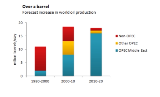
The chart illustrates the world’s petroleum productions in OPEC intermediate East, other OPEC and non-OPEC countries over forty years.

Overall, it is noticeable that globally between 1980 to 2000, non-OPEC-producing countries produced a higher quantity of grease. However, it is forecasted that in the future Middle East will take over the highest percentage.

According to the bars in the data, in the years 1980 to 2000, it is noticeable that the regions where oil is not manufactured are the world’s leading oil-manufacturing nations with about 11 million barrels/ 24 hours. While the Middle East produced less than 3 million gallons/day. Moreover, From 2000-2010, the Middle East took the lead becoming the top zone of coarse products over that decade. Furthermore, an equal quantity of about 4 million barrels/day came from other petroleum producers and Non- production regions in that same period.

Nevertheless, it is predicted that from 2010 to 2020, there will be a universal increase in petroleum products with over 75% of oil being from mid-East production in contrast, a significant reduction will be seen in Other producers and Non- producing nations with fewer than 25% grease production.

Word Count: 189

Answers On The Same Topic:

The bar chart below shows the production of the world’s oil in OPEC and non-OPEC countries. Write a short report for a university lecturer describing the information shown below.

The bar graph illustrate the number of oil barrel produced per day by OPEC and non-OPEC nations over 40 years period from 1980 to 2020. Overall, non-OPEC countries made up the majority of the world’s oil production at the beginning; however, their figures experienced a sharp decline over the period in question, similar to that […]

The bar chart below shows the production of the world’s oil in OPEC and non-OPEC countries. Write a short report for a university lecturer describing the information shown below.

The bar chart presents data regarding global oil production, specifically highlighting contributions from OPEC and non-OPEC countries between 1980 and 2020. The chart contrasts three distinct categories: non-OPEC nations, other OPEC countries, and OPEC nations from the Middle East. A prominent observation from the data is the substantial growth of oil production in non-OPEC countries, […]

The bar chart below shows the production of the world’s oil in OPEC and non-OPEC countries. Write a short report for a university lecturer describing the information shown below.

The bar chart illustrates the production of the worlds oil in OPEC and non-OPEC countries. The figures are measured by millions of barrels. Overall, there are two trends: increase and decrease. it is clear that other OPEC had the signifficant increase throughout the years. During 1980-2000, other OPEC did not have a part in oid […]

The bar chart below shows the production of the world’s oil in OPEC and non-OPEC countries. Write a short report for a university lecturer describing the information shown below.

The given chart provides information about the amount of consumption of the world’s oil, comparing OPEC and non-OPEC nations in three different period(1980 to 2000, 2000 to 2010, 2010 to 2020) Overall, on the onset, it is clearly seen that non-OPEC countries consume most figure from 2010 to 2020. Moreover,the largest graph appeared between 2000 […]

The bar chart below shows the production of the world’s oil in OPEC and non-OPEC countries. Write a short report for a university lecturer describing the information shown below.

The bar chart gives information about the number of oil production in non-OPEC, OPEC Middle East, and other OPEC countries from 1980 to 2020. Overall, the number of total oil production increased for the first two decades rapidly. However, total oil manufacturing showed a slightly falling process for the second two decade. While OPEC Middle […]

See All

Other Topics:

the graph below shows the amount of energy generated wind in four countries in the period 1980-2000

The bar chart illustrates the amount of energy generated by wind in four countries – India, Denmark, Germany and the United States – between 1985 and 2000, measured in megawatts. Overall, wind energy generation increased in all countries over the period, with the exception of the US, where the figure declined slightly at the end. […]

The graph below gives information about the common activities children of different ages in the United States do as part of their bedtime routines.

The bar chart illustrates the number of children who engaged in common activities, namely reading, brushing teeth, having a bath, watching TV, eating, before going to bed at three different ages in the USA in 2015. Overall, reading was the most popular activity among all given ages groups, while eating was the least common activity […]

The graph below shows the amount of tea and coffee imported by four different countries in tonnes. Summarize the information by selecting and reporting the main points and make comparions where relevant.

The bar chart gives the information about amount of tea and coffee transffered by four countries in 2007, in tonnes. Overall, UK and USA transported more amount of tea, while other two countries conveyed more amount of coffee. Moreover the UK led in top of the largest importer of tea than other states. Tea standed […]

The bar chart below compares the nationality of tourists to Dubai in 2010, 2015 and 2020. Summarise the information by selecting and reporting the main features and make comparisons where relevant.

The bar chart illustrates changes in the proportion of nationality of tourists visited from three different countries to Dubai between 2010 and 2020. In general, it is noticeable that different trends were observed in all the given years. While Saudi recorded the highest percentage of visitors at the beginning of the year, the opposite was […]

The world health organization recommends that people shoud eat five or more portions of fruits and vegetables per day. The chart below shows the percetage of males and females in the UK by age group in 2006.

Some health experts recommend that individuals must eat five or more portions of fruit and vegetables daily. The chart demonstrates the proportion of males and females in the UK by age category in 2006. Overall, women consumed more fruit and vegetables than their counterparts across all age groups. Females in 55-64 age bracket stood out […]

the chart below shows the annual consumption of rice per person in three Asian countries between 1995 and 2015

The bar chart illustrates the amount of rice consumption per person in three Asian nations from 1995 to 2015. Overall, it can be seen that most nations saw an increase in the annual rice consumption over the period. Indonesia’s rice consumption experienced a significant increase throughout the years, while the figures for India and China […]

See All
We have detected unusual activity on your device.
Please verify your identity to continue.
Note: This verification step won't sign you in. If you have a premium account, please log in to access the service as usual.
Google/Gmail Verification
Or verify using Email/Code
We've sent a verification code to:
youremail@gmail.com (Not your email?)
Enter it below to complete the verification process.
Ensure your email address is correct, your inbox is not full, and you check your spam folder. If no email arrives, consider using an alternative email.
You will need a Premium plan to perform your action!
Note: If you already have a premium account, please log in to access our services as usual.

Plans & Pricing

Our mission is to make quality education accessible for everyone.
However, to keep our hardworking team running and this service alive, we genuinely need your support!
By opting for a premium plan, not only do you sustain us in achieving the mission, but you also unlock advanced features to enrich your learning experience.

Free

For learners who aren't pressed for time

What's included on Free
100+ Cambridge IELTS Tests
Instant IELTS Writing Task 1 & 2 Evaluation (2 times/month)
Instant IELTS Speaking Part 1, 2, & 3 Evaluation (5 times/month)
Instant IELTS Writing Task 1 & 2 Essay Generator (2 times/month)
500+ Dictation & Shadowing Exercises
100+ Pronunciation Exercises
Flashcards
Other Advanced Tools

Premium

For those serious about advancing their English proficiency, and for IELTS candidates aspiring to boost their band score by 1-2 points (especially in writing & speaking) in just 30 days or less

What's included on Premium
Save Your IELTS Test Progress
Unlock All Courses & IELTS Tests
Unlimited AI Conversations
Unlimited AI Writing Enhancement Exercises
Unlimited IELTS Writing Task 1 & 2 Evaluation
Unlimited IELTS Speaking Part 1, 2, & 3 Evaluation
Checked Answers Will Not Be Published
Unlimited IELTS Writing Task 1 & 2 Essay Generator
Unlimited IELTS Speaking Part 1, 2, & 3 Sample Generator
Unlimited Usage Of Advanced Tools
Priority Support within 24h (12-month plan only)

Due to the nature of our service and the provided free trials, payments are non-refundable.
Nếu bạn là người Việt Nam và không có hoặc không muốn trả bằng credit/debit cards, bạn có thể thanh toán bằng phương thức chuyển khoản:


Chọn gói:
419,000₫ 277,000 ₫ cho gói 1 tháng (chỉ 9,233₫/ngày)
1,239,000₫ 597,000 ₫ cho gói 3 tháng (chỉ 6,633₫/ngày)
2,469,000₫ 1,027,000 ₫ cho gói 6 tháng (chỉ 5,706₫/ngày)
4,929,000₫ 1,417,000 ₫ cho gói 12 tháng (chỉ 3,936₫/ngày)


Sau khi chuyển khoản, vui lòng đợi trình duyệt tự động điều hướng bạn trở lại Engnovate và bạn sẽ ngay lập tức nhận được mã kích hoạt tài khoản premium.
Nếu có lỗi xảy ra, bạn có thể liên hệ với team thông qua một trong các phương thức: email đến helloengnovate@gmail.com hoặc nhắn tin qua facebook.com/engnovate.
Vì toàn bộ công cụ trên website đều có thể sử dụng thử miễn phí, Engnovate không hỗ trợ hoàn tiền.