24 Hours Only: Get 39% OFF on Our Premium Plan - Check Out Now!
Bar Chart

Band 6+: The bar graph below shows the average monthly rainfall (in millimeters) for three cities: London, Tokyo, and Sydney, over a period of one year. Summariza the information by selecting and reporting the main features, and make comparisons where relevant.

Image for topic: The bar graph below shows the average monthly rainfall (in millimeters) for three cities: London, Tokyo, and Sydney, over a period of one year. Summariza the information by selecting and reporting the main features, and make comparisons where relevant.
Our system will evaluate the answer based on this AI-generated description.
The image depicts a bar graph illustrating average monthly rainfall in millimeters: In January, London records approximately 80mm, Tokyo 50mm, Sydney slightly above 100mm; February shows London at 60mm, Tokyo just over 50mm, Sydney close to 120mm; March shows London around 60mm, Tokyo about 100mm, Sydney slightly over 130mm; April has London at roughly 50mm, Tokyo 150mm, Sydney over 100mm; May has London near 50mm, Tokyo slightly over 140mm, Sydney around 100mm; June shows London at approximately 50mm, Tokyo close to 200mm, Sydney at 130mm; July has London at 60mm, Tokyo slightly above 150mm, Sydney reaches around 90mm; August reads London slightly over 60mm, Tokyo above 150mm, Sydney approximately 70mm; September lists London at 50mm, Tokyo about 180mm, Sydney close to 55mm; October reveals London at 70mm, Tokyo approximately 160mm, Sydney slightly over 90mm; November shows London at 80mm, Tokyo 100mm, Sydney about 110mm; December displays London slightly above 70mm, Tokyo nearly 50mm, Sydney just over 75mm.
Given the complexity of the image, the above description may not be entirely accurate.
Note: Both the topic and the answer were created by one of our users.

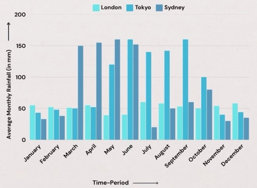
This bar graph below compares the average monthly rainfall (in millimeters) between three cities: London, Tokyo, and Sydney, over a period of one year.

Overall, Tokyo has the highest rainfall levels throughout the year. Tokyo’s rainfall peak is between May until September, ranging from around 120 mm to around 160 mm. Meanwhile, Sydney dominated the rainfall levels between March until June with 150 mm and over. London’s rainfall levels seem to be stabilized throughout the year, with around 40 mm to around 60 mm.

London’s lowest rainfall levels are in May and June, meanwhile London rains the most in July. London’s rainfall levels do not change much over the period. Tokyo rains the least in November with around 40 mm, and rains the most in September with 160 mm. Sydney’s lowest rainfall level is in July with around 20 mm, however, its highest rainfall level reaches around 160 mm in May.

Word Count: 151

Answers On The Same Topic:

The bar graph below shows the average monthly rainfall (in millimeters) for three cities: London, Tokyo, and Sydney, over a period of one year. Summariza the information by selecting and reporting the main features, and make comparisons where relevant.

The line graph illustrates the average rainfall in a month from 3 big cities (London, Tokyo and Sydney) Overall, Tokyo had the highest amount of rainfall overyear, while London weather had lowest rainning part.Throughout every cities the peaking of rainfall is on middle year. In detail, London rains stayed constant, between 40-60 millimeters.Tokyo begin the […]

The bar graph below shows the average monthly rainfall (in millimeters) for three cities: London, Tokyo, and Sydney, over a period of one year. Summariza the information by selecting and reporting the main features, and make comparisons where relevant.

Overall, Tokyo experiences the greatest fluctuation in rainfall, peaking dramatically in the middle of the year, whereas Sydney shows a clear downward trend. In contrast, London’s rainfall remains relatively stable throughout the twelve months. In detail, London records modest and consistent rainfall, fluctuating slightly between about 40 and 60 millimetres each month. Tokyo, on the […]

See All

Other Topics:

The chart below shows the number of passengers who used public transport in somewhere town from 2012 to 2015. Summarise the information by selecting and reporting the main features and make comparisons where relevant.

The bar graph compares the number of passengers, travelled somewhere by three different transportation: bus, train, and tram between 2012 and 2015. Overall, number of passengers who used tram for traveling gradually increased through out the period, while other traveling options were fluctuated. Notably, tram was the most common travelling way at the end of […]

The graph below shows the percentage of urban/suburban and rural households in a certain country that had Internet access between 2011 and 2016. Summarize' the information by selecting and reporting the main features, and make comparisons where relevant.

The graph illustrates how urban/suburban and rural households in a specific country access the internet from 2011 to 2016. Internet subscribers increased in both urban and rural households, shown in percentage over the period under review. Every year urban households access the internet more than rural households. In 2011, urban households were 15%. The following […]

The bar chart below shows the net worth of the UK from 2000 to 2010 according to three different sectors.

The bar graph illustrates the net worth of households, businesses and the UK goverment, as well as their overall net worth, between the years 2000 and 2010. Overall, the UK total followed the households trend, but there is a stark contrast between the amount of money that households have and the net worth of both […]

The following bar chart shows the different modes of transport used to travel to and from work in one European city in 1960, 1980 and 2000. Summarize the information by selecting and reporting the main features and make comparisons where relevant. Write at least 150 words.

the bar chart compares the rates of four types of transport used by people in European city in 1960, 1980 and 2000. overall, the percentage of car using increased sifnigicantly, while bike and foot showed slight drop over the period, and travellers of bus made growth but then declined. According to the bar chart, we […]

The bar chart below shows the average duration of housework done by women and men done.

The given bar chart illustrates the housework by female on highest hours between unemployed, part time employed and full time employed and full-time working male. As an overview, it can be seen that the highest number of women with no employment in three years. The second highest time spent by women with part time job. […]

the chart below shows the percentage of a grud company's total sales, by region, from 2002 to 2006

The chart show the number for the total sales in percentage for grud companys, by their region between 2002 to 2006. Overall, American companys were decreasing over the period.On the other hand, the companys in Asia were increasing. However, the Eruope companys stayed almost the same. The American companys had a sharp decline from 41 […]

See All
We have detected unusual activity on your device.
Please verify your identity to continue.
Note: This verification step won't sign you in. If you have a premium account, please log in to access the service as usual.
Google/Gmail Verification
Or verify using Email/Code
We've sent a verification code to:
youremail@gmail.com (Not your email?)
Enter it below to complete the verification process.
Ensure your email address is correct, your inbox is not full, and you check your spam folder. If no email arrives, consider using an alternative email.
You will need a Premium plan to perform your action!
Note: If you already have a premium account, please log in to access our services as usual.

Plans & Pricing

Our mission is to make quality education accessible and free for everyone.
However, to keep our hardworking team running and this service alive, we genuinely need your support!
By opting for a premium plan, not only do you sustain us in achieving the mission, but you also unlock advanced features to enrich your learning experience.

Free

For learners who aren't pressed for time

What's included on Free
1000+ IELTS Tests & Samples
Instant IELTS Writing Task 1 & 2 Evaluation (2 times/month)
Instant IELTS Speaking Part 1, 2, & 3 Evaluation (5 times/month)
Instant IELTS Writing Task 1 & 2 Essay Generator (2 times/month)
500+ Dictation & Shadowing Exercises
100+ Pronunciation Exercises
Flashcards
Other Advanced Tools

Premium

For those serious about advancing their English proficiency, and for IELTS candidates aspiring to boost their band score by 1-2 points (especially in writing & speaking) in just 30 days or less

What's included on Premium
Save Your IELTS Test Progress
Unlock All Courses & Content
Unlimited AI Conversations
Unlimited AI Writing Enhancement Exercises
Unlimited IELTS Writing Task 1 & 2 Evaluation
Unlimited IELTS Speaking Part 1, 2, & 3 Evaluation
Checked Answers Will Not Be Published
Unlimited IELTS Writing Task 1 & 2 Essay Generator
Unlimited IELTS Speaking Part 1, 2, & 3 Sample Generator
Unlimited Usage Of Advanced Tools

Due to the nature of our service and the provided free trials, payments are non-refundable.
Nếu bạn là người Việt Nam và không có hoặc không muốn trả bằng credit/debit cards, bạn có thể thanh toán bằng phương thức chuyển khoản:


Chọn gói:
279,000₫ 157,000 ₫ cho gói 1 tháng (chỉ 5,233₫/ngày)
819,000₫ 397,000 ₫ cho gói 3 tháng (chỉ 4,411₫/ngày)
1,649,000₫ 667,000 ₫ cho gói 6 tháng (chỉ 3,706₫/ngày)
3,299,000₫ 857,000 ₫ cho gói 12 tháng (chỉ 2,381₫/ngày)


Sau khi chuyển khoản, vui lòng đợi trình duyệt tự động điều hướng bạn trở lại Engnovate và bạn sẽ ngay lập tức nhận được mã kích hoạt tài khoản premium.
Nếu có lỗi xảy ra, bạn có thể liên hệ với team thông qua một trong các phương thức: email đến helloengnovate@gmail.com hoặc nhắn tin qua facebook.com/engnovate.
Vì toàn bộ công cụ trên website đều có thể sử dụng thử miễn phí, Engnovate không hỗ trợ hoàn tiền.