🔥 Today Only: Save 30% on Premium — Offer Ends Soon! - Upgrade Now!
Line Graph

Band 5+: The chart below gives information about population growth in three major Australian citie from 1992 to 2016. Summarize the information by selecting and reporting the main features and make comparisons where relevant.

Image for topic: The chart below gives information about population growth in three major Australian citie from 1992 to 2016. Summarize the information by selecting and reporting the main features and make comparisons where relevant.
Our system will evaluate the answer based on this AI-generated description.
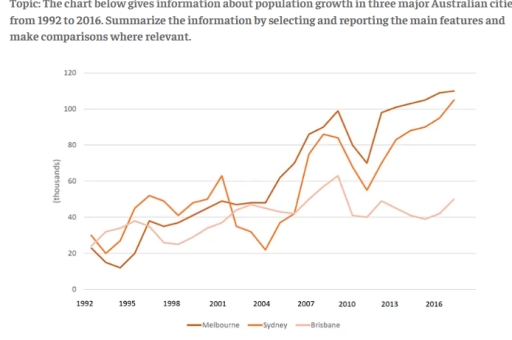
The image shows population growth (in thousands) from 1992 to 2016 for Melbourne, Sydney, and Brisbane. In 1992: Melbourne 20, Sydney 40, Brisbane slightly above 20. In 1993: Melbourne around 20, Sydney 40, Brisbane slightly below 20. In 1994: Melbourne below 40, Sydney around 25, Brisbane between 20-40. In 1995: Melbourne around 40, Sydney below 20, Brisbane below 40. In 1996: Melbourne around 40, Sydney below 40, Brisbane around 40. In 1997: Melbourne slightly above 40, Sydney around 25, Brisbane around 40. In 1998: Melbourne around 40, Sydney around 40, Brisbane below 40. In 1999: Melbourne above 40, Sydney around 40, Brisbane around 40. In 2000: Melbourne above 40, Sydney slightly above 40, Brisbane below 40. In 2001: Melbourne around 60, Sydney around 60, Brisbane below 40. In 2002: Melbourne 80, Sydney around 80, Brisbane slightly above 40. In 2003: Melbourne around 80, Sydney below 40, Brisbane around 60. In 2004-2005: Melbourne around 80, Sydney below 40, Brisbane below 40. In 2006: Melbourne around 100, Sydney above 60, Brisbane above 40. In 2007: Melbourne around 120, Sydney above 80, Brisbane around 40. In 2008: Melbourne around 120, Sydney above 40, Brisbane around 60. In 2009: Melbourne below 100, Sydney above 60, Brisbane around 60. In 2010: Melbourne below 100, Sydney below 60, Brisbane around 40. In 2011: Melbourne slightly above 100, Sydney below 80, Brisbane below 60. In 2012: Melbourne slightly below 120, Sydney slightly above 80, Brisbane below 60. In 2013: Melbourne around 120, Sydney around 100, Brisbane around 60. In 2014: Melbourne 100 to 80, Sydney below 80, Brisbane above 60. In 2015: Melbourne above 100, Sydney slight drop then up from slightly below 80 to around 100
Given the complexity of the image, the above description may not be entirely accurate.
Note: Both the topic and the answer were created by one of our users.

The line graph shows the changes in population for three countries in Australia: Melbourne, Sydney and Brisbane over a period of 25 years.

Overall, all three cities started at similar levels also Melbourne and Sydney showed almost the same pattern. Moreover population in these countries growth especially in Melbourne, while Brisbane had the smaller population.

In 1992, Melbourne’s population was nearly 20% and about 30% in Sydney. Both cities saw a slight decline but in the 1995 Sydney’ population rose to approximately 25% , while Melbourne reached the low at around 18% and since this period they followed a similar growth with different 5%, where Melbourne was lower. However, then Sydney showed significant fell to nearly 35% and Melbourne was around 47%. Thereafter Melbourne surpassed Sydney’s population to around 5%, and by the end of the period, Melbourne’s population was roughly 110%, about 4% more than Sydney.

In contrast, Brisbane’s population in 1992 was just over Melbourne’s but it did not show significant growth until the period between 2007 and 2010, when it rose from around 43 to% just over 60%. However, after that Brisbane’s population began decline, in totally was nearly to 50, show a significant difference compared to the other citries.

Word Count: 203

Answers On The Same Topic:

The chart below gives information about population growth in three major Australian citie from 1992 to 2016. Summarize the information by selecting and reporting the main features and make comparisons where relevant.

The line graph illustrates the number of population growth in three distinct Australian cities over a period spanning from 1992 to 2016. Overall, the data reveals a significant upward trend in population growth of both Melbourne and Sydney, whereas population growth of Brisbane exhibit a small growth compared to the other cities during the same […]

The chart below gives information about population growth in three major Australian citie from 1992 to 2016. Summarize the information by selecting and reporting the main features and make comparisons where relevant.

The line chart compares the number of population growth in three different major Australian cities between 1992 and 2016. It is clear that the highest number of population growth was in the city of Melbourne in Australia in the year of 2016. By contrast, the number of population growth in Brisbane was the lowest in […]

The chart below gives information about population growth in three major Australian citie from 1992 to 2016. Summarize the information by selecting and reporting the main features and make comparisons where relevant.

The line graph illustrates changes in population growth across Melbourne, Sydney and Brisbane over a 24-year period, from 1992 to 2016. Overall, Melbourne experienced the most substantial and uninterrupted rise, eventually becoming the fastest-growing city. Sydney’s trend was far more volatile, while Brisbane showed only modest and steady increases throughout. At the beginning of the […]

The chart below gives information about population growth in three major Australian citie from 1992 to 2016. Summarize the information by selecting and reporting the main features and make comparisons where relevant.

The line graph compares population growth in Melbourne, Sydney and Brisbane between 1992 and 2016. Overall, all three cities experienced upward trends, but Melbourne saw the most dramatic and consistent growth, while Brisbane grew more slowly. Sydney fluctuated noticeably throughout the period. In 1992, Melbourne’s population increase was around 20,000, slightly lower than Sydney and […]

The chart below gives information about population growth in three major Australian citie from 1992 to 2016. Summarize the information by selecting and reporting the main features and make comparisons where relevant.

The line graph illustrates the demographic growth in three big Australian cities between 1992 to 2016. Overall, it is easy to notice that all three city’s population fluctuated over the period. In addition, Melbourne’s population reached the highest population by the end of period, while Brisbane’s population fluctuated until the end of the phase. In […]

See All

Other Topics:

The line graph shows the number of queries received by tourist information office in one city over a period of six month in 2011 .

This data presents the amount of queries received from visitors to the information office in one place over the time of 6 months in the year 2011. Overall, the way of these queries changes in each month depends on how the person delivers it to the information office.Either in person, by letter or email or […]

The graph shows information regarding new Facebook users by province in Cambodia between 2003 and 2014. Summarize the information by selection and reporting the main features, and make comparison where relevant

The multiple line graph encapsulates the number of new Facebook users in three cambodian provinces, namely Kampot, Phnom Penh, and Siem Reap between 2004 and 2014. The overall informarion dipicted in the collection of data that Siem Reap recored the highest figure among the other provines at the beginning of the period but withnessed a […]

The line graph shows the number of people using cars, bicycles, and buses in a European city between 2000 and 2020.

The line graph illustrates the changes in the number of peopl using different modes of transport in a Europeab City over a period of 20 years from 2000 to 2020. It compares three distincts methodes namley Cars, Bicycles and Buses, with figures expressed in number of users. Overall, it is evident that Cars consistently recorded […]

The graph shows the percantage of visiting the cinema once a month or more bewtweem 1984 to 2003

Overall, the graphs shows percentage of people with different age groups visiting the cinema once or several times in month between 1984 to 2003. The most low percent of visiting cinema have adults 35 years old and over, from 1984 to 2003 it’s grow only to 10%. And the most high percent of cinema lovers […]

the line graph which i wrote when i get bored

The supplied illustration of line graph demonstrates common carbon dioxide emmissions per person across 4 regions, such as the UK, Sweden, Italy, and Portugal from 1967 to 2007. Overall, it is obvious that the Sweden individuals produced carbon emmissions fewer than other countries, while the rate of the italians increased. With regards to Italy and […]

The graph below shows Twitter use by age group in the USA between November 2010 and May 2013. Summarise the information by selecting and reporting the main features, and make comparisons where relevant.

The multiple line graph encapsulates Twitter use divided into various group according to age in the US measured in percentages from November 2010 to May 2013. The overall information depicted in the collection of data is that, most of the mention Twitter users increase for all groupings over the given period of time. Taking a […]

See All
We have detected unusual activity on your device.
Please verify your identity to continue.
Note: This verification step won't sign you in. If you have a premium account, please log in to access the service as usual.
Google/Gmail Verification
Or verify using Email/Code
We've sent a verification code to:
youremail@gmail.com (Not your email?)
Enter it below to complete the verification process.
Ensure your email address is correct, your inbox is not full, and you check your spam folder. If no email arrives, consider using an alternative email.
You will need a Premium plan to perform your action!
Note: If you already have a premium account, please log in to access our services as usual.

Plans & Pricing

Our mission is to make quality education accessible for everyone.
However, to keep our hardworking team running and this service alive, we genuinely need your support!
By opting for a premium plan, not only do you sustain us in achieving the mission, but you also unlock advanced features to enrich your learning experience.

Free

For learners who aren't pressed for time

What's included on Free
100+ Cambridge IELTS Tests
Instant IELTS Writing Task 1 & 2 Evaluation (2 times/month)
Instant IELTS Speaking Part 1, 2, & 3 Evaluation (5 times/month)
Instant IELTS Writing Task 1 & 2 Essay Generator (2 times/month)
500+ Dictation & Shadowing Exercises
100+ Pronunciation Exercises
Flashcards
Other Advanced Tools

Premium

For those serious about advancing their English proficiency, and for IELTS candidates aspiring to boost their band score by 1-2 points (especially in writing & speaking) in just 30 days or less

What's included on Premium
Save Your IELTS Test Progress
Unlock All Courses & IELTS Tests
Unlimited AI Conversations
Unlimited AI Writing Enhancement Exercises
Unlimited IELTS Writing Task 1 & 2 Evaluation
Unlimited IELTS Speaking Part 1, 2, & 3 Evaluation
Checked Answers Will Not Be Published
Unlimited IELTS Writing Task 1 & 2 Essay Generator
Unlimited IELTS Speaking Part 1, 2, & 3 Sample Generator
Unlimited Usage Of Advanced Tools
Priority Support within 24h (12-month plan only)

Due to the nature of our service and the provided free trials, payments are non-refundable.
Nếu bạn là người Việt Nam và không có hoặc không muốn trả bằng credit/debit cards, bạn có thể thanh toán bằng phương thức chuyển khoản:


Chọn gói:
419,000₫ 277,000 ₫ cho gói 1 tháng (chỉ 9,233₫/ngày)
1,239,000₫ 597,000 ₫ cho gói 3 tháng (chỉ 6,633₫/ngày)
2,469,000₫ 1,027,000 ₫ cho gói 6 tháng (chỉ 5,706₫/ngày)
4,929,000₫ 1,417,000 ₫ cho gói 12 tháng (chỉ 3,936₫/ngày)


Sau khi chuyển khoản, vui lòng đợi trình duyệt tự động điều hướng bạn trở lại Engnovate và bạn sẽ ngay lập tức nhận được mã kích hoạt tài khoản premium.
Nếu có lỗi xảy ra, bạn có thể liên hệ với team thông qua một trong các phương thức: email đến helloengnovate@gmail.com hoặc nhắn tin qua facebook.com/engnovate.
Vì toàn bộ công cụ trên website đều có thể sử dụng thử miễn phí, Engnovate không hỗ trợ hoàn tiền.