🔥 Today Only: Save 30% on Premium — Offer Ends Soon! - Upgrade Now!
Bar Chart

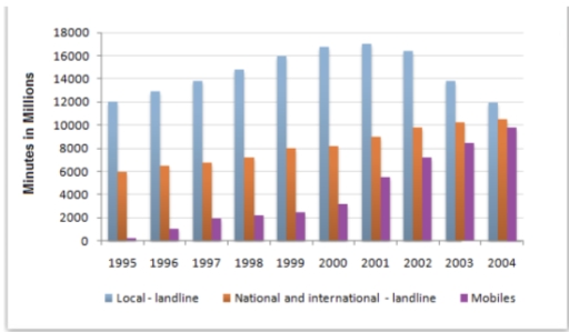
Band 6+: The chart below shows the total number of minutes (in millions) of telephone calls divided into three categories from 1995-2004. Summarise the information by selecting and reporting the main features, and make comparisons where relevant.

Image for topic: The chart below shows the total number of minutes (in millions) of telephone calls divided into three categories from 1995-2004. Summarise the information by selecting and reporting the main features, and make comparisons where relevant.
Our system will evaluate the answer based on this AI-generated description.
The image is a clustered bar chart with years on the x-axis (1995-2004) and "Minutes in Millions" on the y-axis (2000 intervals from 0 to 18000). Each year has 3 bars representing "Local-landline," "National and international-landline," and "Mobiles." 1995 data: Local-landline around 7200, National and international-landline around 3800, Mobiles around 200. 1996 data: Local-landline around 8000, National and international-landline around 4200, Mobiles around 400. 1997 data: Local-landline around 8600, National and international-landline around 4400, Mobiles around 600. 1998 data: Local-landline around 9200, National and international-landline around 4800, Mobiles around 1000. 1999 data: Local-landline around 9600, National and international-landline around 5000, Mobiles around 1400. 2000 data: Local-landline around 10000, National and international-landline around 5400, Mobiles around 2000. 2001 data: Local-landline around 10400, National and international-landline around 5800, Mobiles around 2600. 2002 data: Local-landline around 10800, National and international-landline around 6200, Mobiles around 3000. 2003 data: Local-landline around 11000, National and international-landline around 6400, Mobiles around 5000. 2004 data: Local-landline around 10000, National and international-landline around 6000, Mobiles around 7000.
Given the complexity of the image, the above description may not be entirely accurate.
Note: Both the topic and the answer were created by one of our users.

The data about the duration of phone calls in the UK throughout the 1995-2004 period is depicted in the chart. Overall, most UK residents at the time take local landline as the most common contacting method.

Starting off with the mobiles, this category had been the least popular since 1995, with nearly no users. However, from 1996 until 2000, this figure experienced a significant increase, with more than 3 billion minutes at the end of the phase. After that, the increasing rate rocketed and reached the peak in 2004, remarkably tripled compared to the previous phase.

On the other hand, national and international landline witnessed negligible changes throughout the whole period. With 6 billion minutes in 1995, stable increases can be seen every year with an average of 0.4 billion. In contrast, the figure for local landline peaked at approximate 17 billion minutes in 2001, before dropping down to 12 billion by the year 2004, though staying the most used means of communication.

Word Count: 163

Answers On The Same Topic:

The chart below shows the total number of minutes (in millions) of telephone calls divided into three categories from 1995-2004. Summarise the information by selecting and reporting the main features, and make comparisons where relevant.

The bar graph illustrating the three distinct categories shows the total quantitiy of minutes (in billions) of phone calls in the United Kingdom, over an 8 year period starting from 1995 to 2002. In general, local calls remained the most popular category throughout the period, followed by national and international calls, and mobile calls in […]

The chart below shows the total number of minutes (in millions) of telephone calls divided into three categories from 1995-2004. Summarise the information by selecting and reporting the main features, and make comparisons where relevant.

The provided bar graph represents the total quantity of minutes (in billions) of telephone calls in the United Kingdom, separated into three distinct types, between 1995 and 2002. Overall, local phone calls remained as the most popular type of callss during the period. National and international calls rose steadily without breaking the trend. However, mobile […]

The chart below shows the total number of minutes (in millions) of telephone calls divided into three categories from 1995-2004. Summarise the information by selecting and reporting the main features, and make comparisons where relevant.

The bar graph represents the total quantity of minutes (in billions) of telephone calls in the United Kingdom, separated into three different types, between 1995 to 2002. Overall, local calls always remained the most popular type of call among the categories, and was followed by national and international calls. In addition, mobile calls experienced a […]

The chart below shows the total number of minutes (in millions) of telephone calls divided into three categories from 1995-2004. Summarise the information by selecting and reporting the main features, and make comparisons where relevant.

The bar chart illustrates the total number of minutes, measured in millions, spent on telephone calls in the UK, divided into three categories- local landline, national and internatiomal landline, and mobiles-over a nine-year period from 1995 to 2004 Overall, local landline calls accounted for the highest number of minutes throughout the givenperiod, while mobile calls, […]

The chart below shows the total number of minutes (in millions) of telephone calls divided into three categories from 1995-2004. Summarise the information by selecting and reporting the main features, and make comparisons where relevant.

The bar chart illustrates the time spent by Finland residents on three different types of telephone calls between 1995 and 2004. It is evident from the observation that in 1995, the highest people used local landline at 12000 millions, while this number of minutes rapidly grew in 2001, approximately 17000 millions, before reached it falling […]

See All

Other Topics:

the percentage contribution of the IT and service industries to the GDP

The given data displayed features of the UK’s GDP between 1992 and 2000. Overall, IT industry percentage of GDP throughout entire graph always take the highest position in all possible that’s bar chart time periods.Meanwhile, both of service industry and IT industry increased. To begin, IT industry started fluctuated in 1992 from just over 6 […]

The chart below shows waste collection by a recycling centre from 2011 to 2015.

The bar chart illustrates the amount of garbage collected by a recycling facility over a five-year period from 2011 to 2015. Overall, all four categories showed an upward trend, albeit to varying degrees. Notably, the amount of paper waste experienced the most significant increase throughout the period, whereas the figures for glass, tins and garden […]

The type of media that people of different age groups used to get daily news in one country in 2011.

The graph illustrates the percentage of the type of media that people of different age groups used to get dily news in one country in 2011. There is 5 age groups and 3 types of ways of getting news. Overall, it is clear that as the age became older then the percent of all three […]

The chart below shows the number of men and women in further education in Britain in three periods and whether they were studying full-time or part-time. Summarise the information by selecting and reporting the main features and make comparisons where relevant.

The chart illustrates the amount of male and female people in further education in the UK in three timelines and whether they were studying full-time or part-time. Overall, it is clear that females’ number in full-time in the latest period was higher than males’. In Contrast, other figures of full-time education were higher than females’. […]

The graph shows changes in meat production worldwide between 2010 and 2020.Summarise the information by selecting and reporting the main features, and make comparisons where relevant.

The diagram illustrates differences in meat production worldwide between 2010 and 2020. Overall, in this chart the most popular meat type is pork and beef, while sheep meat is least popular. Beef increased and dominated constantly 8 years, while poultry increased significantly only in 2020. In 2010, Beef had the highest production, maintaining 25 million […]

The chart below shows the destinations of students graduating from Physics and from Arts Design in one European country in 2007. Summarize the information by selecting and reporting the main features, and make comparisons where relevant. Write at least 150 words.

The chart illustrates the destinations of scholars advancing from Physics and from Arts and Design in one European country in a given year (2007). Overall, the majority of the pupils after graduating with Arts and Design are likely to get employed immediately, while in the case of Physics, many students are rather also focusing on […]

See All
We have detected unusual activity on your device.
Please verify your identity to continue.
Note: This verification step won't sign you in. If you have a premium account, please log in to access the service as usual.
Google/Gmail Verification
Or verify using Email/Code
We've sent a verification code to:
youremail@gmail.com (Not your email?)
Enter it below to complete the verification process.
Ensure your email address is correct, your inbox is not full, and you check your spam folder. If no email arrives, consider using an alternative email.
You will need a Premium plan to perform your action!
Note: If you already have a premium account, please log in to access our services as usual.

Plans & Pricing

Our mission is to make quality education accessible for everyone.
However, to keep our hardworking team running and this service alive, we genuinely need your support!
By opting for a premium plan, not only do you sustain us in achieving the mission, but you also unlock advanced features to enrich your learning experience.

Free

For learners who aren't pressed for time

What's included on Free
100+ Cambridge IELTS Tests
Instant IELTS Writing Task 1 & 2 Evaluation (2 times/month)
Instant IELTS Speaking Part 1, 2, & 3 Evaluation (2 times/month)
Instant IELTS Writing Task 1 & 2 Essay Generator (2 times/month)
500+ Dictation & Shadowing Exercises
100+ Pronunciation Exercises
Flashcards
Other Advanced Tools

Premium

For those serious about advancing their English proficiency, and for IELTS candidates aspiring to boost their band score by 1-2 points (especially in writing & speaking) in just 30 days or less

What's included on Premium
Save Your IELTS Test Progress & Analyze Mistakes By Question Type
Save Your Own Flashcard Sets & Use Them On Any Device
Unlock All Courses, IELTS Tests, Section & Part Practice
Unlimited AI Conversations
Unlimited AI Writing Enhancement Exercises
Unlimited IELTS Writing Task 1 & 2 Evaluation
Unlimited IELTS Speaking Part 1, 2, & 3 Evaluation
Checked Answers Will Not Be Published
Unlimited IELTS Writing Task 1 & 2 Essay Generator
Unlimited IELTS Speaking Part 1, 2, & 3 Sample Generator
Unlimited Usage Of Advanced Tools & AI Features
Priority Support within 24h (12-month plan only)

Due to the nature of our service and the provided free trials, payments are non-refundable.