🔥 Today Only: Save 30% on Premium — Offer Ends Soon! - Upgrade Now!
Multiple Graphs

Band 6+: The Comparison of the Production and the Consumption of Rice in X Country The Comparison of Rice and Other Food Crops Consumed in X Country

Image for topic: The Comparison of the Production and the Consumption of Rice in X Country The Comparison of Rice and Other Food Crops Consumed in X Country
Our system will evaluate the answer based on this AI-generated description.
The image presents two graphs related to rice in X Country, with timelines from 1990 to 2040. The top graph, marking "Rice Production" in solid lines and "Rice Consumption" in dashed lines, displays a quantitative increase in million tons: production rises from roughly 25 in 1990, stays near 50 in 2010 and 2020, anticipated to escalate near 75 by 2040; consumption initiates around 20 in 1990, approximates 40 by 2010 and 2020, predicting a rise to about 60 by 2040. The bottom graph contrasts the percentages of "Rice" versus "Other Food Crops" consumed over the same periods: in 1990, Rice accounts for nearly 45%, other crops at 55%, in 2000, rice slightly drops below 40%, other crops surpassing 60%, by 2010 rice ascends back to 45%, maintaining a balance near 55% for other crops, displaying a notable increase in rice at about 55% with other crops lessening around 45% for 2020, with a speculated continuous trend leading to 2040 showing rice possibly near 60% and other crops at 40%.
Given the complexity of the image, the above description may not be entirely accurate.
Note: Both the topic and the answer were created by one of our users.

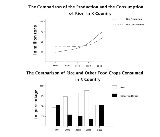
The line graph anticipates the analogy between the production and the utilization of rice in X country, while the bar chart predicts how many proportions of rice and other food crop consumed in the same country over the course of 50-year period, from 1990 to 2040.

Overall, it is obvious that while both production and consumption of rice have demonstrated an upward trend, consumption will be outnumbered by production. Furthermore, rice consumption exceeds other food types most of the time, followed by the equality in the future.

In terms of the line graph, at the beginning of the given time period, in 1990, rice usage and cultivation stood at approximately 35 million tons and precisely 25 million tons, respectively. Until 2015, the rice consumption levelled off, meanwhile that of production increased moderately, converging on just around 35 million. From 2015 onward, it is surmised that whereas both of them exhibit a drastic rise, production will take the lead, peaking at just under 75 million tons.

With regard to bar chart, in 1990, other food crops accounted for just over 50%, whereas in upcoming three decades, rice consumption outweighed significantly, trebling the percentage of other products. It is anticipated that until 2040, they will equaled at the same proportions, 50%.

Word Count: 209

Answers On The Same Topic:

The Comparison of the Production and the Consumption of Rice in X Country The Comparison of Rice and Other Food Crops Consumed in X Country

The first chart compares how much rice was and will be consumed in X country from 1990 to 2040, while the second chart illustrates how much rice was consumed in the past and will be consumed in the future (down the line) rather than other food crops in the same period. Overall, although there was […]

The Comparison of the Production and the Consumption of Rice in X Country The Comparison of Rice and Other Food Crops Consumed in X Country

The provide graph shows the comparison of producing and consuming of rice start from 1990 to 2024 in predict time, while the table compares between rice and other cops consumed in the same country during the same period. Overall, in the first data shows that both of production and consumption of rice significantly increased. Meanwhile, […]

The Comparison of the Production and the Consumption of Rice in X Country The Comparison of Rice and Other Food Crops Consumed in X Country

The first line graph compares the production and consumption of rice in X country in million tons from 1990 to 2040.While, the second chart compares rice and other food commodities consumed in the same country. Overall, the number of rice and other food crops increased significantly over the given period in same place. In contrast, […]

The Comparison of the Production and the Consumption of Rice in X Country The Comparison of Rice and Other Food Crops Consumed in X Country

The given charts illustrate the comparison of rice production and consumption in X country. While the first chart compares rice production and consumption in million tons from 1990 to 2040, the second chart compares rice and other food crops consumed in that country. Generally speaking, it is apparent that rice production increased markedly during this […]

The Comparison of the Production and the Consumption of Rice in X Country The Comparison of Rice and Other Food Crops Consumed in X Country

The given bar chart provides data on the amount of consumed rice and other types of food crops in percentages over a 50-year period, with projections until 2040, while the provided line graph compares the production and consumption of rice in tons over the given time frame. Looking from an overall perspective, it is readily […]

See All

Other Topics:

The graph shows the number of marriages and divorces in the USA between 1970 and 2000.

The bar chart provides information about the marriage and divorce rates in the USA from 1970 to 2000 and the marital status of adult Americans is demonstrated in another bar chart, for 1970 and 2000. To commence with, in 1970, 2.5 million marriages happened, whereas only 1 million divorces took place. In subsequent years, marriage […]

The pie charts below show the percentage of five kinds of books sold by a bookseller between 1972 and 2012. Summarise the information by selecting and reporting the main features, and make comparisons where relevant.

The graph illustrates the ratio of five distinct type2 of books marketed by a bookseller from 1972 to 2012. Overall, it is clear that Adult fiction was the most popular books in the end of3 period. Conversely, Others was most preferred type of books in the early period. In 1972, Others type books recorded was […]

The charts below show the number of international students enrolled in four subjects at universities in one country in 2010 and 2020, and the percentage of those students who successfully completed their degrees.

The bar chart illustrates the number of international students enrolled in four subjects at third-level education in one country in 2010 and 2020, and the line graph shows the percentage of those students who successfully completed their degrees. Overall, there is an increase in the number of students in all three subjects, with Arts being […]

The first chart shows the average housing prices in two cities in one country in 2010 and 2015, with projections for 2025. The second chart shows the percentage of people aged 30-35 who owned a home in 2010 and 2015.

The bar chart illustrates the average prices on housing in two cities under same country between 2015 and 2010, with projections for 2025, while the pie charts depicts the proportion of the housing status for 30-35 age group between 2010 and 2015. In general, the housing prices in both cities represented an upward trend, while […]

The line graph shows the number of newly graduated students in the UK, while the bar chart compares their proportions in five different jobs occupied by them

The given graphs show a comparison between the number of UK college graduates along with the professions they chose the most within a decade beginning from 1992. It is crystal clear that the number of graduates peaked in 1997, while low interest in professionals led to growth in other fields, even though professionals kept their […]

The charts compare the amount of renewable energy produced in four countries between 2010 and 2020, and the breakdown of produced energy.

The graphs below show us firstly renewable energy production in four countries from 2010 to 2020, secondly renewable energy production in the US from 2010 to 2020, and finally an energy source breakdown in a certain country in 2020. Overall, in the first graph the United States produced the most renewable energy, while India produced […]

See All
We have detected unusual activity on your device.
Please verify your identity to continue.
Note: This verification step won't sign you in. If you have a premium account, please log in to access the service as usual.
Google/Gmail Verification
Or verify using Email/Code
We've sent a verification code to:
youremail@gmail.com (Not your email?)
Enter it below to complete the verification process.
Ensure your email address is correct, your inbox is not full, and you check your spam folder. If no email arrives, consider using an alternative email.
You will need a Premium plan to perform your action!
Note: If you already have a premium account, please log in to access our services as usual.

Plans & Pricing

Our mission is to make quality education accessible for everyone.
However, to keep our hardworking team running and this service alive, we genuinely need your support!
By opting for a premium plan, not only do you sustain us in achieving the mission, but you also unlock advanced features to enrich your learning experience.

Free

For learners who aren't pressed for time

What's included on Free
100+ Cambridge IELTS Tests
Instant IELTS Writing Task 1 & 2 Evaluation (2 times/month)
Instant IELTS Speaking Part 1, 2, & 3 Evaluation (2 times/month)
Instant IELTS Writing Task 1 & 2 Essay Generator (2 times/month)
500+ Dictation & Shadowing Exercises
100+ Pronunciation Exercises
Flashcards
Other Advanced Tools

Premium

For those serious about advancing their English proficiency, and for IELTS candidates aspiring to boost their band score by 1-2 points (especially in writing & speaking) in just 30 days or less

What's included on Premium
Save Your IELTS Test Progress & Analyze Mistakes By Question Type
Save Your Own Flashcard Sets & Use Them On Any Device
Unlock All Courses, IELTS Tests, Section & Part Practice
Unlimited AI Conversations
Unlimited AI Writing Enhancement Exercises
Unlimited IELTS Writing Task 1 & 2 Evaluation
Unlimited IELTS Speaking Part 1, 2, & 3 Evaluation
Checked Answers Will Not Be Published
Unlimited IELTS Writing Task 1 & 2 Essay Generator
Unlimited IELTS Speaking Part 1, 2, & 3 Sample Generator
Unlimited Usage Of Advanced Tools & AI Features
Priority Support within 24h (12-month plan only)

Due to the nature of our service and the provided free trials, payments are non-refundable.