🔥 Today Only: Save 30% on Premium — Offer Ends Soon! - Upgrade Now!
Multiple Graphs

Band 7+: The graph and chart below give information on the average daily maximum and minimum temperatures in degree celsius (C) and the average number of days with rainfall each month for two American cities.

Image for topic: The graph and chart below give information on the average daily maximum and minimum temperatures in degree celsius (C) and the average number of days with rainfall each month for two American cities.
Our system will evaluate the answer based on this AI-generated description.
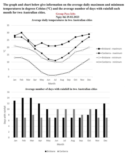
The image presents data on the daily maximum and minimum temperatures and the average number of rainy days monthly for Brisbane and Canberra. For maximum temperatures in Brisbane: Jan 30, Feb 29.5, Mar 28, Apr 26, May 23, Jun 21, Jul 21, Aug 23, Sep 25, Oct 27, Nov 29, Dec 30. Canberra maximum temperatures: Jan 28, Feb 27, Mar 25, Apr 20, May 16, Jun 12, Jul 11, Aug 14, Sep 17, Oct 20, Nov 24, Dec 27. Minimum temperatures in Brisbane: Jan 21, Feb 21, Mar 20, Apr 17, May 13, Jun 10, Jul 9, Aug 10, Sep 13, Oct 16, Nov 19, Dec 21. Canberra minimum temperatures: Jan 13, Feb 13, Mar 11, Apr 7, May 3, Jun 0, Jul -1, Aug 1, Sep 4, Oct 7, Nov 10, Dec 12. Rainy days in Brisbane: Jan 14, Feb 13, Mar 14, Apr 13, May 10, Jun 7, Jul 6, Aug 4, Sep 4, Oct 7, Nov 9, Dec 11. Rainy days in Canberra: Jan 7, Feb 7, Mar 7, Apr 8, May 9, Jun 10, Jul 10, Aug 11, Sep 10, Oct 10, Nov 8, Dec 7.
Given the complexity of the image, the above description may not be entirely accurate.
Note: Both the topic and the answer were created by one of our users.

The graph and chart provide data on the average daily maximum and minimum temperatures in degrees Celsius, along with the average number of rainy days each month in two American cities. This visual comparison helps identify differences in climate and seasonal weather patterns.

From the temperature graph, one city experiences higher temperature variations, suggesting a more continental climate. The other city shows milder changes, indicating a more stable or coastal environment. Maximum temperatures usually peak during July and August, while minimums drop in winter months like January.

The bar chart displaying rainfall shows that one city has more frequent rainy days spread throughout the year, while the other has fewer but possibly heavier rainfall periods. This can affect agriculture, lifestyle, and tourism.

In conclusion, the data gives valuable insight into how climate differs across regions. Clear and well-presented visuals are key to accurate understanding. Always ensure images are sharp and upright to avoid misinterpretation.

Word Count: 154

Answers On The Same Topic:

The graph and chart below give information on the average daily maximum and minimum temperatures in degree celsius (C) and the average number of days with rainfall each month for two American cities.

The line graph compares the average daily maximum and minimum temperatures, measured in degrees Celsius, while the bar chart shows the average number of days with rainfall per month in two Australian cities. Overall, both cities experience similar seasonal temperature patterns, with figures reaching their lowest point in the middle of the year and peaking […]

The graph and chart below give information on the average daily maximum and minimum temperatures in degree celsius (C) and the average number of days with rainfall each month for two American cities.

The line graph illustrates the average daily highest and lowest levels of temperature in degree celsius, while the bar chart depicts the number of monthly days with rainfall for two cities in Australia. Overall, the average maximum and minimum of temperatures varies all year round, with the data falling to the bottom in the middle […]

The graph and chart below give information on the average daily maximum and minimum temperatures in degree celsius (C) and the average number of days with rainfall each month for two American cities.

The two visuals present related data on the average daily upper and lower temperatures in degree celsius in addition the average number of days with rainfall each month for couple Australian cities. Overall,the table shows days with rainfall over a year between Brisbane and Canberra, the line graph highlights every day temperatures as above both […]

The graph and chart below give information on the average daily maximum and minimum temperatures in degree celsius (C) and the average number of days with rainfall each month for two American cities.

The line graph indicates the daily temperature in degrees Celsius in terms of maximum and minimum, while the bar chart illustrates the monthly rainfall days in two Australian cities, namely Brisbane and Canberra. Overall, the daily temperatures in both cities displayed erratic patterns in both categories, with the figure for Brisbane consistently higher than the […]

See All

Other Topics:

The piecharts below show the percentage of five kinds of books sold by a bookseller between 1971 and 2012

The given pie charts illustrate the sales number of books in five different categories from a bookseller in 50 years between 1972 and 2012. In overall, adult fiction and children’s fiction sales increased gradually over the period, while other categories decreased steadily throughout the years. In 1972, the number of adult fiction books comprised of […]

The graphs below show four categories of citrus fruits and the top three countries to which these were exported (in thousand tonnes) in 2012. Summarise the information by selecting and reporting the main features and make comparisons where relevant.

The claim chart gives information about four different citrus fruits: oranges, lemons, grapefruits and others with the most popular three countries to which these exported (in thousand tonnes) in 2012. Overall, it is clear that there are four categories of citrus fruits. Mexico with lemon and others fruits remained a considerably higher among other countries. […]

The four bar charts compare the percentage of male and female students who achieved high grades (A and B) in five subjects at Parston School and the national average.

The four bar charts illustrate the percentage of Parston school students, categorised by genders, who achieved high grades in five subjects and the national average figures. Overall, while male students were good at math and science, the remaining subjects attracted female students more. Moreover, all students at Parston school performed above the national average in […]

The three pie charts below show changes in annual spending by a particular UK school in 1981,1991 and 2001.

The three pie charts compares yearly expenditure by a specific UK school in 1981, 1991 and 2001. Overall, expenses on teacher’s salaries increased and dominated all categories over the period. Similarly, the amount of money spent on furniture and equipment and other worker’s salaries showed a growth whereas that of resources and insurance decreased. In […]

You should spend about 20 minutes on this task. The line graph below shows the percentage of households in a country with access to the Internet from 2000 to 2020. The pie chart shows the distribution of Internet usage by purpose in the year 2020. Summarise the information by selecting and reporting the main features, and make comparisons where relevant. Write at least 150 words.

The line graph elucidate the proportion of households with internet access in a country between 2000 and 2020, While the pie chart indicates how the internet was used for different purposes in 2020 Overall,the persentage of households with internrt access increased significantly throughout the period. in addition social media accounted for the largest share of […]

The graphs show the residential water use by 5 sections in UK. Summarise the information by selecting and reporting the main features, and make comparisons where relevant.

The charts below show information on residential water use in 1988 and 2008. The two pie charts outline the residental water use for different reasons -garden, bathroom, toilet, washing clothes, kitchen- between 1988 and 2008. Overall, there was a downward trend, albeit to varying degrees and different patterns, in the proportion of water usage for […]

See All
We have detected unusual activity on your device.
Please verify your identity to continue.
Note: This verification step won't sign you in. If you have a premium account, please log in to access the service as usual.
Google/Gmail Verification
Or verify using Email/Code
We've sent a verification code to:
youremail@gmail.com (Not your email?)
Enter it below to complete the verification process.
Ensure your email address is correct, your inbox is not full, and you check your spam folder. If no email arrives, consider using an alternative email.
You will need a Premium plan to perform your action!
Note: If you already have a premium account, please log in to access our services as usual.

Plans & Pricing

Our mission is to make quality education accessible for everyone.
However, to keep our hardworking team running and this service alive, we genuinely need your support!
By opting for a premium plan, not only do you sustain us in achieving the mission, but you also unlock advanced features to enrich your learning experience.

Free

For learners who aren't pressed for time

What's included on Free
100+ Cambridge IELTS Tests
Instant IELTS Writing Task 1 & 2 Evaluation (2 times/month)
Instant IELTS Speaking Part 1, 2, & 3 Evaluation (5 times/month)
Instant IELTS Writing Task 1 & 2 Essay Generator (2 times/month)
500+ Dictation & Shadowing Exercises
100+ Pronunciation Exercises
Flashcards
Other Advanced Tools

Premium

For those serious about advancing their English proficiency, and for IELTS candidates aspiring to boost their band score by 1-2 points (especially in writing & speaking) in just 30 days or less

What's included on Premium
Save Your IELTS Test Progress
Unlock All Courses & IELTS Tests
Unlimited AI Conversations
Unlimited AI Writing Enhancement Exercises
Unlimited IELTS Writing Task 1 & 2 Evaluation
Unlimited IELTS Speaking Part 1, 2, & 3 Evaluation
Checked Answers Will Not Be Published
Unlimited IELTS Writing Task 1 & 2 Essay Generator
Unlimited IELTS Speaking Part 1, 2, & 3 Sample Generator
Unlimited Usage Of Advanced Tools
Priority Support within 24h (12-month plan only)

Due to the nature of our service and the provided free trials, payments are non-refundable.
Nếu bạn là người Việt Nam và không có hoặc không muốn trả bằng credit/debit cards, bạn có thể thanh toán bằng phương thức chuyển khoản:


Chọn gói:
419,000₫ 277,000 ₫ cho gói 1 tháng (chỉ 9,233₫/ngày)
1,239,000₫ 597,000 ₫ cho gói 3 tháng (chỉ 6,633₫/ngày)
2,469,000₫ 1,027,000 ₫ cho gói 6 tháng (chỉ 5,706₫/ngày)
4,929,000₫ 1,417,000 ₫ cho gói 12 tháng (chỉ 3,936₫/ngày)


Sau khi chuyển khoản, vui lòng đợi trình duyệt tự động điều hướng bạn trở lại Engnovate và bạn sẽ ngay lập tức nhận được mã kích hoạt tài khoản premium.
Nếu có lỗi xảy ra, bạn có thể liên hệ với team thông qua một trong các phương thức: email đến helloengnovate@gmail.com hoặc nhắn tin qua facebook.com/engnovate.
Vì toàn bộ công cụ trên website đều có thể sử dụng thử miễn phí, Engnovate không hỗ trợ hoàn tiền.