Our system will evaluate the answer based on this AI-generated description.
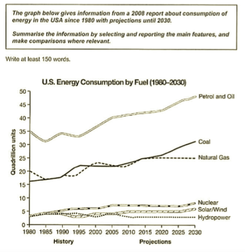
The image shows a line graph titled "U.S. Energy Consumption by Fuel (1980-2030)" with data from 1980 to 2007 as history and projected data from 2010 to 2030. The graph displays energy consumption in quadrillion units on the y-axis and time in years on the x-axis. Petrol and Oil consumption starts at approximately 35 quadrillion units in 1980, reaching nearly 45 quadrillion units in 2007 and projected to reach over 50 quadrillion units by 2030. Coal consumption begins at just over 15 quadrillion units, increasing to almost 25 quadrillion units in 2007 and projected at 30 quadrillion units in 2030. Natural Gas consumption starts at around 15 quadrillion units, with a steady increase to 25 quadrillion units in 2007 and projected to continue to about 30 quadrillion units in 2030. Nuclear, Solar/Wind, and Hydropower have significantly lower consumption levels, all starting below 5 quadrillion units in 1980. Nuclear energy shows a gradual increase to approximately 8 quadrillion units by 2007, with a projection of nearly 10 quadrillion units by 2030. Solar/Wind energy sees the most significant projected increase, starting at nearly 0 quadrillion units in 1980, with a slight increase to almost 3 quadrillion units in 2007 and an anticipated surge to 10 quadrillion units by 2030. Hydropower consumption remains relatively stable, starting at just over 2 quadrillion units, with little change by 2007 and a small projected increase to about 4 quadrillion units by 2030.
Given the complexity of the image, the above description may not be entirely accurate.
Skyrocket your IELTS band score by 1-2 points in under a month with our premium plan!
Note: Both the topic and the answer were created by one of our users.
The given line graph illustrates data from a report in 2008 regarding energy consumption in USA since 1980 with a prediction until 2030.
Overall the cleaner energy as nuclear , solar-wind and hydropower have the same start by 1980 with less than 5 quadrillion units. Moreover the petrol-oil , coal and natural gas faced a slight increase.
Regarding the fossil fuel , petrol and oil was the highest consumption starts with 35 quadrillion in 1980 followed by a fluctuation until the year 2000 furthermore by the rest of years the given graph shows the gradual increase until it reach their peak by 2030.Looking to the coal and natural gas the proportion in 1980 made up almost 15 and 20 , respectively , followed by a fluctuation for both of them until 2015 little bit more than 20 where natural gas remained steady where coal consumption dramatical rise peaked at 30 by 2030.In the other hand we have the cleaner energy all of them starts from the same point in 1980 followed by a fluctuation until 2005 for both of solar-wind and hydropower where the hydropower faced a slight decrease until 2010 before it remained steady and the line of solar-wind showed a slight increase while the nuclear line’s showed a slight increase before it remained steady until 2030
Word Count: 218
