🔥 Today Only: Save 30% on Premium — Offer Ends Soon! - Upgrade Now!
Line Graph

Band 4+: The graph below shows the consumption of fish and some different kinds of meat in a European country between 1979 and 2004.

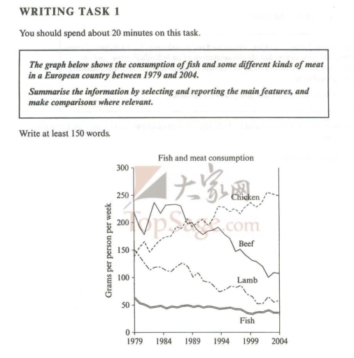
Image for topic: The graph below shows the consumption of fish and some different kinds of meat in a European country between 1979 and 2004.
Our system will evaluate the answer based on this AI-generated description.
The image shows a line graph depicting the consumption of fish and different kinds of meat in a European country between 1979 and 2004, measured in grams per person per week. The x-axis represents the years, with intervals of 5 years from 1979 to 2004, while the y-axis measures the consumption from 0 to 300 grams, with intervals of 50 grams. The graph includes four lines representing Chicken, Beef, Lamb, and Fish, with each line showing an individual trend over the years. Chicken consumption started at just below 150 grams in 1979, steadily increased to just below 250 grams by 2004. Beef consumption fluctuated, starting at just above 200 grams in 1979, decreasing to just above 150 grams in 1999, and slightly increasing to just below 200 grams again by 2004. Lamb consumption showed a consistent decrease, starting at just below 150 grams in 1979 and ending at just above 50 grams in 2004. Fish consumption remained relatively stable, starting at just above 50 grams in 1979, reaching a peak at just below 100 grams in 1989, and fluctuating between 50 and 75 grams in the years following, ending at just below 50 grams in 2004.
Given the complexity of the image, the above description may not be entirely accurate.
Note: Both the topic and the answer were created by one of our users.

The line graph demonstrates about the ingestion of various types of meat based foods eaten by the individuals of European country between 1979 and 2004.

Overall, By analyzing the general trend, fish was the lowest intake food in over the years. Whereas, chicken was consumed very much after an half decade.

Initially, approx. 148 grams of chicken were consumed by the citizens of European country in the initial year. Coherently, intake of beef was extreme at the beginning but as the years passed it got deteriorated by 120 grams. Whereas, after an 5 year of duration the consumption of chicken got rocketed and became the highest meal derived consumed food in a European country by approx. 270 gram.

On the other hand, intake of lamb was at the stable level of 150 gram but as the years passed the level got drop and reached at approx. 65 grams. However, individuals of European country was not intaking the fish as the other meat and after an year, the consistency prevailed and it became the lowest meat based food which consumed by people of European country.

Word Count: 184

Answers On The Same Topic:

The graph below shows the consumption of fish and some different kinds of meat in a European country between 1979 and 2004.

The line chart illustrates the consumption of chicken, beef, lamb, and fish in a country in Europe from 1979 to 2004. Overall, it is clear that the amount of chicken consumed rose significantly and overtook beef, while lamb and beef had a downward trend. Having stood at about 145 grams initially (the third highest figure […]

The graph below shows the consumption of fish and some different kinds of meat in a European country between 1979 and 2004.

The graph shows the stark different of consumption kind of meat in 1979 to 2004. The unit of measurement is in grams(g). Overall, the consumption of chicken was increased through year. While the other catagories such as beef , lamb, and fish did not increased as well as chciken. For chicken catagories, the number of […]

The graph below shows the consumption of fish and some different kinds of meat in a European country between 1979 and 2004.

The line graph compares the amount of four types of meat and fish consumed per person per week in a European country from 1979 to 2004. Overall, chicken consumption increased steadily over the period, while the intake of beef, lamb, and fish decreased. Among all, chicken became the most popular meat by the end of […]

The graph below shows the consumption of fish and some different kinds of meat in a European country between 1979 and 2004.

The graph illustrates changes in the amount of beef, lamb, chicken and fish consumed in a particular European country over a 25-year period, from 1979 to 2004. Units are measured in grams per person per week. Overall, it can be seen that the consumption of all types of meat and fish decreased, with the exception […]

See All

Other Topics:

The graph below shows the results of a survey among online adults on their use of various social media in the USA between 2012 and 201 5.

The line graph illustrates the usage of different websites, namely Facebook, Pinterest, Instagram, LinkedIn, and Twitter, by adults in the United States from 2012 to 2015. The percentage of people using all the websites showed a slight, steady increase during the 4 years, except for LinkedIn, which showed a mild decline starting in 2014. Facebook […]

The line graph below shows changes in the amount and type of fast food consumed by Australian from 1975 to 2000.

The line graph illustrates how much fast food consumed by teenagers in Australia from 1975 to 2000, which is a 25-year period. Overall, what stands out from the graph is that the consumption of fish and chips declined over the period, while the reverse true for the intake of hamburgers and pizza. Notably, although fish […]

The graph below shows the percentage of Australian exports to 4 countries from 1990 to 2o15.

The graph provides data on the percentage (0 – 30) of Australian export to four countries – Japan, US, China, and India in 22 years from 1990 to 2012. Overail, Japan and United States noticeable decreased, while China and India dramatically rises. Japan was leading at the start but being overtaken by India at the […]

the chart below shows the changes in the amount of coffee exported from three countries between 2002 and 2012

The line graph compares the variation in the figure of exported coffee from three countries – Brazil, Colombia and Costa Rica – over a 10-year period from 2002 to 2012. Overall, coffee exports followed a discernible upward trend in all three countries, although the magnitude and pattern of the rises differed markedly. Colombia and Costa […]

The chart below shows the percentage of households with different kinds of technology in the UK from 1997 to 2001. Summarise the information by selecting and reporting the main features, and make comparisons where relevant.

The line graph illustrates the proportion of residents who used various type of technological pattens in the UK between 1997 and 2001. Overall, while the precentage of technology pattens usage rose during this period, the CD palyer was the most popular among the other pattens. Furthermore, the rate of DVD palyer recoreded the lowest usage […]

You should spend about 20 minutes on this task. The graph below shows the daily consumption of three spreads per person from 1981 to 2007 in a country. Summarise the information by selecting and reporting the main features, and make comparisons where relevant. You should write at least 150 words.

The line graph gives information about margarine,butter,low-fat and reduced spreads from 1981 to 2007 and is measured in grams. The most significant facts to emerge from the graph are that butter and margarine experienceD significant fall. Low fat and reduced spreads, WHICH appeared later, had a high decrease. Butter was the most popular spreads, which […]

See All
We have detected unusual activity on your device.
Please verify your identity to continue.
Note: This verification step won't sign you in. If you have a premium account, please log in to access the service as usual.
Google/Gmail Verification
Or verify using Email/Code
We've sent a verification code to:
youremail@gmail.com (Not your email?)
Enter it below to complete the verification process.
Ensure your email address is correct, your inbox is not full, and you check your spam folder. If no email arrives, consider using an alternative email.
You will need a Premium plan to perform your action!
Note: If you already have a premium account, please log in to access our services as usual.

Plans & Pricing

Our mission is to make quality education accessible for everyone.
However, to keep our hardworking team running and this service alive, we genuinely need your support!
By opting for a premium plan, not only do you sustain us in achieving the mission, but you also unlock advanced features to enrich your learning experience.

Free

For learners who aren't pressed for time

What's included on Free
100+ Cambridge IELTS Tests
Instant IELTS Writing Task 1 & 2 Evaluation (2 times/month)
Instant IELTS Speaking Part 1, 2, & 3 Evaluation (2 times/month)
Instant IELTS Writing Task 1 & 2 Essay Generator (2 times/month)
500+ Dictation & Shadowing Exercises
100+ Pronunciation Exercises
Flashcards
Other Advanced Tools

Premium

For those serious about advancing their English proficiency, and for IELTS candidates aspiring to boost their band score by 1-2 points (especially in writing & speaking) in just 30 days or less

What's included on Premium
Save Your IELTS Test Progress & Analyze Mistakes By Question Type
Save Your Own Flashcard Sets & Use Them On Any Device
Unlock All Courses, IELTS Tests, Section & Part Practice
Unlimited AI Conversations
Unlimited AI Writing Enhancement Exercises
Unlimited IELTS Writing Task 1 & 2 Evaluation
Unlimited IELTS Speaking Part 1, 2, & 3 Evaluation
Checked Answers Will Not Be Published
Unlimited IELTS Writing Task 1 & 2 Essay Generator
Unlimited IELTS Speaking Part 1, 2, & 3 Sample Generator
Unlimited Usage Of Advanced Tools & AI Features
Priority Support within 24h (12-month plan only)

Due to the nature of our service and the provided free trials, payments are non-refundable.