🔥 Today Only: Save 30% on Premium — Offer Ends Soon! - Upgrade Now!
Bar Chart

Band 7+: The graph below shows the contribution of three sectors, agriculture manufacturing and business and financial services to the UK economy in the twentieth century.summarizing information by selecting and reporting the main features and make a comparisons were relevant.

Image for topic: The graph below shows the contribution of three sectors, agriculture manufacturing and business and financial services to the UK economy in the twentieth century.summarizing information by selecting and reporting the main features and make a comparisons were relevant.
Our system will evaluate the answer based on this AI-generated description.
The image depicts a bar graph representing the contribution of selected sectors to the UK economy in the twentieth century, with data points in 1900, 1950, 1975, and 2000. The graph shows three sectors: Agriculture (in blue), Manufacturing (in green), and Business and Financial (in purple). In 1900, Agriculture contributed approximately 10%, Manufacturing 50%, and Business and Financial 40%. In 1950, the contributions were approximately 5% for Agriculture, 45% for Manufacturing, and 50% for Business and Financial. By 1975, Agriculture's contribution decreased to around 2%, while Manufacturing and Business and Financial had contributions of roughly 35% and 63% respectively. In 2000, Agriculture's contribution was negligible at less than 5%, Manufacturing decreased further to around 25%, and Business and Financial increased to around 70%.
Given the complexity of the image, the above description may not be entirely accurate.
Note: Both the topic and the answer were created by one of our users.

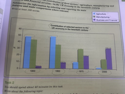
The bar chart displays the variations in how agriculture, manufacturing and business and financial services contributed to the British economy throughout the 20th century.

In general, it is clearly evident that agriculture and manufacturing, once the most dominant sectors in the UK’s past economy, had witnessed a diminishment in values over the timeframe, whereas business and finance experienced an upward trend.

Being the first ranked sector, agriculture commenced the period with under a half of the economy, which was closely followed by manufacturing, registering around 45%. The figure for agriculture then underwent a slight increase to a high of roughly 53% in the 50s before experiencing a precipitous decline to just above 2% in 2000. Meanwhile, manufacturing recorded a rather steady fall in its contribution of about 30% over the next century.

Regarding business and finance, from being the lowest ranking segment with just under 5% in 1900, the figure then made a significant growth to approximately 35% in the last year, overtaking agriculture’s initial position to become the most predominant economic sector.

Word Count: 173

Answers On The Same Topic:

The graph below shows the contribution of three sectors, agriculture manufacturing and business and financial services to the UK economy in the twentieth century.summarizing information by selecting and reporting the main features and make a comparisons were relevant.

At first,we look at the contribution of agriculture in 1900.it is placed a bit lower than 50%.To 1950 it rose to above 50%. Then it was getting lower,In 1975 it hit a little more than 10% and to 2000 it hit almost 0%. As we look to the manufacturing sector,we can say,that it was getting […]

The graph below shows the contribution of three sectors, agriculture manufacturing and business and financial services to the UK economy in the twentieth century.summarizing information by selecting and reporting the main features and make a comparisons were relevant.

The graph illustrates how the contribution of agriculture, manufacturing, and business and financial services to the UK economy changed over the 20th century. Overall, it can be seen that the agriculture and manufacturing saw a stable decrease during the entire period, whilst the business and financial witnessed a noticeable rise. Agriculture accounted for almost 50% […]

The graph below shows the contribution of three sectors, agriculture manufacturing and business and financial services to the UK economy in the twentieth century.summarizing information by selecting and reporting the main features and make a comparisons were relevant.

The diagram provides a supplement of three economic fields of the UK in the twentieth century, including agriculture, manufacturing, and business and financial services. Overall, the contribution of the trio showed some fluctuation from 1900 to 2000; each of them had general upward and downward trends. In the period between 1900 and 1950, agriculture occupied […]

The graph below shows the contribution of three sectors, agriculture manufacturing and business and financial services to the UK economy in the twentieth century.summarizing information by selecting and reporting the main features and make a comparisons were relevant.

The graph illustrates how the contributions of agriculture, manufacturing, and business and financial services to the UK economy changed over the 20th century. Overall, the financial and business sector saw a remarkable rise, the manufacturing sector witnessed a steady decrease, and agriculture had undergone a dramatic decline by the end of the century. Manufacturing accounted […]

The graph below shows the contribution of three sectors, agriculture manufacturing and business and financial services to the UK economy in the twentieth century.summarizing information by selecting and reporting the main features and make a comparisons were relevant.

The Bart chart describes data about three different fields – agriculture, manufacturing, and business and financial services- contributed to the economy in the UK in last the century. Overall, there were downward trends in the contribution of agriculture and manufacturing, while business and financial services experienced an upward trend, becoming the most profitable. Focusing on […]

See All

Other Topics:

The graph shows the percentage of males aged 16-25 in a particular country who prefer watching sports to males who prefer participating in sports. Summarise the information by selecting and reporting the main features and make comparisons where relevant.

The bar chart illustrates the percentage of male aged 16-25 who prefer watching sports and who prefer participating in a particular country Overall,the percentage of males watching exceeded that of participating sports. Another outstanding feature is that fishing was the most popular sport among male who loves participating while the majority of watching-lovers show the […]

The chart shows the number of households in the us by thier annual income in 2007,20011and 2015.

The table provides information on the numbers of households (millions) in the US according to their income per annum for the following year’s (2007, 2010 and 2015). Generally, the number of households earnings per year varied over the specified years. Notably, the low income bracket (less than $25.000- $49.999) and the highest income group ($100.000 […]

the chart below shows the population percentage aged 65 and above in three countries in 1980, 2000, and predicted percentage in 2030

The given bar chart illustrates the percentage of population aged 65 and over in Canada, Germany and United Kingdom in 1980, 2000 and 2030. Overall, it can be clearly seen that the proportion of eldary people in Germany was the highest chart and rose gradually in every years shown. Meanwhile, the percentage of people in […]

The chart below gives information on agricultural exports from the United States in 2019 and 2020. Summarise the information by selecting and reporting the main features and make comparisons where relevant.

The bar chart compares the value of four agricultural exports from the United States in 2019 and 2020. Overall, soybeans were the most valuable export in both years, while beef was the least exported product. In general, all four items showed an increase over the period. In 2019, soybean exports were by far the highest, […]

Writing Task 1 The graph below gives information about the number of people who smoked cigarettes in the UK between 2011 and 2021.

The bar chart displays data about numbers of cigarette smokers in England, Wales, Scotland and Northen Ireland from 2011 to 2021. Overall, figures of smokers of both males and females showed a significant decrease over the entire period of time, while more men smoked cigarettes than women during all the recorded years. Male smokers made […]

The table Below gives information about the percentage of workforce employed in six industries in Australia between 1989 and 2009.

The chart illustrates the proportion of Australia’s workforce engaged in six industries: manufacturing, retail, health care, construction, education and tourism from 1989 to 2009. Overall, many people worked in health care, construction, education, and tourism over the period, while the opposite was true for the remaining sectors. In addition, tourism had the lowest percentage of […]

See All
We have detected unusual activity on your device.
Please verify your identity to continue.
Note: This verification step won't sign you in. If you have a premium account, please log in to access the service as usual.
Google/Gmail Verification
Or verify using Email/Code
We've sent a verification code to:
youremail@gmail.com (Not your email?)
Enter it below to complete the verification process.
Ensure your email address is correct, your inbox is not full, and you check your spam folder. If no email arrives, consider using an alternative email.
You will need a Premium plan to perform your action!
Note: If you already have a premium account, please log in to access our services as usual.

Plans & Pricing

Our mission is to make quality education accessible for everyone.
However, to keep our hardworking team running and this service alive, we genuinely need your support!
By opting for a premium plan, not only do you sustain us in achieving the mission, but you also unlock advanced features to enrich your learning experience.

Free

For learners who aren't pressed for time

What's included on Free
100+ Cambridge IELTS Tests
Instant IELTS Writing Task 1 & 2 Evaluation (2 times/month)
Instant IELTS Speaking Part 1, 2, & 3 Evaluation (5 times/month)
Instant IELTS Writing Task 1 & 2 Essay Generator (2 times/month)
500+ Dictation & Shadowing Exercises
100+ Pronunciation Exercises
Flashcards
Other Advanced Tools

Premium

For those serious about advancing their English proficiency, and for IELTS candidates aspiring to boost their band score by 1-2 points (especially in writing & speaking) in just 30 days or less

What's included on Premium
Save Your IELTS Test Progress & Analyze Mistakes By Question Type
Unlock All Courses & IELTS Tests
Unlimited AI Conversations
Unlimited AI Writing Enhancement Exercises
Unlimited IELTS Writing Task 1 & 2 Evaluation
Unlimited IELTS Speaking Part 1, 2, & 3 Evaluation
Checked Answers Will Not Be Published
Unlimited IELTS Writing Task 1 & 2 Essay Generator
Unlimited IELTS Speaking Part 1, 2, & 3 Sample Generator
Unlimited Usage Of Advanced Tools
Priority Support within 24h (12-month plan only)

Due to the nature of our service and the provided free trials, payments are non-refundable.
Nếu bạn là người Việt Nam và không có hoặc không muốn trả bằng credit/debit cards, bạn có thể thanh toán bằng phương thức chuyển khoản:


Chọn gói:
419,000₫ 277,000 ₫ cho gói 1 tháng (chỉ 9,233₫/ngày)
1,239,000₫ 597,000 ₫ cho gói 3 tháng (chỉ 6,633₫/ngày)
2,469,000₫ 1,027,000 ₫ cho gói 6 tháng (chỉ 5,706₫/ngày)
4,929,000₫ 1,417,000 ₫ cho gói 12 tháng (chỉ 3,936₫/ngày)


Sau khi chuyển khoản, vui lòng đợi trình duyệt tự động điều hướng bạn trở lại Engnovate và bạn sẽ ngay lập tức nhận được mã kích hoạt tài khoản premium.
Nếu có lỗi xảy ra, bạn có thể liên hệ với team thông qua một trong các phương thức: email đến helloengnovate@gmail.com hoặc nhắn tin qua facebook.com/engnovate.
Vì toàn bộ công cụ trên website đều có thể sử dụng thử miễn phí, Engnovate không hỗ trợ hoàn tiền.