24 Hours Only: Get 39% OFF on Our Premium Plan - Check Out Now!
Line Graph

Band 7+: The graph below shows the percentage of the Australian workforce in five industries between 1962 and 2012. Summarise the information by selecting and reporting the main features, and make comparisons where relevant.

Image for topic: The graph below shows the percentage of the Australian workforce in five industries between 1962 and 2012. Summarise the information by selecting and reporting the main features, and make comparisons where relevant.
Our system will evaluate the answer based on this AI-generated description.
The image shows data trends from 1962 to 2012 for Services, Manufacturing, Agriculture, Construction, and Mining; in 1962, Services at 40%, Manufacturing at 25%, Agriculture at 30%, Construction at approximately 3%, and Mining at 2%; in 1972, Services at 50%, Manufacturing at approximately 21%, Agriculture at 25%, Construction at 2%, and Mining at around 2%; in 1982, Services at 55%, Manufacturing at approximately 15%, Agriculture at 19%, Construction at 2%, and Mining at around 1%; in 1992, Services at 60%, Manufacturing at around 10%, Agriculture at 14%, Construction at approximately 2%, and Mining at around 1%; in 2002, Services at 70%, Manufacturing at approximately 7%, Agriculture at 11%, Construction at 2%, and Mining at less than 1%; in 2012, Services at around 78%, Manufacturing at 6%, Agriculture at 9%, Construction at around 2%, and Mining at less than 1%.
Given the complexity of the image, the above description may not be entirely accurate.
Note: Both the topic and the answer were created by one of our users.

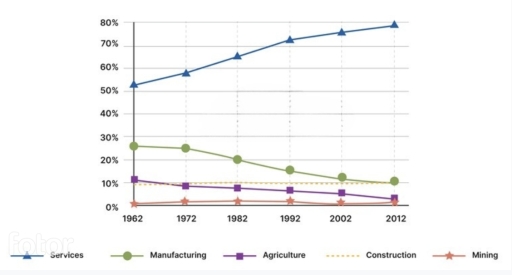
The given graph illustrates the proportion of Australia labour in five different fields during 1962 and 2012.

Overall, the number of people working in services outstripped the list the entire period, while the rest shared no significant differences.

In 1962, staff in services accounted for 50% of total employees in Australia, doubling that of manufacturing and quintupling that of agriculture and construction. In the next 30 years, a dramatic upward trend could be recognized from its volume, reaching over 70%. From then to 2012, the growth slowed down, yet increased slightly to 80%.

Manufacturing and agriculture both witnessed a decline in their percentage of workers, losing 15% and 10% respectively between 1962 and 2012. Meanwhile, that of construction underwent a perfectly static tendency, stabilizing at 10%. Standing at the bottom of the list was mining, recording little to none rate of employees during the same time frame, although the number fluctuated at some points.

Word Count: 154

Answers On The Same Topic:

The graph below shows the percentage of the Australian workforce in five industries between 1962 and 2012. Summarise the information by selecting and reporting the main features, and make comparisons where relevant.

The line graph illustrates the percentage of the workforce employed in five different industries over a 50-year period starting from 1962. Overall, the services sector experienced a significant and steady increase in workforce share, becoming the dominant industry. In contrast, manufacturing and agriculture saw a consistent decline. Meanwhile, construction and mining remained relatively stable with […]

The graph below shows the percentage of the Australian workforce in five industries between 1962 and 2012. Summarise the information by selecting and reporting the main features, and make comparisons where relevant.

The line graph illustrates data about the proportion of Australian workforce in the different industries from 1962 to 2012. Overall, it is quite evident that the all industries declined throughout the given time period, with exception of services increased. To begin with, the Australian workforce of construction industries was stable over the year. Following that, […]

The graph below shows the percentage of the Australian workforce in five industries between 1962 and 2012. Summarise the information by selecting and reporting the main features, and make comparisons where relevant.

The graph illustrate the proportion of different worlforces in five major industries in australia between 1962 to 2012 overall service sector contributed by hugh number of percentage through out the period whilw mining industry never extend any growth and remained last over 52 year firstly manufacturing industry experienced fluctuate situation throughout the period in the […]

The graph below shows the percentage of the Australian workforce in five industries between 1962 and 2012. Summarise the information by selecting and reporting the main features, and make comparisons where relevant.

The chart depicts the proportion of the workforce in five different industries in Australia over two decades of a period, commencing from 1962. By and large, what stands out from the graph is the considerable upward trend in the Services’ figure while other categaries experienced a moderate downward trend. It is also notable that, the […]

The graph below shows the percentage of the Australian workforce in five industries between 1962 and 2012. Summarise the information by selecting and reporting the main features, and make comparisons where relevant.

The line graph illustrates Australia’s workforce proportion in five separate industries in 1962 and 2012. Overall, the line graph did not experience many changes except for the figure for services, which accomplished first place throughout the period examined and reached its peak at nearly 80%. Conversely, the figure for the manufacturing industry started in second […]

See All

Other Topics:

The line graph below shows the percentage of tourists to Scotland who visited four different attractions inEdinburgh. Summarize the information by selecting and reporting the main features, and make comparisons where relevant

The line graph illustrates the proportion of travellers to Scotland who made trips to various attractions in Edinburgh between 1980 and 2010. Overall, the percentage of people who visited the castle and the zoo increased, while the opposed was true for the figure for individuals travelling to the aquarium and the festival. Additionally, visiting the […]

The graph below shows the number of shops that closed and the number of shops that opened in one country between 2011 and 2018.

The graph below illustrates amount of shops which were closed and opened in one country from 2011 to 2018. Overall, the trends show fluctuations in the given time period. The amount of closed shoppings were more than opened ones. The huge gap was seen in 2015 with 3000 shops difference. The amount of closed shops […]

The line graphs shows number of cases of x disease in some land from1960 till 1995.

the line graph illustrates the nuber of affected people byX gisease in Someland from 1960 to 1995. overall, it can be seen that the cases reached at highest poin in the mids before hiting zero in the end of the period. In 1960, the number of people affected by X diseases stood at approximately 50, […]

The provided chart illustrates the percentage of people by age group visiting the cinema at least once per month in one particular country from 1978 to 2008.

The line graph gives information about the proportion of individuals in different age brackets who visited the cinema at least once per month in a country from 1978 to 2008. Overall, all age cohorts followed a similar trend throughout the period from 1978 to 2008. The percentage of visitors in the cinema were in 35-49 […]

the graph below gives information about sugar production and consumption in India from 2001 to 2011

The line graph illustrates how much sugar produce and consume in India from 2001 and 2011. Generally, two of lines fluctuated. Produsing showed a significtant increasing and decreasing overtaking with consumption. Crafting sugar had the highest figure achiving approximatly 32 score in 2011. However, there was a dramatically fall in 2005 and dropped to around […]

The line graph below shows the household recycling rates in three different countries between 2005 and 2015. Summarise the information by selecting and reporting the main features, and make comparisons where relevant.

The line graph illustrates regional recycling trash in three different countries (UK, France, Germany)from 2005 to 2015. Overall, while the rates of Germany and the UK were moderately climbing, the percentages of recycled trash in France were steadily falling at the beginning and then gradually rose in the last years. Over the period from 2005 […]

See All
We have detected unusual activity on your device.
Please verify your identity to continue.
Note: This verification step won't sign you in. If you have a premium account, please log in to access the service as usual.
Google/Gmail Verification
Or verify using Email/Code
We've sent a verification code to:
youremail@gmail.com (Not your email?)
Enter it below to complete the verification process.
Ensure your email address is correct, your inbox is not full, and you check your spam folder. If no email arrives, consider using an alternative email.
You will need a Premium plan to perform your action!
Note: If you already have a premium account, please log in to access our services as usual.

Plans & Pricing

Our mission is to make quality education accessible and free for everyone.
However, to keep our hardworking team running and this service alive, we genuinely need your support!
By opting for a premium plan, not only do you sustain us in achieving the mission, but you also unlock advanced features to enrich your learning experience.

Free

For learners who aren't pressed for time

What's included on Free
1000+ IELTS Tests & Samples
Instant IELTS Writing Task 1 & 2 Evaluation (2 times/month)
Instant IELTS Speaking Part 1, 2, & 3 Evaluation (5 times/month)
Instant IELTS Writing Task 1 & 2 Essay Generator (2 times/month)
500+ Dictation & Shadowing Exercises
100+ Pronunciation Exercises
Flashcards
Other Advanced Tools

Premium

For those serious about advancing their English proficiency, and for IELTS candidates aspiring to boost their band score by 1-2 points (especially in writing & speaking) in just 30 days or less

What's included on Premium
Save Your IELTS Test Progress
Unlock All Courses & Content
Unlimited AI Conversations
Unlimited AI Writing Enhancement Exercises
Unlimited IELTS Writing Task 1 & 2 Evaluation
Unlimited IELTS Speaking Part 1, 2, & 3 Evaluation
Checked Answers Will Not Be Published
Unlimited IELTS Writing Task 1 & 2 Essay Generator
Unlimited IELTS Speaking Part 1, 2, & 3 Sample Generator
Unlimited Usage Of Advanced Tools

Due to the nature of our service and the provided free trials, payments are non-refundable.
Nếu bạn là người Việt Nam và không có hoặc không muốn trả bằng credit/debit cards, bạn có thể thanh toán bằng phương thức chuyển khoản:


Chọn gói:
279,000₫ 157,000 ₫ cho gói 1 tháng (chỉ 5,233₫/ngày)
819,000₫ 397,000 ₫ cho gói 3 tháng (chỉ 4,411₫/ngày)
1,649,000₫ 667,000 ₫ cho gói 6 tháng (chỉ 3,706₫/ngày)
3,299,000₫ 857,000 ₫ cho gói 12 tháng (chỉ 2,381₫/ngày)


Sau khi chuyển khoản, vui lòng đợi trình duyệt tự động điều hướng bạn trở lại Engnovate và bạn sẽ ngay lập tức nhận được mã kích hoạt tài khoản premium.
Nếu có lỗi xảy ra, bạn có thể liên hệ với team thông qua một trong các phương thức: email đến helloengnovate@gmail.com hoặc nhắn tin qua facebook.com/engnovate.
Vì toàn bộ công cụ trên website đều có thể sử dụng thử miễn phí, Engnovate không hỗ trợ hoàn tiền.