🔥 Today Only: Save 30% on Premium — Offer Ends Soon! - Upgrade Now!
Line Graph

Band 6+: The graph below shows the percentage of the Australian workforce in five industries between 1962 and 2012. Summarise the information by selecting and reporting the main features, and make comparisons where relevant.

Image for topic: The graph below shows the percentage of the Australian workforce in five industries between 1962 and 2012. Summarise the information by selecting and reporting the main features, and make comparisons where relevant.
Our system will evaluate the answer based on this AI-generated description.
The image shows data trends from 1962 to 2012 for Services, Manufacturing, Agriculture, Construction, and Mining; in 1962, Services at 40%, Manufacturing at 25%, Agriculture at 30%, Construction at approximately 3%, and Mining at 2%; in 1972, Services at 50%, Manufacturing at approximately 21%, Agriculture at 25%, Construction at 2%, and Mining at around 2%; in 1982, Services at 55%, Manufacturing at approximately 15%, Agriculture at 19%, Construction at 2%, and Mining at around 1%; in 1992, Services at 60%, Manufacturing at around 10%, Agriculture at 14%, Construction at approximately 2%, and Mining at around 1%; in 2002, Services at 70%, Manufacturing at approximately 7%, Agriculture at 11%, Construction at 2%, and Mining at less than 1%; in 2012, Services at around 78%, Manufacturing at 6%, Agriculture at 9%, Construction at around 2%, and Mining at less than 1%.
Given the complexity of the image, the above description may not be entirely accurate.
Note: Both the topic and the answer were created by one of our users.

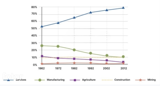
The presented illustration of the line graph demonstrates the proportion of the Australian workforce in five distinct sectors (services, manufacturing, agriculture, construction, and mining) in both years, from 1962 to 2012. Units are measured in percentages.

Overall, it can be clearly seen that all sections are decreased, while services was the only sector that experienced an upward trend.

At the beginning of the period, services makes up at just over 50%, and significantly increased to 72% in 1992, then gradually climbed to 80% at the end of the given period. In contrast, both construction and agriculture accounts for around 10% in 1962, then construction remained unchanged, however, agriculture slightly decreased to 0% in the year 2012. Likewise, throughout the period, there was no change in mining section. Moreover, manufacturing initially starts at approximately 28%, then it was dramatically declined to 10% in 2012.

Word Count: 143

Answers On The Same Topic:

The graph below shows the percentage of the Australian workforce in five industries between 1962 and 2012. Summarise the information by selecting and reporting the main features, and make comparisons where relevant.

The line graph illustrates the percentage of the workforce employed in five different industries over a 50-year period starting from 1962. Overall, the services sector experienced a significant and steady increase in workforce share, becoming the dominant industry. In contrast, manufacturing and agriculture saw a consistent decline. Meanwhile, construction and mining remained relatively stable with […]

The graph below shows the percentage of the Australian workforce in five industries between 1962 and 2012. Summarise the information by selecting and reporting the main features, and make comparisons where relevant.

The line graph illustrates data about the proportion of Australian workforce in the different industries from 1962 to 2012. Overall, it is quite evident that the all industries declined throughout the given time period, with exception of services increased. To begin with, the Australian workforce of construction industries was stable over the year. Following that, […]

The graph below shows the percentage of the Australian workforce in five industries between 1962 and 2012. Summarise the information by selecting and reporting the main features, and make comparisons where relevant.

The graph illustrate the proportion of different worlforces in five major industries in australia between 1962 to 2012 overall service sector contributed by hugh number of percentage through out the period whilw mining industry never extend any growth and remained last over 52 year firstly manufacturing industry experienced fluctuate situation throughout the period in the […]

The graph below shows the percentage of the Australian workforce in five industries between 1962 and 2012. Summarise the information by selecting and reporting the main features, and make comparisons where relevant.

The chart depicts the proportion of the workforce in five different industries in Australia over two decades of a period, commencing from 1962. By and large, what stands out from the graph is the considerable upward trend in the Services’ figure while other categaries experienced a moderate downward trend. It is also notable that, the […]

The graph below shows the percentage of the Australian workforce in five industries between 1962 and 2012. Summarise the information by selecting and reporting the main features, and make comparisons where relevant.

The line graph illustrates Australia’s workforce proportion in five separate industries in 1962 and 2012. Overall, the line graph did not experience many changes except for the figure for services, which accomplished first place throughout the period examined and reached its peak at nearly 80%. Conversely, the figure for the manufacturing industry started in second […]

See All

Other Topics:

THE GRAPH BELOW SHOWS THE NUMBER OF MOBILE PHONE SUBSCRIPTIONS

The line graph compares three world regions by their mobile phone subscriptions from 2010 to 2025. Overall, every region shares the same pattern by gradually increasing in all time periods. However, Asia remained higher than the other regions. In 2010, the number of mobile subscriptions in Asia was about 2000, in contrast to Europe, which […]

THE GRAPH BELOW SHOWS THE NUMBER OF MOBILE PHONE SUBSCRIPTIONS

THE LINE GRAHP COMPARES THREE WORLD REGONS BY THEIR MOBILE PHONE SUBSCRIPTIONS FROM 2010 TO 2025. OVERALL, EVERY REGION SHARES THE SAME PATTERN BY GRADULLY INCREASING IN ALL TIME PERIODS. HOWEVER, ASIA REMAINED HIGHER THAN THE OTHER REGIONS. IN 2010, THE NUMBER OF MOBILE SUBSCRIPTIONS IN ASIA WAS ABOUT 2000 IN CONTRAST TO EUROPE STARTED […]

The line graph shows the change in population of 5 countries from 1800 to 2020.

The illustration displays the difference between different countries’ populations. Overall China and India had the best results among the mentioned candidates, whereas Indonesia, Brazil and The United States had almost the same number. It is hard to point out where is Indonasia’s and Brazil’s statistics just because they were roughly the same. According to this […]

The line graph shows the change in population of 5 countries from 1800 to 2020.

The illustrationg displays the difference between different countries’ population. Overall China and India had the best results among the mentioned candidates, whereas Indonesia, Brazil and The United States had almost the same number. It is hard to point out where is Indonasia’s and Brazil’s statistics is just because they were roughly the same. According to […]

The graph below shows the percentage of people by age group visiting the cinema at least once per month in one particular country between 1978 and 2008.

The graph provides information that shows the percentage of people that visiting the cinema at least once per month in one partcular country from 1978 to 2008. Overall, it is clear that the number of people by the age how visiting the cinema at least once show the diffrences between the years, such as the […]

The graph below shows the price of different kinds of bread, in dollars, from 2001 to 2005. Summarise the information by selecting and reporting the main features and make comparisons where relevant.

Overall, the prices of most bread varieties witnessed an upward trend with the exception of Wholegrain bread. While Brown bread was generally the most expensive type, Rye consistently remained the lowest price. Commencing with Brown bread, its price experienced a dramatic increase from approximately 0.6 dollars in 2001 to $1.5 in 2002, before peaking at […]

See All
We have detected unusual activity on your device.
Please verify your identity to continue.
Note: This verification step won't sign you in. If you have a premium account, please log in to access the service as usual.
Google/Gmail Verification
Or verify using Email/Code
We've sent a verification code to:
youremail@gmail.com (Not your email?)
Enter it below to complete the verification process.
Ensure your email address is correct, your inbox is not full, and you check your spam folder. If no email arrives, consider using an alternative email.
You will need a Premium plan to perform your action!
Note: If you already have a premium account, please log in to access our services as usual.

Plans & Pricing

Our mission is to make quality education accessible for everyone.
However, to keep our hardworking team running and this service alive, we genuinely need your support!
By opting for a premium plan, not only do you sustain us in achieving the mission, but you also unlock advanced features to enrich your learning experience.

Free

For learners who aren't pressed for time

What's included on Free
100+ Cambridge IELTS Tests
Instant IELTS Writing Task 1 & 2 Evaluation (2 times/month)
Instant IELTS Speaking Part 1, 2, & 3 Evaluation (5 times/month)
Instant IELTS Writing Task 1 & 2 Essay Generator (2 times/month)
500+ Dictation & Shadowing Exercises
100+ Pronunciation Exercises
Flashcards
Other Advanced Tools

Premium

For those serious about advancing their English proficiency, and for IELTS candidates aspiring to boost their band score by 1-2 points (especially in writing & speaking) in just 30 days or less

What's included on Premium
Save Your IELTS Test Progress
Unlock All Courses & IELTS Tests
Unlimited AI Conversations
Unlimited AI Writing Enhancement Exercises
Unlimited IELTS Writing Task 1 & 2 Evaluation
Unlimited IELTS Speaking Part 1, 2, & 3 Evaluation
Checked Answers Will Not Be Published
Unlimited IELTS Writing Task 1 & 2 Essay Generator
Unlimited IELTS Speaking Part 1, 2, & 3 Sample Generator
Unlimited Usage Of Advanced Tools
Priority Support within 24h (12-month plan only)

Due to the nature of our service and the provided free trials, payments are non-refundable.
Nếu bạn là người Việt Nam và không có hoặc không muốn trả bằng credit/debit cards, bạn có thể thanh toán bằng phương thức chuyển khoản:


Chọn gói:
419,000₫ 277,000 ₫ cho gói 1 tháng (chỉ 9,233₫/ngày)
1,239,000₫ 597,000 ₫ cho gói 3 tháng (chỉ 6,633₫/ngày)
2,469,000₫ 1,027,000 ₫ cho gói 6 tháng (chỉ 5,706₫/ngày)
4,929,000₫ 1,417,000 ₫ cho gói 12 tháng (chỉ 3,936₫/ngày)


Sau khi chuyển khoản, vui lòng đợi trình duyệt tự động điều hướng bạn trở lại Engnovate và bạn sẽ ngay lập tức nhận được mã kích hoạt tài khoản premium.
Nếu có lỗi xảy ra, bạn có thể liên hệ với team thông qua một trong các phương thức: email đến helloengnovate@gmail.com hoặc nhắn tin qua facebook.com/engnovate.
Vì toàn bộ công cụ trên website đều có thể sử dụng thử miễn phí, Engnovate không hỗ trợ hoàn tiền.