Our system will evaluate the answer based on this AI-generated description.
The image contains a line graph showing Twitter use by age group over 8 time points: 10/11, 11/01, 11/05, 11/08, 12/02, 12/08, 12/12, 13/05. Age groups are represented as 18-29, 30-49, 50-64, 65+. At 10/11, 18-29 usage is around 30%, 30-49 around 15%, 50-64 around 5%, 65+ just under 5%. At 11/01, 18-29 increases to just under 35%, 30-49 to just above 15%, 50-64 and 65+ remain steady. At 11/05, 18-29 drops to just above 30%, 30-49 rises to 20%, 50-64 to almost 10%, 65+ to almost 5%. At 11/08, 18-29 rises to just under 35%, 30-49 to just over 20%, 50-64 to just over 10%, 65+ to just over 5%. At 12/02, 18-29 drops to 30%, 30-49 drops to 15%, 50-64 rises to 12.5%, 65+ drops to 5%. At 12/08, 18-29 rises to almost 35%, 30-49 rises to 20%, 50-64 to almost 15%, 65+ to just over 5%. At 12/12, 18-29 drops to just above 30%, 30-49 drops to just over 15%, 50-64 rises to 15%, 65+ to just under 5%. At 13/05, 18-29 rises to just below 35%, 30-49 to just over 20%, 50-64 to just under 15%, 65+ remains steady.
Given the complexity of the image, the above description may not be entirely accurate.
Skyrocket your IELTS band score by 1-2 points in under a month with our premium plan!
Note: Both the topic and the answer were created by one of our users.
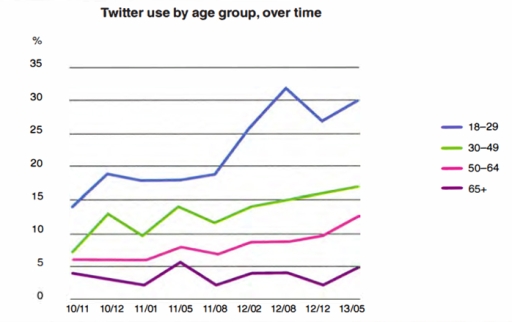
The line graph compares the proportion of US citizens active on Twitter by age category between November 2010 and May 2013. It is clear from the graph that the trends for all four age groups fluctuated upwards with the youngest group of 18-29 year olds being the highest users in contrast to the oldest group who were the lowest.
Looking at the data, the youngest age group stands out as being the highest among the groups throughout the period with the peak of 33 percent in August 2012 before dipping and recovering again. Moreover, this cohort shows an increase from 14% in November 2010 to 30% at the end of the period in May 2013. Meanwhile, the 65+ group has lower improvements with the highest peak of only 6% and the whole usage has barely changed, hovering around 0 to 5 percent throughout the whole period.
According to the graph, three age groups which are 30-49s, 50-64s and 65+ groups have fairly similar looking patterns yet the middle age group of 30-49s year olds has the most jumps among the three. It fluctuated from the start of the period until it started to rise gradually upward to around 17 percent as a peak at the end of the period. While on the other hand, the 50-64 group continuously rose slowly from 5% until 13% at the end of the period.
Word Count: 230