🔥 Today Only: Save 30% on Premium — Offer Ends Soon! - Upgrade Now!
Line Graph

Band 7+: The line graph below gives information about the percentage of women aged 15-64 in employment between 2003 and 2009.

Image for topic: The line graph below gives information about the percentage of women aged 15-64 in employment between 2003 and 2009.
Our system will evaluate the answer based on this AI-generated description.
The image shows a line graph displaying the percentage of women aged 15-64 in employment between 2003 and 2009 in five different countries (Iceland, Canada, Germany, Chile, and Turkey). Data points for each country are represented by distinct shapes for each year. In 2003, Iceland had about 80%, Canada had about 70%, Germany had around 60%, Chile had approximately 35%, and Turkey started with about 25%. By 2005, Iceland's percentage increased slightly to just above 80%, Canada remained close to 70%, Germany showed a small increase to just above 60%, Chile's percentage dropped to just below 35%, and Turkey decreased to around 23%. In 2007, Iceland's percentage remained above 80%, Canada's stayed near 70%, Germany's increased to about 65%, Chile rose slightly to just above 35%, and Turkey decreased further to just above 20%. In the final year, 2009, Iceland's percentage remained steady above 80%, Canada's stayed near 70%, Germany's increased slightly to around 67%, Chile decreased to just below 35%, and Turkey decreased further to just below 20%. The graph illustrates trends over the six-year period for each country in terms of the percentage of women employed within the specified age range.
Given the complexity of the image, the above description may not be entirely accurate.
Note: Both the topic and the answer were created by one of our users.

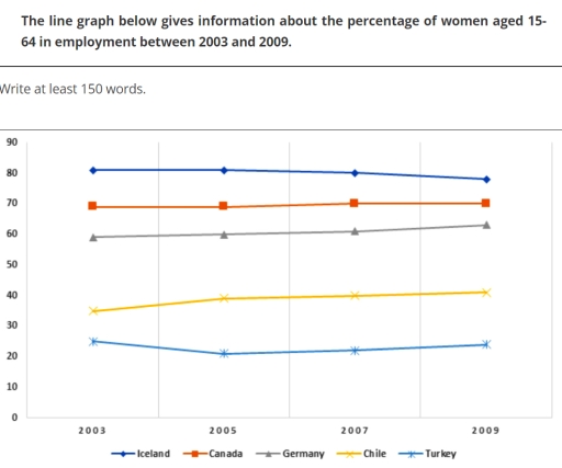
The graph illustrates the proportion of the working population of females of 15 to 64 years old in five countries between 2003 and 2009.

Looking at the trend in Iceland, the percentage of working women with ages from 15 to 64 experienced a gentle downturn over the period shown, dropping from slightly above 80% to a little less than 80%. However, that in Canada elevated gently over the same period.

As is shown in the line graph, there was an escalating ratio of women being employed in Chile and Germany over this time frame. Chile witnessed a gradual uplift in it over the first two years, levelling off at 40% for the last four years, whilst the percentage of women from 15 to 64-years-old having jobs in Germany ascended moderately from a little beneath 60% to a little more than 60% over this 6-year period.

Regarding the trend in the percentage of female employees aged 15-64 in Turkey in these 6 years, it diminished progressively from 2003 to 2005, resulting in a roughly 20% decline. It then reached a plateau of somewhere in the vicinity of 20% throughout the remaining four years.

In general, the percentage of working females in Iceland always outstripped that in the other four countries throughout the whole period, with the proportion of female workers in Chile experienced the most noticeable rise.

Word Count: 226

Answers On The Same Topic:

The line graph below gives information about the percentage of women aged 15-64 in employment between 2003 and 2009.

The graph shows data about the percentage of women aged 15-54 in job between 2003-2009. Overall,The Iceland have the highest female employment percentage among the countries while The turkey shows the lowest rates over the years. In 2003,Iceland started at 80% higher than Canada which stated at 70%. From 2003 to 2007 Iceland remained unchanged,by […]

The line graph below gives information about the percentage of women aged 15-64 in employment between 2003 and 2009.

The line graph illustrate the data of proportion of women employed at the of aged 15-64 in countries Iceland , Canada ,Germany ,Chile and turkey between 2003 and 2009. Overall , Iceland has the highest amount of women employed throughout the period followed by Canada and Germany while the lowest proportion are the Chile and […]

The line graph below gives information about the percentage of women aged 15-64 in employment between 2003 and 2009.

The line graph illustrates changes in the employment rates of women aged 15 to 64 across five nations over a six-year period, from 2003 to 2009. Iceland maintained a clear lead, starting at approximately 82% in 2003. Despite a slight dip to around 78% in 2005, it recovered strongly, ending the period at roughly 85%. […]

The line graph below gives information about the percentage of women aged 15-64 in employment between 2003 and 2009.

The line graph performs data about the percentage of female around 15-64 year old who are employed in the period of 2003 to 2009. As a shole, in the five nations, including Iceland, Canada, Germany, Chile and Turkey remained constant throughout the whole peroid between 2003 to 2009. The rankings of the level of female […]

The line graph below gives information about the percentage of women aged 15-64 in employment between 2003 and 2009.

The graph illustrates the percentage of the female employees in five different countries, namely Iceland, Canada, Germany, Chile, Turkey, between 15 to 64-years-old, spanning from 2003 to 2009. Overall the change of percentage experienced a fluctuation and is stable, while Iceland stand at the top status, Canada act as the first-runner-up, Germany at he middle, […]

See All

Other Topics:

Task 1: The chart below shows the price in Euros of 800 grams of four types of bread in one European country from 2001 to 2005. Summarize the information by selecting and reporting the main features, and make comparisons where relevant.

Given is a line graph illustrating the prices of four types of 800-gram bread loaves in a European country over the period of five years since 2001. Overall, while the figure for wholegrain remained the same, the remaining categories saw an increase in the data of them. Besides, the brown bread was the most expensive […]

Task 1: The chart below shows the prices, in euros, of 800 grams of four types of bread in a European country between 2001 and 2005. Provide an overview of the information by identifying and describing the key details, and include comparisons where appropriate.

The chart illustrate the prices of 800 grams of different types of breads including wholegrain, brown, white and rye in a Eroupean country from 2001 to 2006. Prices of those are mesured in euros. As can be seen from the picture, prices of the four breads except for wholegrain increased over the period. Wholegrain used […]

The graph below shows the average monthly change in the prices of three meals during 2014. Summerize the information by selecting and reporting main features and make comparisions where relevant.

the graph compares the average monthly trends in the cost of three diffrent meals during the period of 2014. Overal.all three meals experienced thier lowest points around mid year(june-august), suggesting a common market downturn during that period.However nickel showed the most dramatic recovery,while copper remained sbdued in the letter half.Zinc was the least volatile metal […]

The graph below shows the average number of American commuters travelling each day by car, bus or train between 1980 and 2040

The graph illustrates midrange of American travellers commuting by car, bus or train during period of 1980 and 2040. Overall, in the period of 60 years, from 1980 to 2040, the number of cars will have raised. While the percentage of buses will have rapidly decreased. During the period cars will have the highest percentage […]

The graph below shows the average number of American commuters travelling each day by car, bus or train between 1980 and 2040

The graph below illustrates the usual number of pendular American travellers commuting daily by cars, buses and trains during the period of 60 years. Overall, in the period of 60 years, from 1980 to 2040, the average amount of passengers commuting each day by cars will have risen. In contrast, the buses will have plunged. […]

The graph below gives information about the number of jobs in four sectors economy in the US between 1960 and 2020.

The line graph compares the number of occupations in four sectors of the US industry from 1960 to 2020. Overall, manufacturing dominated in the number of workers, while the opposite was true for healthcare. Additionally, the number staffs who worked in the healthcare and retail increased over the period, whereas manufacturing and agriculture experienced decreases. […]

See All
We have detected unusual activity on your device.
Please verify your identity to continue.
Note: This verification step won't sign you in. If you have a premium account, please log in to access the service as usual.
Google/Gmail Verification
Or verify using Email/Code
We've sent a verification code to:
youremail@gmail.com (Not your email?)
Enter it below to complete the verification process.
Ensure your email address is correct, your inbox is not full, and you check your spam folder. If no email arrives, consider using an alternative email.
You will need a Premium plan to perform your action!
Note: If you already have a premium account, please log in to access our services as usual.

Plans & Pricing

Our mission is to make quality education accessible for everyone.
However, to keep our hardworking team running and this service alive, we genuinely need your support!
By opting for a premium plan, not only do you sustain us in achieving the mission, but you also unlock advanced features to enrich your learning experience.

Free

For learners who aren't pressed for time

What's included on Free
100+ Cambridge IELTS Tests
Instant IELTS Writing Task 1 & 2 Evaluation (2 times/month)
Instant IELTS Speaking Part 1, 2, & 3 Evaluation (5 times/month)
Instant IELTS Writing Task 1 & 2 Essay Generator (2 times/month)
500+ Dictation & Shadowing Exercises
100+ Pronunciation Exercises
Flashcards
Other Advanced Tools

Premium

For those serious about advancing their English proficiency, and for IELTS candidates aspiring to boost their band score by 1-2 points (especially in writing & speaking) in just 30 days or less

What's included on Premium
Save Your IELTS Test Progress
Unlock All Courses & IELTS Tests
Unlimited AI Conversations
Unlimited AI Writing Enhancement Exercises
Unlimited IELTS Writing Task 1 & 2 Evaluation
Unlimited IELTS Speaking Part 1, 2, & 3 Evaluation
Checked Answers Will Not Be Published
Unlimited IELTS Writing Task 1 & 2 Essay Generator
Unlimited IELTS Speaking Part 1, 2, & 3 Sample Generator
Unlimited Usage Of Advanced Tools
Priority Support within 24h (12-month plan only)

Due to the nature of our service and the provided free trials, payments are non-refundable.
Nếu bạn là người Việt Nam và không có hoặc không muốn trả bằng credit/debit cards, bạn có thể thanh toán bằng phương thức chuyển khoản:


Chọn gói:
419,000₫ 277,000 ₫ cho gói 1 tháng (chỉ 9,233₫/ngày)
1,239,000₫ 597,000 ₫ cho gói 3 tháng (chỉ 6,633₫/ngày)
2,469,000₫ 1,027,000 ₫ cho gói 6 tháng (chỉ 5,706₫/ngày)
4,929,000₫ 1,417,000 ₫ cho gói 12 tháng (chỉ 3,936₫/ngày)


Sau khi chuyển khoản, vui lòng đợi trình duyệt tự động điều hướng bạn trở lại Engnovate và bạn sẽ ngay lập tức nhận được mã kích hoạt tài khoản premium.
Nếu có lỗi xảy ra, bạn có thể liên hệ với team thông qua một trong các phương thức: email đến helloengnovate@gmail.com hoặc nhắn tin qua facebook.com/engnovate.
Vì toàn bộ công cụ trên website đều có thể sử dụng thử miễn phí, Engnovate không hỗ trợ hoàn tiền.