Our system will evaluate the answer based on this AI-generated description.
The image presents a line graph indicating population growth by age groups in New Zealand from 1950 to 2050; the age groups are 0-14, 25-37, 36-45, and over 65. In 1950, percentages for age groups were as follows: 0-14 at 45%, 25-37 at 25%, 36-45 at 20%, and over 65 at 10%. In 1960, 0-14 rose to 50%, 25-37 dropped to 20%, 36-45 remained at 20%, and over 65 increased to 15%. By 1970, all groups except 36-45 increased by 5% each, but by 1980, 0-14 declined to 40%, 25-37 grew to 30%, 36-45 stayed at 25%, and over 65 reached 20%. By 1990, 0-14 dropped to 35%, 25-37 slightly grew to 35%, 36-45 maintained at 20%, and over 65 rose to 25%. In 2000, 0-14 went down to 30%, 25-37 shrunk to 30%, 36-45 increased to 30%, and over 65 remained at 25%. In 2010, 0-14 further decreased to 25%, 25-37 went up to 40%, 36-45 slightly rose to 35%, and over 65 fell to 20%. The forecast for 2020 anticipates 0-14 at 20%, 25-37 at 45%, 36-45 at 40%, and over 65 at 30%. By 2030, 0-14 is expected to continue at 20%, 25-37 at 55%, and 36-45 at 40%, with over 65 projected to hit 35%. In 2040, predictions suggest 0-14 remaining at 20%, 25-37 peaking at 60%, 36-45 staying at 40%, and over 65 climbing to 45%. Lastly, the 2050 outlook projects 0-14 at 20%, 25-37 reducing to 55%, 36-45 maintaining at 35%, and over 65 surging to 50%.
Given the complexity of the image, the above description may not be entirely accurate.
Skyrocket your IELTS band score by 1-2 points in under a month with our premium plan!
Note: Both the topic and the answer were created by one of our users.
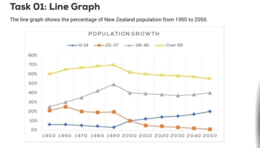
Depicted is a line graph, which offers insights into the change of residents in New Zealand, within the year from 1950 to 2050.
From a generic point of view, the data of people over 65 years old always reach the highest percentage and it is predicted that it will keep this position in the future ,whereas the number of adolescents is tending to decrease and will become the least of population groups in the next quarter of decade.
Delving deeper, one instantly visible feature concerns the data for over 65 groups, which comprised the largest portion initially with about 60%. It then experienced an upward trend around 10% for the following 4 decades. After that, the figure had a decreasing trend and it is estimated to drop to more than a half in the next 3 decades. Regarding the proportion of 38 – 45 groups, it hit a peak with under a half in the 1990s and tends to decline in the following period with approximately 40%.
Presenting a contrastive tendency is the ratio of 25 – 37 groups, which made up around a fifth from 1950 to 1990. In the next 20 years from 1990, it went down significantly and will hit a bottom in 2050. With regard to the index of 0 – 14 population groups, it was a slight decline from 1950 to the next 4 decades, facing a remarkable for the next period, and a upward trend is forecasted in the future.
Word Count: 246