🔥 Today Only: Save 30% on Premium — Offer Ends Soon! - Upgrade Now!
Line Graph

Band 6+: The line graph shows the percentage of New Zealand population from 1950 to 2050

Image for topic: The line graph shows the percentage of New Zealand population from 1950 to 2050
Our system will evaluate the answer based on this AI-generated description.
The image presents a line graph indicating population growth by age groups in New Zealand from 1950 to 2050; the age groups are 0-14, 25-37, 36-45, and over 65. In 1950, percentages for age groups were as follows: 0-14 at 45%, 25-37 at 25%, 36-45 at 20%, and over 65 at 10%. In 1960, 0-14 rose to 50%, 25-37 dropped to 20%, 36-45 remained at 20%, and over 65 increased to 15%. By 1970, all groups except 36-45 increased by 5% each, but by 1980, 0-14 declined to 40%, 25-37 grew to 30%, 36-45 stayed at 25%, and over 65 reached 20%. By 1990, 0-14 dropped to 35%, 25-37 slightly grew to 35%, 36-45 maintained at 20%, and over 65 rose to 25%. In 2000, 0-14 went down to 30%, 25-37 shrunk to 30%, 36-45 increased to 30%, and over 65 remained at 25%. In 2010, 0-14 further decreased to 25%, 25-37 went up to 40%, 36-45 slightly rose to 35%, and over 65 fell to 20%. The forecast for 2020 anticipates 0-14 at 20%, 25-37 at 45%, 36-45 at 40%, and over 65 at 30%. By 2030, 0-14 is expected to continue at 20%, 25-37 at 55%, and 36-45 at 40%, with over 65 projected to hit 35%. In 2040, predictions suggest 0-14 remaining at 20%, 25-37 peaking at 60%, 36-45 staying at 40%, and over 65 climbing to 45%. Lastly, the 2050 outlook projects 0-14 at 20%, 25-37 reducing to 55%, 36-45 maintaining at 35%, and over 65 surging to 50%.
Given the complexity of the image, the above description may not be entirely accurate.
Note: Both the topic and the answer were created by one of our users.

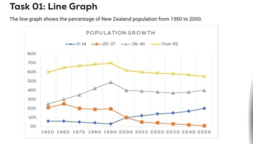
The given line chart illustrates the porpotion of New Zealand citizens in the period of 100 years from 1950 to 2050.

It is clear that while the percentage of individuals who under 15 years old and people who from 38 to 45 years old will be upward trends, the opposite is predicted for those who aged between 25 and 37 years and people over 65 years old. It is also noticeable that the number of old people in New Zealand was highest among all age groups and is likely to continue in the future.

The rate of people aged over 65 years old stood at 60%, increased gradually until reached the highest point of 70% in 1990, then slightly declined. It is predicted that it will continue decreasing by the end of the period. In constrast, the figures for the 25 to 37 years -olds was 21% in 1950, dropped significantly in the first 40 years, then remained stable before continued falling and will hit a low point of 2% in 2050.

Regarding the remaining categories, the perccentage of citizens who aged between 38 to 45 years old was the second highest in terms of all age groups. It rised dramatically from 1950 to 1990 by 25%, the fell slightly and reached 40% in 2000 and is predicted to be the same in the rest of the time period. Meanwhile, the number of people who under 15 years old experienced a marginal fall in the first 40 years, then went up and will reach a high point of 20% in 2050.

Word Count: 261

Answers On The Same Topic:

The line graph shows the percentage of New Zealand population from 1950 to 2050

The line graph illustrates the percentage of New Zealand’s population in different age groups between 1950 and 2050. Overall, it can be seen that the proportion of older people is expected to rise significantly, while the percentage of younger age groups will decline over the period. This indicates an ageing population in New Zealand. In […]

The line graph shows the percentage of New Zealand population from 1950 to 2050

The chart illustrates the proportion of the Australian workforce employed in five different industries between 1962 and 2012. Overall, while employment in the services, mining, and construction sectors increased over the period, the proportions of workers in manufacturing and agriculture showed a steady decline. Throughout the timeframe, the services industry consistently accounted for the largest […]

The line graph shows the percentage of New Zealand population from 1950 to 2050

The chart gives information about the portion of the Australian labour force recruited in five distinct industries between 1962 and 2012. Overall, while the employment rate of services, mining and construction witnessed an upward trend, that of manufacturing and agriculture experienced an opposite situation. Additionally, the percentage of workforce in services remained the highest over […]

The line graph shows the percentage of New Zealand population from 1950 to 2050

The two maps illustrate how the museum has changed since 1998. Overall, it is evident that the museum has transformed dramatically, with the introduction of new facilities and the relocation of rooms. In 1998, visitors could enter the museum from the entrance in the south. On the left of the museum stood a permanent exhibition […]

The line graph shows the percentage of New Zealand population from 1950 to 2050

TThe line graph illustrates the proportion of people in New Zealand across four different age groups from 1950 to 2050. Overall, the percentage of those aged over 65 experienced a steady upward trend over the whole period, while the proportion of those aged 25-37 is expected to decline significantly. However, the percentage of people aged […]

See All

Other Topics:

The line graph below shows the percentage of households in Singapore owned in four different consumer items (computer, car, air conditioning, washing machine) between 1973 and 2008.

The line graph compares the percentage of households with electronic devices in Singapore between 1973 and 2008. Overall, it is clear that four different consumer items increased significantly over the given the period. It is also worth mentioning that the washing machine and the car had the highest position among other categories at the end […]

The line graph below shows the average high and low temperatures in Glasgow, Scotland, over the course of a year, while the table provides information on the average monthly rainfall and sunshine hours. Summarise the information by selecting and reporting the main features, and make comparisons where relevant.

The line graph illustrates the average high and low temperatures in Glasgow, Scotland, during a year, while the table shows the average monthly rainfall and sunshine hours. Overall, the average high temperature in Glasgow and Scotland increases between January and June, and it peaks in July before it decreases. Average September and October rainfall is […]

The graph below compares the percentage of unemployed workers in the European Union (all workers) with the percentages in three categories: professionals, manual workers and self-employed workers.

The graph below demonstrates the percentage of unemployed workers in the European Union’s all workers with the percentages in three categories: professionals, manual workers and self-employed workers. Overall, the unemployment rate rose for all workers by the end of the period, although manual workers experienced a notable fall after 1994, while self-employed workers reached the […]

The line graph below shows the percentage of households in Singapore owned in four different consumer items (computer, car, air conditioning, washing machine) between 1973 and 2008.

The line graph shows the percentage of households in Singapore that owned four different electronic devices, including air conditioning, washing machines, cars and computers between 1973 and 2008. Overall, the percentage of household with all four type of devices increased over the period. Washing machines were the most common device for most of the years, […]

The line graph below shows the changes that took place in three different areas of crime in New Port city center from 2003 to 2012. Summarize the information by selecting and reporting the main features and make comparisons where relevant.

Burglary began at around 3,400 incidents and peaked at approximately 3,700 in 2004, making it the most frequent crime at that point. It then declined steeply, falling below car theft in 2007 and reaching its lowest point of roughly 1,200 in 2008. Thereafter, the figure recovered slightly and fluctuated between about 1,300 and 1,500 until […]

The line graph below shows past and current overweight rates, as well as a projected future overweight rate in nine selected countries. Summarise the information by selecting and reporting the main features, and make comparisons where relevant.

The provided line graph illustrates the percentage of obesity across nine OECD countries between 1970 to 2020. Overall, it is clearly evident that the rate of overweight increased in almost all countries throughout the given period.The USA had the highest proportion of overweight people, while the Korea had the lowest. In detail, the rate of […]

See All
We have detected unusual activity on your device.
Please verify your identity to continue.
Note: This verification step won't sign you in. If you have a premium account, please log in to access the service as usual.
Google/Gmail Verification
Or verify using Email/Code
We've sent a verification code to:
youremail@gmail.com (Not your email?)
Enter it below to complete the verification process.
Ensure your email address is correct, your inbox is not full, and you check your spam folder. If no email arrives, consider using an alternative email.
You will need a Premium plan to perform your action!
Note: If you already have a premium account, please log in to access our services as usual.

Plans & Pricing

Our mission is to make quality education accessible for everyone.
However, to keep our hardworking team running and this service alive, we genuinely need your support!
By opting for a premium plan, not only do you sustain us in achieving the mission, but you also unlock advanced features to enrich your learning experience.

Free

For learners who aren't pressed for time

What's included on Free
100+ Cambridge IELTS Tests
Instant IELTS Writing Task 1 & 2 Evaluation (2 times/month)
Instant IELTS Speaking Part 1, 2, & 3 Evaluation (2 times/month)
Instant IELTS Writing Task 1 & 2 Essay Generator (2 times/month)
500+ Dictation & Shadowing Exercises
100+ Pronunciation Exercises
Flashcards
Other Advanced Tools

Premium

For those serious about advancing their English proficiency, and for IELTS candidates aspiring to boost their band score by 1-2 points (especially in writing & speaking) in just 30 days or less

What's included on Premium
Save Your IELTS Test Progress & Analyze Mistakes By Question Type
Save Your Own Flashcard Sets & Use Them On Any Device
Unlock All Courses, IELTS Tests, Section & Part Practice
Unlimited AI Conversations
Unlimited AI Writing Enhancement Exercises
Unlimited IELTS Writing Task 1 & 2 Evaluation
Unlimited IELTS Speaking Part 1, 2, & 3 Evaluation
Checked Answers Will Not Be Published
Unlimited IELTS Writing Task 1 & 2 Essay Generator
Unlimited IELTS Speaking Part 1, 2, & 3 Sample Generator
Unlimited Usage Of Advanced Tools & AI Features
Priority Support within 24h (12-month plan only)

Due to the nature of our service and the provided free trials, payments are non-refundable.