🔥 Today Only: Save 30% on Premium — Offer Ends Soon! - Upgrade Now!
Line Graph

Band 4+: The line graph shows the proportion of total exports of clothing in 4 parts of the world between 2000 and 2014.

Image for topic: The line graph shows the proportion of total exports of clothing in 4 parts of the world between 2000 and 2014.
Our system will evaluate the answer based on this AI-generated description.
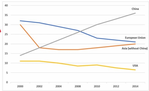
The image presents a line graph from 2000 to 2014 detailing numerical data for four entities: China, European Union, Asia (without China), and USA. In 2000, China starts at 8, European Union at 28, Asia (without China) at 26, and USA at 12. By 2002, China reaches 10, European Union at 26, Asia (without China) at 22, and USA at 11. In 2004, China's data moves to 15, European Union sits at 24, Asia (without China) at 19, and USA at 10. By 2006, China edges up to 19, European Union remains at 23, Asia (without China) remains steady at 19, and USA slightly lowers to 9. The 2008 data shows China at 23, European Union continuing at 23, Asia (without China) consistent at 19, USA at 9. In 2010, China advances to 27, European Union decreases to 21, Asia (without China) is steady at 19, and USA slightly dips to 8. By 2012, China records 32, European Union decreases to 20, Asia (without China) at 20, and USA charts 7. In 2014, China tops at 36, European Union stabilizes at 20, Asia (without China) at 21, and USA declines further to 6.
Given the complexity of the image, the above description may not be entirely accurate.
Note: Both the topic and the answer were created by one of our users.

The bar chart gives ratio about products, which is made by tobacco, and the consumer is secondary school students in the United States.

Overall, tobacco products are more likely to be used by high school students than middle school students.

The percentage of students who consume for any use among middle school students is 35%. This is the highest level of all-time cigarettes are less likely to be smoked by them in order to any use. It’s below 30% which is the second-highest level of smoking. Students who smoke cigars the ratio of them is 15%. Now the smokeless students ratio is just above 5% among others like pipes, bidis, and kreteks who use this for smoking the percentage of students is below 5% except forKreteks which is 5%.

In high school students who smoke for any purpose, the ratio is between 10% and 15%. Cigarettes and cigars are both consumed by middle-aged a ratio is between 10 % and 15%. The remaining other types who smoked by pipes, bidis, and kreteks the percentage is the same which is between 0 and 5%. Students who smokeless ration is also between 0 and 5 %.

Word Count: 194

Answers On The Same Topic:

The line graph shows the proportion of total exports of clothing in 4 parts of the world between 2000 and 2014.

The line graph illustrates the proportion of water in UK rivers that divided four countries as having good chemical quality water namely Wales, Northern Ireland, England and Scotland changed between 1990 and 2002. Overall, the high percentage of positive chemical quality water were Wales and Northern Ireland. However, the opposite was true with England and […]

The line graph shows the proportion of total exports of clothing in 4 parts of the world between 2000 and 2014.

The line graph below illustrates the consumption of three types of spreads between 1982 and 2007 Overall, there was a downward trend in margarine and butter, while low fat and reduced spreads experienced an upward trend over the period. Low fat and reduced spread-s was not as popular as margarine and butter until 1996. The […]

The line graph shows the proportion of total exports of clothing in 4 parts of the world between 2000 and 2014.

The line graph illustrates proportion of total exports of clothing in 4 different countries or contenents from 2000 to 2014. The proportion of total exports of clothing in China showed steady but significant rise over the period, while the rate of total exports of clothing in USA experienced a downward trend. The proportion of total […]

The line graph shows the proportion of total exports of clothing in 4 parts of the world between 2000 and 2014.

The line chart depicts how many travellers visited a Caribbean island from 2010 to 2017, staying on cruise ships, on the island and the number of them totally. The data is measured in millions. At first glance, it is readily obvious that Caribbean island witnessed a gradual growth in the number of visitors, despite minor […]

The line graph shows the proportion of total exports of clothing in 4 parts of the world between 2000 and 2014.

The given chart illustrates amount of paper,wood pulp and sawn-wood manufactured in the UK from 1980 to 2000, spanning a 20-year period Overall,the amount of paper and packaging witnessed an upward trend, while reverse pattern could be seen on sawn-wood.On the other hand ,the total amount of wood-pulp production witnessed an flactuation,which decreased and then […]

See All

Other Topics:

The line graph below shows the number of overseas tourists (in millions) who visited France, Spain, and Japan between 1990 and 2020. Summarise the information by selecting and reporting the main features, and make comparisons where relevant.

The provided line graph illustrates the total number of tourists exploring three different foreign countries over the period of 30 years, from 1990 to 2020. Overall, the number of visitors in Spain and France surged significantly, whereas Japan increased slightly until 2000 and then declined throughout the period. Furthermore, France remained the dominant destination over […]

The graph below shows the percentage of people who accessed news in the USA between 2012 and 2015.

The line graph illustrates the percentage of people in the USA who accessed news through four types of media, namely websites, TV, print newspapers and social media, between 2012 and 2015. Overall, online news had the highest percentage throughout the period, while TV news remained relatively stable. By contrast, print news declined significantly, whereas social […]

The chart below shows the number of four different species of fish between 1982 and 2007. Summarize the information by selecting and reporting the main features, and make comparisons where relevant.

The line graph illustates four different types of fishes from 1982 to 2007. In general, while the figure for Atlantic Cod and Yellow fin Tuna showed great competition, others two did not demonstrated changes. Focusing first on bigger numbers, the number of Atlantic Cod was around 2,25,000 in 1982, and this was followed by considerable […]

The graph below gives information about the percentage of people living in Australia who were born in Asia, the UK, and other regions.

This graph shows description about The proportion of citizen living in Australia who were born and growth in Asia, UK & other regions. As we can see, Asian in Australia has been increased significantly from 1976 until 2011. The increase reached 15 percent in 2011. Data reveals a high interest among the Asian population in […]

the line graph shows the percentage of people who used five different communication methods between 1998 and 2008.

The line graph delineates the proportions of individuals utilizing five distinct communication methods over a decade, from 1998 to 2008. In summary, while all communication methods, barring landline services, experienced a notable increase in usage, cellular phone services emerged as the predominant choice by the end of the period. In 1998, the proportion of individuals […]

The graph below shows the number of library books read by boys and girls at Starmouth School from 2006 to the present. Summarize the information by selecting and reporting the main features, and make comparisons where relevant.

The chart illustrates the number of library books read by boys and girls at Starmouth School from 2006 to the present. Overall, the boys had a general upward trend at the beginning and decreased minimally at the end. Besides that, the girls increased dramatically over the period. In 2009, the girls read about 25 books. […]

See All
We have detected unusual activity on your device.
Please verify your identity to continue.
Note: This verification step won't sign you in. If you have a premium account, please log in to access the service as usual.
Google/Gmail Verification
Or verify using Email/Code
We've sent a verification code to:
youremail@gmail.com (Not your email?)
Enter it below to complete the verification process.
Ensure your email address is correct, your inbox is not full, and you check your spam folder. If no email arrives, consider using an alternative email.
You will need a Premium plan to perform your action!
Note: If you already have a premium account, please log in to access our services as usual.

Plans & Pricing

Our mission is to make quality education accessible for everyone.
However, to keep our hardworking team running and this service alive, we genuinely need your support!
By opting for a premium plan, not only do you sustain us in achieving the mission, but you also unlock advanced features to enrich your learning experience.

Free

For learners who aren't pressed for time

What's included on Free
100+ Cambridge IELTS Tests
Instant IELTS Writing Task 1 & 2 Evaluation (2 times/month)
Instant IELTS Speaking Part 1, 2, & 3 Evaluation (5 times/month)
Instant IELTS Writing Task 1 & 2 Essay Generator (2 times/month)
500+ Dictation & Shadowing Exercises
100+ Pronunciation Exercises
Flashcards
Other Advanced Tools

Premium

For those serious about advancing their English proficiency, and for IELTS candidates aspiring to boost their band score by 1-2 points (especially in writing & speaking) in just 30 days or less

What's included on Premium
Save Your IELTS Test Progress
Unlock All Courses & IELTS Tests
Unlimited AI Conversations
Unlimited AI Writing Enhancement Exercises
Unlimited IELTS Writing Task 1 & 2 Evaluation
Unlimited IELTS Speaking Part 1, 2, & 3 Evaluation
Checked Answers Will Not Be Published
Unlimited IELTS Writing Task 1 & 2 Essay Generator
Unlimited IELTS Speaking Part 1, 2, & 3 Sample Generator
Unlimited Usage Of Advanced Tools
Priority Support within 24h (12-month plan only)

Due to the nature of our service and the provided free trials, payments are non-refundable.
Nếu bạn là người Việt Nam và không có hoặc không muốn trả bằng credit/debit cards, bạn có thể thanh toán bằng phương thức chuyển khoản:


Chọn gói:
419,000₫ 277,000 ₫ cho gói 1 tháng (chỉ 9,233₫/ngày)
1,239,000₫ 597,000 ₫ cho gói 3 tháng (chỉ 6,633₫/ngày)
2,469,000₫ 1,027,000 ₫ cho gói 6 tháng (chỉ 5,706₫/ngày)
4,929,000₫ 1,417,000 ₫ cho gói 12 tháng (chỉ 3,936₫/ngày)


Sau khi chuyển khoản, vui lòng đợi trình duyệt tự động điều hướng bạn trở lại Engnovate và bạn sẽ ngay lập tức nhận được mã kích hoạt tài khoản premium.
Nếu có lỗi xảy ra, bạn có thể liên hệ với team thông qua một trong các phương thức: email đến helloengnovate@gmail.com hoặc nhắn tin qua facebook.com/engnovate.
Vì toàn bộ công cụ trên website đều có thể sử dụng thử miễn phí, Engnovate không hỗ trợ hoàn tiền.