🔥 Today Only: Save 30% on Premium — Offer Ends Soon! - Upgrade Now!
Line Graph

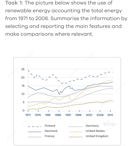
Band 8+: The picture below shows the use of renewable energy accounting the total energy from 1971 to 2006. Summarize the information by selecting and reporting the main features and make comparisons where relevant

Image for topic: The picture below shows the use of renewable energy accounting the total energy from 1971 to 2006. Summarize the information by selecting and reporting the main features and make comparisons where relevant
Our system will evaluate the answer based on this AI-generated description.
The image displays a line graph comparing the use of renewable energy from 1971 to 2006 in six countries: Finland, Denmark, Germany, United States, France, and United Kingdom. The y-axis represents the percentage use of renewable energy ranging from 0 to 25%, while the x-axis covers selected years from 1971 to 2011 (1971, 1976, 1981, 1986, 1991, 1996, 2001, 2006, 2011). The lines fluctuate as follows: Finland starts near 15% in 1971, peaks around 25% in 1996, then slightly declines to just below 25% in 2006. Denmark begins slightly above 5% in 1971, shows a rising trend to nearly 20% by 2006. Germany starts at around 5%, gradually increases to approximately 10% by 2006. The US stays consistently around 5% throughout the entire period. France begins near 10% in 1971, decreases to about 5% in 1981, then remains stable through to 2006. The UK line remains consistently around 0%-2% from 1971 to 2006.
Given the complexity of the image, the above description may not be entirely accurate.
Note: Both the topic and the answer were created by one of our users.

The line graph illustrates how the use of renewable energy changed in six European countries over a 40-year period, commencing from 1971.

Overall, what stands out from the graph is that five out of six countries showed an increase in their usage of renewable energy. Despite seeing some mild falls in its figure, Finland topped the list over the period shown.

To elaborate, in 1971, 15% of renewable energy was used in Denmark, after which it saw growth to around 17% in 2011. Following this was an increase in the share of renewable energy consumed in France, from just under 10% to 15%. An opposite trend was apparent in the case of Finland, beginning at 25%, and reaching a point of 23% during the 40 years. Despite that, Finland still ranked first throughout the provided timescale.

Regarding categories with lower data, both Germany and the United States witnessed a considerable climb in their proportions; however, the figures for the United States increased more significantly, from a low of roughly 5% to just under 20%, and surpassed the numbers for Germany, France, and Denmark. Despite seeing some upturns, the shares of renewable energy used in the United Kingdom still ranked last over the timeline.

Word Count: 203

Answers On The Same Topic:

The picture below shows the use of renewable energy accounting the total energy from 1971 to 2006. Summarize the information by selecting and reporting the main features and make comparisons where relevant

The line graph illustrates the number of renewable energy were used accounting the total energy between 1971 and 2006. Overall, the use ofrenewable energy in the United Kingdom,Germany and France had more stability compared with thestrength and continous fluctuation in Finland, Denmark and the United States. In addition, the use of renewable energy in Finland […]

The picture below shows the use of renewable energy accounting the total energy from 1971 to 2006. Summarize the information by selecting and reporting the main features and make comparisons where relevant

The picture illustrate the use of renewable energy accounting the total energy between 197 and 2006. In general, the figure for all categories saw an upward trend, while Finland was the highest figure among 6 sectors including Denmark, France, Germany, United States, United Kingdom and Finland. To begin with, the amount of Finland accounted for […]

The picture below shows the use of renewable energy accounting the total energy from 1971 to 2006. Summarize the information by selecting and reporting the main features and make comparisons where relevant

The given line graph illustrates the total renewable energy consumption of six different countries over a 35-year period from 1971 to 2006, with projections in 2011. Overall, the utilization of renewable energy in almost all countries recorded upward trends, while only Finland experienced a fluctuating trend before recovering significantly and remaining the highest among all […]

The picture below shows the use of renewable energy accounting the total energy from 1971 to 2006. Summarize the information by selecting and reporting the main features and make comparisons where relevant

The line graph shows the share of renewable energy in overall energy use between 1971 and 2006. Overall, it is clear that the highest proportion was in Finland and the lowest number was in the United Kingdom. The most noticeable figure is Finland. In 1971, the number accounted for 25, while the United Kingdom stood […]

The picture below shows the use of renewable energy accounting the total energy from 1971 to 2006. Summarize the information by selecting and reporting the main features and make comparisons where relevant

The line graph shows the share of renewable energy in overall energy use between 1971 and 2006. Overall, it shows clear that the highest proportion have in Finland and the lowest number in the United Kingdom. The most noticeable figure is Finland. In 1971, the number accounted for 25, while the United Kingdom stood at […]

See All

Other Topics:

The line graph shows the average number of weekly patients visiting four clinics of a hospital from 2010 to 2016

The given line chart illustrates the average weekly number of patients who visited four specialized clinics – Birth Control, Eye, Diabetic, and Dental – at a hospital over the period from 2010 to 2016. Overall, most clinics experienced an upward trend in patient numbers during the six-year period. Although the Birth Control clinic was initially […]

The graph below shows the average weekly consumption of three beverages (coffee, tea and soft drinks) per person between 2000 and 2020.

The provided line graph illustrates three different drinks consumption litres per individual which are coffee tea and soft drinks over 20 year period between 2000 and 2020. Overall, the coffee consumption significantly increased all that period wasn’t reduced in 20 years. However tea utilize numbers were decreased all that period Specifically, Soft drink usage ratio […]

The chart shows the percentage of people who accessed news from 4 sources from 1995 and 2025.

The line graph compares the proportion of people who used four different sources to access news, from 1995 to 2025. Overall, TV was the most widespread source of news for most of the period, whereas newspaper and radio use decreased considerably. Notably, the internet surged significantly, surpassing the previous frontrunner (television) by the end of […]

The graph shows sales of songs from three musical genres during a period of ten years.

The line chart illustrates the sales of songs from three different musical genres during last one decades. Overall, sales of korean pop edged throughout the period of ten years. Additionally, the jazz sales also increased but very little. However, the pop which has been declined from starting. On the one side, the sales of pop […]

The chart below shows the evolution of the major world exporters of liquefied gas from 2017 to 2023. Summarize the information by selecting and reporting the main features, and make comparisons where relevant.

The line chart illustrates the changes that occurred between the years 2017 and 2023 in the amount of liguified gas exported by three countries, namely: Quatar, Australia, and the US. Overall, the US enjoyed the most significant growth of the featured countries, while Australia saw minor rise and Quatar remained at roughly the same value […]

The graph below shows the average number of people attending top-level football matches in three European countries from 1980 to 2004. Summarize the information by selecting and reporting the main features, and make comparisons where relevant

The line graph illustrates the number of people attending top level football matches in Italy, England and Germany over a 24 years , beginning at 1980 Overall, the number of people attending top level football matches in Italy decreased significantly, while the number of people from England and Germamy saw sharp climb. Notably, the highest […]

See All
We have detected unusual activity on your device.
Please verify your identity to continue.
Note: This verification step won't sign you in. If you have a premium account, please log in to access the service as usual.
Google/Gmail Verification
Or verify using Email/Code
We've sent a verification code to:
youremail@gmail.com (Not your email?)
Enter it below to complete the verification process.
Ensure your email address is correct, your inbox is not full, and you check your spam folder. If no email arrives, consider using an alternative email.
You will need a Premium plan to perform your action!
Note: If you already have a premium account, please log in to access our services as usual.

Plans & Pricing

Our mission is to make quality education accessible for everyone.
However, to keep our hardworking team running and this service alive, we genuinely need your support!
By opting for a premium plan, not only do you sustain us in achieving the mission, but you also unlock advanced features to enrich your learning experience.

Free

For learners who aren't pressed for time

What's included on Free
100+ Cambridge IELTS Tests
Instant IELTS Writing Task 1 & 2 Evaluation (2 times/month)
Instant IELTS Speaking Part 1, 2, & 3 Evaluation (2 times/month)
Instant IELTS Writing Task 1 & 2 Essay Generator (2 times/month)
500+ Dictation & Shadowing Exercises
100+ Pronunciation Exercises
Flashcards
Other Advanced Tools

Premium

For those serious about advancing their English proficiency, and for IELTS candidates aspiring to boost their band score by 1-2 points (especially in writing & speaking) in just 30 days or less

What's included on Premium
Save Your IELTS Test Progress & Analyze Mistakes By Question Type
Save Your Own Flashcard Sets & Use Them On Any Device
Unlock All Courses, IELTS Tests, Section & Part Practice
Unlimited AI Conversations
Unlimited AI Writing Enhancement Exercises
Unlimited IELTS Writing Task 1 & 2 Evaluation
Unlimited IELTS Speaking Part 1, 2, & 3 Evaluation
Checked Answers Will Not Be Published
Unlimited IELTS Writing Task 1 & 2 Essay Generator
Unlimited IELTS Speaking Part 1, 2, & 3 Sample Generator
Unlimited Usage Of Advanced Tools & AI Features
Priority Support within 24h (12-month plan only)

Due to the nature of our service and the provided free trials, payments are non-refundable.