🔥 Today Only: Save 30% on Premium — Offer Ends Soon! - Upgrade Now!
Bar Chart

Band 6+: You should spend about 20 minutes on this task. Writing Task 1 The graph shows the percentage of male and female academic staff members across the faculties of a major university in 2012. Summarise the information by selecting and reporting the main features, and make comparisons where relevant.

Image for topic: You should spend about 20 minutes on this task. Writing Task 1 The graph shows the percentage of male and female academic staff members across the faculties of a major university in 2012. Summarise the information by selecting and reporting the main features, and make comparisons where relevant.
Our system will evaluate the answer based on this AI-generated description.
The image presents a bar chart titled "Academic staff percentages in faculties, by gender, 2012", displaying percent composition of male and female academic staff across various faculties. For the Arts faculty, female staff make roughly 40% while male staff comprise about 60%. In the Business faculty, the percentages are approximately female 35% and male 65%. The Education faculty shows a higher female representation at about 70%, with males constituting about 30%. Engineering shows a contrasting distribution, with females at around 15% and males dominating at approximately 85%. For Law, the distribution is nearly balanced, with females at about 45% and males at 55%. The Medical faculty portrays females at approximately 45% and males at 55%. Lastly, the Science faculty has about 40% females and 60% males. Each faculty's data is divided into two distinct bars representing each gender, aligned on a vertical axis ranging from 0 to 100%.
Given the complexity of the image, the above description may not be entirely accurate.
Note: Both the topic and the answer were created by one of our users.

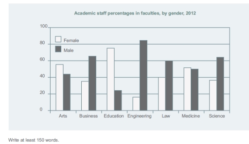
The above bar chart illustrates the percentage ratio of male and female academics in different faculties of a main university in 2012.

Overall, gender gap within most of the faculties is considerably higher apart from the Faculty of Medicine. Significantly, more female academics are linked to the faculties with a arts background , while more males are attached to the science back-grounded ones.

Faculty of Engineering has both highest male percentage and also the lowest female percentage, along with the largest gender disparity within a faculty, which is approximately six males to one female in ratio. Interestingly, the Faculty of Education has the second highest gender gap, in which male to female ratio was almost 1:3.

Furthermore, in the Faculty of Medicine, academic staff members had been recruited up to an equal proportion of 50 % ,for both genders. Meanwhile, the percentages of males and females are approximately 65% and 35% in both Business and Science Faculties respectively.

Word Count: 158

Answers On The Same Topic:

You should spend about 20 minutes on this task. Writing Task 1 The graph shows the percentage of male and female academic staff members across the faculties of a major university in 2012. Summarise the information by selecting and reporting the main features, and make comparisons where relevant.

The bar chart illustrates the number of female and male academic stuff members across the faculties of a major institution in 2012. Overall, the percentage rages across different disciplines, with females prevailing in arts and education and males taking over business and engineering fields. As for women, the highest percentage is reported in education and […]

You should spend about 20 minutes on this task. Writing Task 1 The graph shows the percentage of male and female academic staff members across the faculties of a major university in 2012. Summarise the information by selecting and reporting the main features, and make comparisons where relevant.

The given bar graph provides information about the percentage of academic staff by their gender in different faculties of a major university in 2012. Overall, the engineering, buisness, science and law departments held the highest percentage of male staff. While, female staff was more prevailent in eductaion, and art departments. However, the medicine department showed […]

You should spend about 20 minutes on this task. Writing Task 1 The graph shows the percentage of male and female academic staff members across the faculties of a major university in 2012. Summarise the information by selecting and reporting the main features, and make comparisons where relevant.

The bar chart illustrates the proportions of academic staff members between men and women across the academic faculties of a major university in 2012. Overall, it is evident that the proportion of male staff members higher than female staff members in business, engineering, law, and science facilities. In contrast, the proportion of male staff members […]

You should spend about 20 minutes on this task. Writing Task 1 The graph shows the percentage of male and female academic staff members across the faculties of a major university in 2012. Summarise the information by selecting and reporting the main features, and make comparisons where relevant.

The graph illustrates the proportion of male and female academic staff members associated with different faculties of a main university during 2012. Overall, male were maximum involved in engineering, whereas female participation seemed larger in education faculty. However, there was almost same ratio of male and female in medicine. In 2012, male participation dominated female […]

You should spend about 20 minutes on this task. Writing Task 1 The graph shows the percentage of male and female academic staff members across the faculties of a major university in 2012. Summarise the information by selecting and reporting the main features, and make comparisons where relevant.

The bar chart illustrates the proportions of male and female academic staff in seven faculties of a large university in 2012. Overall, men dominated the teaching staff in most disciplines, particularly in Engineering and Science, while women prevailed in Education and Arts. Other faculties, such as Law, Medicine, and Business, displayed a more balanced distribution […]

See All

Other Topics:

The charts below give information about the number of hours that students study each day at five different universities. Summarise the information by selecting and reporting the main features, and make comparisons where relevant.

The charts depicts data about the how much hours that students spend to studying each day at five different universities. Overall, study hours in the weekends are less than hours in the weekdays with all universities. The University labelled D is the lowest hours comparsion to the rest of universities at these times. Regarding to […]

The bar chart below shows the proportion of individuals possessing smartphones in five different countries from 2015 to 2020.

The bar chart illustrates the percentage of individuals using smartphones in five different countries between 2015 and 2020. Overall, the bar chart shows that the highest number of smartphone users in 2020 was in Country A. Conversely, the fewest users were in Country C in 2015, highlighting a substantial difference among the five countries. In […]

The bar chart below shows the proportion of individuals possessing smartphones in five different countries from 2015 to 2020.

The bar chart illustrate the percentage of individuals using smartphones in five different countries between 2015 and 2020. Overall, in the bar chart we can see that the most smatrphone users were in 2020 in country A. However, the fewer people were in 2015 in country C. Moreover, the difference between five countries was substantial. […]

The graph below shows the proportion of revenue from three film types - romance, comedies and action/horror - for a Hollywood film studio from 1970 to 2000. Summarise the information by selecting and reporting the main features, and make comparisons where relevant.

The bar chart depicts revenue percentages from three Hollywood film genres, namely, Romance, Comedies and Action/Horror between 1970 and 2000. In general, while the proportion for Romance witnessed a noticeable downward trend and Comedies’ figure remained stable after experiencing a slight increase and a significant decline, there was a steady growth in the percentage of […]

The chart shows the proportion of renewable energy in total energy supply in 4 countries from 1997 to 2010. Summarize the information by selecting and reporting the main features, and make comparisons where relevant.

The bar chart compares how much of the total energy supply comes from renewable energy sources in 4 nations between 1997 and 2010. Overall, compared to Iceland and Turkey, Australia and Sweden relied much less on renewable energy. In addition, while Australia and Turkey experienced a decreasing trend, the opposite was true for Sweden and […]

The graph below shows the number of men and women in further education in Britain in three periods and whether they were studying full-time or part-time.

The bar chart illustrate data about the five different educational degree who owned a computer in 2002 and 2010. Overall, the proportion of computer ownership in each educational level in 2010 was higher than in 2002. Moreover, by the higher educational degree, more students would have owned a computer. In 2002, only 15% people with […]

See All
We have detected unusual activity on your device.
Please verify your identity to continue.
Note: This verification step won't sign you in. If you have a premium account, please log in to access the service as usual.
Google/Gmail Verification
Or verify using Email/Code
We've sent a verification code to:
youremail@gmail.com (Not your email?)
Enter it below to complete the verification process.
Ensure your email address is correct, your inbox is not full, and you check your spam folder. If no email arrives, consider using an alternative email.
You will need a Premium plan to perform your action!
Note: If you already have a premium account, please log in to access our services as usual.

Plans & Pricing

Our mission is to make quality education accessible for everyone.
However, to keep our hardworking team running and this service alive, we genuinely need your support!
By opting for a premium plan, not only do you sustain us in achieving the mission, but you also unlock advanced features to enrich your learning experience.

Free

For learners who aren't pressed for time

What's included on Free
100+ Cambridge IELTS Tests
Instant IELTS Writing Task 1 & 2 Evaluation (2 times/month)
Instant IELTS Speaking Part 1, 2, & 3 Evaluation (5 times/month)
Instant IELTS Writing Task 1 & 2 Essay Generator (2 times/month)
500+ Dictation & Shadowing Exercises
100+ Pronunciation Exercises
Flashcards
Other Advanced Tools

Premium

For those serious about advancing their English proficiency, and for IELTS candidates aspiring to boost their band score by 1-2 points (especially in writing & speaking) in just 30 days or less

What's included on Premium
Save Your IELTS Test Progress
Unlock All Courses & IELTS Tests
Unlimited AI Conversations
Unlimited AI Writing Enhancement Exercises
Unlimited IELTS Writing Task 1 & 2 Evaluation
Unlimited IELTS Speaking Part 1, 2, & 3 Evaluation
Checked Answers Will Not Be Published
Unlimited IELTS Writing Task 1 & 2 Essay Generator
Unlimited IELTS Speaking Part 1, 2, & 3 Sample Generator
Unlimited Usage Of Advanced Tools
Priority Support within 24h (12-month plan only)

Due to the nature of our service and the provided free trials, payments are non-refundable.
Nếu bạn là người Việt Nam và không có hoặc không muốn trả bằng credit/debit cards, bạn có thể thanh toán bằng phương thức chuyển khoản:


Chọn gói:
419,000₫ 277,000 ₫ cho gói 1 tháng (chỉ 9,233₫/ngày)
1,239,000₫ 597,000 ₫ cho gói 3 tháng (chỉ 6,633₫/ngày)
2,469,000₫ 1,027,000 ₫ cho gói 6 tháng (chỉ 5,706₫/ngày)
4,929,000₫ 1,417,000 ₫ cho gói 12 tháng (chỉ 3,936₫/ngày)


Sau khi chuyển khoản, vui lòng đợi trình duyệt tự động điều hướng bạn trở lại Engnovate và bạn sẽ ngay lập tức nhận được mã kích hoạt tài khoản premium.
Nếu có lỗi xảy ra, bạn có thể liên hệ với team thông qua một trong các phương thức: email đến helloengnovate@gmail.com hoặc nhắn tin qua facebook.com/engnovate.
Vì toàn bộ công cụ trên website đều có thể sử dụng thử miễn phí, Engnovate không hỗ trợ hoàn tiền.