🔥 Today Only: Save 30% on Premium — Offer Ends Soon! - Upgrade Now!
Bar Chart

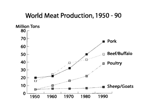
Band 6+: This graph shows the world meat production from 1950 to 1990. Describe the graph by your own words.

Image for topic: This graph shows the world meat production from 1950 to 1990. Describe the graph by your own words.
Our system will evaluate the answer based on this AI-generated description.
The image depicts a graph titled "World Meat Production, 1950 - 90" with the y-axis labeled "Million Tons" from 0 to 80, and the x-axis marked with the years 1950, 1960, 1970, 1980, and 1990. Four types of meat are plotted: Pork, Beef/Buffalo, Poultry, and Sheep/Goats. Pork production shows a steady increase from approximately 20 million tons in 1950 to around 70 million tons in 1990. Beef/Buffalo production starts at roughly 10 million tons in 1950 and escalates to near 50 million tons in 1990. Poultry production begins below 10 million tons in 1950, with a sharp climb to just over 30 million tons in 1990. Sheep/Goats production commences at about 5 million tons in 1950 and rises slightly above 10 million tons in 1990. Each data point is connected with lines, with Pork and Beef/Buffalo using solid lines and Poultry and Sheep/Goats using dashed lines.
Given the complexity of the image, the above description may not be entirely accurate.
Note: Both the topic and the answer were created by one of our users.

The graph represents the meat production in the world between 1950 and 1990. It is evident that the production of pork, poultry, beef rose significantly while sheep meat remain unchanged.

The sheep meat barely had any difference during the period. It slightly increased in 1990 and barely reached 10 million tons of meat.

However, starting at the same place, the production of poultry had a considerable change from 1950 to 1980. In the 90s, it escalated from almost 20 million tons to more than 30 million tons.

The proportion of beef meat increased substantially for over 20 years from1950. In the 70s the production of beef was at its very peak, yet started to slow down. Until 1990, the world has produced approximately 50 million tons of beef meat.

Though the change was minimum between the years 1950 and 1960, the amount of pork meat has been produced more than any kind of meat, and increased at a rapid pace from 1960. In 1990, there were 80 million tons of pork meat produced worldwide.

Word Count: 174

Answers On The Same Topic:

This graph shows the world meat production from 1950 to 1990. Describe the graph by your own words.

The line graph depicts how many millions of tons of different types of meat were produced across the world from 1950 to 1990. Production of all kinds of meats, pork, beef/buffalo and poultry to name a few grew from their original amount by the end of the given time. No form of meat saw any […]

This graph shows the world meat production from 1950 to 1990. Describe the graph by your own words.

The given line graph highlights the data about the global production of meat in four decades ,starting from 1950 to 1990. Overall, the proportion of pork beef and poultry showed a moderate upward trend between 1950 and 1990 , whereas the sheep production maintained the same level over the period. At the beginning of the […]

This graph shows the world meat production from 1950 to 1990. Describe the graph by your own words.

The given line graph highlights the data about the global production of meat in four decades starting from 1950 to 1990. Overall the proportion of pork beef and poultry showed a moderate upward trend between 1950 and 1990 , whereas the sheep production maintained the same level over the period. At the beginning of the […]

This graph shows the world meat production from 1950 to 1990. Describe the graph by your own words.

The chart illustrates world meat production, in between 1950 and 1990, and comparing production amount of pork, beef/buffalo meat, poultry and sheep/goat meat in million tons by year. In 1950, production of sheep/goat meat was exactly the same with the poultry, around five million tons. Beef was following pork which was produced precisely 20 million […]

This graph shows the world meat production from 1950 to 1990. Describe the graph by your own words.

The line graph illustrates 4 different types of meat types in world production between 1950 and 1990. Overall, pork took the lead by rocketing and beef/buffalo and poultry increasedgradually over the period. However, sheep/goats keep unchanged in the least number. As regards pork and beef/buffalo began in similar number around 20 million tonnes in 1950. […]

See All

Other Topics:

The chart below illustrates the percentage of British households that had various items in 2001 and 2008.

The bar chart illustrates the proportion of domestic units in one country that had eight different types of goods between 2001 and 2008. Overall, the telephone had higher percentages in both years rather than other goods, while microwave and CD player users showed similar proportions with telephone in 2008. Mobile phone, internet, and dishwasher were […]

The chart shows the percentage of household expenditure on goods and services in a country from 1995 to 2005. Summarise the information by selecting and reporting the main features and make comparisons where relevant.

The bar chart illustrates the proportion of spending money for goods and services in a country between 1995 and 2005. Overall, it is evident that spending money for housing and food and drinks had the highest figure in two separate years, while transport also exhibited the least figure in the same period. In 1995, housing […]

The chart below shows information about calorie consumption in seven countries in 1975 and 2000. Summarise the information by selecting and reporting the main features, and make comparisions where relevant.

The given bar chart provides details on the amount of calories consumed in seven different countries in 1975 and 2000. Overall, there is an increase in calorie consumption across all nations. In countries such as Bangladesh and Pakistan, the calorie intake only grew marginally. However, in China and Indonesia consumption rose significantly. The number of […]

The bar chart shows the number of hours men and women spent on different tasks on average per day in 2011.

The bar chart illustrates how many hours male and female spent on variaty of tasks on avarage per day in 2011. Overall, the number of hours spent on work was the highest among the given six task groups for both gender, while shopping recorded the lowest number. Men spent more hours for working, doing houshold […]

The chart below shows the sales for a coffee shop in a town in the UK from 2000 to 2020

THE BAR GRAPH ILLUSTRATES THE TYPICAL MONTHLY SALES OF CUPPA COFFEE SHOP,LOCATED IN A BRITISH TOWN,FROM THE SALES OF SIX FOOD AND DRINKS ITEMS IN 2000,2010AND 2020.UNITS ARE MEASURED IN POUNDS STERLING. OVERALL,COFFEE WAS THE BEST SELLING ITEM,WHILE SOUP IS THE LOWEST SALES DURING THE 2000-2020 PERIOD.THE CHART ALSO INDICATES THE SALES OF HOT CHOCOLATE […]

The chart below shows the sales for a coffee shop in a town in the UK from 2000 to 2020

THE PROVIDED BAR GRAPH ILLUSTRATES THE TYPICAL MONTHLY SALES OF CUPPA COFFEE SHOP,LOCATED IN A BRITISH TOWN,FROM THE SALES OF SIX FOOD AND DRINKS ITEMS IN 2000,2010AND 2020.UNITS ARE MEASURED IN POUNDS STERLING. OVERALL,IT IS EVIDENT THAT COFFEE WAS THE BEST SELLING ITEM,WHILE SOUP IS THE LOWEST SALES DURING THE 2000-2020 PERIOD.THE CHART ALSO INDICATES […]

See All
We have detected unusual activity on your device.
Please verify your identity to continue.
Note: This verification step won't sign you in. If you have a premium account, please log in to access the service as usual.
Google/Gmail Verification
Or verify using Email/Code
We've sent a verification code to:
youremail@gmail.com (Not your email?)
Enter it below to complete the verification process.
Ensure your email address is correct, your inbox is not full, and you check your spam folder. If no email arrives, consider using an alternative email.
You will need a Premium plan to perform your action!
Note: If you already have a premium account, please log in to access our services as usual.

Plans & Pricing

Our mission is to make quality education accessible for everyone.
However, to keep our hardworking team running and this service alive, we genuinely need your support!
By opting for a premium plan, not only do you sustain us in achieving the mission, but you also unlock advanced features to enrich your learning experience.

Free

For learners who aren't pressed for time

What's included on Free
100+ Cambridge IELTS Tests
Instant IELTS Writing Task 1 & 2 Evaluation (2 times/month)
Instant IELTS Speaking Part 1, 2, & 3 Evaluation (2 times/month)
Instant IELTS Writing Task 1 & 2 Essay Generator (2 times/month)
500+ Dictation & Shadowing Exercises
100+ Pronunciation Exercises
Flashcards
Other Advanced Tools

Premium

For those serious about advancing their English proficiency, and for IELTS candidates aspiring to boost their band score by 1-2 points (especially in writing & speaking) in just 30 days or less

What's included on Premium
Save Your IELTS Test Progress & Analyze Mistakes By Question Type
Save Your Own Flashcard Sets & Use Them On Any Device
Unlock All Courses, IELTS Tests, Section & Part Practice
Unlimited AI Conversations
Unlimited AI Writing Enhancement Exercises
Unlimited IELTS Writing Task 1 & 2 Evaluation
Unlimited IELTS Speaking Part 1, 2, & 3 Evaluation
Checked Answers Will Not Be Published
Unlimited IELTS Writing Task 1 & 2 Essay Generator
Unlimited IELTS Speaking Part 1, 2, & 3 Sample Generator
Unlimited Usage Of Advanced Tools & AI Features
Priority Support within 24h (12-month plan only)

Due to the nature of our service and the provided free trials, payments are non-refundable.