🔥 Today Only: Save 30% on Premium — Offer Ends Soon! - Upgrade Now!
Bar Chart

Band 7+: This bar graph shows the number of days lost due to injury per worker for three countries. There are three time periods shown beginning with the year 1991 and ending in 2005. Write a report for a university lecturer describing the information. You should write at least 150 words.

Image for topic: This bar graph shows the number of days lost due to injury per worker for three countries. There are three time periods shown beginning with the year 1991 and ending in 2005. Write a report for a university lecturer describing the information. You should write at least 150 words.
Our system will evaluate the answer based on this AI-generated description.
The image is a bar graph representing the number of days lost due to on-the-job injuries per worker across five countries over three-time periods. In Germany, 1991-1995 shows 2.5 days, 1996-2000 shows 5 days, and 2001-2005 shows 3.75 days. In America, 1991-1995 shows 5 days, 1996-2000 shows 7.5 days, and 2001-2005 shows 5.75 days. In China, 1991-1995 shows 7.5 days, 1996-2000 shows 10 days, and 2001-2005 shows 6.25 days. In Korea, 1991-1995 shows 10 days, 1996-2000 shows 2.5 days, and 2001-2005 shows 5 days. In Brazil, 1991-1995 shows 5 days, 1996-2000 shows 3.75 days, and 2001-2005 shows 2.5 days. The x-axis lists the countries Germany, America, China, Korea, and Brazil, and the y-axis measures the number of days from 0 to 10 in increments of 2.5. There are three sets of bars for each country, each representing a different time period with the key indicating light blue for 1991-1995, dark blue for 1996-2000, and medium blue for 2001-2005.
Given the complexity of the image, the above description may not be entirely accurate.
Note: Both the topic and the answer were created by one of our users.

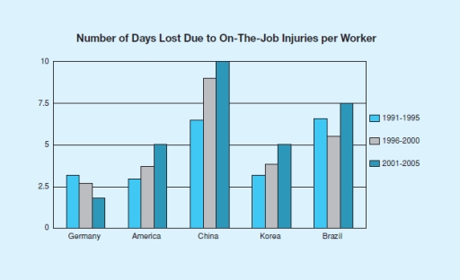
The chart illustrates the number of day-offs due to injury per worker in Germany, America, China, Korea, and Brazil. The data is divided to three periods of time, from 1991 to 1995, continued with 1996 to 2000, and followed by 2001 to 2005.

Overall, China had the highest number of days lost, while Germany had the lowest. The number for Germany also decreased over the time period, while the numbers in America, China, and Korea increased instead. On another side, in Brazil, the number plummeted in the second time period before it went up again in the third time period.

Germany started with above 2.5 days lost in 1991 to 1995, but the number continued to fall until it reached below 2.5 in 2001 to 2005. In contrast, both America and Korea started at the number of above 2.5 days in 1991 to 1995 and climbed to approximately 5 days in 2001 to 2005. Meanwhile, China began with the number of between 5 and 7.5 days in 1991 to 1995 and skyrocketed to 10 days in 2001 to 2005.

There were between 5 and 7.5 days off due to job injuries in Brazil during 1991 to 1995. Then, the number went down to almost 5 days in 1996 to 2000. However, the number jumped again to 7.5 days in 2001 to 2005.

Word Count: 222

Answers On The Same Topic:

This bar graph shows the number of days lost due to injury per worker for three countries. There are three time periods shown beginning with the year 1991 and ending in 2005. Write a report for a university lecturer describing the information. You should write at least 150 words.

The bar graph illustrates the three times periods shown beginning with the year 1991 and ending in 2005. China show the most amount of days since year 2001 till 2005. Germany show the lowest level among all of the countries. We can see the drop, unstabillity, grow. also, it is noticeable that before workers were […]

This bar graph shows the number of days lost due to injury per worker for three countries. There are three time periods shown beginning with the year 1991 and ending in 2005. Write a report for a university lecturer describing the information. You should write at least 150 words.

The bar chart illustrates the lost days causes by worker’s injuries in five particular countries. Along with the numbers of days lost are three periods of year starting from 1991 to 2005. From a quick glance at the chart, the numbers of days lost in the given countries increased in each five-year period, except for […]

This bar graph shows the number of days lost due to injury per worker for three countries. There are three time periods shown beginning with the year 1991 and ending in 2005. Write a report for a university lecturer describing the information. You should write at least 150 words.

The bar chart illustrates the working days missed because of job injuries per employee in four different European countries from 1991 to 2005 divided into three time periods. Overall, the figures for China were dominant compared to the countries.The opposite is true for Germany. In addition, the number of days lost in America, China, Brazil […]

See All

Other Topics:

The bar chart shows information about fiction book sales from 2006 to 2010.

The bar chart illustrates five different types of fiction books and showed how much book sales during the time from 2006 to 2010. Overall, the fiction book sales was leader mystery and romance all the time and romance was increased a little bit finally, whereas young adult, classics, sci-fi and fantasy had a low figure […]

Percentage of individuals living alone across five distinct age categories

The given bar chart shows the rate of individuals living alone in five varius distinct age categories from 1850 to 2000 in the United States. Overall, percentage for all categories increased at different varieties. Interestingly, the rate of oldest people was the highest at the end of the period. In 1850 people who were between […]

The bar chart below illustrates five different industries' percentage share of Country B's economy in 2005 and 2015 with a forecast for 2025. Summarise the information by selecting and reporting the main features, and make comparisons where relevant. Write at least 150 words.

The bar chart demonstrates the general economy positions and anticipation of the country, and different industries’ percentage of share in 2005 and 2015 with a forecast for 2025. Overall, the graph illustrates 4 main industries, with growing or decreasing forecasts and results of the last years. (2005 and 2015). Food processing underwent a sharp decrease […]

The chart below shows the number of houses sold in 8 cities in the world for more than 5 Million US dollars in 2009 and 2014. Summarise the information by selecting and reporting the main features, and make comparisons where relevant.

The bar chart illustrates the amount of the apartments which were merchandised more than 5 million dollar in several cities in two years 2009 and 2014. Overall, London was dominated in both years through the way of sales while the lowest point of the house trading was in Dubai. However, other cities were also retailed […]

4. The chart below shows the amount of money in euros (€) spent on four different categories by five organizations over a five-year period.

The given bar chart depicts the amount of money in euros invested in four various categories namely machinery, building, staff training and research from five organizations. Overall, organization B recorded the highest investment among four categories, whereas organization D and organization E allocated the least funding. In addition, the amount of money invested in machinery […]

The graph show the amount of tea and coffee imported by different countries in tonnes.

The bar chart compares the amounts of tea and coffee imported by four countries, namely Canada, the US, the UK, and Germany, measured in tonnes. Overall, the UK imported by far the largest quantity of tea, while Germany was the biggest importer of coffee. In addition, coffee imports were higher than tea imports in Canada, […]

See All
We have detected unusual activity on your device.
Please verify your identity to continue.
Note: This verification step won't sign you in. If you have a premium account, please log in to access the service as usual.
Google/Gmail Verification
Or verify using Email/Code
We've sent a verification code to:
youremail@gmail.com (Not your email?)
Enter it below to complete the verification process.
Ensure your email address is correct, your inbox is not full, and you check your spam folder. If no email arrives, consider using an alternative email.
You will need a Premium plan to perform your action!
Note: If you already have a premium account, please log in to access our services as usual.

Plans & Pricing

Our mission is to make quality education accessible for everyone.
However, to keep our hardworking team running and this service alive, we genuinely need your support!
By opting for a premium plan, not only do you sustain us in achieving the mission, but you also unlock advanced features to enrich your learning experience.

Free

For learners who aren't pressed for time

What's included on Free
100+ Cambridge IELTS Tests
Instant IELTS Writing Task 1 & 2 Evaluation (2 times/month)
Instant IELTS Speaking Part 1, 2, & 3 Evaluation (5 times/month)
Instant IELTS Writing Task 1 & 2 Essay Generator (2 times/month)
500+ Dictation & Shadowing Exercises
100+ Pronunciation Exercises
Flashcards
Other Advanced Tools

Premium

For those serious about advancing their English proficiency, and for IELTS candidates aspiring to boost their band score by 1-2 points (especially in writing & speaking) in just 30 days or less

What's included on Premium
Save Your IELTS Test Progress
Unlock All Courses & IELTS Tests
Unlimited AI Conversations
Unlimited AI Writing Enhancement Exercises
Unlimited IELTS Writing Task 1 & 2 Evaluation
Unlimited IELTS Speaking Part 1, 2, & 3 Evaluation
Checked Answers Will Not Be Published
Unlimited IELTS Writing Task 1 & 2 Essay Generator
Unlimited IELTS Speaking Part 1, 2, & 3 Sample Generator
Unlimited Usage Of Advanced Tools
Priority Support within 24h (12-month plan only)

Due to the nature of our service and the provided free trials, payments are non-refundable.
Nếu bạn là người Việt Nam và không có hoặc không muốn trả bằng credit/debit cards, bạn có thể thanh toán bằng phương thức chuyển khoản:


Chọn gói:
419,000₫ 277,000 ₫ cho gói 1 tháng (chỉ 9,233₫/ngày)
1,239,000₫ 597,000 ₫ cho gói 3 tháng (chỉ 6,633₫/ngày)
2,469,000₫ 1,027,000 ₫ cho gói 6 tháng (chỉ 5,706₫/ngày)
4,929,000₫ 1,417,000 ₫ cho gói 12 tháng (chỉ 3,936₫/ngày)


Sau khi chuyển khoản, vui lòng đợi trình duyệt tự động điều hướng bạn trở lại Engnovate và bạn sẽ ngay lập tức nhận được mã kích hoạt tài khoản premium.
Nếu có lỗi xảy ra, bạn có thể liên hệ với team thông qua một trong các phương thức: email đến helloengnovate@gmail.com hoặc nhắn tin qua facebook.com/engnovate.
Vì toàn bộ công cụ trên website đều có thể sử dụng thử miễn phí, Engnovate không hỗ trợ hoàn tiền.