🔥 Today Only: Save 30% on Premium — Offer Ends Soon! - Upgrade Now!
Bar Chart

Band 7+: The bar chart below shows the number of employed persons by job type and sex for Australia last year Summarise the information by selecting and reporting the main features, and make comparisons where relevant. You should write at least 150 words.

Image for topic: The bar chart below shows the number of employed persons by job type and sex for Australia last year Summarise the information by selecting and reporting the main features, and make comparisons where relevant. You should write at least 150 words.
Our system will evaluate the answer based on this AI-generated description.
The image depicts a bar chart showing the number of employed persons by job type and sex for Australia last year. The chart has seven categories: Managers, Professionals, Semi-professionals, Tradespeople, Production, Clerical, Labourers. For Managers, there are approximately 700 male and 300 female employed persons. For Professionals, there are about 600 male and 400 female employed persons. For Semi-professionals, there are around 500 male and 500 female employed persons. For Tradespeople, there are approximately 600 male and 200 female employed persons. For Production, there are about 600 male and 400 female employed persons. For Clerical, there are around 200 male and 800 female employed persons. For Labourers, there are approximately 800 male and 200 female employed persons. The chart is measured in 1000s on the x-axis, with a range from 0 to 1000.
Given the complexity of the image, the above description may not be entirely accurate.
Note: Both the topic and the answer were created by one of our users.

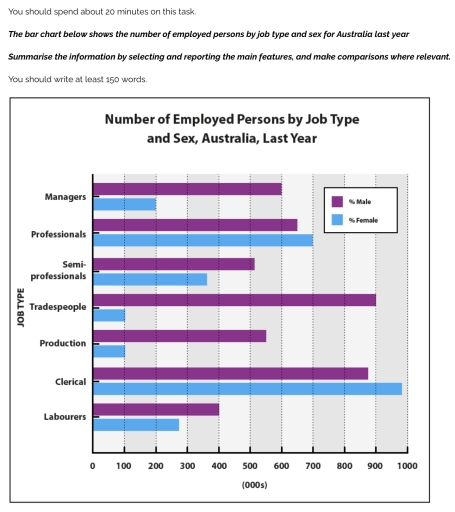
The bar chart illustrates the number of people in employment by their job type and sex for Austrailia, last year.

Overall, it is clear that clerical jobs recorded the highest number of employees, with women significantly outnumbering men, whereas trades related jobs were dominated by men.

In detail, clerical work was the largest sector, with around 950,000 women and 700,000 men. Professional occupation also showed a female majority, with women slightly outnumbering men. A similar trend was observed in semi-professional roles, although the gap was narrow, with both genders employed in significant numbers.

By contrast, tradespeople accounted for the highest male employment, with nearly 900,000 men compared to a very small number of women. Men also exceeded women in production and labour-related jobs, where the gap was notable through less extreme. Managerial positions, however, showed relatively equal participation between the two genders.

Word Count: 142

Answers On The Same Topic:

The bar chart below shows the number of employed persons by job type and sex for Australia last year Summarise the information by selecting and reporting the main features, and make comparisons where relevant. You should write at least 150 words.

The image depicts a bar graph showing the number of employees working in Australia with respect to gender and job type in the last year. Overall, the graph suggests 7 job categories, in which the male are dominant in almost all the sectors when compared to woman, with one exclusion in the clerical category where […]

The bar chart below shows the number of employed persons by job type and sex for Australia last year Summarise the information by selecting and reporting the main features, and make comparisons where relevant. You should write at least 150 words.

The bar chart illustrates the number of employed persons in different jobs in Australia in the previous year. Overall, it is clear that the ratio of female clerical employees was the most dominant throughout the timeframe, while male employment was the least significant in trades and production. In terms of managers, the female employment rate […]

The bar chart below shows the number of employed persons by job type and sex for Australia last year Summarise the information by selecting and reporting the main features, and make comparisons where relevant. You should write at least 150 words.

The bar chart illustrates the proportion of employees based on their gender and job type in Australia Overall, while only professionals and clerical men had the highest percentages compared to other jobs, women dominated in other jobs last year. The figure of males working in a clerical section reached its peak to almost 1000%. While […]

The bar chart below shows the number of employed persons by job type and sex for Australia last year Summarise the information by selecting and reporting the main features, and make comparisons where relevant. You should write at least 150 words.

The bar graph above provides information pertaining to the rate of employment based on factors such as job type and sex across Australia last year. Overall, Tradesmen comprise the highest share of employment, while Clerical jobs are mostly occupied by female employees. Highest number of male employment was recorded as Tradespeople and Clericals with 900 […]

The bar chart below shows the number of employed persons by job type and sex for Australia last year Summarise the information by selecting and reporting the main features, and make comparisons where relevant. You should write at least 150 words.

The chart illustrates the number of employees by occupation and gender in Australia last year. There are 7 types of occupattions, such as manager, professional, semi-professionals, trades people, production, clerical, and labourers. The bar chart shows that females made more majorities in the each of given jobs. Five of seven jobs are dominated by number […]

See All

Other Topics:

The chart below shows the percentage change in total crime arrests for persons under 18 by locality

The chart provides information about the commissions of a crime underage by locality of percentage, between 1995 to 1998. Overall, crime arrests among underage in the suburban areas showed higher rate. In contrast, in cities people under 18 significantly lower than other areas. In 1995, teenegers in rural area showed highest rate with 3%, while […]

The water use in 2000 by six countries in the Middle East.

The table compares the percentages of water used for domestic, agricultural and industrial purposes in six Gulf countries in 2000. Overall, agriculture accounted for the largest proportion of water consumption in most countries, especially Saudi Arabia and Oman, while industrial use represented the smallest share across all six nations. In contrast, Kuwait and Bahrain recorded […]

The percentage of internet users who shopped online in Australia by age group 2007-2009. Summarize the information by selecting and reporting the main features and make comparisons where relevant.

The bar chart gives information about internet users purchased online by different age group from 2014 to 2018 where is in Australia. Overall, it is also clear that 26-35 and 35-45 aged group had increases between periods but old aged group that is 65+ years old was the lowest percentage among age groups by shopping-online. […]

The water use in 2000 by six countries in the Middle East.

The given bar graph depicts the percentages of water used for domestic, agriculture and industrial purposes in six different Gulf Countries in 2000. Overall, it was agricultrue that most countries used the largest amount of water for, while domestic use accounted for the highest only in a few countries. The figure for industrial was the […]

You should spend about 20 minutes on this task. The chart below shows the percentage of children in a European country who took part in four kinds of activities in 2009. Summarise the information by selecting and reporting the main features, and make comparisons where relevant. You should write at least 150 words. <

The illustration provides information about numbers of children in several European countryes in four tipes of activities. Overall, we have dates about the activities such as Watch TV and Ride bikes, which shows the most higher percentage. The most percentages of all the age categories of activities is Watching TV. Meanwhile the least popular tipe […]

The chart below gives information about how families in one country spend their weekly income in 1968 and in 2018. Summarize the information by selecting and reporting the main features, and make comparisons where relevant.

The bar chart illustrates how families in a particular country allocate their weekly income to different categories in 1968 to 2018 Overall, the highest proportion was spent on food in 1968 and the least was spent on fuel and power. While in 2018, the most amount of spending was on leisure and the least investing […]

See All
We have detected unusual activity on your device.
Please verify your identity to continue.
Note: This verification step won't sign you in. If you have a premium account, please log in to access the service as usual.
Google/Gmail Verification
Or verify using Email/Code
We've sent a verification code to:
youremail@gmail.com (Not your email?)
Enter it below to complete the verification process.
Ensure your email address is correct, your inbox is not full, and you check your spam folder. If no email arrives, consider using an alternative email.
You will need a Premium plan to perform your action!
Note: If you already have a premium account, please log in to access our services as usual.

Plans & Pricing

Our mission is to make quality education accessible for everyone.
However, to keep our hardworking team running and this service alive, we genuinely need your support!
By opting for a premium plan, not only do you sustain us in achieving the mission, but you also unlock advanced features to enrich your learning experience.

Free

For learners who aren't pressed for time

What's included on Free
100+ Cambridge IELTS Tests
Instant IELTS Writing Task 1 & 2 Evaluation (2 times/month)
Instant IELTS Speaking Part 1, 2, & 3 Evaluation (5 times/month)
Instant IELTS Writing Task 1 & 2 Essay Generator (2 times/month)
500+ Dictation & Shadowing Exercises
100+ Pronunciation Exercises
Flashcards
Other Advanced Tools

Premium

For those serious about advancing their English proficiency, and for IELTS candidates aspiring to boost their band score by 1-2 points (especially in writing & speaking) in just 30 days or less

What's included on Premium
Save Your IELTS Test Progress
Unlock All Courses & IELTS Tests
Unlimited AI Conversations
Unlimited AI Writing Enhancement Exercises
Unlimited IELTS Writing Task 1 & 2 Evaluation
Unlimited IELTS Speaking Part 1, 2, & 3 Evaluation
Checked Answers Will Not Be Published
Unlimited IELTS Writing Task 1 & 2 Essay Generator
Unlimited IELTS Speaking Part 1, 2, & 3 Sample Generator
Unlimited Usage Of Advanced Tools
Priority Support within 24h (12-month plan only)

Due to the nature of our service and the provided free trials, payments are non-refundable.
Nếu bạn là người Việt Nam và không có hoặc không muốn trả bằng credit/debit cards, bạn có thể thanh toán bằng phương thức chuyển khoản:


Chọn gói:
419,000₫ 277,000 ₫ cho gói 1 tháng (chỉ 9,233₫/ngày)
1,239,000₫ 597,000 ₫ cho gói 3 tháng (chỉ 6,633₫/ngày)
2,469,000₫ 1,027,000 ₫ cho gói 6 tháng (chỉ 5,706₫/ngày)
4,929,000₫ 1,417,000 ₫ cho gói 12 tháng (chỉ 3,936₫/ngày)


Sau khi chuyển khoản, vui lòng đợi trình duyệt tự động điều hướng bạn trở lại Engnovate và bạn sẽ ngay lập tức nhận được mã kích hoạt tài khoản premium.
Nếu có lỗi xảy ra, bạn có thể liên hệ với team thông qua một trong các phương thức: email đến helloengnovate@gmail.com hoặc nhắn tin qua facebook.com/engnovate.
Vì toàn bộ công cụ trên website đều có thể sử dụng thử miễn phí, Engnovate không hỗ trợ hoàn tiền.