🔥 Today Only: Save 30% on Premium — Offer Ends Soon! - Upgrade Now!
Bar Chart

Band 7+: The bar chart below shows the number of employed persons by job type and sex for Australia last year Summarise the information by selecting and reporting the main features, and make comparisons where relevant. You should write at least 150 words.

Image for topic: The bar chart below shows the number of employed persons by job type and sex for Australia last year Summarise the information by selecting and reporting the main features, and make comparisons where relevant. You should write at least 150 words.
Our system will evaluate the answer based on this AI-generated description.
The image depicts a bar chart showing the number of employed persons by job type and sex for Australia last year. The chart has seven categories: Managers, Professionals, Semi-professionals, Tradespeople, Production, Clerical, Labourers. For Managers, there are approximately 700 male and 300 female employed persons. For Professionals, there are about 600 male and 400 female employed persons. For Semi-professionals, there are around 500 male and 500 female employed persons. For Tradespeople, there are approximately 600 male and 200 female employed persons. For Production, there are about 600 male and 400 female employed persons. For Clerical, there are around 200 male and 800 female employed persons. For Labourers, there are approximately 800 male and 200 female employed persons. The chart is measured in 1000s on the x-axis, with a range from 0 to 1000.
Given the complexity of the image, the above description may not be entirely accurate.
Note: Both the topic and the answer were created by one of our users.

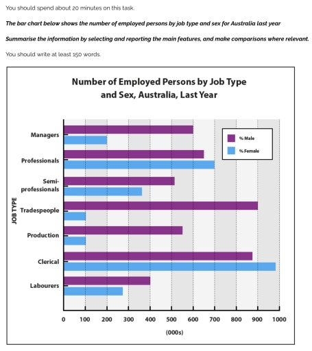
The bar chart gives demographic information for employment sectors and gender in Australia last year.

There were significantly more men than women in management, production – over 400,00 in each case and 800,000 more for tradesperson roles. When looking at management roles proportionally, they were three times more likely to be filled by men. However, the gap was largest in trade occupations with men ten times more likely to be doing this kind of work. There was a less sizeable difference for labourers and semi-professionals but still considerably more men than women. The only sectors in which there were more women than men were in those of professionals and clerical, with 50,000 and 100,00 more women in each respectively. However, when looking at the figures you can see that there were still a high number of men who were employed in these areas.

Overall, we can see that there are more men than women in nearly every sector and even those with a female majority the figures were close. This means that men make up a disproportionate amount of the Australian workforce.

Word Count: 182

Answers On The Same Topic:

The bar chart below shows the number of employed persons by job type and sex for Australia last year Summarise the information by selecting and reporting the main features, and make comparisons where relevant. You should write at least 150 words.

The image depicts a bar graph showing the number of employees working in Australia with respect to gender and job type in the last year. Overall, the graph suggests 7 job categories, in which the male are dominant in almost all the sectors when compared to woman, with one exclusion in the clerical category where […]

The bar chart below shows the number of employed persons by job type and sex for Australia last year Summarise the information by selecting and reporting the main features, and make comparisons where relevant. You should write at least 150 words.

The bar chart illustrates the number of employed persons in different jobs in Australia in the previous year. Overall, it is clear that the ratio of female clerical employees was the most dominant throughout the timeframe, while male employment was the least significant in trades and production. In terms of managers, the female employment rate […]

The bar chart below shows the number of employed persons by job type and sex for Australia last year Summarise the information by selecting and reporting the main features, and make comparisons where relevant. You should write at least 150 words.

The bar chart illustrates the proportion of employees based on their gender and job type in Australia Overall, while only professionals and clerical men had the highest percentages compared to other jobs, women dominated in other jobs last year. The figure of males working in a clerical section reached its peak to almost 1000%. While […]

The bar chart below shows the number of employed persons by job type and sex for Australia last year Summarise the information by selecting and reporting the main features, and make comparisons where relevant. You should write at least 150 words.

The bar graph above provides information pertaining to the rate of employment based on factors such as job type and sex across Australia last year. Overall, Tradesmen comprise the highest share of employment, while Clerical jobs are mostly occupied by female employees. Highest number of male employment was recorded as Tradespeople and Clericals with 900 […]

The bar chart below shows the number of employed persons by job type and sex for Australia last year Summarise the information by selecting and reporting the main features, and make comparisons where relevant. You should write at least 150 words.

The chart illustrates the number of employees by occupation and gender in Australia last year. There are 7 types of occupattions, such as manager, professional, semi-professionals, trades people, production, clerical, and labourers. The bar chart shows that females made more majorities in the each of given jobs. Five of seven jobs are dominated by number […]

See All

Other Topics:

The bar chart below shows the percentage of unemployed graduates, aged 20-24, in one European country over a two-year period. Summarise the information by selecting and reporting the main features, and making comparisons where relevant.

The bar graph illustrates the proportion of jobless graduates, aged 20 to 24, in a particular European country between 2008 and 2009. Overall, the period given saw a rise in the percentage of both sexes. While unemployment rate for both genders constituted a vast majority in October, a tiny fraction was accounted in April and […]

The chart below shows the number of jobs in tourism-related industry in one UK city between 1989 and 2009

The bar chart compares the number of jobs in tourism-related industries in the UK from 1989 to 2009. Overall, the number of jobs in restaurants experienced a dramatic increase, consistently outpacing other sectors. In contrast, the number of jobs in hotels showed a period of stability with slight fluctuations. Meanwhile, jobs in sport and leisure, […]

The chart below shows the number of jobs in tourism-related industry in one UK city between 1989 and 2009

The bar chart compares information about how many jobs were there in tourism concerned industries in the UK from 1989 to 2009. Overall, the figure for restaurants saw a dramatic increase and become the consistently higher figure, while that for hotels observed a period of stability with slight fluctuations. Meanwhile jobs in sport and leisure […]

the chart below shows the aid from six developed countries to developing countries from 2008 - 2010.

The bar chart compares the differences foreign aid from six developed countries from 2008 to 2010. The chart shows how much money this developed countries donated to foreign aid. At all, all countries developed their aid slightly throughout the year, although some fluctuations can be seen. USA giving the highest amount of funding. While Sweden […]

the bar chart shows the number of cars per 1000 people in 5 European countries in 3 years and compares with the European average.

The chart illustrates the number of car owners per 1,000 people in five European countries in 2005, 2009 and 2015, compared with the European average. Overall, Countries 1 and 2 had lower levels of car ownership than the European average throughout the period, whereas the remaining countries recorded higher figures. In addition, Country 5 consistently […]

the bar chart shows the number of cars per 1000 people in 5 European countries in 3 years and compares with the European average.

The data gives information about the figure of car owners per 1000 people in European nations in 3 several years: 2005,2009 and 2015 and compares with European avarage. Overall, while the number of cars per 1000 people showed smaller numbers in Country 1 and Country 2 where are compared with avarage, the reverse was true […]

See All
We have detected unusual activity on your device.
Please verify your identity to continue.
Note: This verification step won't sign you in. If you have a premium account, please log in to access the service as usual.
Google/Gmail Verification
Or verify using Email/Code
We've sent a verification code to:
youremail@gmail.com (Not your email?)
Enter it below to complete the verification process.
Ensure your email address is correct, your inbox is not full, and you check your spam folder. If no email arrives, consider using an alternative email.
You will need a Premium plan to perform your action!
Note: If you already have a premium account, please log in to access our services as usual.

Plans & Pricing

Our mission is to make quality education accessible for everyone.
However, to keep our hardworking team running and this service alive, we genuinely need your support!
By opting for a premium plan, not only do you sustain us in achieving the mission, but you also unlock advanced features to enrich your learning experience.

Free

For learners who aren't pressed for time

What's included on Free
100+ Cambridge IELTS Tests
Instant IELTS Writing Task 1 & 2 Evaluation (2 times/month)
Instant IELTS Speaking Part 1, 2, & 3 Evaluation (5 times/month)
Instant IELTS Writing Task 1 & 2 Essay Generator (2 times/month)
500+ Dictation & Shadowing Exercises
100+ Pronunciation Exercises
Flashcards
Other Advanced Tools

Premium

For those serious about advancing their English proficiency, and for IELTS candidates aspiring to boost their band score by 1-2 points (especially in writing & speaking) in just 30 days or less

What's included on Premium
Save Your IELTS Test Progress
Unlock All Courses & IELTS Tests
Unlimited AI Conversations
Unlimited AI Writing Enhancement Exercises
Unlimited IELTS Writing Task 1 & 2 Evaluation
Unlimited IELTS Speaking Part 1, 2, & 3 Evaluation
Checked Answers Will Not Be Published
Unlimited IELTS Writing Task 1 & 2 Essay Generator
Unlimited IELTS Speaking Part 1, 2, & 3 Sample Generator
Unlimited Usage Of Advanced Tools
Priority Support within 24h (12-month plan only)

Due to the nature of our service and the provided free trials, payments are non-refundable.
Nếu bạn là người Việt Nam và không có hoặc không muốn trả bằng credit/debit cards, bạn có thể thanh toán bằng phương thức chuyển khoản:


Chọn gói:
419,000₫ 277,000 ₫ cho gói 1 tháng (chỉ 9,233₫/ngày)
1,239,000₫ 597,000 ₫ cho gói 3 tháng (chỉ 6,633₫/ngày)
2,469,000₫ 1,027,000 ₫ cho gói 6 tháng (chỉ 5,706₫/ngày)
4,929,000₫ 1,417,000 ₫ cho gói 12 tháng (chỉ 3,936₫/ngày)


Sau khi chuyển khoản, vui lòng đợi trình duyệt tự động điều hướng bạn trở lại Engnovate và bạn sẽ ngay lập tức nhận được mã kích hoạt tài khoản premium.
Nếu có lỗi xảy ra, bạn có thể liên hệ với team thông qua một trong các phương thức: email đến helloengnovate@gmail.com hoặc nhắn tin qua facebook.com/engnovate.
Vì toàn bộ công cụ trên website đều có thể sử dụng thử miễn phí, Engnovate không hỗ trợ hoàn tiền.