🔥 Today Only: Save 30% on Premium — Offer Ends Soon! - Upgrade Now!
Bar Chart

Band 5+: The chart below shows the percentage of the total us population aged 65 and over between 1900 and 2000.

Image for topic: The chart below shows the percentage of the total us population aged 65 and over between 1900 and 2000.
Our system will evaluate the answer based on this AI-generated description.
The image is a bar chart with eight bars, representing the percentage of the total US population aged 65 and over between 1900 and 2000, at ten-year intervals. Among all bars, three age groups are represented by segmented colors in each bar: 65-74, 75-84, and 85+. In 1900, 65-74 was 3.1%, 75-84 was 0.2%, and 85+ was 0.01%. In 1910, 65-74 was 3.2%, 75-84 was 0.3%, and 85+ was 0.02%. In 1920, 65-74 was 3.5%, 75-84 was 0.4%, and 85+ was 0.02%. In 1930, 65-74 was 4.1%, 75-84 was 0.6%, and 85+ was 0.03%. In 1940, 65-74 was 4.5%, 75-84 was 0.7%, and 85+ was 0.04%. In 1950, 65-74 was 5.0%, 75-84 was 1.0%, and 85+ was 0.07%. In 1960, 65-74 was 6.0%, 75-84 was 1.4%, and 85+ was 0.1%. In 1970, 65-74 was 7.1%, 75-84 was 2.0%, and 85+ was 0.2%. In 1980, 65-74 was 8.3%, 75-84 was 2.7%, and 85+ was 0.4%. In 1990, 65-74 was 9.6%, 75-84 was 3.4%, and 85+ was 0.7%. In 2000, 65-74 was 10.1%, 75-84 was 3.5%, and 85+ was 1.2%. Overall, the trend shows an increase in the percentage of the population aged 65 and over, with significant growth in the older age groups, especially 85+.
Given the complexity of the image, the above description may not be entirely accurate.
Note: Both the topic and the answer were created by one of our users.

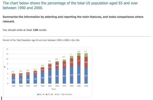
The bar chart illustrates the proportion of the total US senior citizens aged 65 and over during 100 years starting from 1900.

Overall, it can be seen that the data shows a notable upward trend in the percentage of elderly individuals in the UK in the given period. The 65-74 age group had the highest proportion, followed by the 75-84 age group and the 85+ age group with the lowest percentage.

According to the given chart, in 1900, the number of the total elderly population in the US began at 4%, which comprised 2.9% 65-74 years old, 1% 75-84 years old and a tiny proportion, 0.2% 85+. This figure significantly rose to over 8% which doubled the percentage in the first period. It included 5.6% 65-75 age group and almost tripled the 75-84 age group while 0.4% of the 85+ age group.

Between 1960 and 2000, the total number of senior residents experienced continuous growth from nearly 9% and over 12%, respectively. It hit the top at almost 12.5% in 1990 and slowly decreased in 2000. The 65-74 age group reached 7.3% in 1990 and slowly declined to 6.5% in 2000 whereas the remaining two groups, the 75-84 age group and the 85+ age group, continued to go up and hit 4.4% and 1.5%, respectively.

Word Count: 215

Answers On The Same Topic:

The chart below shows the percentage of the total us population aged 65 and over between 1900 and 2000.

The chart illustrates changes in the total number of people from 65 years for one century./over the period from Overall, it is clear that the highest percent of population was in 1990 and the lowest in 1900. Additionally, it can be seen that the biggest percent of people was by group aged 65-74 in every […]

The chart below shows the percentage of the total us population aged 65 and over between 1900 and 2000.

The bar chart illustrates the percentage of the US population aged 65 and over for each decade spanning from 1900 to 2000. Overall, there was a substantial increase in all three age groups within the US population over the century. Notably, the percentage of individuals aged 65 to 74 was consistently the highest among the […]

The chart below shows the percentage of the total us population aged 65 and over between 1900 and 2000.

The bar chart illustrates the percentage of the entire US population from 65 years old to 85 over between 1900 and 2000, The figure calculated in percentage. Overall, both 75 to 84 years old and over 85 years old age group shown a simmilar condition with gradual increased while in 65 to 74 years old […]

The chart below shows the percentage of the total us population aged 65 and over between 1900 and 2000.

The given chart illustrates information about the total percentage of the USA population aged 65 and over between the two time period, fron 1990 to 2000. Overall, there are three age groups that’s number had been increasing over the decades. Excluding the one group that’s age is from 65 to 74. The percentage of people […]

The chart below shows the percentage of the total us population aged 65 and over between 1900 and 2000.

The bar chart provided illustrates changes in the percentage of the US population aged 65 and over from 1900 to 2000. Overall, there was a significant increase in the proportion of individuals aged 65 and above in the US population. The percentage of those aged 65-74 was consistently the highest compared to the other age […]

See All

Other Topics:

Task 1: The Chart below shows the percentage of males and females with higher education qualifications in five countries in 2001. Summarize the information be selecting and reporting the main features and make comparisons where relevant.

The given bar chart illustrates the proportion of two genders with prerequisites for higher education in Japan, the US, Switzerland, Britain and Germany in 2001. Overall, Switzerland and Germany were the figures with highest rates in obtaining university degrees for both men and women, whereas the rate of Japan was the least. Notably, Switzerland showed […]

Writing Task 1 The graph below gives information about the number of people who smoked cigarettes in the UK between 2011 and 2021.

The bar chart compares the number of people smoking cigarettes in the UK between 2011 and 2021. Overall, it is clear that the number of male smokers was the highest throughout the entire period compared to female smokers. Additionally, the data for women fluctuated over the decade. In 2011, the number of male smokers reached […]

Writing Task 1 The graph below gives information about the number of people who smoked cigarettes in the UK between 2011 and 2021.

The bar chart compares the number of people smoking cigarettes in the UK between 2011 and 2021. Overall, it is clearly seen that the number of men smoking was the highest over the whole period compared with women. What is more, the data for women fluctuated over the decade. In terms of men, the number […]

The graph below shows the way people of a country invested their money in stock market during the years 2001-2006

“The provided bar chart compares the volume of financial investments made by citizens of a particular nation into two distinct market instruments, namely bonds and stocks, over a six-year period commencing from 2001.” “Overall, it is immediately apparent that both investment options experienced a consistent upward trend throughout the timeframe. Furthermore, it is also noticeable […]

The bar chart below shows the international student enrolments at three universities.

The provided bar graph displayed informant about the international student enrolment at three university and five different countries like India, Nepal, Vietnam, Indonesia, Colombia. Overall, it is clear that India had the highest number of international students while, Colombia had was the lowest number of student. additionally, the university of Riverview was the most popular […]

the bar chart below shows the number of students who choose certain university subjects in 2005

The graph compares the numbers of male and female students who selected various university subjects in 2005. Overall, clear gender preferences can be observed in subject choices. Female students showed a strong inclination towards Social Sciences and Languages, whereas males were far more likely to study Science-related subjects and Mathematics. In addition, Mathematics was the […]

See All
We have detected unusual activity on your device.
Please verify your identity to continue.
Note: This verification step won't sign you in. If you have a premium account, please log in to access the service as usual.
Google/Gmail Verification
Or verify using Email/Code
We've sent a verification code to:
youremail@gmail.com (Not your email?)
Enter it below to complete the verification process.
Ensure your email address is correct, your inbox is not full, and you check your spam folder. If no email arrives, consider using an alternative email.
You will need a Premium plan to perform your action!
Note: If you already have a premium account, please log in to access our services as usual.

Plans & Pricing

Our mission is to make quality education accessible for everyone.
However, to keep our hardworking team running and this service alive, we genuinely need your support!
By opting for a premium plan, not only do you sustain us in achieving the mission, but you also unlock advanced features to enrich your learning experience.

Free

For learners who aren't pressed for time

What's included on Free
100+ Cambridge IELTS Tests
Instant IELTS Writing Task 1 & 2 Evaluation (2 times/month)
Instant IELTS Speaking Part 1, 2, & 3 Evaluation (5 times/month)
Instant IELTS Writing Task 1 & 2 Essay Generator (2 times/month)
500+ Dictation & Shadowing Exercises
100+ Pronunciation Exercises
Flashcards
Other Advanced Tools

Premium

For those serious about advancing their English proficiency, and for IELTS candidates aspiring to boost their band score by 1-2 points (especially in writing & speaking) in just 30 days or less

What's included on Premium
Save Your IELTS Test Progress
Unlock All Courses & IELTS Tests
Unlimited AI Conversations
Unlimited AI Writing Enhancement Exercises
Unlimited IELTS Writing Task 1 & 2 Evaluation
Unlimited IELTS Speaking Part 1, 2, & 3 Evaluation
Checked Answers Will Not Be Published
Unlimited IELTS Writing Task 1 & 2 Essay Generator
Unlimited IELTS Speaking Part 1, 2, & 3 Sample Generator
Unlimited Usage Of Advanced Tools
Priority Support within 24h (12-month plan only)

Due to the nature of our service and the provided free trials, payments are non-refundable.
Nếu bạn là người Việt Nam và không có hoặc không muốn trả bằng credit/debit cards, bạn có thể thanh toán bằng phương thức chuyển khoản:


Chọn gói:
419,000₫ 277,000 ₫ cho gói 1 tháng (chỉ 9,233₫/ngày)
1,239,000₫ 597,000 ₫ cho gói 3 tháng (chỉ 6,633₫/ngày)
2,469,000₫ 1,027,000 ₫ cho gói 6 tháng (chỉ 5,706₫/ngày)
4,929,000₫ 1,417,000 ₫ cho gói 12 tháng (chỉ 3,936₫/ngày)


Sau khi chuyển khoản, vui lòng đợi trình duyệt tự động điều hướng bạn trở lại Engnovate và bạn sẽ ngay lập tức nhận được mã kích hoạt tài khoản premium.
Nếu có lỗi xảy ra, bạn có thể liên hệ với team thông qua một trong các phương thức: email đến helloengnovate@gmail.com hoặc nhắn tin qua facebook.com/engnovate.
Vì toàn bộ công cụ trên website đều có thể sử dụng thử miễn phí, Engnovate không hỗ trợ hoàn tiền.