🔥 Today Only: Save 30% on Premium — Offer Ends Soon! - Upgrade Now!
Line Graph

Band 5+: The graph shows the percentage of 15-year-olds with low literacy (reading and writing) levels in four countries. Summarise the information by selecting and reporting the main features making comparisons where relevant.

Image for topic: The graph shows the percentage of 15-year-olds with low literacy (reading and writing) levels in four countries. Summarise the information by selecting and reporting the main features making comparisons where relevant.
Our system will evaluate the answer based on this AI-generated description.
The image shows a line graph of 15 year-olds with low literacy levels from 2000 to 2009 for Austria, Denmark, Ireland, and Sweden. In 2000, Austria started at about 18%, Denmark at 16%, Ireland at 12%, and Sweden at 10%. In 2003, Austria increased to about 19%, Denmark stayed the same, Ireland increased to about 13%, and Sweden increased to about 11%. In 2006, Austria increased dramatically to about 27%, Denmark increased to about 17%, Ireland increased to about 15%, and Sweden increased to about 12%. In 2009, Austria decreased to about 26%, Denmark increased to about 18%, Ireland increased to about 17%, and Sweden increased to about 14%. The y-axis represents the percentage of 15 year-olds with low literacy levels, while the x-axis represents the years. Each country is represented by a different colored line: Austria (blue), Denmark (purple), Ireland (yellow), and Sweden (green).
Given the complexity of the image, the above description may not be entirely accurate.
Note: Both the topic and the answer were created by one of our users.

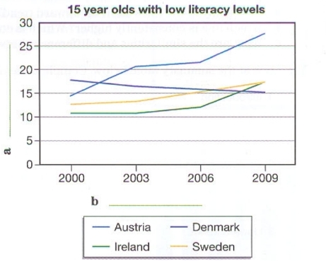
The line graph illustrates the amount of low literacy percentage on reading and writing of 15-year-olds in Austria, Denmark, Ireland and Sweden from 2000 to 2009.

Overall, the graph portrays flactuations of low literacy in various countries, among them Austria had a significant increasement, however Denmark had a great fall.

In 2000, Denmark had the highest of approximately of 17% lower literacy level, wherelse Ireland had just slightly more than 10% of the level. With the time being, Denmark gradually fell down and in 2009 it made it to 15% only. In addition, Ireland was in its stable position until 2003, and took a drastic shift in 2006 to 2009 that crossed more than 15%.

On the other hand, Austria reached at its peak in 2003, remain stable upto 2006 and from that dramatically leveled up to 2009 with a nearly 30% low literacy levels. Last but not least, for Sweden it was alomost a smooth uprising thorught the years.

Word Count: 160

Answers On The Same Topic:

The graph shows the percentage of 15-year-olds with low literacy (reading and writing) levels in four countries. Summarise the information by selecting and reporting the main features making comparisons where relevant.

The line graph compares changes in the proportions of the children aged 15 who were bad at reading and writing in Austria, Denmark, Ireland and Sweden from 2000 to 2009. Overall, with the exception of Denmark, the remaining three countries experienced substantial increases throughout the period. Besides, Austria became the dominant in terms of having […]

The graph shows the percentage of 15-year-olds with low literacy (reading and writing) levels in four countries. Summarise the information by selecting and reporting the main features making comparisons where relevant.

This line graph provides information about the ability of learning how to read and write properly from 15 years old over the year from 2000 to 2009 years. There are two clear trends visible. Only one country,Denmark , has dropping in literacy skills. In 2000 year Denmark got 17 percent and by the end of […]

The graph shows the percentage of 15-year-olds with low literacy (reading and writing) levels in four countries. Summarise the information by selecting and reporting the main features making comparisons where relevant.

The line graph illustrates that the percentage of 15 year old teenagers with low literacy, includes reading and writing levels in four different countries. Firstly, the highest percentage in Austria, it showed the highest numbers in each years(2000, 2003, 2006 and 2009). Denmark is on the second place, it was in the middle of three […]

The graph shows the percentage of 15-year-olds with low literacy (reading and writing) levels in four countries. Summarise the information by selecting and reporting the main features making comparisons where relevant.

The linegraph illustrates the percentage of 15 year-old teenagers with low literacy level in four countries. Overall literacy rate in Austria the highest among four countries. In Denmark the lowest percentage. Ireland in 2000 showed about 10% till 2006 growed gradually but after 2006 it surged. It became higher than 15%. Sweden between 2000 and […]

The graph shows the percentage of 15-year-olds with low literacy (reading and writing) levels in four countries. Summarise the information by selecting and reporting the main features making comparisons where relevant.

The linegraph illustrates the distribution of low literacy skilleds among 15-year-olds in Austria, Denmark, Ireland and Sweden. Overall, percentage of teenagers who can barely read and write in Austria, Ireland and Sweden grew gradually throughout the given period.Meanwhile, Denmark’s distribution declined in 9 years. While low literacy percentage skyrocketed in sweden from around 14 to […]

See All

Other Topics:

The graph shows data about the annual earnings of three bakeries in London, 2000-2010. Summarize the information by selecting and reporting the main features, and make comparisons where relevant.

The line graph illustrates the annual net income of three bakeries in London between 2000 and 2010. Overall, Robbie’s Bakery experienced a substantial increase in revenue and became the most profitable bakery by the end of the period. By contrast, Bernie’s Buns fluctuated considerably and finished with the lowest income, while Lovely Loaves rose steadily […]

The graph below gives information about three different ways of communication used by teenagers in the United States between 1990 and 2020

The line graph delineates the evolution of three distinct modes of communication employed by adolescents in the United States from 1990 to 2020. Overall, there is a marked increase in text messaging as a preferred communication method among teenagers, while both calls and face-to-face interactions exhibit a significant decline over the specified period. In 1990, […]

The graph below gives information about three different ways of communication used by teenagers in the United States between 1990 and 2020

The line chart illustrates information about three various methods of conversation utilized by young people in United States from 1990 to 2020. Overall, at the beginning of the period, the figure for face to face interaction was highest figure among other figures, whereas text messages recorded the lowest figure at the starting point. Nevertheless, over […]

The graph below shows the number of enquuiries received by teh tourist information office in one city over a six-month period in 2011Summarize the information by selecting and reporting the main features and take comparisons where relevant You should write at least 150 words.

Based on the graphs, there are more enquuiries by in person compare by letter and by telephone. From January to February, enquuiries by in person is less than enquuiries by telephone and by letter. The people most prefer to make enquuiries bytelephone and by letter. In my perspection that because January and February are early […]

IELTS Writing Task 1 Practice: Line Graph - You should write between 150 - 180 words and spend only 20 minutes. - Make sure you have studied how Writing Task 1 is organized.

The line chart depicts the sales of different kinds of books in millions between 2002 and 2006 in one country.Overall, it is evident that children’s books exhibited the highest sales compared to adult and educational books. In 2002, children’s fiction were above 30 million sales which increased steadily by around 10 million in 2003.The figure […]

Writing task 1 The line graph illustrates the amount of spreads consumed from 1981 to 2007, in grams per person per week

The line graph illustates of tree spreads consumption (margarine, butter, low fat and reduced spreads) since from the period 1981 to 2007. The measured are grams. Overall, the consumption margarine and butter was decreased over the given period, while low fat and reduced spreads rose. At start of the period butter was the most popular […]

See All
We have detected unusual activity on your device.
Please verify your identity to continue.
Note: This verification step won't sign you in. If you have a premium account, please log in to access the service as usual.
Google/Gmail Verification
Or verify using Email/Code
We've sent a verification code to:
youremail@gmail.com (Not your email?)
Enter it below to complete the verification process.
Ensure your email address is correct, your inbox is not full, and you check your spam folder. If no email arrives, consider using an alternative email.
You will need a Premium plan to perform your action!
Note: If you already have a premium account, please log in to access our services as usual.

Plans & Pricing

Our mission is to make quality education accessible for everyone.
However, to keep our hardworking team running and this service alive, we genuinely need your support!
By opting for a premium plan, not only do you sustain us in achieving the mission, but you also unlock advanced features to enrich your learning experience.

Free

For learners who aren't pressed for time

What's included on Free
100+ Cambridge IELTS Tests
Instant IELTS Writing Task 1 & 2 Evaluation (2 times/month)
Instant IELTS Speaking Part 1, 2, & 3 Evaluation (5 times/month)
Instant IELTS Writing Task 1 & 2 Essay Generator (2 times/month)
500+ Dictation & Shadowing Exercises
100+ Pronunciation Exercises
Flashcards
Other Advanced Tools

Premium

For those serious about advancing their English proficiency, and for IELTS candidates aspiring to boost their band score by 1-2 points (especially in writing & speaking) in just 30 days or less

What's included on Premium
Save Your IELTS Test Progress
Unlock All Courses & IELTS Tests
Unlimited AI Conversations
Unlimited AI Writing Enhancement Exercises
Unlimited IELTS Writing Task 1 & 2 Evaluation
Unlimited IELTS Speaking Part 1, 2, & 3 Evaluation
Checked Answers Will Not Be Published
Unlimited IELTS Writing Task 1 & 2 Essay Generator
Unlimited IELTS Speaking Part 1, 2, & 3 Sample Generator
Unlimited Usage Of Advanced Tools
Priority Support within 24h (12-month plan only)

Due to the nature of our service and the provided free trials, payments are non-refundable.
Nếu bạn là người Việt Nam và không có hoặc không muốn trả bằng credit/debit cards, bạn có thể thanh toán bằng phương thức chuyển khoản:


Chọn gói:
419,000₫ 277,000 ₫ cho gói 1 tháng (chỉ 9,233₫/ngày)
1,239,000₫ 597,000 ₫ cho gói 3 tháng (chỉ 6,633₫/ngày)
2,469,000₫ 1,027,000 ₫ cho gói 6 tháng (chỉ 5,706₫/ngày)
4,929,000₫ 1,417,000 ₫ cho gói 12 tháng (chỉ 3,936₫/ngày)


Sau khi chuyển khoản, vui lòng đợi trình duyệt tự động điều hướng bạn trở lại Engnovate và bạn sẽ ngay lập tức nhận được mã kích hoạt tài khoản premium.
Nếu có lỗi xảy ra, bạn có thể liên hệ với team thông qua một trong các phương thức: email đến helloengnovate@gmail.com hoặc nhắn tin qua facebook.com/engnovate.
Vì toàn bộ công cụ trên website đều có thể sử dụng thử miễn phí, Engnovate không hỗ trợ hoàn tiền.