🔥 Today Only: Save 30% on Premium — Offer Ends Soon! - Upgrade Now!
Multiple Graphs

Band 4+: The graphs below show the number of men and women in full and part-time employment in Australia between 1973 and 1993. Summarise the information by selecting and reporting the main features, and make comparisons where relevant.

Image for topic: The graphs below show the number of men and women in full and part-time employment in Australia between 1973 and 1993. Summarise the information by selecting and reporting the main features, and make comparisons where relevant.
Our system will evaluate the answer based on this AI-generated description.
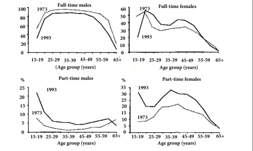
The image shows four graphs comparing employment percentages across age groups for 1973 and 1993. For full-time males: age groups 15-19: 90%, 50%; 20-24: 98%, 75%; 25-29: 95%, 85%; 30-34: 95%, 90%; 35-39: 92%, 90%; 40-44: 90%, 88%; 45-49: 85%, 88%; 50-54: 80%, 85%; 55-59: 60%, 70%; 65+: 10%, 8%. For full-time females: 15-19: 50%, 35%; 20-24: 35%, 50%; 25-29: 18%, 35%; 30-34: 25%, 42%; 35-39: 30%, 45%; 40-44: 35%, 45%; 45-49: 32%, 45%; 50-54: 32%, 42%; 55-59: 25%, 32%; 65+: 5%, 5%. For part-time males: 15-19: 5%, 40%; 20-24: 2%, 15%; 25-29: 1%, 5%; 30-34: 1%, 4%; 35-39: 2%, 3%; 40-44: 2%, 3%; 45-49: 3%, 5%; 50-54: 5%, 7%; 55-59: 10%, 10%; 65+: 6%, 11%. For part-time females: 15-19: 7%, 35%; 20-24: 5%, 15%; 25-29: 15%, 20%; 30-34: 20%, 35%; 35-39: 22%, 35%; 40-44: 20%, 32%; 45-49: 18%, 30%; 50-54: 18%, 27%; 55-59: 12%, 18%; 65+: 5%, 5%.
Given the complexity of the image, the above description may not be entirely accurate.
Note: Both the topic and the answer were created by one of our users.

The graphs illustrate the percentage of men and women doing full and part-time jobs in the year 1973 and 1993. (Australia)

Overall, it is evident, in comparision of different age groups of males and females, males have worked more in full rather than part-time. Slight fluctuation can be observed in part-time jobs done my males.

In the first line graph, in 1973 full time work done by age group of 15-19 upto 45-49 it has slightly increased, while from age group 55-59 and over 65 has gradually declined and reached below 20 percent. Likewise, in 1993 the graph is parallel with percent of 1973, being over 30% with age group 15-19 and reaching 78% and it remained constant from age group 15-19 to 45-59 age. It decreased until the age group to 65 over. In contrast the females of age groups 15-19 involved in full-time in 1973 was approximately 50%, whereas in 1993 there was drastical change and it reduced to oless than 20%. In both the years it fluctuated reaching 55% for age group 25-29 in 1993 and similar percent in 1973. There is upward as down ward trend in both years being less than 10% women doing full time work.

Word Count: 202

Answers On The Same Topic:

The graphs below show the number of men and women in full and part-time employment in Australia between 1973 and 1993. Summarise the information by selecting and reporting the main features, and make comparisons where relevant.

The line graph illustrates the distribution of employments by gender in Australia, over a two decades period, from 1973 to 1993. In addition, they are seperated on the basis of the full-time and part-time jobs. Generally speaking, in 1973, fill-time females outnumbered the full-time males, whereas part-time womens and mens were notable to be similar. […]

The graphs below show the number of men and women in full and part-time employment in Australia between 1973 and 1993. Summarise the information by selecting and reporting the main features, and make comparisons where relevant.

The line graphs represent data on the proportion of full and part-time employees of both genders in Australia over a 20-year period starting from 1973. Overall, it can be seen that male had a tendency to work full-time, while females engaged in part-time and full-time jobs in a fairly similar pattern. In 1993, while 23% […]

The graphs below show the number of men and women in full and part-time employment in Australia between 1973 and 1993. Summarise the information by selecting and reporting the main features, and make comparisons where relevant.

The line graphs illustrate the percentages of male and female in full and part-time employment in Australia over a 20-year period from 1973 to 1993. Overall, it is clear that in 1993 part-time males and females employment accounted for the largest proportion in 15-19 age group, whereas full-time males and females employment carried the last. […]

The graphs below show the number of men and women in full and part-time employment in Australia between 1973 and 1993. Summarise the information by selecting and reporting the main features, and make comparisons where relevant.

The provided graphs illustrate the proportion of males and females engaged in full-time and part-time employment in Australia between 1973 and 1993. Overall, men were more likely to work full-time, while women tended to participate more in part-time jobs. Both genders experienced changes over the two decades, with most figures showing a general upward trend. […]

The graphs below show the number of men and women in full and part-time employment in Australia between 1973 and 1993. Summarise the information by selecting and reporting the main features, and make comparisons where relevant.

The provided graphs illustrate the proportion of both genders involved in full and part-time occupations in Australia between 1973 and 1993 Overall, males were likely to take part in part-time in their youth, females tended to follow a similar pattern fairly in both types of work. As can be seen from the graphs, the majority […]

See All

Other Topics:

You should spend about 20 minutes on this task. The line graph below shows the percentage of households in a country with access to the Internet from 2000 to 2020. The pie chart shows the distribution of Internet usage by purpose in the year 2020. Summarise the information by selecting and reporting the main features, and make comparisons where relevant. Write at least 150 words.

The line graph elucidate the proportion of households with internet access in a country between 2000 and 2020, While the pie chart indicates how the internet was used for different purposes in 2020 Overall,the persentage of households with internrt access increased significantly throughout the period. in addition social media accounted for the largest share of […]

The graphs show the residential water use by 5 sections in UK. Summarise the information by selecting and reporting the main features, and make comparisons where relevant.

The charts below show information on residential water use in 1988 and 2008. The two pie charts outline the residental water use for different reasons -garden, bathroom, toilet, washing clothes, kitchen- between 1988 and 2008. Overall, there was a downward trend, albeit to varying degrees and different patterns, in the proportion of water usage for […]

Writing task 1 The graph below shows the viewership of different TV programs among three different age groups. Summarise the information by selecting and reporting the main features, and make comparisons where relevant.

The pie charts compare the percentage of viewers in 3 different age groups namely 10-15, 16-20 and 21-25 years old. Overall, there is a significant change in watching habits as people grow older, shifting from prefer watching cartoon and sport to watching news and drama the most. In addition, drama is consistently welcomed by all […]

The chart and table below show the results of a survey of library users at a university. Summarise the information by selecting and reporting the main features, and make comparisons where relevant.

The bar and table chart give information about results of a survey of people, who attend library at a university. Information is divided into users and satisfaction rate of different facilities. Units measured in per cents. Overall, the highest percentage of library users was by full-time undergraduate as opposed to academic staff having the least […]

The graphs below show data on Australian trades with three other countries.

The line graph provides information about the value of trade between Australia and three countries, namely China, the USA and Japan, from 2002 to 2005, in billions of Australian dollars. Overall, exports were higher than imports in all three trading relationships throughout the period, except for China in 2008. The most significant change was a […]

The table and graph below give information about cinema attendance in Australia between 1994 and 2002. Summarize the information by selecting and reporting the main features, and make comparisons where relevant

The given picture illustrates the cinema visits in Australia and the average visits to cinema by different ages between 1996 and 2000. Overall the highest procentage of attendance and frequency was in the middle of the compared years and showed a slightly decreasing. Moreover the visitors age groups was compared into four groups the highest, […]

See All
We have detected unusual activity on your device.
Please verify your identity to continue.
Note: This verification step won't sign you in. If you have a premium account, please log in to access the service as usual.
Google/Gmail Verification
Or verify using Email/Code
We've sent a verification code to:
youremail@gmail.com (Not your email?)
Enter it below to complete the verification process.
Ensure your email address is correct, your inbox is not full, and you check your spam folder. If no email arrives, consider using an alternative email.
You will need a Premium plan to perform your action!
Note: If you already have a premium account, please log in to access our services as usual.

Plans & Pricing

Our mission is to make quality education accessible for everyone.
However, to keep our hardworking team running and this service alive, we genuinely need your support!
By opting for a premium plan, not only do you sustain us in achieving the mission, but you also unlock advanced features to enrich your learning experience.

Free

For learners who aren't pressed for time

What's included on Free
100+ Cambridge IELTS Tests
Instant IELTS Writing Task 1 & 2 Evaluation (2 times/month)
Instant IELTS Speaking Part 1, 2, & 3 Evaluation (5 times/month)
Instant IELTS Writing Task 1 & 2 Essay Generator (2 times/month)
500+ Dictation & Shadowing Exercises
100+ Pronunciation Exercises
Flashcards
Other Advanced Tools

Premium

For those serious about advancing their English proficiency, and for IELTS candidates aspiring to boost their band score by 1-2 points (especially in writing & speaking) in just 30 days or less

What's included on Premium
Save Your IELTS Test Progress
Unlock All Courses & IELTS Tests
Unlimited AI Conversations
Unlimited AI Writing Enhancement Exercises
Unlimited IELTS Writing Task 1 & 2 Evaluation
Unlimited IELTS Speaking Part 1, 2, & 3 Evaluation
Checked Answers Will Not Be Published
Unlimited IELTS Writing Task 1 & 2 Essay Generator
Unlimited IELTS Speaking Part 1, 2, & 3 Sample Generator
Unlimited Usage Of Advanced Tools
Priority Support within 24h (12-month plan only)

Due to the nature of our service and the provided free trials, payments are non-refundable.
Nếu bạn là người Việt Nam và không có hoặc không muốn trả bằng credit/debit cards, bạn có thể thanh toán bằng phương thức chuyển khoản:


Chọn gói:
419,000₫ 277,000 ₫ cho gói 1 tháng (chỉ 9,233₫/ngày)
1,239,000₫ 597,000 ₫ cho gói 3 tháng (chỉ 6,633₫/ngày)
2,469,000₫ 1,027,000 ₫ cho gói 6 tháng (chỉ 5,706₫/ngày)
4,929,000₫ 1,417,000 ₫ cho gói 12 tháng (chỉ 3,936₫/ngày)


Sau khi chuyển khoản, vui lòng đợi trình duyệt tự động điều hướng bạn trở lại Engnovate và bạn sẽ ngay lập tức nhận được mã kích hoạt tài khoản premium.
Nếu có lỗi xảy ra, bạn có thể liên hệ với team thông qua một trong các phương thức: email đến helloengnovate@gmail.com hoặc nhắn tin qua facebook.com/engnovate.
Vì toàn bộ công cụ trên website đều có thể sử dụng thử miễn phí, Engnovate không hỗ trợ hoàn tiền.